Daily news, dev blogs, and stories from Game Developer straight to your inbox
Sponsored By
Featured Blog | This community-written post highlights the best of what the game industry has to offer. Read more like it on the Game Developer Blogs.
Designing Sausage Sports Club
Lessons learned designing Sausage Sports Club, including a few deep dives into specific features.
22 Min Read

Designing Sausage Sports Club
Also check out my posts on (Programming, Tech Art, and BizDev)
What Is This?
I worked on Sausage Sports Club for 3 years and learned an insane amount in the process. I was incredibly lucky to be surrounded by experienced and generous game makers in that time who were willing to give feedback, advice, and help push me and my game forward every step of the way. I know few people have that privilege, so this post is to lower the ladder a bit and hopefully make making games a little bit easier. Here are the topics I cover in this post:
Design Pillars—Defining project goals to judge decisions against
Player Select—Lessons from refining first time user experience
Adventure Mode—Building replayable seasons of a procedural sitcom
Progression—Improving engagement and retention with juice
Level Design—Workflow optimization and encouraging exploration
Camera—Reducing complexity in a multi-target, zone-based camera
Design Pillars
Every design decision made along the way was based on a few design pillars I set at the start of the project. It’s not necessary to do this, but defining pillars is useful in deciding what game you’re trying to make and in giving some semblance of objectivity to making design decisions. When faced with any question in designing your game, you can always check whether they support these pillars.
My design pillars for Sausage Sports Club were:
Depth not complexity—Whenever possible, features should add depth without adding unnecessary complexity for new players.
Fun for low-skill players—Even the worst player should be able to laugh and have a good time.
Everything is funny—Everything added should push in the direction of making players laugh.
High intensity moments—Modes and features should encourage memorable, intense moments whether scripted or created by players.
Craftsmanship—Everything in the game should be polished, feel complete, and give the perception that a larger team made it.
Player Select
One aspect of the game’s UI design I’m conflicted on is the Player Select menu. Many people playing for the first time notice and comment that it resembles the Super Smash Bros’ Player Select. I was pretty annoyed by this because getting to that design was the result of solving small UX problems over many iterations. I spent a lot of time making changes to try and differentiate it more, but most of those changes added complexity and made the menu harder to use.
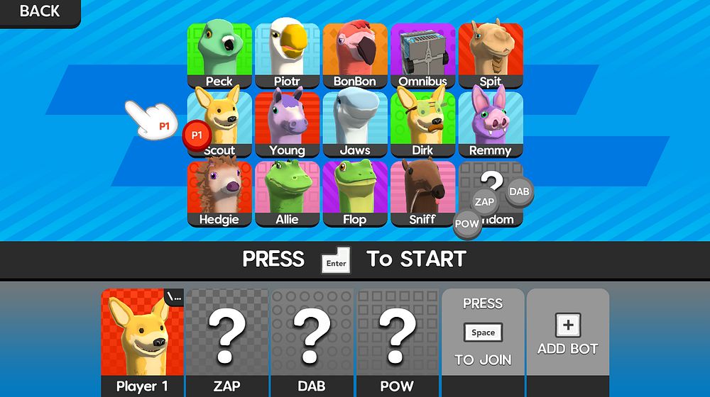
Looks a bit familiar, right?
Early versions of this menu front-loaded the customization process so players had to select their character, skin, team, and hat one step at a time through a small window where you could only see one option at a time. With 14 characters, 3–4 skins per character, 8 team options, and 60 hats, this was a long, burdensome process that was intimidating for new players and boring for decisive players. It became clear I needed to focus on reducing how much information new players needed to see before getting started, which meant fewer required choices and that getting through this menu should take as few clicks as possible.
Here are some ways I reduced complexity of this important initial menu while retaining the depth of customization:
Screen space is limited and showing the same information multiple times wastes it. Sausage Sports Club has a fairly large pool of characters to choose from, so it makes more sense to show all of them at once instead of forcing each player to cycle through them one at a time. I show a grid of all available characters in the center of the screen and each player’s individual information in widgets along the bottom of the screen.
Using a paradigm of cursors as each player’s avatar and tokens as each player’s selection has a lot of benefits. The most important of these is that it helps smooth the flow of getting into the game by allowing advanced players to help get newbies started. Before this change, when families with younger kids played, parents would often have to take their kid’s controller to help and I wanted to avoid that condescending break in game flow.
Having a cursor that’s free to move around the screen is also inherently more fun than locking your selection to a widget. It gives players room to play because they can steal from each other, change each other’s selections, and even hide tokens. It makes adding and managing bots easier since everyone can help pick characters for bots. It also establishes an interaction language that can be used in other parts of the game, like the Team Select menu which happens just before a match starts and lets players drop their token onto different team slices.
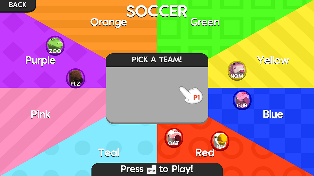
Team Select also uses the cursor-token paradigm!
Starting players off with tokens in-hand makes it so someone can play after only hitting one button to select their character. And if they’re overwhelmed and another player wants to help them, they don’t need to do anything or even pass their controller. If you can’t find your token, that’s fine too- the cancel button will retrieve it, even if another player is holding it.
Hiding advanced, optional customization and options behind small, relatively hidden buttons keeps them from distracting new, overwhelmed players without adding the extra complexity of a new menu. In Sausage Sports Club, players have advanced options like skins and player names that aren’t needed to play, but add depth for advanced users. By auto assigning the first available skin when a player picks a character, we let players get started without having to teach about skins or giving players too many choices before they’re ready. Player names are also auto-assigned because they carry player’s save data including hat progress and input rebinds but not until a player has played enough that those become relevant.
Some other notes about player names: Because Sausage Sports Club is family friendly I wanted to limit how dirty players could make their names. I noticed by limiting names to 3 characters, basically every curse word is left out and there’s a few bonuses. With only 3 letters, a much high proportion of the names you can make are funny without players having to be clever. This limit also gives a hard cap to how many players saves can be created, which keeps me from having to implement and communicate a cap even on platforms with limited save data size.
Here are the biggest lessons I learned from designing Sausage Sports Club’s first time user experience (FTUE):
Get players into the fun part in as few steps and with as little unnecessary information as possible.
Deep customization options are great, but don’t require them and let players discover them at their own pace.
If you can’t remove enough confusing complexity for beginners, add tools so other players can help.
Re-use interaction paradigms as often as possible to limit how much you have to teach.
Adventure Mode
At the halfway point of development, I had figured out the gameplay and art pipeline for everything, but was seriously worried about differentiating Sausage Sports Club from other local multiplayer games and especially that the game didn’t offer enough for solo players. To quell that fear I decided to add a campaign mode built for single-player and co-op with up to 4 players. I spent weeks deciding how it should be structured to add the most value, while keeping in mind the big limitation that I’d be the one writing dialogue, building environments, and coding everything. Once I’d weighed all the pros and cons, had a plan for Adventure Mode, and accepted it would add at least 6 months to my development, I decided scope up.
I’d already spent 1.5 years on the game and didn’t have any project-related debt, so why not follow through in making it the best thing I could and give it the best chance to succeed?
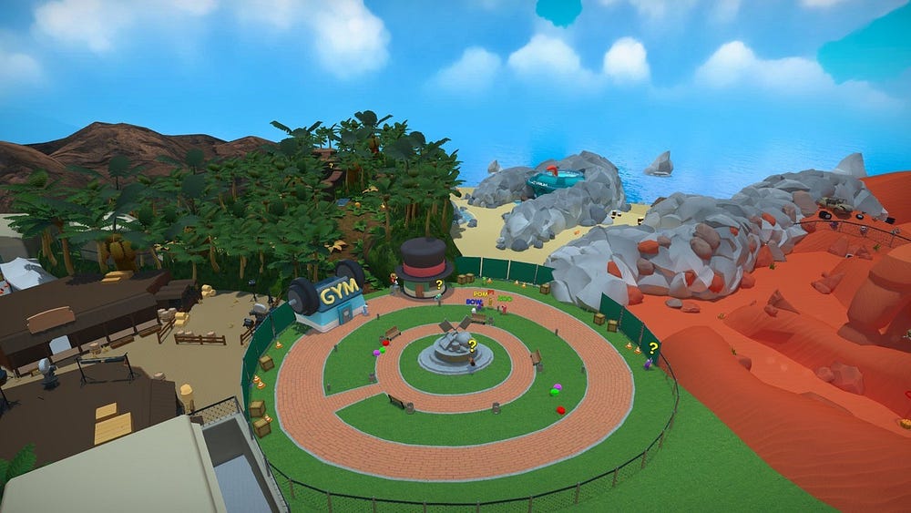
The Overworld!
So what is Adventure Mode? It’s a reality TV show where you’ll meet NPCs and help them solve interpersonal drama by competing in sports matches. On each day of the season, more of the Overworld will open up and give access to new biomes filled with toys and entrances new arenas. As you play, you’ll unlock new characters and skins, while also earning coins you’ll use to unlock hats. Most importantly, each playthrough holds new quests and arrangements of the Overworld meaning your adventure is always different. Elevator pitch aside, how does this work?
I knew there was a limit to how much content I could make alone, so instead of making one linear story that would only last one playthrough, I chose to make many short stories that could be re-arranged, interspersed with random sports matches, and replayed. I referenced sitcoms which similarly have short episodes, always feature the same characters, and can be watched for the most part in any order or combination without being too confusing.
To get the procedural sitcom feel I wanted, I wrote lots of quests; over 2x as many as I’d expect or want players to go through in one sitting. They all feature different combinations of characters, have their own 5-minute contained stories, and (for the most part) can be placed anywhere around the Overworld. When starting any day of the season I randomly grab a few from this pool of quests, making sure to only use any character once per day and to not reuse quests later in the season. Then I pick random locations to place them in the Overworld, which was important to encourage players used to linear games to go out and explore. A season requires players to go through 12 quests and the full pool is 26 quests, so you’re very likely to see lots of new quests for at least the first 3 or 4 playthroughs.
I’m pumped with where Adventure Mode ended up, especially that the structure feels so different from any other game and that every player’s experience really is unique, but the process of getting here was tough. All told, I spent another 18 months on the game after deciding to add Adventure Mode which is a lot more than the 6 months I first expected. Much of that was hustling at conventions, porting the game to Nintendo Switch, and moving to Austin to start a new job, but I definitely bit off more than I expected. Much of that extra time was spent redoing work after my first (or first few) versions sucked.
Here’s a few memorable spots where my first attempts at parts of Adventure Mode didn’t work out:
When I started building Adventure Mode I thought my bottleneck was going to be writing scripted sequences that would make quests feel unique, so I spent weeks building a visual node editor to speed up that process. I also had some hope that I’d be able to hire a non-programmer friend to help author quests with this tool. Eventually, after getting this tool pretty functional I realized my bottleneck was actually writing dialogue, that the scripted sequences were simple enough to build and debug easily in code, and that maintaining/adding features to this tool was costing more time than it was likely to earn back I threw out all that work.
Quest Editor v0.1
My process for writing quests was to make a matrix of all the characters, point to an intersection and think about how their motivations could intersect to create conflict. Once I had a handful of quests written I rated how interesting each one was and tried to analyze why. Most of them sucked and felt too similar to each other, so that led me to focus on making quests feel more different by giving the bots interesting behaviors like following you, racing each other, running away, exchanging hats, or running along splines.
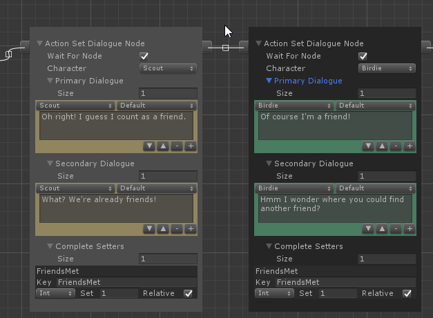
My first pass at implementing the quests and dialogue for Adventure Mode was rough because characters weren’t charming. Until I showed character color on dialogue bubbles, added emotes, pushed in the camera, added dialogue sounds, and added blinking and mouth movement- dialogue was a slog.
Exciting dialogue!
All these procedural systems required lots of tech and dealing with bugs to make things work. Debugging these issues was especially annoying because every playthrough shuffles which quests show up and where they’re placed. When possible I added debug settings to load specific quests under specific conditions, but sometimes issues resulted from a cascade of quest, character, and implementation issues that I struggled with for days at a time.
Progression
As Adventure Mode, arenas, and characters all started getting finished up it became clear that player direction and motivation was lacking and I needed to look at how other games keep players interested and invested over time without making things feel like a grind.
I referenced addicting multiplayer games with repetitive gameplay loops like Overwatch, PUBG, TF2 to see how they kept players engaged. Here are the common threads I noted:
Short exciting play sessions that end before players have a chance to get get bored
Explicit notice that a match is nearing its end so players aren’t surprised by the ending and know when it’s time for a final push
Immediate dopamine hit of showing unlock progress post-game to reinforce finishing a match is exciting and fun, even if you lost
Multiple avenues of unlock/progression so players are more likely to earn a reward after every match
Varied and subjective quality of rewards, so there’s a varied level of excitement between players and unlocks
Tie progress/unlocks to customization so players feel a sense of pride and investment between matches
Up until that point, I thought my plan for progression and unlocks was good, but players weren’t responding to the implementation. At that point you earned coins (which are used to roll for a random hat) after each Adventure Mode quest and filled a meter towards unlocked a random character, skin or arena. I thought just having these elements in the game would be enough for a tight, compelling loop but it turned out that the little details of my implementation made a huge difference.
At that point in development there wasn’t enough time to add more unlockables, or add other progression systems I had in mind and I was hopeful adding juice would be enough to sell these moments. So I decided to keep iterating on each of the unlock sequences until playtesters started connecting with the systems.
Earning hat coins!
Here are all the changes I had to make before players would continuously play through seasons of Adventure Mode and revisit the hat shop to roll for hats:
My curve deciding how many matches it took to unlock a new character/skin/arena needed to be tweaked so early on unlocks would come fast and loose.
The XP meter filling to show your progress towards the next unlock needed a rising tone as the bar filled and a special cue when filled to trigger player’s excitement.
The music in the cinematic sequence where players mash buttons to open a gift box needed to react to player input and rise in intensity, so the moment was exciting.
The shake/punch of the lootbox in that same sequence needed to feel like fast jabs or players didn’t understand you were trying to smash it open.
The background music of whatever level an unlock happened in needed to be muted during this sequence to focus your attention.
When any player has enough coins to unlock a hat, there needed to be a UI element above the hat shop showing you could get a new hat.
When unlocking a hat, there had to be a quick, dramatic jingle to make the moment memorable and to give it impact.
When unlocking a hat, the camera needs to zoom in and lock player’s input to showcase the big moment.
I don’t share this example to suggest that any feature can work if you spend enough time polishing it, but to highlight that little details like pacing, timing, audio levels, camera angles, zoom, and music volume matter a lot especially in features closely related to making players feel a specific emotion.
Level Design
After building all the spaces in this game I’m convinced level design has to be fun before you can build anything worthwhile. That means making things fast, playing them fast, and jumping between fast. That workflow is going to be different for everybody, but you should think seriously about it and use any tools you have to make it better, whether that’s building your own tools, asking your team to prioritize tools for you, or buying good tools.
I used ProBuilder for some early levels and I still do to make collision geometry, but the interface is too slow and clunky for sketching. Specifically needing to look from a straight-on angle to select things and the tedious process of creating a new primitive and putting it in place slow me down so much compared to Maya’s refined toolset. When building levels I use Maya to sketch ideas with primitives and more complex shapes as needed. I select everything and export as FBX then run around in Unity on the sketch. I have a component in Unity that automatically adds mesh colliders to all mesh renderers in children, so I don’t need to take any extra steps in Unity after each export before I can test.
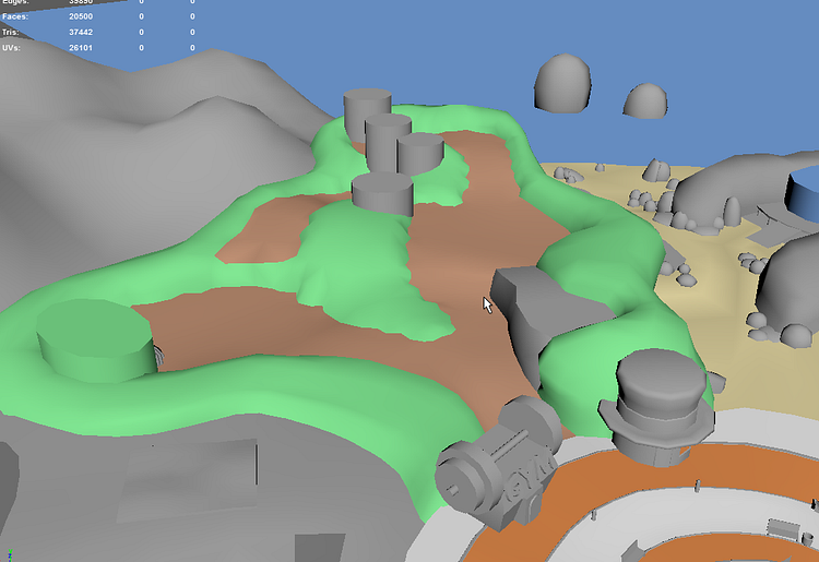
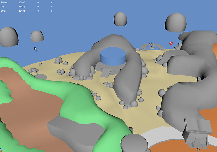
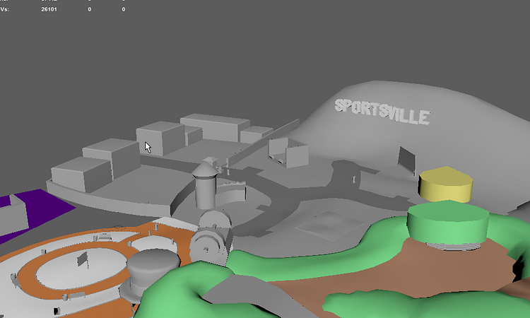
Some early shots of the Overworld in Maya.
At the start the start of this process I take a lot of notes and tear up the sketch a lot more, then as things get more refined I go back and forth making little tweaks. I’ll also throw on temp materials to various objects in Unity to help get a sense of how the space will look as it gets farther along. Once I’m happy with the layout of a level, I’ll start polishing in that same FBX by replacing primitives with higher poly shapes. I’m pretty frivolous about using many materials since I use a lot of tiling textures and find optimizing UVs boring. I generally only split props out into separate FBXs. Unless something has an especially simple shape I almost always use a mesh colliders for static geometry. For anything dynamic I’ll place a few colliders to approximate the shape.
Building the Overworld was especially challenging because of all the extra spaces and expectations it affords. It’s notably different from all the arenas because it’s one continuous space that sprawls in many directions. Also, everyone’s attention isn’t focused on objectives in the same way it is during matches, which means players are free to run in any direction.
With these constraints in mind, what were my design principles in building this space?
I stuck to having just a few path splits in each biome and adding high walls, fences, and other blocking props around these paths and to separate biomes to keep players from running off and getting lost. It was also useful to define camera settings along these to try to keep players’ view on areas they can traverse.
I created sight lines that partially obscure interesting things around corners or behind objects to build anticipation and reward players for exploring. As you play through Adventure Mode you unlock new biomes each day, but from the beginning their all partially visible behind blocking fences around the hub. In addition to hiding interesting spaces, Sausage Sports Club also affords hiding toys and arena entrances.
I made sure to change up height as often as possible to help define interesting sight lines and to create fun spots to jump on and between, which is especially important for a platformer. Besides the hub, most of the Overworld is paths going up or down and fun bits of geometry to jump on and knock around by flopping your head.
One last thought about designing spaces is that they can feel pretty dead until far into the process, which makes it hard to have confidence in what you’re building. For this game, I couldn’t tell how successful a spaces were at communicating their theme until close to finished and I had to experiment a lot. That feeling is always part of the process, but I’d recommend building a pretty corner or vertical slice early in your project (and maybe for each new zone) so you’ll know what you’re capable of, what you’re aiming for, and how you’ll get there.
Camera
The design of the game created a few constraints for the camera. Since it’s local multiplayer only and supports up to 8 players, the camera needs to be dynamic and controlled by the game’s state rather than any individual player.
Given these constraints and 3 years of time iterating, rewriting, over complicating, and simplifying here are the important aspects:
Zoom: This is the most obvious. If all the targets are spread out, the camera should move back to see more.
Height Offset: This is huge for depth perception. A top view makes it easier to tell where players are on the Z-axis.
Weighted Targets: When specifying transform targets for the camera to track, you can optionally specify a multiplier of how much weight that target should have when finding the average position of all targets.
Max Target Distance: The maximum distance between your targets should be used to drive values like zoom distance and height offset. If all targets are very close together, you can be zoomed in and have a straight on view; but if some targets are very far apart, the camera should zoom out and get a higher view.
Override Focus & Weight: Allow an override focus position and weight to be specified in code. This allows cutscenes or scripted sequences to take partial or full control of the camera while maintaining awareness of tracked targets.
The camera doesn’t move as much in arenas!
With the above lessons in tow, I decided to add a sprawling Overworld for Adventure Mode and it came with a host of new camera problems. Because different areas of the Overworld face different directions and afford different views, I needed a way to define settings quickly for different areas.
To this end I setup dozens of camera zones that each define the aforementioned settings and a few new ones:
Look Angle: Since zones face arbitrary directions, the camera should rotate to change the perceived forward.
Spline Control: Since paths can be dramatically winding and our zones are defined as primitive shapes (boxes, spheres) it’s useful to be able to define a spline with different settings per control point and interpolate along the spline. This gives the added benefit of smoother transitions along paths. The lightweight spline tools I built for this system, especially being able to interpolate between arbitrary data defined at each control point, ended up being very robust and is now an invaluable part of my toolkit for anything path related.
Collision: A common issue with 3rd person cameras is clipping through geometry showing the underside of the world. Rather than add lots of complexity to my camera code to shoot whisker raycasts and properly avoid and push away from walls I just added a rigidbody and sphere collider and used ProBuilder to block in camera-only collision geometry in problematic areas. There are still very rare occasions where the camera gets into a wall or snags on camera blocking colliders, but it saved me dozens (if not hundreds) of hours of work to end up with what probably would have been a similarly robust solution.
Camera Blockers: For some props and pieces of geometry in the Overworld adding colliders would make the camera bounce around a lot and feel rough. In those cases, I instead choose to fade them out so they don’t block our view players. We check for these CameraBlockers with a spherecast from the camera’s focus position back towards the camera.
Editor Preview: Now that there’s a lot of camera settings to tweak (instead of just one per game mode) it was important to speed up the workflow by adding a preview window in the inspector to see what the camera zone would show without having to enter Play Mode and fly over to that zone.
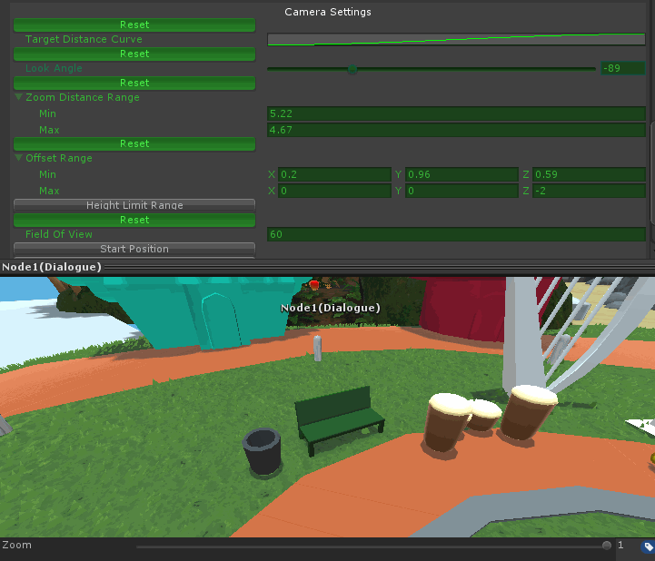
Inspector preview!
One major takeaway from writing this camera system over such a long time is that more variables aren’t necessarily better. Especially as a game grows and more parts need to be tweaked, limiting variables to the fewest necessary to achieve the important range of outcomes can save time and make systems more intuitive and fun to use.
Shameless Plug
Thanks for reading, I hope you found this valuable. If you’d like to see more content like this please support my work by checking out Sausage Sports Club and sharing it with a friend. It’s out now on Steam and Nintendo Switch!
Read more about:
Featured BlogsAbout the Author(s)
You May Also Like