

Trending
Opinion: How will Project 2025 impact game developers?
The Heritage Foundation's manifesto for the possible next administration could do great harm to many, including large portions of the game development community.
How can visual art create meaning in games, and what techniques will serve best? Volatile Games' art team behind Dead to Rights: Retribution's neo-noir Grant City attempts to answer these questions.

[How can visual art create meaning in games, and what techniques will serve best? UK Blitz subsidiary Volatile Games' art team -- the people behind Dead to Rights: Retribution's neo-noir Grant City -- attempts to answer these questions.]
A great game experience is all about emotion, communicated to the player via the characters and the environment. To achieve this, the player must be completely immersed in that environment, in the game world. In this article we discuss some of the artistic techniques that we used in Dead to Rights: Retribution (published by Namco Bandai Games) to hopefully achieve that immersion and the emotions that we wanted the player to experience.
We wanted the art direction of the game [YouTube trailer] to be very much a stylish dystopia, based broadly on film noir and neo noir. This took in concepts such as Fritz Lang's Metropolis as well as German Expressionism (heavily influential in the visual development of original film noir), and architectural styles from Beaux Arts, Neo-Gothic and Structural Expressionism.
Throughout the visual development of Grant City it was, in essence, its back story that gave it direction and form.
Once a great and successful city built on the back of heavy industry, it is now on its social and economic knees; to reflect this we see the city in its rusting, oxidised iron palette and the crumbling, defaced surfaces of Art Deco architecture (itself a design style that exuded opulence).
This theme of a dead, or at least dying, city infested by corruption resurfaced in a number of ways. The concept for the Temple Tower was the modern glass tower thrusting up out of the older, hollowed-out, Deco building like some hideous parasite; there are still the remnants of elegant Deco references all over the first floor.
The GAC in the stadium picks up on the necrotic theme, where the stadium appears like the ribcage of a dead carcass, and it recurs again in the old hospital on Danvers Island, a "dead" building inhabited by the parasitic GAC.
Metropolis suggested the exaggerated scale, as well as visually explores the juxtaposition of the haves and the have-nots, a theme to which Dead to Rights: Retribution returns to through the game. From artists such as Edvard Munch, as well as films like Nosferatu, we took the bold use of shadow and strong contrasts between light and dark, which we found again in the work of relatively more recent painters such as Edward Hopper.
The texture theme is strong throughout; worn with neglect, architecture which was once proud but is now fallen, with earthy, rusty, industrial colors desaturated as though from weariness.
A lot of time was spent researching the buildings and structures that would make up Grant City. We pored over a large number of iconic buildings and structures found in major US cities and shortlisted the most appropriate examples. From other reference materials we took particular styles of architecture; once we felt we had gained a greater understanding of what it was that appealed to us about those particular styles, we applied that to create the foundations for a "Grant City architectural style", out of which grew the city's great buildings.
The architectural styles mentioned above provided the base upon which we then built and exaggerated the rarer principles of Iron Gothic and Dark Deco; this gave a feel of cinematic reality and provided a unique visual, one that has a basis in reality -- but with a twist. For example, the structure in the docks area was drawn originally from a well-known existing bridge in New York; by adding more struts and stanchions we created more negative space, making it more open than its actual, very dense, silhouette.
Altering the form in this broadly suggests and calls on players' knowledge or memories of cities like New York or Chicago, drawing upon their known industrial heritage without tying the game to those specific cities. That heritage was again underscored by the warehouses' rusting iron corners and footings.
We wanted the player to know instinctively, wherever they were in the game, that they were in Grant City, and that it was a metaphor -- in the same way that in a Batman comic every panel is instantly recognizable as Gotham City. That was the strength of identity at which we were aiming.
Having a film noir/neo noir-inspired script style gave us a definite starting point with regards to the lighting and atmosphere of the concept work. The whole atmosphere of the city, from the weather to the lighting (or in our case the light and shadow), was at the forefront of our mind when tackling the various locations and scenes. Low-key chiaroscuro with stark, dramatic lighting effects, mixed with torrential rain, freezing fog, or drifting snow overlaid on an architecturally rich city was exactly where we wanted to be.
So with all this in mind we began to consider the techniques we could use to achieve the very strong look, feel and experience that we wanted. In one respect at least, games are like TV, film and paintings: they are framed experiences. In film it is comparatively easy for the director to achieve the tone they want, to call forth a particular emotional response, using a combination of lighting, color, audio, camera angles and so on in addition to the acting of the characters.
It is obviously harder to do this in a game (other than in cutscenes) because the player is in this respect the director; they have the choice and the control over how to move through this environment. The trick then becomes how you maintain the player's freedom to explore the world while still creating -- framing -- the experience you want them to have.
To do this, the game artists drew on techniques used by traditional artists for hundreds of years: compositional theory and tools like the Fibonacci sequence, positive and negative space, the balance of light and dark, vertical and horizontal intersections and colour were all used to express mood, direct the player's attention and support the story and the characters.
Lighting is always crucial; we found that getting a given level or room lit as early as possible was really important, preferably before the textures were applied. A useful technique was to "wash" the scene with a base texture in the correct palette and use that as the basis of the lighting. Detail could be applied later, once the light and shadow were established.
Many people will be familiar with the use of a strong, bright or intense light source to indicate to the player the location of the exit from a given scene or level -- this is a basic game design tool. Different benefits can be gained by using multiple sources, for example to entertain them by giving them lots to look at and to make the player examine the scene more closely.
This can have the effect of slowing the player up for a while, without physically impeding their progress, both by giving them elements to study but also by adding a little confusion so that the exit or the next stage of the level is not immediately evident.
Clearly this has to be handled carefully, as the intention is not to over-confuse or frustrate the player, but it can encourage them to explore an area more thoroughly than they might otherwise have done.
Lighting can also be used to subconsciously suggest or reinforce themes within the game; certain views in the concept art and within the game hint at a "them and us" dichotomy by highlighting two different elements within the one view.
For example, you might have Jack and Shadow in the lower third of the frame, spot-lit against rising shadows, and in the top third another highlight throwing a particular piece of architecture such as a tower into sharp relief.
As well as being an arresting view, this would symbolize the overarching power of the corruption against which Jack is fighting. Throughout the game we tried to show conflict in the very environment -- the old and the new, the natural and the synthetic. Manmade geometry can include interesting shapes and forms which showcase the complexity of the model work, while more organic forms offset this and showcase a complementary set of skills.
Strong geometric shapes combined with dramatic lighting, such as those found in Edward Hopper's paintings, can be used to create powerful emotional currents. Using heavy blocks of light and shadow to create a diagonal slash across a scene of tense dialogue heightens the sense of discomfort and unease within the scene.
As with some shots in original noir films, the best lighting for the scene need not be restricted by the sources available -- one of our cut-scenes has only a small table lamp visible whereas the scene is actually lit by a key light that has been positioned above the ceiling fan to provide a tight pool of light and a dynamic high contrast shadow.
In several instances we used light and shadow to subconsciously suggest the characters' underlying morality; so early on in the game, two of the main characters both appear moving from the shadows into the light, hinting (at the very least) at a definite moral ambiguity in both their temperaments.
Other characters are seen predominantly in the shadows, broadly suggesting that they are morally negative as well. This sort of "black hat/white hat" signaling was not only widely used in film noir, but was frequently utilized by painters as long ago as the Renaissance.
Throughout film history this technique has been used to introduce main characters in shadow to infer that moral ambiguity or sense of being "in the dark" in some way. A modern example might be Strider in Lord of the Rings, but the mother in The Exorcist spends an entire scene in a doctor's surgery in silhouette as she scrambles for a reason why her daughter is so "ill", and going further back, in Citizen Kane the reporter Thomas is depicted in shadow throughout the movie as he searches to find out about Kane.
Lighting and color work together to allow us to vary the temperature of a scene. In the scene where Jack is sitting alone in the bar, the warmth of the Tiffany lamp inside the room contrasts with the frosty chill outside. Jack seems to belong more to the cold than to the warmth, subtly emphasizing the recent events of the narrative. The division places him "out in the cold", in shadow; this describes where he is at this stage of the game in terms of his relationship with Faith, where he is with his own police force, and of course with the GAC.
Once again strong geometric shapes are used, wedges of light and shadow bisecting the shot to give a powerful noir feel. This scene drew heavily on inspiration from the paintings of both Edvard Munch and Edward Hopper, in particular Nighthawks. (As a final homage to that painting, our bar is called Phillies.) This is also a good example of where the final in-game shot was really close to the original concept:
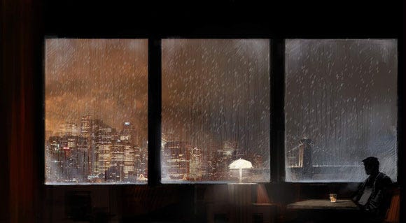
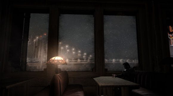
This image also serves as another example of how approaching particular visual aspects of a shot achieves the best cinematic result: initially there was a high reflection value on the glass, which while technically correct and visually appealing, meant we lost a lot of the essential exterior scene detail. By adjusting the reflection value, the desired visual narrative was achieved.
The lighting, the colors and the composition (where Jack is placed relative to the rest of the scene) all serve to isolate Jack in that scene and this technique is used at various points during the game, and with various characters, to underscore or reinforce the narrative. The attitude of the camera is also an extremely useful technique, just as it is in film, and we used this extensively in Dead to Rights: Retribution.
Foreshadowing is one very effective use, where exactly the same composition is used with two different characters at different times to suggest to the player that the fate that befell the first character they see in this position might happen to the subsequent character. For example, a character is seen dying in a certain position and from a certain angle; later on another character is seen in the same position and from the same angle, which immediately -- if subconsciously -- gets the player wondering if the same outcome will occur.
Similarly, the camera can be used to subtly align the player's sympathies with one or another character. We utilized this in a cutscene with Jack and Faith; at the start of the scene the camera, and the player's viewpoint, is literally in Faith's face -- Jack and the player are as one.
As she reasons with him, calming him down, the camera tracks round to her point of view, putting the player in Faith's shoes rather than Jack's, and stays there. The scene thus ends with Jack effectively isolated once again.
An excellent painterly example of the camera attitude technique can be seen in Edward Hopper's Night Window where the viewer is cast, willingly or not, as a voyeur.
The attitude of the camera plays an important role in each of the major cutscenes in the game, so in the bar scene for example the camera definitely belongs to Jack as we need to identify with him.
This is not just about sharing his point of view, but about using the camera's position to empower, weaken, create intimacy or create a sense of detachment throughout the scenes to subtly communicate with and influence the audience.
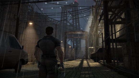
We've already mentioned a couple of instances where the game overrides the realistic use of lighting, for example, for aesthetic or practical reasons. Of course, games do this all the time, for whatever reason, but it's always worth looking at scenes or shots to see if they can be improved by this sort of intervention. Another example of this, in this case to help the player, can be seen in this image below, of Jack approaching the stadium.
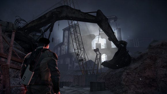
In reality, the contrast value would be the same throughout the scene, but we chose to lessen it over distance so that the lower contrast value helps the player to read the depth of the scene. This also illustrates the use of negative space; the arm of the monstrous digger curves above the player, framing the entrance towards which they are heading.
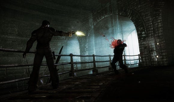
Lastly, we see the use of color to intensify the otherwise virtually monochromatic palette, something that can be seen in the shot below, where the spots of intense red also signify that the player is heading rapidly into danger, and which is also used widely in the Sewers area of the game.
The Sewers area intentionally owes much to the classic film The Third Man; the below scene is almost an exact recreation of a shot from the film, using the same long black shadows and placed silhouettes against the harsh, contrasting white, with the red of the blood spatter standing in for the red of danger and intensity.
We wanted to give the sewers a very similar feel to the Third Man sewer scenes, but make them bigger, grander, more Grant City, and we feel we succeeded well in this instance.
In the development of any game there will always be things that aren't quite achieved to the original concepts; in Dead to Rights: Retribution we would have liked to have made our Gothic architecture even taller, even more exaggerated, but as ever a balance had to be struck between aesthetic desire and production constraints.
Overall though, we are very happy with Grant City; from the very start it was the team's ambition to fully immerse the player in a truly believable neo-noir dystopia, a decaying metropolis in its autumn years, reflected in its rain-soaked rusting industrial architecture and its sorrowful statues. We hope this is what our players get to experience.
Read more about:
FeaturesYou May Also Like