

Trending
Opinion: How will Project 2025 impact game developers?
The Heritage Foundation's manifesto for the possible next administration could do great harm to many, including large portions of the game development community.
Does the Golden Ratio have application in game design? These two trained artists -- Rob Kay, lead designer of Guitar Hero and Rock Band, and Andy Tudor, lead designer on Need for Speed: Shift, follow classic art training -- so they may know what they are talking about.

[Does the Golden Ratio have application in game design? These two trained artists -- Rob Kay, lead designer of Guitar Hero and Rock Band, and Andy Tudor, lead designer on Need for Speed: Shift, talk about using classic art training in game design, in this article originally published in Game Developer magazine earlier this year.]
Some people will tell you that having a good eye is an artist's gift -- that no sooner have artists left the womb than they're able to see the world differently than regular folk, and hence have a natural tendency toward brilliant art. These people couldn't be more wrong. The notion that artists are "born, not made" is complete nonsense. The simple truth is that artists learn to hone their eyes over many years of education and practice.
The two authors of this article both took this long journey to obtain good eyes, and then journeyed past, to the brave frontier of game design. In making the switch we found that visual arts and game design share a lot in common.
The principles we'd learned as we became artists were useful in game design too. In this article we'll share three art principles that we've found particularly useful as game designers: thumbnail sketches, the Golden Ratio, and anticipation.
Thumbnail sketches are small abbreviated drawings, just an inch or two in size, which artists use to explore ideas quickly. A graphic designer might do thumbnail sketches of possible page layouts, a fashion designer might sketch interesting new silhouettes, and a product designer could explore new form factors.
These rapidly sketched ideas give them multiple directions for attacking their problem. They help artists find strong ideas and rule out weak ones before precious time and resources are committed.
A common practice is to explore a wide range of possible solutions with thumbnail sketches before committing to any single idea. This approach works, is widely practiced, and becomes second nature to most artists.
I first had thumbnail sketches explained to me in my high school graphic design class, and have used them non-stop since. Jumping into game design, the habit stuck and I've found thumbnail sketches really useful here as well. These "sketches" don't have to be in perfect visual form either, if you're not an artist. Ideas can be sketched out in text, diagram, diorama, or stick figures.
It's worth noting that the major difference between thumbnails and prototypes is that thumbnails are far faster to create. Creating them quickly means a range of possible options can be explored in minutes, not days. The key use of thumbnails then is a rapid exploration of the solution space prior to prototyping. The end result is one well-defined problem, and multiple ideas for solving it.
This early exploration via thumbnails increases the chances of revealing the "obvious solution," which of course only becomes obvious once it's found. Here are three examples, two from my time at Harmonix and one from AiLive.
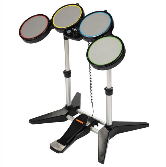
The shipping Rock Band controller, the pad layout of which first found form in thumbnail sketches.
Rock Band, drum controller design. Early on, I did some thumbnails of various drum pad layouts, mostly to help me think visually about the various alternatives we were discussing.
This varied from things like the number of pads, asymmetrical vs symmetrical layouts, and different mappings of drums and cymbals to pads.
By doing quick drawings of the layouts which bubbled up in conversation, I was forced to identify more important criteria (for instance, pads should be readable as one row to aid usability).
This in turn fed into more design discussion. The solutions we gravitated toward at this early stage (four pads in a row, kick pedal mounted to the frame) shaped our first physical prototype, became requirements for the industrial design phase, and can be seen in the shipping drum controllers.
EyeToy: AntiGrav, level design thumbnails. On this project, quick sketches helped us explore big-picture ideas for each level and the main sections within. Ideas came from the whole team through Harmonix's internal newsgroups, and were incorporated into thumbnail sketches and resulting level designs.
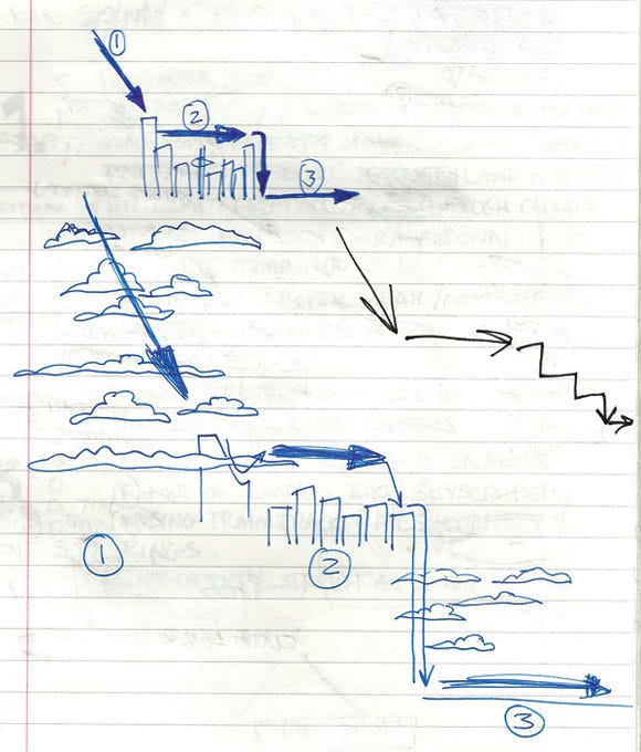
A thumbnail sketch for EyeToy: AntiGrav's skyway level. Sections 1, 2, and 3 rough out the big picture of a journey which descends though clouds, rooftops, and down the side of a skyscraper into the city.
The ideas came together first in sketch form, informing the digital 2D maps and 3D level creation that followed. The sketches focused on the main lines through a level, dramatic changes of environment and direction, and most of all, created a sense of journey.
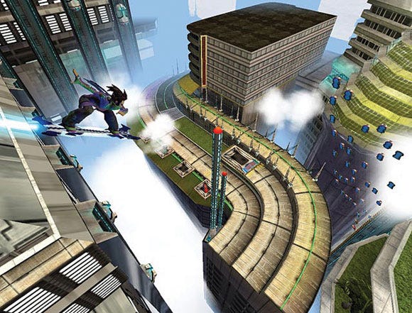
A moment from the rooftops section in the final version of Eyetoy: AntiGrav.
Time pressure limited the amount of exploration, but there was just enough for solid ideas to come together on paper, and the resulting levels were well received.
AiLive, game concepting. The thumbnail approach has helped us generate and evaluate new game concepts at AiLive. In this case, the thumbnail sketches weren't literally sketches, but words: a collection of very short game descriptions in the spirit of thumbnail sketches. Each game thumbnail attacked our new project's brief from a different angle. I'm happy to say a clear winner emerged, and while I can't say much about it yet, I will say it wasn't the first interesting idea we had; an important point we'll return to in a moment.
When creating and reviewing thumbnails, there are a couple of tricks to avoid pitfalls. First, you should never go with the first idea. This is easier said than done. It can be very tempting to develop the first half-decent idea that emerges. Jumping straight into a design or prototyping phase like this is a risky move. No amount of detailed thinking or iteration makes up for a bad early design call. Iteration is like walking up a mountain. You need to do it to reach the summit, but it helps if you choose the right mountain first. Or put more simply, you can't polish a turd.
Avoiding this pitfall is simple. Be diligent. Explore different ideas in thumbnail sketches before developing any single idea too far. Force yourself (or your team) to come up with several approaches to your problem, thumbnail them, and do a little analysis of the options on the table before making big design calls.
Second, make the criteria explicit. It's much easier to evaluate an idea objectively as strong or weak with a list of criteria. What qualities are required in the solution? What's desirable? What isn't desired? Exploring options via thumbnails gets you thinking about the pros and cons, and forces you to get a clear picture of your own criteria. The more explicit the needs, the more defined the solution space is, and the easier it is to generate good ideas. A lack of criteria can lead to idea churn, and can force you to run with an idea you're not sure about.
If there are enough criteria, it can make sense to throw together a quick table to make evaluation easier. For example, list your idea thumbnails (one per row) and your criteria (one per column). Find a simple metric by which to rate each column and complete the table. This helps clarify the big picture, and makes a good conversation point for collaborative decision-making.
Since 500 BCE, the arts and sciences have studied and utilized the Golden Ratio in their work. Either consciously or subconsciously, the usage and recurrence of the mathematical constant 1.618 and the proportion of thirds in nature, architecture, and biology is one that has kept boffins and people who wear bow ties intrigued for years.
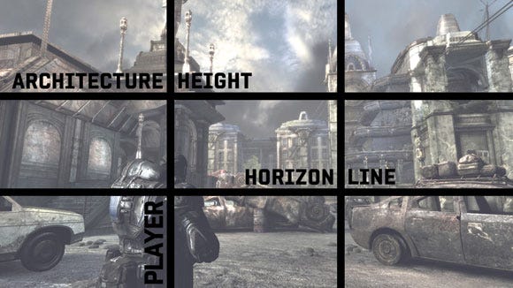
In Gears of War 2, guided by the Golden Ratio, the player's eye and Marcus' path are channeled between the two buildings, with the main action area staying in the bottom third of the screen.
At the risk of comparing Bayonetta's currency progression system to the works of Pythagoras and Da Vinci, the Golden Ratio is also in active use in video games, as a modern day medium where art and science collaborate.
For the purposes of simplicity, though there are many equations and diagrams that can aid the definition of the Golden Ratio, we'll consider an approximation -- the relationship between one-third and two-thirds.
This ratio creates an interesting asymmetrical balance, and is often used as a compositional device. In this guise, the Golden Ratio can be extensively seen in game interface design, camera positioning, and environment layout.
If we take a broader look at the mathematics around gameplay length, the Golden Ratio can also bear some interesting analysis there too.
Dependent on genre or platform, one statistic that remains generally constant is that a third of purchasers actually finish games, according to research we did at sony.
In today's world of "butterfly media" (where users move rapidly between different media sources), traditional games now fight for spare time with many other electronic activities, such as TV, social networking, and mobile gaming/internet browsing. It's worth considering, then, that the chances of players actually getting that final Weapon of Epicness or reaching that Ultimate Boss Battle are generally quite slim.
Therefore, one good usage of the Rule of Thirds is to keep splitting your total game length into thirds until you reach a "gameplay bite" length of around half an hour (the average time spent by players in a session).
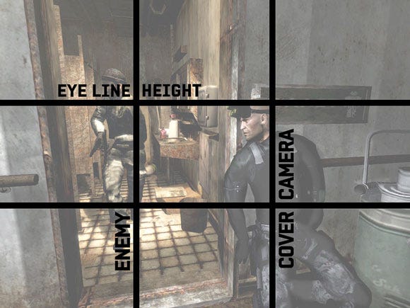
When in cover, the camera in Splinter Cell naturally moves into position so that Sam Fisher takes up a vertical third of the screen, with his eyeline hitting the top horizontal third.
If you ensure that some new experience or gameplay change or substantial reward is synchronized with these half-hour session, you can be more confident that the player is going to keep returning to the game because to them, regular and meaningful "carrots on sticks" provide compelling gameplay rewards.
Evidence of this can be seen in some of the more memorable and successful games of the past few years, such as Resident Evil 4, Uncharted 2, Shadow Complex, and Batman: Arkham Asylum, all of which continue to throw brand new experiences at the player.
Whether that's with a new mission type, weapon, location change, story twist, character introduction, or power-up, the regularity of these incentives may keep the player involved beyond their traditional cutoff point. Subconsciously, players look forward to the next reveal, since they know they won't have to wait very long for it.
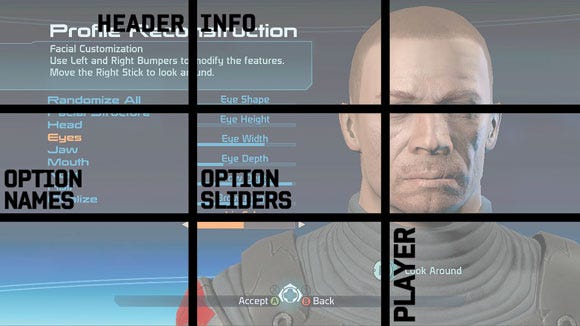
A simple interface in Mass Effect 2 allows the player to reconstruct Commander Shepard's face. This is made all the more aesthetically pleasing and user-friendly through the lens of thirds.
On Need For Speed: SHIFT we achieved this by layering multiple reward mechanisms of Cash, Badges, Stars, and Driver Levels in order to create a persistent urge of "just one more race" within the player. Where possible, these were timed to occur within half hour bites, and at a higher level, we used the concept of thirds to structure the introduction of game modes, Tier unlocking, track and car reveals, and communication of the roadmap for the player's final entry into the NFS World Championship.
We also provided sneak peeks of future events in Career in order to give the player a chance to experience our equivalents of the Weapons of Epicness ahead of time. Telemetry showed that over 55 percent of players reached the penultimate tier in the game due to these choices, significantly higher than the baseline statistic.
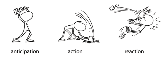
Back in the 1930s, Disney's "nine old men" coined 12 basic principles for animation. One of the most insightful is anticipation -- the preparation for an action. It turns out that when animating, the individual actions themselves are relatively unimportant. The key is selling the audience on the idea that something is about to happen (the anticipation) and then a moment later that it did happen (the reaction).
For example: a boxer pulls his arm back to prepare for a punch (anticipation), strikes his opponent (action), who recoils from the hit (reaction). Every action has three distinct phases: anticipation, action, and reaction.
To ensure their animation can be read by audiences, animators the world over use this three-step approach, which always starts with anticipation.
So, how can this principle be used in game design? It turns out that the anticipation-action-reaction model is a great aid for crafting clear and rewarding player interactions.
For a moment, let's re-frame games as interactive animation. Games are much richer than this of course, but the simplification is useful for breaking down the magic of a single interactive moment.
So, in an interactive animation, the player co-animates the action with the game. The game serves up opportunities for the player to trigger action animations using button presses, and does it so expertly that it feels to players that they, rather than the game, are driving events forward.
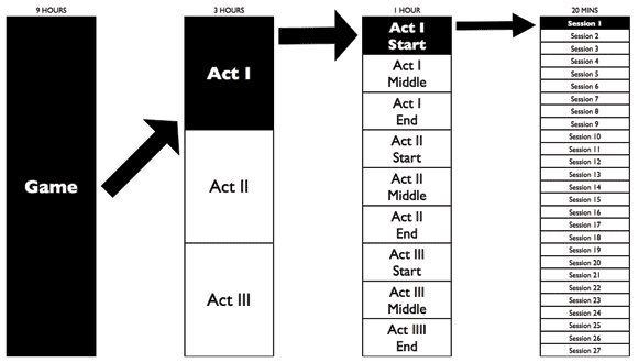
Divide gameplay length into thirds until you reach a gameplay bite of around a half hour, and then plan a new experience or reward at these markers to ensure a steady and meaningful progression.
It's an illusion of course. In fact, each and every interaction moment is an illusion which can be analyzed with our anticipation-action-reaction model. Break it down, and it's the game that animates the anticipation, which cues the player to trigger the action animation, which the game swiftly follows up with a suitable reaction animation. What the game is responsible for animating here is critical. It's creating both the anticipation and the reaction, telling the player what to do and letting them know that they did it. Each and every moment in a game is forged between game and player in this manner.
Let's look at some examples using an animator's eye for spotting the anticipation, action, and reaction.
As God of War quicktime events show, anticipation can be created anywhere in the game's user interface. In this case, it's created on the HUD as well as the enemy character. It could just as easily come from the environment, the lighting, visual effects, the sound effects, the music, the controller rumble, or any other channel capable of communicating with the player.
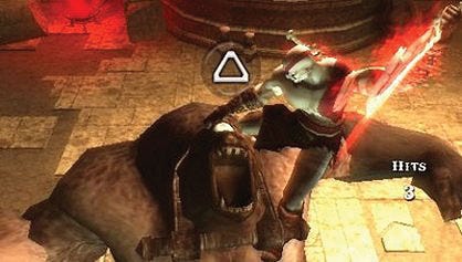
First, let's discuss the so-called quick time events in the God of War series. The player is asked to perform a sequence of moves, one at a time. Breaking down one move using our model, a monstrous enemy is stunned with a large circle icon floating above its head.
The stun animation and the circle icon is the game's form of anticipation. It cues the player to press the circle button quickly, triggering the attack move. This button press is the action. In response to the button press, the game animates Kratos attacking the enemy who recoils from the attack, often with some animated gore as payoff. This is the reaction.
Now, let's look at another God of War moment, this time a block move in combat. An enemy within attack range of Kratos pulls his sword back. This is the anticipation, exaggerated and held in place just long enough for the player to spot it. This "tell" cues the player to hold down the block button. In response to this button press, the game animates Kratos into a block stance, and the incoming enemy attack is greeted by a ricochet reaction which includes a gratifying shower of metal-on-metal sparks. This is the reaction.
The final example is almost devoid of animation, showing that the principle is a universal one. Consider Star Power activation in Guitar Hero. A "Star Power Ready" message flashes center screen as the Star Power meter begins pulsing to draw attention.
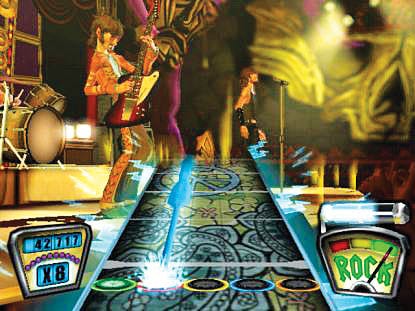
Star Power in Guitar Hero carries a theme into the UI for maximum impact.
This is the anticipation. The player lifts the guitar neck upwards providing the action. The game sends electricity FX rushing down the play surface, notes turn electric blue, and the crowd roars. This is the reaction.
It's worth noting that the anticipation-action-reaction model has a parallel in interface design, known as "cue, action, feedback," about which much has been written (see Resources). No matter the language you use to describe it, it's a powerful tool for analyzing and creating interaction moments in games.
Here are three rules of thumb that may prove helpful when sandwiching player actions with anticipation and reaction:
Stage it. In animation, staging is the clear presentation of an idea. This usually means communicating one visual element of the game at a time, leading the viewer's eye to that one element, exaggerating its size or duration. Staging can be particularly tricky in games, as we often deal with an interplay of systems which, by their nature, throw up near simultaneous interactions.
The more actions you anticipate at any given moment, the less likely it is that the player will see or hear them, and the less well-staged they'll be. A cluttered HUD is an obvious symptom of poor staging. Some tips to help staging: anticipate only when you need the action (not all the time), remember to use audio and tactile channels, and always look for opportunities to simplify.
Theme it. Ideally, every element of a game reinforces the intended player experience. Theming can be a great way to do this. For example, to help the player feel like a Guitar Hero, we themed our secondary game mechanics in that game around Star Power. The idea was to boost the showmanship side of being a rock star knowing we already had musicianship covered in our core beat-matching gameplay.
We knew the user interface would need to be clear and themed around our idea. The question became what does Star Power, which is a bit of an abstract concept, look and sound like? The electricity theme we used felt right for a game about rock 'n roll, and crucially gave us a bold color (electric blue) to aid with staging.
Playtest it. It's impossible to know if anticipation-action-reaction solutions are working until you actually see people "get it," as they're co-animating your game with you. Clear anticipation is particularly hard to get right. Fortunately, it's very easy to tell when you're failing. If your playtesters don't perform the action you're expecting at the moment you want them to, chances are your anticipation isn't clear enough (which usually means it's too subtle).
That concludes our whistlestop tour of the proven art principles we've found useful in game design. We started off with the thumbnail method, proven to help avoid common pitfalls in idea development. Andy showed you how the Golden Ratio can be used to stage a game's rewards and content. The tour finished up by showing how animators sell individual actions using anticipation, and how designers can harness the anticipation-action-reaction model to inspect and craft every moment of interaction with the player. Knowledge and practice of these principles can help you inspect any game with an artist's eye.
Applying proven art principles to your game design will pay dividends, and what we've covered here is just the tip of the iceberg. I'd encourage game designers from any background who want to improve their eye to break out some art books (see Resources for our recommendations). Let's not forget that many revered game designers began their careers as artists -- Fumito Ueda (Ico) and Shigeru Miyamoto (Mario) to name just two. So you'll certainly be in good company!
Illusion Of Life by Frank Thomas and Ollie Johnston
The Animators Survival Kit by Richard Williams
A Painter's Guide to Design and Composition by Margot Schulzke
The Power of Limits: Proportional Harmonies in Nature, Art, and Architecture by Gyorgy Doczi
The Design of Everyday Things by Donald Norman
Universal Principles of Design by William Lidwell, Kritina Holden, Jill Butler
Read more about:
FeaturesYou May Also Like