Trending
Opinion: How will Project 2025 impact game developers?
The Heritage Foundation's manifesto for the possible next administration could do great harm to many, including large portions of the game development community.
To Hell With the Ugly adapts the Boris Vian novel of the same name into a game of solving your own kidnapping in the boiling heat of 1950's L.A.

This interview is part of our Road to the IGF series. The IGF (Independent Games Festival) aims to encourage innovation in game development and to recognize independent game developers advancing the medium. Every year, Game Developer sits down with the finalists for the IGF ahead of GDC to explore the themes, design decisions, and tools behind each entry.
To Hell With the Ugly adapts the Boris Vian novel of the same name into a game of solving your own kidnapping in the boiling heat of 1950s L.A.
Game Developer had a talk with the producer and writer for the Excellence in Visual Art-nominated work, David Duriot, to discuss the thoughts that went into respectfully converting Boris Vian's novel into a game, the research and inspirations that went into capturing a fantasy version of 1950s L.A., and how they created an investigation system that would suit a bunch of characters who weren't really investigators.
Who are you, and what was your role in developing To Hell With the Ugly?
Hello, I'm David Duriot, producer and half writer on To Hell With the Ugly.
What's your background in making games?
It's a typical French career. I started with Ubisoft, then was unemployed for few months, went to a bad double A studio, Ubisoft again, a digital agency, took a sabbatical year as a ride operator in NZ and then I moved on to La Poule Noire, the studio I founded with two friends.

How did you come up with the concept for To Hell With The Ugly?
I was living as a carnie (carnival worker) in NZ, and I had some books with me from France including Boris Vian's To Hell With the Ugly. This was the first brick in creating La Poule Noire, but after few months of thinking about what should be our first game, we decided to create our own universe with Edgar—Bokbok in Boulzac. After the release, it was time to find a new goal and the book came back on the table. Voilà!
What development tools were used to build your game?
Very usual stuff. Unity, Photoshop, Animate, Notion, and Giphy.
What appealed to you to adapting a novel into a game? Why this work from Boris Vian?
The pace, humor, and a very zany story about a mad professor who wants to kill uglies. This work is the closest to what we want to do in video games. It's an odd setup with an offbeat humor with very stupid characters.
What challenges came from adding interactivity to a novel's story? What interesting opportunities arise to expand its setting and story through turning it into a game?
The biggest challenge was to respect the novel. Boris Vian has grandchildren who keep a close eye on what people are doing with the work of Boris (yes, he's my homie now). But adding interactivity was very easy because this novel was made to be a video game: lot of fights, investigations, and funny dialogues. Please read it before playing the game.

To Hell With the Ugly features a striking visual style. How did you design this look? What inspirations helped bring it together?
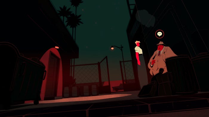
Amélie Guinet, our art director, began by looking at the period in which the book was written and, of course, in 1948 lots of films noir were released with a very interesting aesthetic. After that, it was about how bodies are described and represented (Rock has very long legs, for example).
Can you tell us about the work that went into the fashion design? What research went into the outfits the characters wear? How did you capture the period with clothing?
For fashion design, we were inspired by film characters from the 50s or films that were shot in those years (Gun Crazy, Hitchcock films, etc.). For example, the Petrossian gang adopted a rockabilly look inspired by John Travolta and his gang in Grease. There are many references to the looks of actors mentioned in Boris Vian's novel or iconic looks from the 50s (Linda Darnell, Audrey Hepburn, Brigitte Bardot, James Dean, etc.).
There is also a lot of fashion advertising on the internet. it was necessary to refer to, and then play with, the volumes of these outfits in the semi-realistic style chosen for the game (for example, Rock's high-waisted pants).
What challenges and opportunities come from trying to capture that 50's feel with the visuals? How does that time period restrict you, visually, while also allowing you to be creative with it?
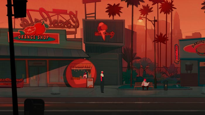
It was a pleasure to immerse [ourselves] in the 1950s. It was a very rich period that marked the history of art, design, and architecture. Objects are fun to draw, and shapes and curves are elegant (like the Buick cars and other design objects). It was also an opportunity to discover unusual architectural styles specific to those years—things like the "Novelty Architecture" that takes the form of the product sold inside to attract customers, which we find in the game in the orange structure of the juice seller.
In his book, Boris Vian gives us a lot of detail on the environment, which plunges us directly into the 50s. We wanted it to be as immersive in our game. It was a huge job doing all that referencing, but very doable thanks to images and video archives. It was also a challenge for us to imagine a city (L.A.) that we did not know at a time before our birth. Boris Vian had never been to the United States either, and instead he offered a fantasized vision of American society, so we also allowed ourselves to offer a semi-realistic representation of L.A. in the 50s.

To Hell With the Ugly is very deliberate with its use of color. What thoughts went into the colors of the game?
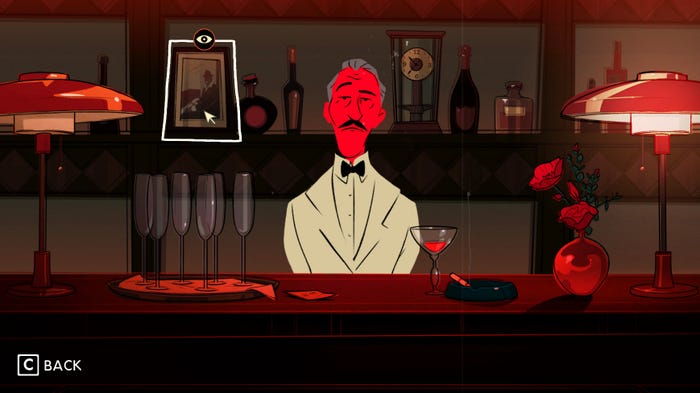
The fans are spinning, we're in L.A., the mercury is rising, and Rock Bailey has "a chaud aux fesses" (a narrow escape) in this story. All of this reminds us of warm colors! The bright colors and strong moods also serve to refresh and make the artistic direction attractive. Also, the flat areas of bright color for the skin bring an original and modern touch and allow the identification of the characters in the more nuanced décor.
What ideas went into the combat system? Into its visual presentation and the mechanics?
Regarding the combat system, we had some strong ideas early on in the production directly inspired by Boris Vian’s novel. When we read the original book, even if the fights were intense and Rock (the main character) wasn’t subtle with his fists, they are all depicted more on a funny side than a dramatic one.
With that in mind, we wanted our fights to keep a "bar brawl" mood with non-graphic, yet strong, impacts and a pinch of off-beat humor. The healing action is probably one of our favorites, which also allowed us to portray some of the cast’s archetypal characteristics, like Rock whose identity is heavily tied to his handsome boy persona who regains health by fixing his hair. The visual representation of the mechanics also come from inspirations from the 1950s, which can be found in the shapes of the special effects or in the frame-by-frame animation of the characters.
Likewise, what ideas went into the visuals and mechanics of investigation? Into making it flow with the world while still making information clear to the player?
We wanted to give our players the opportunity to live the fantasy of investigating via mechanics that would reward the logical connections they could make between the hints we displayed to them. We tried to keep the UI as light as possible to avoid information overload—when players have to build a theory, for example.
Also, a significant part of the investigation revolves around characters who are more or less tied to the entertainment industry, so we took inspiration from 50s cover girls, Hollywood’s Golden Age, trendy Jazz Club aesthetics... As said previously, it is more about a fantasized version of Los Angeles than a historically accurate one.
Finally, our characters are amateurs. Investigating isn’t their jobs, so we also thought about keeping a bit of a disorganized look to some of the investigation sequences (documents dwelling haphazardly on the screen, information displayed with handwritten fonts as if the characters themselves would have added them on documents, etc).
Read more about:
[EDITORIAL] Road to IGF 2023You May Also Like