Daily news, dev blogs, and stories from Game Developer straight to your inbox
Sponsored By
6 examples of UI design that every game developer should study
HUD and UI design determines how players interface with the most core systems of a game. We reached out to developers to share their picks for the best, most instructive examples.
10 Min Read

One of the most under-appreciated but most important elements of modern game development, HUD and UI design determines how players interface with the most core systems of a game. They serve to not only provide vital information about player characters’ status and the state of the world, but are often key to shaping player behavior.
The urgency with which a health indicator signals a terrible wound, or a mini-map emphasizes a quest icon, can dramatically affect how players interact with a game and what gameplay elements get priority.
Recognizing this, we reached out to developers who have some experience in the realm of HUD and UI design, to get some feedback about what some of the best designs in this space are, and what they do so well.
1) Clash Royale - Surface and scroll
Clash Royale is full of design lessons that are broadly applicable. A large part of its appeal stems from taking a simple premise (adversarial tower defense, with each player defending a king and two towers and buying offensive units) and presenting in an extremely sleek and refined package.
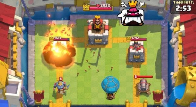
Om Tandon, UX director at DIGIT Game Studios, praises Clash Royale for avoiding the pitfalls of so many other mobile games trying to appeal to a “mid-core” audience -- players that fall somewhere between casual and hardcore.
“If you look at most mid-core mobile games today, you see a generic, cloned approach to a home screen, usually a base or a lobby screen with multiple entry points to other sections of the game like battles, events, shop, social, etc.” Tandon says this approach leads to a jarring sort of friction as players move back and forth from area to area or return to the home screen, each with distinct art and backgrounds. And it increases load times, as “more and more features are dynamically populated by communicating with servers, instead of being native.”
Clash Royale solves this problem with a HUD that surfaces player controls instead of tucking them several layers deep in cumbersome menus, and a snappy UI that lets plays swipe through multiple tabs instead of treating them as discrete menus.
“Drill-downs are further reduced by populating secondary pieces of information on top of each primary scrollable section,” Om says. “And tab scrolling design is further complemented by instantaneous population of content in each section, eliminating ugly load times.”
TAKEAWAY: The key takeaway from Clash Royale’s slick design is that information should be surfaced and as readily accessible as possible, and that it’s no fun having to wait just to load one of a huge number of discrete menus.
2) Half Life 2 - Dynamic and aural
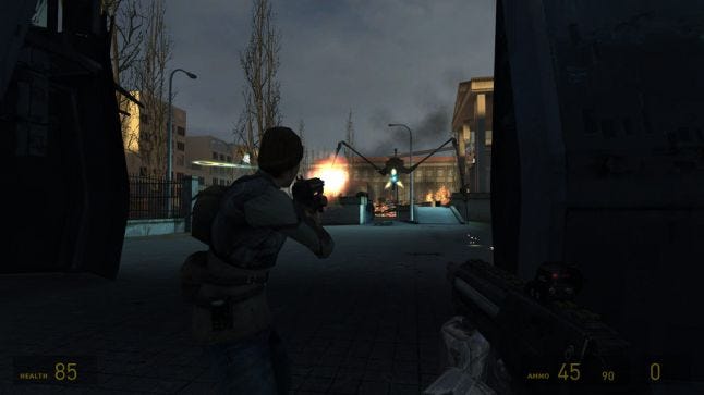 Valve has a history of producing lean, slick HUDs that complement the overall aesthetic of its games, and Half Life 2’s might be the top of its class. David Candland, the UI design lead at Bungie, calls it out for expertly executing on some ideas that had never been attempted around the time of its launch.
“One of my favorite HUDs ever,” Candland says. “The monochromatic amber palette had a distinctive look to it that solidified the HUD as part of the game’s unique identity. It was simple, clean, and didn’t obstruct the beautiful combat environments. I absolutely loved the economy of the footprint.”
"[Half-Life 2's HUD] was simple, clean, and didn’t obstruct the beautiful combat environments. I absolutely loved the economy of the footprint."
Candland highlights the way the Half Life 2 HUD would drop elements that weren’t immediately necessary, like stowed weapons. “The concise on-demand chunks of data made the cognitive load very light," he says. "When they did appear, the animations were snappy and responsive."
“But just as important as the visuals in the HUD are the audio cues," he adds. "Who could forget those sounds? In the heat of battle, players tend to get tunnel vision and notice much less of the periphery of their screen. The audio cues were distinct and clear enough that it was easy to tell when you picked up ammo, got caught in an environmental hazard, or resupplied your health in even the most intense combat situations. While no HUD is without some issues, the Half-Life 2 HUD is a great example of economy and clarity, and has been influential in my work.”
TAKEAWAY: Half Life 2 shows us that HUDs don’t have to be afterthoughts, or an unfortunate necessity that detracts from a game’s art. Instead, they can actually be additive (even beautiful). They also don’t need to rely purely on visual elements to convey information.
3) Hearthstone - Tactile and clear
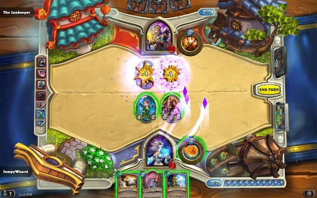 Like Clash Royale, Hearthstone is a game that excels by taking a simple, well-trod formula and executing it with incredible style. A big part of that style is the accessibility of information, a credit to a HUD that highlights important information and surfaces it when players need it, in an easily digestible form. Stanislav Costiuc, a game designer at Ubisoft, points to the card game’s tactile presentation and the legibility of its HUD as major reasons it’s enjoyed the success it has.
“Key information is always clear - who can attack, who will take lethal damage, who adds to spellpower,” Costiuc says. “And the way Hearthstone provides visual and audio feedback with each click and action in every part of the game is outstanding, from the card battles themselves to everything that happens in the menus. Every click feels satisfying, even simple actions like moving a card around the screen.”
TAKEAWAY: Integrating your HUD in a way that feels like an integral part of the game instead of an additional layer cluttering the screen lets players focus on the important stuff: gameplay.
4) Overwatch - Compact and centered
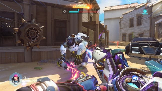
Like any class-based multiplayer shooter, Overwatch faces the challenge of having to tweak its HUD to suit different characters.
Oliver Janoschek, the senior UI artist at Massive Entertainment, singles out the Zarya HUD as particularly effective, feeding players crucial info but keeping them in the action.
“I’m one of the advocates of UI design who is all about bringing the information into a space a player focuses most on, and removing eye travel to fetch information,” Janoschek says.
“Zarya's energy indicator sits comfortably around the actual crosshair, which in return makes the information super easy to access and evaluate. The element itself is subtle enough to not interfere with any of the gameplay, yet its permanent presence makes it so much easier to react to various gameplay situations, which is crucial in such a fast paced FPS game.”
TAKEAWAY: The more information you can pack into a small area and still retain legibility, the better.
5) Assassin's Creed - Less is more
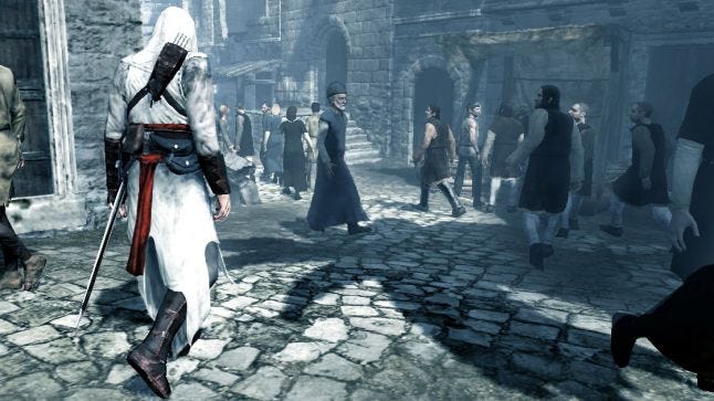 Sometimes the most elegant solution to creating a great HUD is to eliminate it entirely, according to Stanislav Costiuc, a game designer at Ubisoft (but who doesn't work on Assassin's Creed).
“I really want to mention the first Assassin's Creed, not because of what it does with its HUD, but because it's a game that is much better with HUD off, as it clearly was designed with no HUD in mind originally and the experience is absolutely different.”
Peeling the HUD off of a game like Assassin’s Creed, with its open world assassinations and massive, lovingly rendered environments,, provides a level of immersion that’s not possible with constant reminders that you’re playing a simulation (or, in Assassin’s Creed case, a simulation of a simulation). The purity of presenting the action without a HUD as intermediary connects players to characters more directly and makes those characters feel less like clusters of code.
"When you're told at the Assassin Bureau that you can find information in a marketplace near the Jewish quarter, you don't just go towards an icon, do a little mission, and that's it," he says. "You go onto the rooftops, look around, see the Star of David on a gateway in the distance - that means this is the Jewish quarter! And then when you get to it you look for that market nearby, and can use Eagle Vision to find informants, look for shady people talking to each other, or maybe you hear a herald who's talking about your target. The whole investigation flow turns into a process during which you get to learn the city, how to find visual or audio discrepancies in the patterns that help find your goal. The resulting experience is much more engaging and rewarding than the one created by an icon on a mini-map, but also requires a specific approach to environment, mission design, and dialogue writing."
TAKEAWAY: Sometimes the mark of a strong design philosophy is how well a game plays with no HUD at all.
6) Dead Space - Integrated and attractive
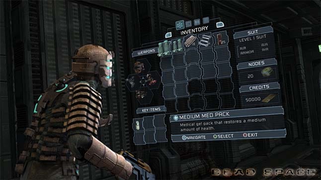 While wholly removing the HUD is a good option for a game like Assassin’s Creed, another option is to build it directly into your game. For games like Dead Space, which makes some sort of HUD almost mandatory, this option lets developers maintain player immersion without sacrificing functionality.
Jim Brown, senior designer at Epic Games, praises the Dead Space approach for its ability to make the HUD work for both the in-game character and the real world player.
"Dead Space is a mixture of the shooter and survival horror genres, and the in-game HUD played very well to the horror aspects of the game."
“Dead Space is very often the 'go-to' for creative HUDs,” Brown says. “Your health meter displays on your back, and the overhead map is a projection that draws on the floor and guides you to your next objective. While this was all very groundbreaking and turns the traditional notion of a HUD completely on its head, this design is often overlooked for the even greater impact it had on the gameplay itself. Dead Space is a mixture of the shooter and survival horror genres, and the in-game HUD played very well to the horror aspects of the game: it helped keep the player focused in the moment, rather than pulling them out to a 2D overlay that distracted from the gameplay.”
That attention split is one of the great challenges developers face when designing a HUD/UI, Brown says, but one that EA Redwood Shores mastered in a unique way.
“The health bar on your suit often serves as a focal point for the player's eyes, and can be your only real source of light in an otherwise dark room, contributing to the overall mood and tension a player might feel in times of stress or exploration. The projected lines were a great way to guide players through complicated levels, but also served to slow the player down, and lock them in place when reviewing their objective. This meant that the player had to stop moving, leaving them in a vulnerable state and thus giving them important decisions to make while playing. Again, this often helped to build tension and suspense for the game, making it more than just an interesting UI presentation.”
TAKEAWAY: Dead Space teaches us that next-level design can be successfully integrated into something that other games treat as really banal and secondary. Done well, a HUD stops feeling like a HUD, and just feels like an intrinsic piece of the game world.
About the Author(s)
You May Also Like


.jpeg?width=700&auto=webp&quality=80&disable=upscale)


