Personal Project Retrospective
As a producer, I try to understand other roles to help me get a clear idea of the work involved and to build a solid vernacular. This is an example of the type of personal projects I take on to achieve this aim.

I've always had an interest in 3D modeling, teaching myself how to use 3D Studio Max and pursuing it as a hobby. Wanting to bolster my portfolio and show a wider artistic range, I decided to take on a project that would have multiple learning stages (so, not only would I be doing something that added value to my portfolio, I would be doing something that also added value to my skillset - what I describe as an ideal project). I'm a big proponent of understanding as many aspects of the game industry as one can, so a lot of the projects I take on have to do with that goal. Some major things I wanted to touch on were high-resolution textures and model unwrapping, as well as poly-modeling on a lower budget, and post-production techniques.
As a sci-fi nerd, I often have some epic vision or concept knocking around in my head, snapshots of amazing vistas or interesting vehicles that never get much farther than a cursory sketch. However, I think just doing that sketch represents the desire to act on an idea, even if it takes you a while to understand how you're going to realize the vision. My notebook pages are generally filled with stuff like this:
 Okay, so I'm no virtuoso - but then, most people aren't. It's important to understand that your sketch is just that - a guideline that may or may not resemble the final product. However, I did find that on this project, sketching removed a lot of the question marks. My sketch answered the following questions:
1) What's the orientation of the scene?
2) What's the general placement of objects?
3) What's the mood or atmosphere?
And by answering these questions, the sketch provided a very useful design tool: Constraints! Whenever I found myself straying off the path, letting my mind wander, I was able to look at the sketch as a challenge - the challenge of sticking to a vision. Obviously, sometimes your initial concept NEEDS to change in order to produce the best work; and sometimes you need your mind to wander to discover why it needs to change. In this regard, the sketch just functions as a touchstone so you don't lose your way too much especially since it answers some basic questions about the concept in general. The sketch represents what I saw in my mind: a jovian-like planet with impressive, sweeping rings and satellites visited by a tiny spacecraft. With the scene hammered out, the spacecraft itself had to be next since it would be the focus of my low-poly modeling and unwrapping efforts:

Okay, nothing too crazy - I definitely favored the "Cargo Transport" idea from the beginning, and this design looks like you could put a big cargo container in between those big struts. I also like the bristling antennae on the top and bottom. This design looks kinda neat from the front, but I didn't have a clear idea of how it would look from behind, and my original sketch has the ship moving away from the viewer - something I wanted to preserve since I wanted to experiment with engine glow. After some messing around, I ended up with this shape (note the helpful star that denotes a design I liked):

Kinda blocky, and with a retro shape, inspired by older sci-fi and the newer movie "Moon" as well. You can see I got lazy with the sketching because all I've got is this sideview, but since the shape was so simple I knew it would be easy to experiment with its flat surfaces. Also, since I knew the ship would appear pretty small in the final composition, I felt it better to go with the simpler look. Okay, first things first: with the sketching out of the way, I wanted to get a sense of scale and perspective in the environment before building the ship. Having never built a scene in space, I found Hoevelkamp's tutorials (the first 5 featured on that page) to be super extremely helpful. They were very clear and allowed for a lot of experimentation. After the initial setup, I spent several hours just tweaking things and experimenting, which got me to this point:

Good enough for government work, but obviously in need of some more experimentation. What this does, though, is give shape to the sketch and achieve the true perspective of the scene that I couldn't capture with my simple, quick drawing. I decided to put together the spacecraft to get a sense of how it would fit into this scene.

Okay, cool. Seeing this gave me some confidence in the design of the ship, so I could press forward on that easily. The scene itself has some problems: weird colors, fuzzy-looking rings, and the planet doesn't look gaseous enough. Since my focus at this point was on the ship, I just made a list of the things I'd want to mess with. Once I was able to finish the modeling of the ship, the next step was unwrapping, which was pretty new to me (though I knew the basics).

On the left is the unwrapped model, the middle is the diffuse map and on the right you see the self-illumination map which tells the program what parts of the ship you want to light up. The ship also has a specular and bump map, but since it's so small the detail really got lost. This was by far the most complete and concerted effort I've ever made to paint a model with this level of detail, and I'm really happy with the results. This all went pretty smoothly and I was able to finish the maps in about 6 hours total. 3D Studio Max automatically updates the textures when they're re-saved, so it was a simple matter to just render things out continually to see if it was meeting my satisfaction.
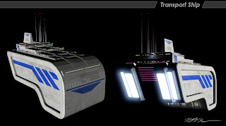
Lookin' good, now to bring everything together... 
You can see some experimentation with the rings and the colors here, and a lot of black space. At this point, I knew I wanted to put in a nebula and starfield, to increase the sense of awe and make the ship really look small and insignificant, almost stunned by this stellar vista. I decided the best way to do this was to do it in post-production, and not having a lot of experience there, I asked a friend of mine for input. His feedback was invaluable:
1) Try to unify the color scheme (most space scenes concentrate on two colors)
2) Make the ship more dynamic and the composition more balanced by re-positioning the ship off center and changing its orientation
3) For the nebula/starfield, you can start by looking for images of clouds or nebula online and then modifying them for blending with your composition
4) Consider using actual 3D models of asteroids to give the rings a more realistic appearance

As you can see, his input really made the difference for this image. I also managed to tweak the textures on the planets just enough to achieve what I really wanted (a more gaseous planet with rocky moons). For the rings, I wasn't getting very good results with actual asteroids; instead, I adjusted the granularity of the map and then tweaked its opacity map so that the rings would appear solid and smooth farther away from the camera, but more translucent and filled with particles closer to the viewer. I felt this was a good compromise. If you scroll back up to the top, you can see how the original concept translated pretty effectively into the final product, which I credit largely due to the constraints I introduced early on. So, there you have it!
Read more about:
BlogsAbout the Author(s)
You May Also Like


