Trending
Opinion: How will Project 2025 impact game developers?
The Heritage Foundation's manifesto for the possible next administration could do great harm to many, including large portions of the game development community.
The art director of Big Fish's successful casual series Drawn explains how he married his non-gaming inspiration and outside perspective with his experiences and thoughts about the game industry to create a visually arresting adventure.

[In our second piece on the creation of Big Fish Games’ Drawn PC casual adventure game series, art director Brian Thompson explains how he married his personal artistic inspirations with his experience in and out of the game industry, while dealing with the unusual constraints of the projects. This follows our earlier piece on the design of the series by sr. producer Chris Campbell.]
When I first sat down to write this article, I was struck by how hard it was to encapsulate the art style of Drawn. Over the past three years, the Drawn team has worked to create a game experience that's visually different and full of wonder.
We saw a great opportunity to give players something that lived outside of the terms "core" or "casual" by focusing on creativity, art, and imagination.
Drawn has become an interactive storybook adventure, at times a dark and haunting fairytale and at others a romp through a vibrantly painted dream. But how did it all come about?
As a kid, when I wasn't playing on the trails behind my house, daydreaming, or lost in the worlds of Sendak, Silverstein, and Seuss, I was sitting at the kitchen table drawing. My brother Todd and I would sit on opposite sides of huge sheets of paper my architect father would bring home from work.
We'd wage hand-drawn wars, scratching in fighter planes, tanks, and battalions of army men as the paper slowly blackened with tracer fire from our stubby No. 2 pencils. That blank slate of paper offered a magic wonderland of creativity where anything seemed possible. I was hooked.
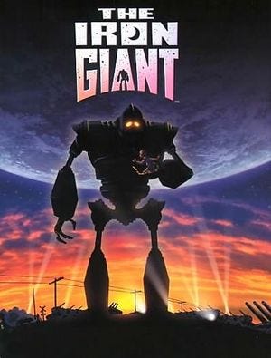
Several years -- and reams of paper -- later, as an illustration student at Art Center College of Design, I heard Director Brad Bird speak about one of my all-time favorite animated films, The Iron Giant. Like him, I wanted to tell timeless stories set in fantastic worlds filled with rich characters, so I focused my time on drawing and painting, storyboarding, and character design.
After graduation, I found work as a concept artist, eventually working for several video game publishers. While I loved working on so many different projects, I didn't find the video game medium to be one in which I could tell the story I envisioned in my painted concepts.
That said, I also found plenty of inspiration in games like the amazingly beautiful Ico, the stylized genius of Okami, the scale and force of Shadow of the Colossus, and the intrinsic charm of LittleBigPlanet. I was inspired by their beauty, but unfortunately, was disenchanted by the tendency toward violence seen in the majority of contemporary video games.
When my wife and I welcomed our daughter into the world, it really clarified my priorities. At the time, I was lead concept artist on Surreal Software's Vegas title, and I decided I wanted to leave the core gaming world. I found myself at a crossroads and experiencing a bit of an identity crisis. How had I ended up as a video game artist? Was I really the same kid who sold his NES at 10 years old and hadn't owned a game console since?
As fate would have it, a fellow artist and friend of mine, Jeff Haynie, was working at Big Fish Games and got in touch with me. He was excited about doing illustration again and focusing on composing a scene, color design, and storytelling. The best part was that the paintings would go straight into the game just as they were, so he had full control over what the player was would see. When I was offered a full-time position as art director on a new intellectual property, I jumped at the chance to be in a position where I could really control the look and feel of an entire game.
My goal with this new IP was to make a visually rich, fantastic, and immersive experience that gamers hadn't seen before. The subject matter, a game about a fairytale world in which the player interacted with the environment by taking magical photos, offered a prime opportunity to push a very stylized and whimsical look to the art.
For inspiration, I started looking at old background paintings from Disney classics like The Jungle Book, Bambi, Fantasia, and Bluth's The Secret of N.I.M.H., along with others like Tarzan and FernGulley: The Last Rainforest.
I wanted the shape language to be designed around curves -- a compositional style that I was formally introduced to by my background painting teacher at Art Center, Dominick Domingo, and which became a huge influence on my personal style. The Spanish artist Enrique Fernandez, best known for his version of The Wizard of Oz, also had a profound influence with his dynamic compositions and color sense.
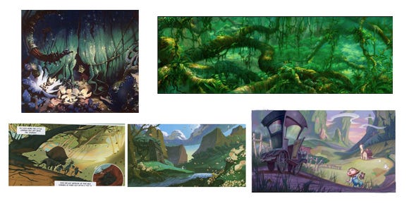
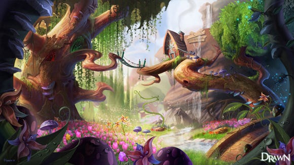
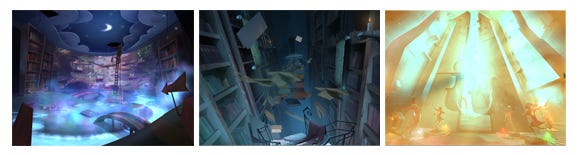
The first image that I produced for the project was The Enchanted Forest, a piece that embodied the colorful, whimsical feel that I wanted to see throughout the game. The image was met with concern from some and cautious interest from others. As most of you know, change is often met with skepticism and it is rare that publishers will go out on a limb to try something new.
This is where the unique world of casual games really shines. The inherently smaller teams, lower overall budgets, and faster production cycles make taking chances a little less frightening. It wasn't easy to convince people that this style would appeal to Big Fish Games customers, who were used to photo-realistic puzzle-adventure games like our flagship titles, Mystery Case Files and Hidden Expedition.
We were roughly a year into development when it became clear that the game's design was not going in the right direction. The overly-complex story, which suffered from frequent rewriting and revising, was causing the project to slow and stutter. Morale was low, and from the art perspective, the team was generally just executing what was directed to them by the designer. We were at a tough crossroads when senior producer Chris Campbell was assigned to help steer the ship clear of ruin.
Chris and I had to make a decision: fix the current game or make a new one. We decided to make a new game... in just seven months. We quickly became brothers-in-arms and formed a partnership and friendship that has been the highlight of my career. Neither of us had ever designed a game before.
We gave ourselves, together with the team, two weeks to come up with a new story. I had an idea that all of these stylized, colorful scenes that we'd already created for the old project could be used as paintings in the new game.
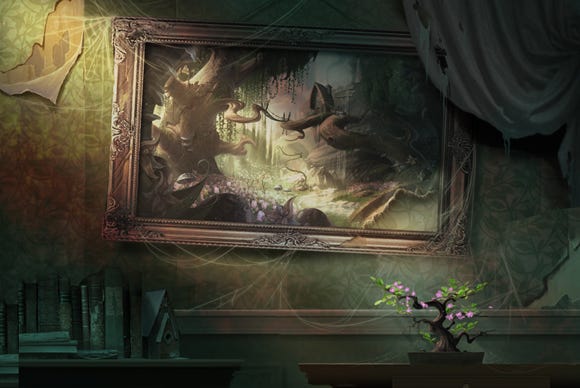
I mocked up a scene of a drab environment with the Enchanted Forest hanging in a frame on the wall. The idea was that the player could enter the artwork to experience the lush and vibrant scenes. This established a core visual and design element of the new game: the contrast of light and dark, and entering magical paintings.
In essence, we took a game based exclusively on the hidden object mechanic and stripped that away, firmly establishing a traditional point-and-click adventure game. Out of the ashes of the previous project, we rose up with a clear sense of direction and camaraderie.
But as we all know, it's never far into the process of creating something new that the question comes up of whom the product is targeting. Would this style appeal to our standard customers? Wouldn't it be risky to make an adventure game when the audience really wants hidden object games? Would the fantasy nature of the game feel mature enough for our customers?
Something we learned early on, which became critical in the way we approached the design of both Drawn games was that stereotyping your audience is a risky thing to do. Being aware of the customer is different. We stuck to the theory that if we gave the customer an artistically beautiful game, full of intriguing puzzles and interesting characters, wrapped in a simple story, that they would enjoy it. Thankfully, the Big Fish Games leadership trusted us and gave us the support we needed.
We quickly developed the skeleton of what we'd later name Drawn: The Painted Tower. The team rallied around the new story: A gifted young girl named Iris is trapped in a tower by an evil tyrant. In order to fulfill her destiny, she needs your help. It was a classic story of good vs. evil and light vs. dark.
We needed to establish Iris as a sympathetic heroine. We wanted her to be young and innocent, but with an inner strength. I focused on Iris's eyes as her most important physical feature. They needed to convey sadness and hope at the same time, and they needed to capture the heart of the player.
I'd sketched some rough drawings of a little girl with red boots, and I liked the idea that she might have some element of color that would be strikingly different from her surroundings. Eventually, this became the red scarf.
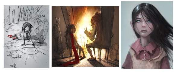
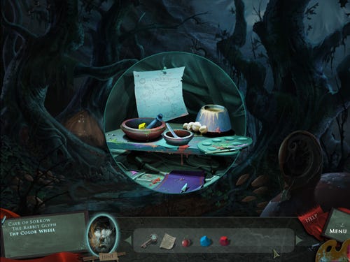
The artwork in Drawn was developed using traditional approaches. Everything is hand drawn then painted digitally, as opposed to compositing the scenes in a matte-painting style. 3D and photo-realism has become so ubiquitous, that gamers are just not accustomed to seeing this type of art in games. In fact, when people first see the paintings from Drawn they often ask me if they are concepts and are usually surprised to hear that the paintings are the actual final game backgrounds. Most game artists simply don't get this opportunity.
Since we'd established that the game takes place in a dark fantasy world, filled with lush interactive paintings, we really had the freedom to do anything we wanted stylistically. But it was still important that each scene be designed paying close attention to layers of depth in the composition.
As I looked more at the traditional background paintings of the great Disney films, I was amazed by the careful attention to foreground, middle, and background, as well as the way the scenes were designed around the character's action. Since we were making a game that could not afford a lot of character animation, we shifted to make the areas of gameplay the focus.
Guiding the player's eye through the scene using value, color, and composition was integral to establishing a consistent feel throughout the game. This consistency allowed us to move beyond paintings into other genres of art, which I'll get into later.
One of the biggest challenges in creating a new IP using existing assets in only seven months is consistency of style.
My two star painters and fellow Art Center College of Design alums, Hamzah Kasom Osman and Soi Che, both took up the challenge.
To get the "real-world" scenes, or the environments, outside of Iris's paintings, done in time, we needed an efficient approach for creating the artwork.
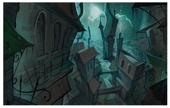
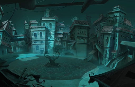
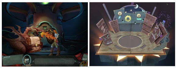
The monochromatic world of Stonebriar came partially out of this necessity. I am a huge fan of Tim Burton and Henry Selick's The Nightmare Before Christmas and have always loved the extreme perspectives of artists like Barry Jackson and Colin Stimpson.
A few years ago, I came across Filmax Animation's Nocturna. The surreal and dreamlike imagery really resonated with my own artistic style. I loved how dramatic the camera angles were.
With these powerful inspirations in mind, I did some rough concepts to try and get my thoughts out and eventually the off-kilter and skewed style of Stonebriar was born.
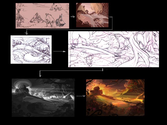
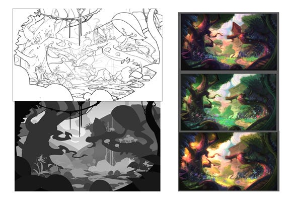
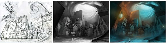
For Iris' paintings we'd been using the five-step process of thumbnail, final pencil, value study, color comp, and final painting. For the scenes outside of the paintings, we quickly sketched up small thumbnail drawings and fleshed out the large, simple, angular shapes. The angularity was a great contrast to the curves in the painted environments that we'd already established. Because of the speed at which we needed to execute these scenes, the layout was rendered in grayscale, allowing us to really focus on the value structure of the piece.
We would take the piece to about 85 percent completion in this way, as opposed to going into the final with opaque color the way we would with a normal painting. We then did a global colorization in Photoshop, and added a small amount of color variation to lessen the "tinted" look and popped some highlights in the form of lanterns and candles.
This fast method worked particularly well because of the contrast it provided with the colorful painted worlds of Iris's imagination. In addition, this down-and-dirty approach allowed us to maintain a consistent look even though three artists were working on the scenes at the same time.
Throughout both games, I focused on giving tasks to each artist that would allow him to really flourish. Soi's keen sense of perspective and facility with hard-edged mechanical drawing were a perfect match for creating these environments. He took the direction I'd established and ran with it, giving it his own style, while Hamzah's soft--edged, colorful style fit perfectly with Iris's whimsical paintings.
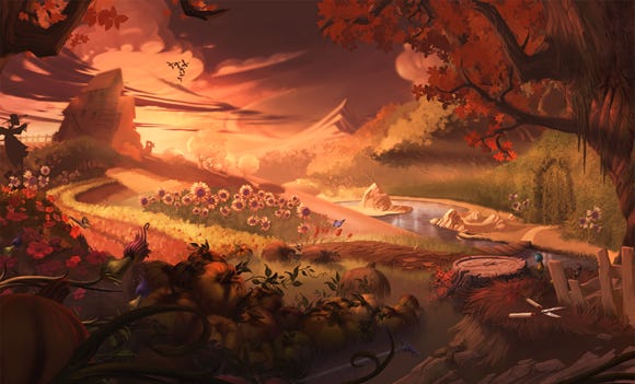
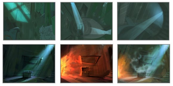
To keep the player engaged and immersed in the adventure, we committed ourselves to the use of contrast. Monochromatic vs. saturated color, light vs. dark, angles vs. curves -- all great tools for controlling mood and pacing. For example, in The Painted Tower, we'd keep the player in a dim enclosed environment and then he or she would be sucked into one of Iris's whimsical paintings of a bright, colorful farm scene.
In Dark Flight, the player might be exploring an underground cavern until he or she splits a massive wall apart to discover a large, expansive shot of the town. Many developers choose a limited color palette through their entire game and the scenes become dull or boring to the player's eye. I think this is a missed opportunity to affect the player's mood in a profound way. Similar to the rhythm and pacing of narrative storytelling, good visual storytelling must have ebb and flow. It is this fluctuation that keeps Drawn from getting stale or overly oppressive.
Animation is a critical complement to the pacing of the static visuals in Drawn. Rebecca Coffman and Mike Baran, our two-person animation team created visual effects and character animations that gave life to what would otherwise be a desolate world.
In addition to maintaining the illusion of a living, breathing world, animation gives the player a rewarding moment after completing a puzzle or advancing to the next area. Rebecca and Mike focused on more intensive 3D and 2D character and effects animations while the scene artists designed fog and ambient particles to create a great sense mood and atmosphere.
Where I think Drawn stands apart from many of the games I've seen in the casual space, is in the attention we paid to giving the player great payoff moments; we embraced every opportunity to give the player an enticing visual surprise.
Because of our minimum specifications, we had tight budgets on both memory and overdraw so balancing animation was critical. These limitations forced us to be highly selective with the animations and to find creative solutions when facing a new challenge. It was impressive to watch both animators tackle each task in different ways while maintaining critical eye on efficiency. For example, in Dark Flight, Rebecca devised ways of using up to four different programs to give life to Smoke Beast, while Mike used a traditional cel animation approach to create the Lamplighter.
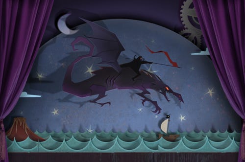
In The Painted Tower, there's an elaborate mini-game that requires players to create a hero by chiseling him out of wood, painting him, and arming him against wooden foes in order to win the heart of the princess. The charm of this wooden show inspired us to pursue additional ways to use flat, animated cutouts in the sequel.
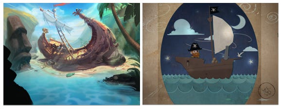
Early in the development process of Dark Flight, we explored the concept of paper craft, which quickly grew to include pop-up books. While the process to create them was time-consuming, the books ended up being a favorite element for many players. The Pirate Card scene grew naturally out of the fun we were having with the pop-up books and -- as a bonus -- since it was intended to look like a real cut-out, we were able to build the art quickly.
The gameplay in the scene is simple and fun, and a fresh departure from the gameplay up to that point. After the player helps the pirate fix his ship and shoot some sharks with a cannon armed with coconuts, he sails off to find the message he's been searching for. We got such a great response to this mechanic that we expanded on it later in the game with the Theater Cart, an interactive play where you complete missing elements to watch the show.
Art is obviously a strong motif in Drawn, and we brought that theme to life by creating puzzles that require the player's artistic contributions. This notion of letting the player in on the magic of art-making really resonated with early focus testers and became a fast hallmark of the brand.
Instead of simply having the player roam around, looking for inventory, Drawn engages the player, involving him or her in the creation of many of the items needed to complete the quest. Whether the player is simply painting a bridge, or drawing clouds to make it rain, or learning how to make paint from pigment and eggs, he or she is helping create the artistic tapestry of the world.
Many customers and reviewers have shared that Drawn makes them feel like a kid again -- without being a game for kids. The reality is that the magic and wonder of drawing, painting, and creating is something that most people left at their third grade tables along with paste and safety scissors. Getting back to that feels good.
People of all ages, whether they consider themselves "core" or "casual," just want to see and do neat things. With Drawn, we simply wanted create an experience that would make players smile, intrigue them, challenge them mentally, and reward them accordingly.
We hold the belief that players want something new -- not just a repackaging of the latest trends -- and that if you give them a great experience, they will be happy. As a team, we built on this by not simply showing players something beautiful, but by allowing them to participate in making a world where they can interact with art, where they find themselves drawn in.
I think that one of the reasons why Drawn is regarded as fresh and different is because many of our ideas as a team come from sources outside of the video game culture; I often draw inspiration from the nostalgia of my childhood, but each team member has his or her own bag of inspirations and influences to draw upon.
As a team, we engage regularly in organic conversations that stem from random anecdotes about people's life experiences but take on a journey of their own and lead to ideas for the game. More often than not, we arrive on some strange and wonderful island where great ideas hang ripe on drooping palm trees. Without this blend of personalities, the world of Drawn would not exist.
Creating Drawn has been one of the most rewarding and collaborative experiences I've had in my career. The brand is truly a reflection of its many unique and gifted creators, and I am grateful and proud to be one of them.
For more about the team's talented individuals, click here.
Read more about:
FeaturesYou May Also Like