


Daily news, dev blogs, and stories from Game Developer straight to your inbox
Sponsored By
Featured Blog | This community-written post highlights the best of what the game industry has to offer. Read more like it on the Game Developer Blogs.
How we found our visual style for Flat Kingdom. A few tips for young aspiring artists.
Fat Panda Art Director José Luis Acosta explains how they've found their own art style in Flat Kingdom and gives some tips for beginner artists. He also goes into details about the design process behind boss Fenrir, the ice wolf.
7 Min Read

The first steps.

Since early stages of development we wanted the game graphics to be in 3D. At the time it seemed like a good idea, but as it tends to happen with your first game, there’s a lot of things we did not consider.
Most of the time as indie studios we want to do what other triple A games are doing, but we do not stop to ask ourselves if we even have the equipment, time, budget and skill necessary to achieve it. That may sound awfully pessimistic, so don’t get me wrong, I think there are some very important questions to consider when you’re crafting the visual style of your game.
What can we really do and how to do it as best as possible.
When we answered that question, we took a step back from development to think things over and make a wise choice. Here in the art department we had a lot of experience drawing and animating in 2D, so we decided to put all that talent and expertise to good use, and well, the game may not be a triple-A graphic style dream project, but we managed to reach a unique style and we’re very pleased with the results.
Searching for uniqueness.

Here you have some of the main Flat Kingdom references.
One of the strongest influences throughout the process was everything we found made with paper ( cuts , origami, etc.) those very geometric ways helped me a lot to easily abstract certain things to their simplest form. There were games that served as a reference, as Paper Mario, Guacamelee , Alto’s Adventure, and the Kirby series, among others.
Our most relevant artistic references were :
Medieval Art : Whether caricatures or real references or fantasy films .
Pop up Books: As books for young children, they show relief and depth between objects.
Geometry: Imposing geometric figures on all scenarios and force the enemies shape.
Alto’s Adventure: Flat Design, style color, very fine design and minimalism.
Paper Mario : The outline style characters , origami , and flat shapes .
It’s quite normal to take inspiration from the work of the people you admire, the hard part is to turn the result of that inspiration into something that is truly yours.
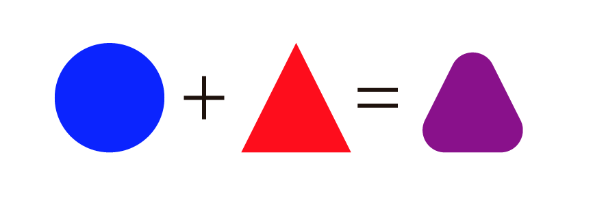
Instead of speaking of other games, take the example from above. What can we do that has not been done before? If I had only used the triangle reference, I would probably come up with another triangle, maybe of a different size or color, but another triangle nonetheless. Our work is the sum of all our references, experiences and personal style, so we must come up with something different with that mix, like in this example, where the sum of two shapes results in a new one.

During the development we took all this and turned it into the visual style of Flat Kingdom. I advise you to collect a lot of references, that way you have more materials to combine and make something truly unique.
Looking for balance.
In a game you have architecture, characters, props, scenery, world’s, flora, fauna, etc… and it’s our job in the art department to find the balance between those things. To find the balance between what’s functional and what’s pretty.
We tend to forget that design and illustration are forms of communication, and as such they need to convey a message, and if that message is not clear, then that graphic asset (pretty as it may be) does not work. In a game, there are a lot of messages to convey, with the correct use of color and elements we must make the player feel the atmosphere we’re aiming for. You also need to make clear the characters intentions and personalities with their designs alone. Not to mention it needs to be functional gameplay-wise (perhaps this last point is the most important of all).
Had to redraw Quetzal because it was so hard to animate.
A very helpful thing to do is to sketch everything and show your work to the rest of the team, that way you can start to see if you’re getting the reactions you want.
Initial sketches for the Princess design.
An example: Building Fenrir from paper to the screen
So, before you begin, you should consider all the things needed from each asset you’re creating. If you’re doing an enemy, then you’ll need to consider his attacks, behaviours, weaknesses, etc. If it’s an NPC, then you need to consider where he’ll be, how can he help, etc. You get the idea.
That’s why it’s super helpful when things are properly planned. In this case, Sergio Ortiz (our level designer) gave us a rough sketch of how the Fenrir boss fight was gonna be. Considering all the things that needed to happen in the fight, now we had a clear path as to what needed to be done and how it would be implemented.
What we know about this character in a nutshell, this should provide us with enough tools to work with.
We already know how he behaves:
He’s a giant monstrous wolf, the boss of the fourth level
His battle arena is mostly covered with ice
Is heavily inspired by the nordic myths, his weak spot is in his back.
Now it’s time to gather some useful references.
Because the characters had very geometrical designs, it was easier to me to draw and sketch directly in the computer, using the basic shapes of the software. I start with the main shape and work over that by adding the details and stuff from the references (remember, you should mix them all!).
It’s important to add unique characteristics in order to define the characters, but I also tried to repeat some features from other enemies (in this case, you can see it in the shape of the legs or the jaws). This little trick helps you create characters that feel like they belong to the same universe (Flat Kingdom). And because this is one of the final bosses, I could add more details than with normal enemies.
You should also be very careful with what colors you choose. Fenrir is an ice wolf, but he also lives in a snow filled room, so I tried to avoid using whites in his color scheme. You don’t want your beautiful Fenrir to blend into the background, the players won’t be able to see him!
Last but not least, remember that you’re doing what you love, so have fun! Don’t be afraid to start over when you need to, listen to the feedback you get, be nice about it and try many styles other than your own! Who knows? You may be surprised with what you can do.
Here at Fat Panda Games are still working in other projects and we’re very excited with the different styles of each of them, I can’t’ wait to tell you in the future how they all work out.
Flat Kingdom is an indie video game developed in Mexico by Fat Panda Games and published by Games Starter.
Thanks for your interest!
If you are interested in following the news about Flat Kingdom, check out the next links:
Official website: http://flatkingdom.com/
Steam page: http://store.steampowered.com/app/405970/
Facebook: https://www.facebook.com/flatkingdom
Twitter: https://twitter.com/FlatKingdom
Tumblr: http://flatkingdom.tumblr.com/
Read more about:
Featured BlogsAbout the Author(s)
You May Also Like