How color scripting conveyed the emotional arcs of Beast Breaker
A fascinating conversation on conveying the emotional ups and downs of a story using color.
The relationship between color and expression is nebulous, often dependent upon culture, context, individual perspective and a myriad of other factors. So how does a creator shape the visual language of their work with so many competing sources of interpretation?
Perhaps shedding some light on that topic is Jemma Salume, lead artist on the game Beast Breaker, a turn based RPG by Vodeo Games that debuted on Switch and PC back in September 2021. After seeing some of the beautiful biome sheets that Salume posted on Twitter, I just had to reach out and ask about the concept of color scripting, that is, the process of more or less storyboarding the emotional sequencing of a story by assigning certain color schemes and combinations to certain emotional milepoints. The conversation was illuminating, and an insightful look about how to convey narrative with color. Read on!
Game Developer: So, what exactly is color scripting? I'm not familiar with the concept, but I'd love to hear about how informed your creative process.
Jemma Salume: My first encounter with color scripting was not through games, but through animation. On a tour of the Pixar campus as a teen, I saw the color script by Lou Romano for The Incredibles on the wall, and it made a massive impression on me.
The idea behind a color script is that you take all the major plot + emotional beats of a story, and draw them out very simply and clearly in sequence to work out dominant shapes and colors in each scene/story beat. Its development is an efficient way for art team to coordinate with story team to make sure your visuals and writing are aligned. Once complete, it provides a bird's eye view of all of your story's visuals so more refined assets remain consistent.
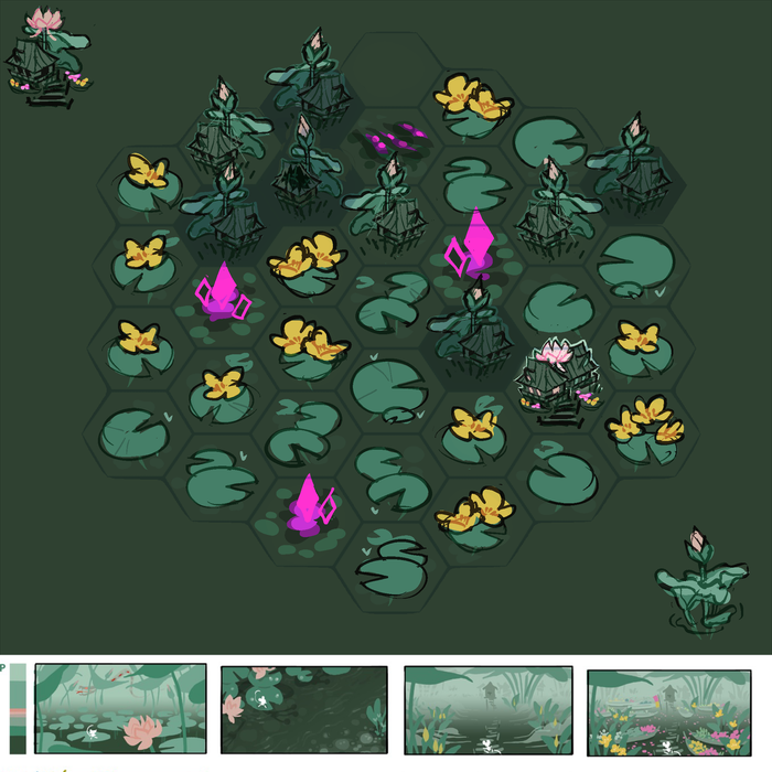
One of the game's many distinct and beautiful biomes.
Beast Breaker's igniting spark was its gameplay hook of being a tiny character ping-ponging around to fight these giant monsters. I was generating and tossing a lot of ideas early in the process, just trying to find visuals that supported that gameplay hook but without a particular roadmap.
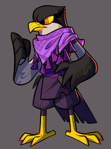
One of the game characters, Echo, designed as a native to the desert. The purple scarf references the desert flowers of her home. "All of the characters native to various biomes got this treatment on their home turf."
As we entered pre-production and characters and story began to crystallize, it became clear we were going to be heading to a wide variety of environments, so I created our color script with three goals in mind: Make sure each biome had a unique identity that supported its point in the story outline, ensure that the player character and beasts would stand out in each biome, and provide a jumping-off point for biome-specific art assets. It also ended up guiding character designs, since each character is native to a specific biome.
OK so to a layperson like me, that's fascinating; I didn't anticipate that color scripting would come so early in the process. How do you decide what color conveys your design goals for a scene? Is it driven by a feeling, a tone, or something else?
Salume: There's enough factors in play that I just go with my gut feeling for the first pass. That early process, I expect everything's going to change anyway.
It's the second pass where things got interesting for Beast Breaker, because that's where we saw patterns emerging and started to narrow down how we were going to communicate things to the player. Some examples: The home farm contains a lot of yellow, so yellow became the main "you want this, it's safe" color throughout the game. White showed up well and looked pleasing against all backgrounds, so Skipper became a white mouse. Magenta also showed up well but clashed with everything, so it became the color of the beast cores and corruption, to convey that the beasts are abominations that shouldn't be there. Once decisions like that crystallized, I went back to edit the color script to reflect the "color vocabulary" we were building.
It's so interesting to hear how the thematic use of each color evolved based on usage over time. Can you tell me more about the color vocabulary and the visual language that resulted?
The vocabulary of the color script in isolation is really simple in my mind - Skipper ventures farther from home and deeper into danger, so the colors of the farm (that warm yellow or sprout green) gradually bleed out of the environments and get replaced. There's also a shape aspect to this, as the elegant organic shapes of plant life get replaced with unnaturally sharp/clean angles, and those magenta diamonds show up more and more frequently.
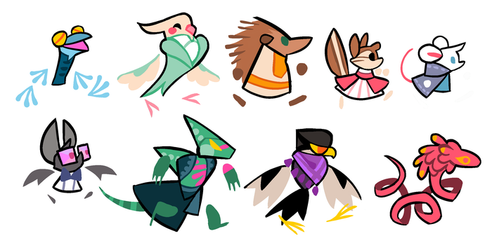
A set of mini characters, designed after the color script was complete to test their color palettes.
I mentioned earlier that characters and story were already being kicked around prior to the color script's creation, and one of my goals for it was to help inform biome specific assets. That included characters native to certain biomes. They were first major evolution of the visual vocabulary after the color script was complete.
For example: We knew there was going to be a desert location and associated character. In the script the place became this bright sun-baked orange wasteland full of ruins, punctuated by these little purple flowers. Purple is your sign of life in that biome. Now that we had that information, the character could exist in conversation with it. Echo was the result - On a practical level, she's black and white to contrast with the sands. On a narrative level, she's wearing purple to align her with those little flowers clinging to life in a harsh environment, and she's got yellow to show she ultimately belongs with the team on the farm.
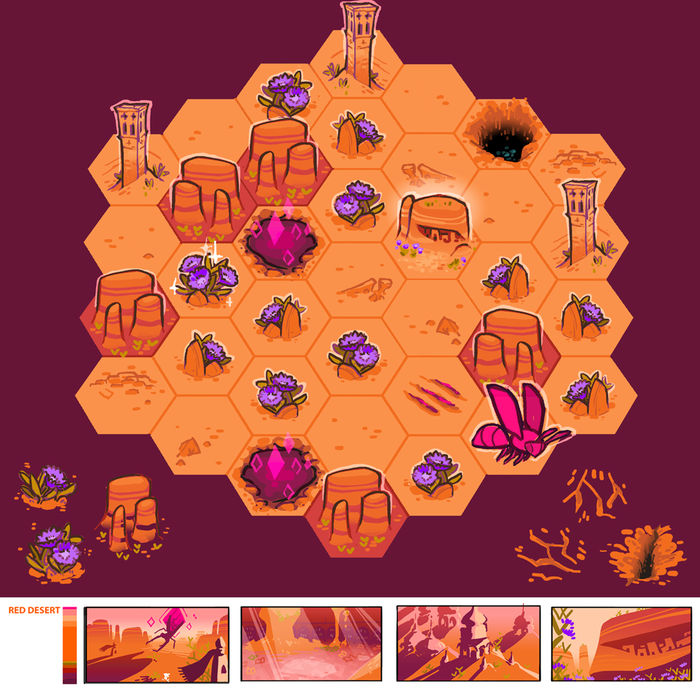
One of many biome sketches. Note the purple desert flowers and the orange desert tiles.
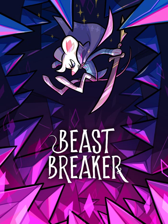
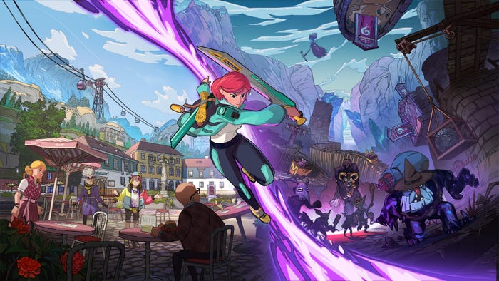
I was just looking at some video and screenshots to get a feel for what you were saying about shape informing the visuals as Skipper leaves the safety of home. I notice the thumbnail art of the game (on the Epic Games storefront) speaks to what you are saying about both that and the color script--all angles and sharpness and deep purple and fuschias. In other words, all danger.
Oh yeah, here, [here's the] big version of that Epic Store poster, plus the square Switch Store image which illustrates the farm! (Note: The Switch Store image is primarily done by Kezrek Laczin based on my color script sketch of the farm, I art directed and added the little Skipper on the stone wall. Credit where credit is due!)
As an artist, are there any influential works that have formed your appreciation for the significance and symbolism of color? Do you have any advice for other artists about forming an inspired palette in their own work?
I've already mentioned the color script for The Incredibles being a huge early influence. Beyond that, I always find myself returning to the works of Eyvind Earle, Bob Peak, and Ivan Bilibin. There's also a set of Rothko paintings called the Seagram Murals which... you know, I keep writing sentences about them and then deleting what I wrote, just go see them if you're fortunate enough to have the opportunity.
I find it really hard to dispense art advice, there's no one-size-fits-all! Generally I see people (including myself) hamstring themselves when they get too in their heads, get too afraid of failure to try stuff, stop trusting their instincts, and before they know it they're getting flattened by a creative block. Walk away a bit when you need to, zoom out to the widest view of the project you can get, try to fix the narrative you're trying to tell into the front of your mind, and remember that failure still provides useful information.
About the Author(s)
You May Also Like




.jpeg?width=700&auto=webp&quality=80&disable=upscale)


