Daily news, dev blogs, and stories from Game Developer straight to your inbox
Sponsored By
Beneath the pixels: The art direction of Super Time Force
A deep look at the decidedly non-retro pixel art direction for Capy Games' Super Time Force Ultra -- what it takes to make a "fever dream" of a 2D game on HD hardware.
October 2, 2015
14 Min Read

Author: by Dan Vader, Mike Nguyen & Vic Nguyen
[A deep look at the decidedly non-retro pixel art direction for Capy Games' Super Time Force Ultra. Written by designer and writer Dan Vader, and artists and animators Mike Nguyen and Vic Nguyen.]
With next-next-gen graphical realism and the hype of gamers strapping on helmets to gaze into the future with virtual reality, it's often asked "why stick with pixel art?" It seems that in 2015 the choice to string together thousands of little colored squares presents players with a litmus test of sorts: Their reaction to it determines what is and isn't acceptable in the medium's downhill slalom through the uncanny valley.
For us, the choice to render the relatively complicated mechanics of Super Time Force in pixels wasn't any kind of statement or rejection of the general direction of the industry. It also wasn't motivated by nostalgia or a desire to wear the "retro" label. As we'll explain, the choice to adopt pixel art was first born of necessity, and then slowly evolved over the course of the project to become not only the best fit for Super Time Force Ultra, but the most natural way for us to showcase the personality of our studio, Capy.
Before they were a Force, they were a Squad
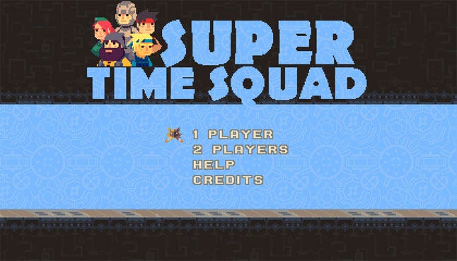
Super Time Force got its start in a three-day game jam project created by three Capy teammates, brother-artists Mike and Vic Nguyen, and programmer Kenneth Yeung. In fact, back then it wasn't even Super Time Force, it was Super Time Squad.
The constraints of a game jam on well, time, means you don't have the luxury of spending much of it on developing the art style. You're just trying to get something, anything on screen. Mike and Vic had worked in pixel art across dozens of small games for not-smartphones as well as other game jams, so they knew they could use it to maximum effect.
The other thing they had going for them is that they're twins and have an unspoken shorthand when it comes to working. Yup, as Mike and Vic tell it, Twin Power is real! They've always done everything together: same school, same college, same job, they even got married around the same time and all live together in one big house! Their partner in jamming, Kenneth, also started with them at Capy around the same time nice years ago, and they've always jammed together -- they're basically the game jam triplets!
Ken coded all the crazy replay mechanics. Mike made all the environments and background art. Vic animated the characters. Bam! Three days later, they had Super Time Squad!
This might be a real game, guys
Super Time Squad ended up far exceeding their modest expectations. They brought it back to the studio and minds were blown. Everyone who gave it a whirl went through the same process, the three stages of Super Time Force Acceptance, you could call it:
Huh?
Aaaargh! I just died? I didn't even know where I was on screen!
Ohhhhhhhhhhhhhhhhhh! I get it! HOLY SHIT!!!
The team at Capy agreed that they should keep working on it (and change the title to Super Time Force) and maybe even make it the studio's next game. Where before they had used pixel art for its convenience, now they wanted to use it to develop a hallmark style. But at no point was there ever any discussion of NOT making it in pixels.
Up to that point, Mike and Vic had used the medium of "pixel" art in chameleonic ways to match the demands of a given project. But now the field was wide open. They could shape and mold those pixels into anything they wanted. But what did they want?
The Sworcery of Superbrothers and simple squares
It wasn't until our studio collaborated with artist/designer Superbrothers on Sword & Sworcery EP, that we fully grasped the versatility of pixels. It was probably Superbrothers' art that made everyone realize this -- in our opinion, he's ground-zero for the pixel art resurgence.
He became a massive influence on Mike and Vic. They were in awe of his art. They loved that he expressed so much with so little. They felt a kinship with the way he enhanced the boxy shape of pixels and made it the signature of his work. He didn't know it, but he set a high bar for them, and spurred them on to take the pixel process and come up with something that was uniquely theirs.
Craig Adams' artwork on Superbrothers: Sword & Sworcery EP
Troubleshooting the visual chaos
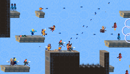
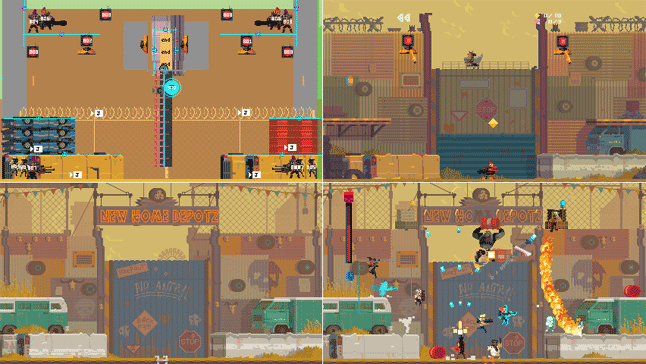
What quickly became apparent -- even in the jam version -- was that the game's concept led to a lot of visual chaos. Its central time-travel mechanic pushes you to create this chaos, and it was exponential. It was the game's reason for being. In fact, most of the art considerations throughout the project involved getting out of the way of the action. Super Time Force is an intense, chaotic, heaping pile of stuff happening all at once. You've got bullets, enemies, explosions, 30+ versions of yourself jumping around. Interacting with ALL of your past actions at once demands a whole other layer of focus from players above and beyond the demands of any platformer. When you "get it" the experience is exhilarating and powerful. If you don't… the game is a locomotive and it's left you behind at the station. Every department, especially Mike and Vic (and later Kelly) of the art team tried to help where we could.
Early test level
Finished game level
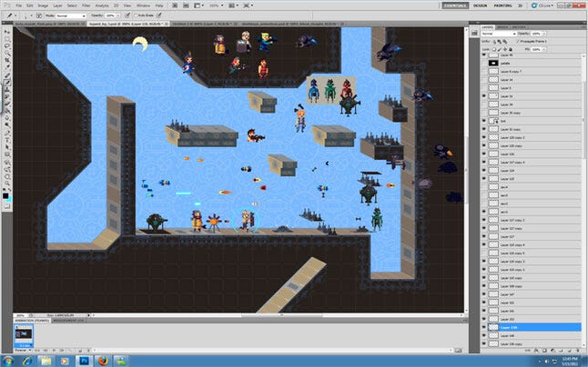
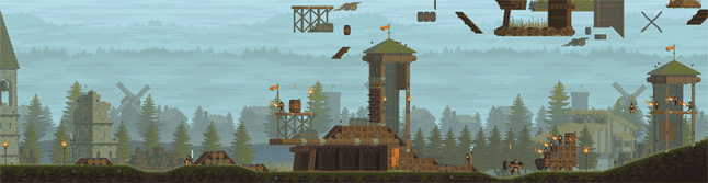
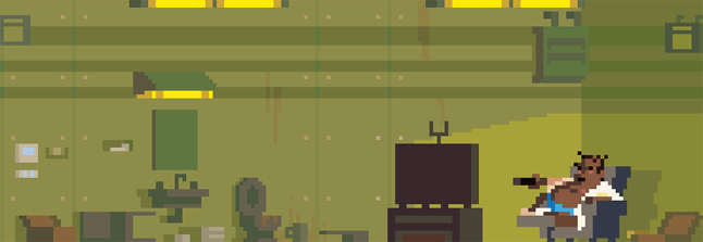
One of the biggest hurdles was making STF readable and cohesive while sticking to its colourful, over-the-top style. The environments of each level had to be as bold as the crew of characters blowing it to shit, but couldn't overwhelm the central action. Mike would create the backdrops and then progressively tinker with them to decrease their contrast, fade them out and make them more pastel-y without losing a sense of the space.
 Background progression from initial block in of shapes to almost final render. Click for enlarged versions
Another example of background progression. Click for enlarged version
In the jam version, the backgrounds were made out of squares and diagonals -- sharp-edged patterns that helped make Vic's more rounded pixel characters pop out and be readable. Initially, they thought they could continue to push the linear visuals of the jam game by having every object made of either straight lines or diagonals. But after a lot of experimentation they found the diagonals were actually contributing to the visual noise we were trying our best to combat.
Diagonals in pixel form naturally have what only can be described as "jag." The squares that form diagonal shapes don't blend seamlessly; they instead ascend or descend in a stepped pattern that lays "jag" across the screen. To solve this problem, they shifted gears and tried to limit diagonals and instead kept things boxy, square and as flat as possible. It helped with the visual noise -- and on top of that looked FREAKIN' good! This solution to one problem ended up opening a path towards creating STF's own signature style.
Perspective changed to help visuals be more blocky
How we learned to stop worrying and love the blocks
Much like our friend Superbrothers had used pixels in a very idiosyncratic way, we too were looking to distinguish the art of Super Time Force and move it further away from a simply "retro" aesthetic.
Quite a lot of pixel art trades in nostalgia. The goal seems to be to make you believe that a contemporary game could have nestled in comfortably between your Castlevania and Chrono Trigger cartridges. We were never interested in that, though. To us, Super Time Force was less like a game you could've played as a kid, and more like a fever dream of that game.
Remember the feeling of playing a game before bed and then shutting off the lights and still having its shapes painting themselves across the black screen of your eyelids until you fitfully drifted off to sleep? To us, that was Super Time Force. One foot in the past, sure -- but the other foot trying to find purchase in the shifting ground of our own tastes and imaginations.
Another big reason why we weren't all that interested in flying the banner of "retro" was that the format of showing games on HD screens has fundamentally changed the way pixels are rendered on screen. Achieving the look of classic pixel games is quite difficult without the use of complicated shaders or post-processing that threaten to tip the game into nostalgia pastiche.
Back in the old days of grainy CRT televisions and arcade cabinets, pixels were rendered softer and fuzzier, and thus they were applied by creators in much rounder, smoother shapes. If you look at old screens of classic games, they aren't typically as blocky as the modern games being hailed as "retro-inspired."
In fact, if you load up an old 8 or 16-bit game and play it on your fancy HD monitor, it won't even look the same as you remember it -- the sharper HD technology has changed the aesthetic of these games in ways that the creators likely never intended. Rather than perpetuating this disconnect of using sharp pixels to try to realize rounded shapes, we instead embraced the look of HD pixels. Mike and Vic allowed the sharper pixels to inform their blocky designs.


In-game effects
They began amplifying the squareness of pixels wherever possible in the environments, characters and effects. They resisted the artist's temptation to elaborate on the frame of a design or add structural flourish and instead decided to run with the idea of squares straight off a cliff.
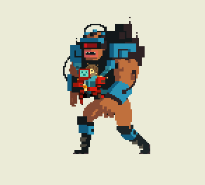
The Super Time Force's headquarters, the Spacebus, is like a flying Kleenex box. Their archenemies, the Blounbots, are just a series of boxes strung together into an exoskeleton. When you shoot a Blounbot, they shed tiny flashing orange squares as a hit effect. The enemy death effect is a giant expanding orange square that emanates out from the perishing foe. Interacting with any of the collectibles in the game throw off hard-edged squares or diamonds that stand apart from the more rounded player-characters and projectiles. Adhering to a square aesthetic gave the game an exaggerated, comedic feel that underlined its inherent silliness, but also helped to clarify the action for the player.
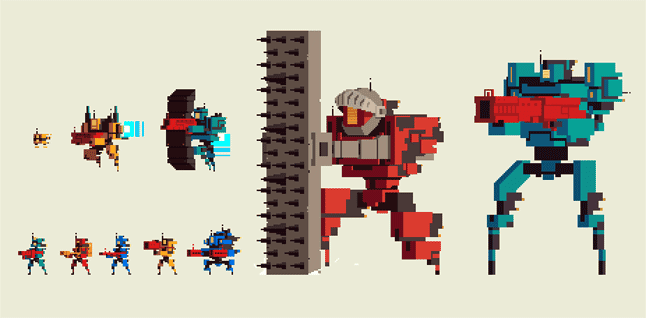
Enemy Blounbot designs
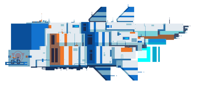
The Super Time Force Spacebus HQ
A game with character(s)
Another defining feature of Super Time Force is its... how should we say, goofballery? Love it or hate it, the game never, ever, takes itself seriously. This decision, however, to make the game skip from one dumb joke to another awful pun was actually not a decision at all. It was the art itself that organically suggested the tone of the game and everything else followed suit.
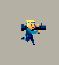
Try as he might, Vic can't seem to draw things that aren't cute. There's a sweetness to the characters he made, and the weapons in their grasp have the effect of instantly parodying the conventions of action games. Their facial expressions are almost placid. They wear a contented look as they're engaging in the intense pyrotechnics of the gameplay, which then underlines the joke of the STF's recklessness.
This de-emphasis on facial expressions was born out of Vic's lack of confidence in his own animation skills (he sheepishly claims, and we obviously disagree). He wanted to make the characters as small as possible so that there would be less real estate to have to animate. This approach however, ended up creating a limitation that itself bred style.
Game jam version vs. final STF version
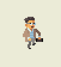
Instead of channeling character personality through facial expressions, Vic defined the traits of each character through their bodies and how they were animated. The gait of their walk, the way they handle the recoil of a weapon. One character, none other than President of Sony Worldwide Studios Shuhei Yoshida himself, swings his arms merrily in his walk-cycle making him look like a kid in a playground of his own making, which in essence, he is.
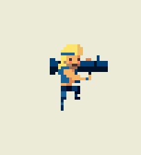
Eventually artist/animator Kelly Smith came onboard to help out, and she is not only one of the funniest people on the planet, but she has none of Vic's confidence issues when it comes to animating. But in following the conventions of character animation he had set, she brought even more physical comedy and personality to the roster of 19(!) playable characters, as well as enemies and bosses. The limitations ended up being a great asset for building memorable characters.
Animations by Vic, Kelly, and Kelly
It was Vic's inability to conjure machismo that set the silly tone of the game from the start. Every level, enemy and story idea flowed out of this. If he'd been artistically capable of creating square-jawed space marine-style characters, perhaps we would've taken Super Time Force in a different direction. So if you don't like the constant barrage of time puns in Super Time Force (and some of you surprisingly, vitriolically don't), it's actually Vic's fault.
Super Time Force is sooo last-gen
People that love Super Time Force often say the same thing as the people who hate it: it looks like it could've been a 16-bit game. While it amuses us that this statement can be used simultaneously as both props AND a dig, ummmm, no. No, it could not have been.
We had to optimize the hell out of it to get it to run on an Xbox 360 and getting it on the PlayStation Vita was a herculean task that absorbed us for months. There was so much art that we actually ran out of texture space! With pixel art! At one quarter resolution! In the year 2014! That's crazy! The reason for this is precisely because we never ever thought of Super Time Force as a "retro" style game.
Animation and design by Kelly
We used pixel art not as a trick to ingratiate Super Time Force into the heart of classic gamers, but simply because we love it. We didn't use it because we are minimalists; we used it because we are maximalists! To create a beautiful animation in pixels takes as much effort and artistry than any other process, and in some cases, more!
We added as much lush visual effects and attention to detail befitting a console game because to us, the insane design and technical hurdles to bring it to life demanded it. We didn't pull any punches or assume the expectations on us were lower because we were using pixel art. Every member of the team felt the same way, and as a result Super Time Force is bursting to contain all of the ideas/jokes/mechanics/collectibles/etc.
In many ways we all feel like Super Time Force is the MOST Capy game we've made so far. Heck, we even circled back and added more stuff to make it ULTRA! It was really the first game we made with no prior dictates on it. As a result, we all treated the game as an amplifier that we could plug the soul of the studio into and wail away on. It was the pixel art, in all its blocky glory, that kept us all in tune.
You May Also Like


.jpeg?width=700&auto=webp&quality=80&disable=upscale)


