


Daily news, dev blogs, and stories from Game Developer straight to your inbox
Sponsored By
Featured Blog | This community-written post highlights the best of what the game industry has to offer. Read more like it on the Game Developer Blogs.
Aegis Defenders & Nausicaa - Character Design Process
Bryce Kho, Game Director & Lead Artist of Aegis Defenders, talks about the comparison between the character designs of Aegis Defenders and Hayao Miyazaki's Nausicaa.
21 Min Read

First off, allow me to introduce myself. My name is Bryce Kho and I’m the game director, lead artist, and story co-writer at the GUTS Department, a new game studio working on its first title called Aegis Defenders. Today I’m going to tackle a very important issue - the comparisons between Aegis Defenders and Hayao Miyazaki’s Nausicaa and the perceived plagiarism. We have come out openly saying that the game was Miyazaki-inspired however that term was meant to express how we wanted to channel the same feeling as his films - in the same way that we wanted to channel classic Super Nintendo games like Final Fantasy and The Legend of Zelda. At no point did we attempt to copy or even reference the character designs from Studio Ghilbli's Nausicaa. Unfortunately for us, when you compare our character designs side by side, it does look suspiciously similar and our pure intentions can begin to look murky.
This blog post will chronicle the real story behind the Aegis Defenders' character designs, my personal point of view, and how there was never any intent to steal from Nausicaa. I'll go into more detail on what our plan is to rectify the situation at the next line break(TLDR - we’re going to adjust them).
==================================================================
Aegis started as a student project. Because our game started out as something completely different, where you played as a couple of old engineers who were building a mech while being chased by giant monsters - the main characters were originally just a couple of cute, old bearded men.
Some crude concept drawings from when we first sat down and discussed the idea
The inspirations for Bart's character design came almost entirely from Final Fantasy's recurring character Cid. I also referenced fan art from the second Hobbit movie which had recently come out at the time. So Bart was created in about two passes. It was pretty straight-forward and had been done hundreds of times before - an old man with a beard, goggles, and a hood.
References: Cid(Final Fantasy 6), Cid Fan Art, Cid from Final Fantasy Tactics, Hobbit Fanart
First pass of Bart’s sprite, second and final pass on Bart’s sprite
It's also important to point out that all of the art done at this point was in pixel art - so the actual style of Bart’s design was really due to the innate limitation that comes with pixel abstraction. I was really into the art of Super Time Force and Swords & Sworcery. Their games feature simple, elegant designs rather than using intricate details for differentiation and in our case, a pointy hooded cape is about as far as I wanted to go.
Other inspirations: Super Time Force & Swords & Sworcery
After iterating on the game’s design, we eventually grew tired of the idea of only old white-bearded engineers because it would be too boring in a single player campaign to switch between two characters that did the same thing - we thought a gunner would be a simple and cool way to mix it up. We color swapped Bart to a complementary color and given that we had to draw a new shooting animation, naturally changed it a bit as well. Thus, Clu.
Clu was drawn quickly by simply doing a color swap on Bart and then adjusting some details. Normally, you’d give a new character a completely different outfit but because we were working under tight time constraints, this was simpler.
Aside from the color of the cape, the gunner was basically identical to Bart - I even used the same color as Bart’s gloves for Clu’s hair and the same color cape for her gloves. If you want to get all meta, you could even go so far as to say that one of the reasons we decided to make them blood-related was because Clu’s design was born of Bart’s ilk. We picked blue because we wanted to give her a strong color that didn't sexualize her like red or pink might have. She was just going to be a cool, sarcastic girl who was a badass. What could go wrong? Seemed like a progressive, forward-thinking thing to do.
And that was that. We wouldn't revisit the characters ever again. When we showed it to classmates who all enjoyed it and would hear comments that it reminded them of several different franchises - Nausicaa was one of them but so were a many others. People constantly would tell me it reminded them of their favorite game of all time that I had only vaguely heard of or not at all. The only time I was accused of ripping something off was when my friend told me that Aegis itself looked like a Shadow of the Colossus clone. “Fair enough,” I said and immediately tried to rectify the situation.
Shadow of the Collossus, Three iterations of Aegis’ design
It wasn't until months later, when our in-class project was almost complete and we had started to think about the KickStarter that I even bothered to look at their designs again. By this time, in my mind I had owned these designs - aside from that, could an item as common as a hooded cape really be in danger of copyright? Whenever I did see Nausicaa, the details or similarities were as similar as Clu was to countless other franchises. She's blonde, wearing predominantly blue, and has boots and gloves but so do countless other characters from other games, from Zero Suit Samus to the new Link design for Zelda Wii U. My limited exposure to Nausicaa and naivety told me that people would see the similarities in the same way that so many other games pay homage to Studio Ghibli films.
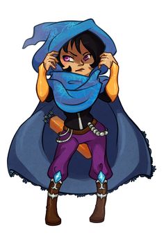
Clu’s Earliest Concept Art(based off of her sprite)
Various Nausicaa images - in my defense, Nausicaa's character design is fairly flexible. Some of them look very different from Clu while others look very similar.
Various IPs that I thought were similar but negligible - Metroid, Towerfall, Legend of Zelda, Princess Mononoke
Most importantly, my main concern with the game was its overall story - something I had been working on for several years for a graphic novel. The premise of a future where humanity worships robots as if they’re gods felt pretty unexplored. Besides, Aegis was always just a prologue to a bigger story anyway, meant merely to introduce us to a world that the graphic novel would further expand upon. With those things as my major priority, a passing mark in character design felt like the least of my worries.
And my naivety continued and this idea that everything was fine was strengthened when we showed off the game at anime conventions. At both Anime Conji and Anime Expo, people would say it looked like Princess Mononoke(my personal favorite Ghilbli film), Risk of Rain, Minecraft, Cave Story, and dozens of other games. Nausicaa definitely came up but when it did, it was always an overwhelmingly positive reaction - the type of reaction that not only validated the design but encouraged the comparison. Part of the reason we never looked deeper is that no one ever challenged the art or criticized the comparison. I suppose that might have been because (A) the movie came out before many of the convention goers were born - including myself - and (B) because people were too polite. In either case, our sample size was thousands of people and yet, no alarms went off.
Photos from Anime Expo
So comes my surprise when the internet sees the game and I start to see actual discontent with our art. I'm no pushover and I can take critique but the overwhelmingly negativity of some posts definitely takes some stomaching. My team assured me and continues to assure me that it's nothing - that haters are gonna hate - but still, to be accused of artistic theft is nothing to scoff at, especially for someone who prides himself on striving to create something original. And so, I finally decided to do something I should have done a long time ago and a responsibility that I ignored - I researched Nausicaa.
To be fair, I do not think that simply having our female protagonist in blue constitutes artistic theft but the similarity in shape structure is questionable(i.e. a pointy headgear). I do not think having an old man with goggles and a beard is artistic theft however, because putting one next to a girl in blue has only been done once before, I can see how it becomes questionable. I cannot tell you how horrified I was when I saw that somehow, against all odds, that my character Bart, who I had given with a mohawk distinctly to make him original and unique looked just like Yupa. I questioned my own subconscious for making Clu look too similar to Nausicaa but Bart, never in a thousand years would I have guessed. It was at this point during my google search that I conceded and fully decided we had do something.
Early Bart concept art(based on the sprite) versus Yupa from Nausicaa. Are you kidding me. I still can’t believe he also had a mohawk under there. I always thought Bart looked like the other old men from Studio Ghibli films but so does any old, engineer, dwarf, gnome, bearded, santa-looking character.
==================================================================
So, after that long winded explanation of why things are the way they are, what do we plan to do about it? First off, it's too late to change all of the art on our Kickstarter page to reflect the extent of character design changes we will make inevitably. It has taken nearly 10 months to arrive at where we are in development and that kind of work isn't going to simply be fixed with a few photoshop tweaks. With that said, we will change the character designs to something different without jeopardizing the original intent and tone of our game. Here’s a look at what I’ve tried out so far. Please note that the above designs are still a work in progress and not final designs.
I’ve attached them mostly to demonstrate how we want to alter Clu’s design by emphasizing the hood more strongly, giving it a more downward and heavy shape as opposed to Nausicaa’s pointy one. Aside from the shape structure, the next similarity to address is the color. Right now my favorite color is this teal color because it still looks like the Clu that I know while still have a degree of separation from Nausicaa but as I get to experiment more, this might change further. In short, the design changes will be minimal but strong enough to give our game a differentiated feel.
If you believe that our world is too similar to Nausicaa, my answer is that our world is much bigger than what we’ve shown you so far. While our game explores a similar time period(post-post-apocalyptic), it explores a very different overall theme and world - a future where humanity worships robots like gods. Many of these gods are inspired by actual mythologies, from Greek to Native American, and I’m confident that this will not be an issue. If you have other issues with our game’s art - as in, you think X or Y is too similar to Z - I can only say the same thing, “maybe it is similar but you haven’t seen what we do with it.”
Concept art of Shem that was drawn during one of our live streams - Shem is a robotic god inspired by ancient Egyptian deities such as Ra and Osiris.
In conclusion, to those of you who are upset about Aegis Defenders looking too similar to Nausicaa - I am sorry for not doing my homework on the designs to check out pre-existing properties and that it looks like I was trying to steal from Studio Ghilbi. But here’s what I’m not sorry for: I’m not sorry for any of the work that I’ve done. All of the work I did came from myself. Like anybody who creates, I was drawing from my own mind, dreams, and experiences - however influenced and inspired by the artists that I love. I love Studio Ghibli and would never want to hurt or take advantage of a studio responsible for films that have given me so much. I am not some money-grubbing cheat trying to make a quick buck - I’m just a person who wanted to tell a story. And as a human being, I’ve made a mistake of not being aware of my surroundings and thinking about the way my actions would be perceived.
Thank you for taking the time to read this.
Sincerely,
Bryce Kho
Read more about:
Featured BlogsAbout the Author(s)
You May Also Like