Daily news, dev blogs, and stories from Game Developer straight to your inbox
Sponsored By
Super Rad Raygun's self-imposed constraint: a 2-bit color palette
“Maintaining a clear distinction between foreground and background is a constant struggle. You also don't have any way to use color to hint to the player what's dangerous and what's beneficial."
5 Min Read

Developers working with the Nintendo Game Boy had to create coherent graphics using only a monochromatic 2-bit color palette. Four shades of grayscale were available: black, dark gray, light gray, and white. (Actually, given the tint of the screen, it was more like a greenscale color palette.) Despite--or perhaps because of--the strict limitations, artists created some truly memorable and iconic imagery on the classic handheld.
And now, modern devs are paying homage to the unmistakable Game Boy aesthetic.
Tru Fun Entertainment's side-scrolling platformer Super Rad Raygun, available on Windows, Mac OS X, and Linux, is the latest in a long line of titles to voluntarily adopt a limited color palette to tell its story. (Other recent examples: Reap What You Sow, Tiny Dangerous Dungeons, and Derelict.)
“The original plan was to use NES-style graphics, but we kept boiling things down to simplest terms,” explains Chris Bryant, lead programmer on Super Rad Raygun. “And nothing says retro like the 4 colors of the original Game Boy!”
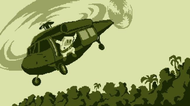
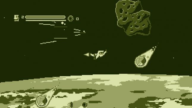
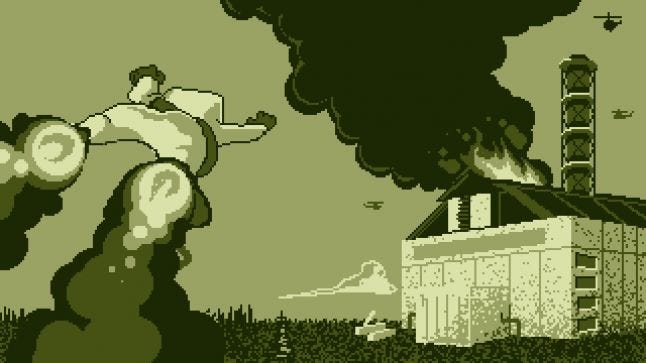
In Super Rad Raygun, you play as a Game Boy-shaped robot who must travel from city to city, collecting power-ups and gunning down the communist machines responsible for destroying the White House. It’s an homage to the 1980s and the video games that the developers played in their youth.
This style, however, came with some huge problems to consider. How were they to compensate for the lack of color, and differentiate between the separate assets on screen? To overcome this problem, they added a lot more detail the image, and gave players contextual clues using the limited shades they had available.
Working within rigid constraints
“The Game Boy hardware is so limited that it's not necessarily that developers made great graphical achievements -- it's more that they managed to create any atmosphere at all," says Chris Hernandez, the lead artist on the game. “Castlevania on the Game Boy has some great examples of that where the background is essentially a blank screen, but there are smatterings of 2-tile 'crack' textures. Combined with the stone tiles in the level, it somehow manages to evoke the grungy, run down look of the opening levels of the NES Castlevania.”
On top of the issues with creating atmosphere, the developers had other problems to address, the most pressing being how they’d communicate specific mechanics to the player with only the four shades if greenish gray available to them.
“The disadvantages are readability, definitely,” admits Hernandez. “Maintaining a clear distinction between foreground and background is always a constant struggle. You also don't have any way to use color to hint to the player what's dangerous and what's beneficial. A lot of games will use a system where green things help you and red things hurt you - but we don't really have that option, and have to figure out other ways to introduce players to the different elements of the game.”
Contextual clues in a monochromatic world
The team discovered a number of tricks that they used to save time and get around some of the difficulties that they’d been encountering.
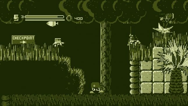
Another example of this in practice is the health drops in the game. Enemies who are a lighter shade of green, like snakes, graffiti animals, and sentient flames, leave behind health items for the player to pick up after dying. This is a way of subtly telling the player they should try to locate this kind of enemy if they’re running low on life.
“The advantages are that a lot of inconsistencies or back and forth decisions on colors don't happen,” says Hernandez. “I don't even need a saved palette to work with, because I just memorized the 4 color hex values. You can also do clever things like reuse projectiles...if one enemy spits water at the player, and another throws lava at them, in a 4-color palette you can just use the same sprite for both and let the player's understanding of context fill in the rest.”
Cheating the limits
Tru Fun Entertainment ended up reverse engineering the Game Boy aesthetic, doing all of their artwork in grayscale before tinting everything green with a shader and placing a pixel grid overlay over the finished image.
Because the team had more memory to play with, they were able to solve some of these complications by cheating and using larger sprites than were possible on the Game Boy. They also had a greater number of these assets onscreen at any given time, with the total sprites trumping the Game Boy’s maximum allocation of 40. This ultimately meant levels and characters became much more detailed and easier to read.
“We have much bigger levels with more tile variety than you could ever do on a Game Boy," says Hernandez. "We generally have more sprites on screen than you could on a Game Boy as well -- both from enemies firing bullets at Rad, but also because lots of our background elements are actually sprites, we have giant sprites that wouldn't ever work on a Game Boy, and enemies have dozens and dozens of animation frames that would blow through the memory on a Game Boy.”
As a result of these improvements, each level received a more pronounced atmosphere. The New York City stage, for example, is especially grungy, with garbage and wire fences littering every inch of the frame, while Mount Saint Helens has a more natural appearance packed with tumbling boulders, foliage, and wildlife. This would have been extremely difficult to pull off on the original Game Boy as it only allowed 256 unique tiles.
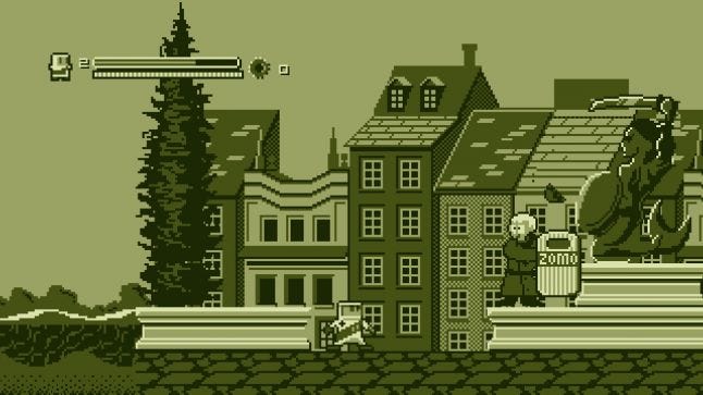
Thanks to the detailed character animations, Super Rad Raygun is also much smoother. These additional frames of animation inject some necessary speed and charisma into the game, as well as give Rad and his adversaries a discernible personality.
The end result is a game that amps up the Game Boy aesthetic, creating a look that's not exactly what you would've found in 1989, but that perfectly recreates how you remember those handheld classics in your mind's eye.
About the Author(s)
You May Also Like