Daily news, dev blogs, and stories from Game Developer straight to your inbox
Sponsored By
GDC Lyon: Antonov Talks Visual Design, Half Life 2
At the 2007 Game Developers Conference in Lyon, Half Life 2 art director and concept designer Viktor Antonov discussed how visual design in games can be so much more than a pretty package to drive sales, explaining how carefully-crafted game visual
December 3, 2007
5 Min Read

Author: by Evan Van Zelfden, Leigh Alexander
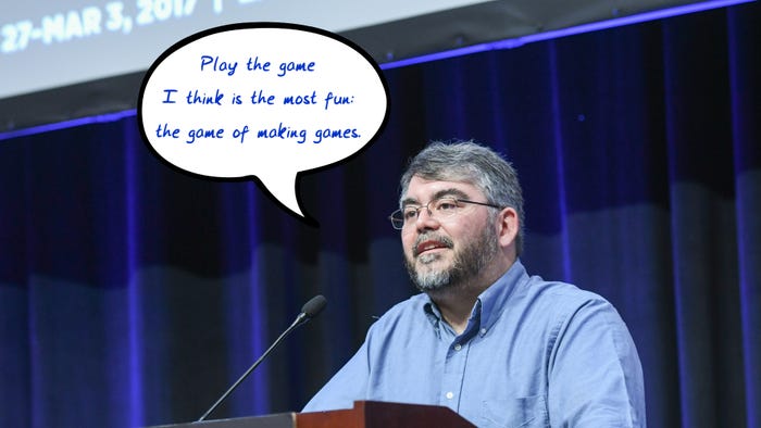
At the 2007 Game Developers Conference in Lyon, independent art director Viktor Antonov, who art-directed and did concept design for the award-winning Half-Life 2, discussed how visual design in games can accomplish so much more than a sales-driving pretty package -- the game world can be a powerful tool for storytelling, and with that in mind, Antonov presented his lecture on meaningful visual design in games. "The topic today is sort of abstract," admitted Antonov as he began. "It's more about defining... the design process and visuals and the story for a game — and I think that [applies to] everyone on a game.” Visual Design vs. Graphics Antonov pointed out that there can be a great deal of confusion about what is graphics and what is art direction. "Nowadays there’s a general consensus that visuals are just as important as anything else in a project because if it looks good, it will sell," he said. "Everyone happens to agree — which was not the case a few years ago. Gameplay was more important, or engine was more important." He continued, "The misinterpretation that happens in production, oftentimes in production teams, is that managers and project leads often perceive visual design as a packaging design for the product. They’ll say, we’ll have the game, game dynamics, gameplay, we’ll make it pretty, and people will like it and consume it.” “I’ve seen this in production," Antonov added. "A project is planned, and then a 'coating' of art is applied. I’d like to step back to a point, and change this perception if possible.” Invisible Storytelling Asserted Antonov, “Visual design is actually a tool for communicating; visual design has a different function than packaging and selling the product.” He had one key point to stress about visual design: "It’s really, really strongly linked to the story, whenever there’s a strong story present in the game.” This could mean using shapes and symbols to tell a story similar to the way letters and words are used to compose a written narrative. Visual design can also comprise emotional information, or rational information. Explained Anton, “In a well designed game, every little piece has a meaning... skillful storytelling is invisible storytelling.” He added, "Games are consumed through the eyes, and are a visual medium. They should use the language of the eyes, and not have a story pushed on them.” Realism Antonov advised discussing realism early on in a project -- not photorealism, but the internal logic of the game world. “When you invite a player to play a game, show him you’ve mastered the medium enough to convince him of anything," he noted. And Anton illustrated how sometimes creating realism can hinge on what the visual designer leaves out -- "like a good photographer," he said. He talked about starting with a banal, boring world at the start. “The more you do that, the most science-fiction you can sell later.” He showed a screenshot of a building, with a common-looking texture. “In cold weather, people use double windows,” he explained, pointing out how modeling the game's double windows took little effort, but added more depth and realism to the world with one simple texture tweak. Antonov said that the worst part is spending days and weeks figuring out the parameters of the world. “How thick are the walls? What is the plaster made out of?” The environment is an amazing medium, he continued. “You can have a whole story in one texture.” Everything means something, he stressed. The back story is important, too, and Anton says incorporating it is simple; you develop those back stories in the design process. “I always imagine some little story that happened there before, not finish it -- just suggest it," he offered. He discussed location serving as another interesting way to enhance the story. In Half-Life 2, he explained, they tried to have some of the monsters not in halls, but outside on beautiful autumn days. He cited the Stanley Kubrick film Barry Lyndon -- set against gorgeous landscapes, but with cruel, tiny people. “Let’s not forget, a game is a series of images,” he added. Creating Contrast and Form “If you have a chance to do that, turn it into black-and-white,” he continued. “I always start with the idea that every image needs an even distribution of darks and lights.” He continued, “Even more abstract, we can give out information through the language of form.” He talked about the difference between horizontal and vertical, calling the horizontal "very normal," while, “there’s something frightening about the vertical.” He talked about one project that featured cylinders. “Choose a theme of form, and stick to it,” he said. "When you’re picking a theme, you can ask yourself, ‘what do I want to do?’ Then you have all these tools to achieve that." Good looks may not be the essential goal, as Antonov illustrated: “Technically, a post-card looks good. But that’s not what we’re after.” He opined that there should be some slightly off-putting or disturbing elements. A prime example, for Antonov, is the film Rosemary’s Baby, where a key scene is blocked from view by a doorway. Without these sort of strategic images, Antonov said, a game can simply become "decorative art." Finally, he talked about how players appreciate art that took this much effort. He recalled seeing Half-Life 2 testers running quickly through a level and not looking at the level’s art work and thinking, "well, there’s a year’s worth of work wasted." Concluded Antonov, “You can’t really predict how people will react, but you can sometimes do the opposite: you can attract them in a certain direction."
You May Also Like