

Daily news, dev blogs, and stories from Game Developer straight to your inbox
Sponsored By
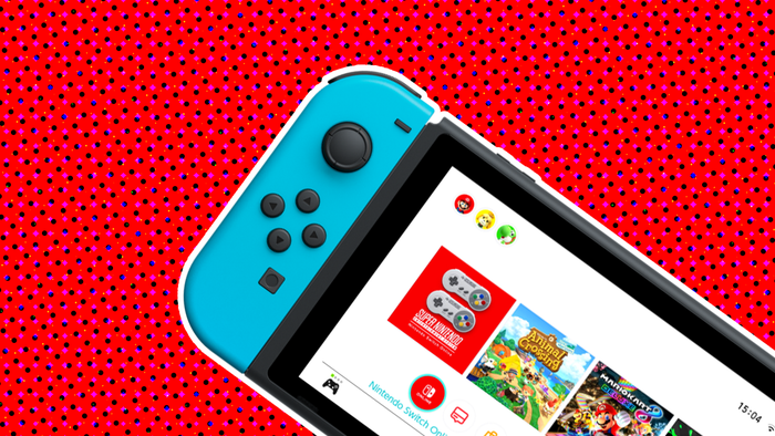
Featured Blog | This community-written post highlights the best of what the game industry has to offer. Read more like it on the Game Developer Blogs.
What to steal: From Destiny’s UI
There's a lot of good stuff in Destiny's UI, good stuff that isn't out of reach for indie devs.. may be worth stealing some of it ;)
11 Min Read

Going to make this into a mini series, of sorts, I think. Blog posts talking about cool stuff done in AAA that we can steal on the lower budget end of things. I did something similar about AAA input smoothing, here.
Basically, Destiny’s UI does a lot of very clever UI stuff, some of which I’ll probably steal for Volume, some of which are just really great examples of UI design in general, and some of which I hope to learn from for future projects.
This isn’t a review, I’m not a critic, just noticed a bunch of clever stuff that wouldn’t be hard to duplicate on an indie budget. Polish costs time, but my goodness does a game benefit from it.
Also, the UI in destiny, judging from twitter, seems a bit marmite. It’s OK if you disagree with my taste, hopefully the lessons are still valid if you do ;)
THINGS IN THE DESTINY MENU SYSTEM AND UI THAT ARE COOL
Colour bar flashes on in game UI - white is standard ammo, green is secondary, purple is heavy, yellow is super charge. That’s a pretty common way to do visual language in a game.. colour coding for the win. One aspect that is cute in Destiny is that events are signposted in the UI by big block colours flashing over the entire lower interface. This uses peripheral vision to help the player stay on top of ‘things happening’ with multiple timers and ammos. More complex information is conveyed if the player takes their eye off the reticule (recharge bars, ammo count etc).. but these big colour flashes are a clever way to yell at the player without being too noisy.
Elective waypointing (flawed, but a cool idea) - A frustrating aspect of AAA games is the ever present waypoint.. it kills the illusion of choice in a number of games.. turning it off made the latest Thief 10x better. That said, in big or visually repetitive spaces, these signposts are useful. Destiny goes for a halfway house of a pointer on a map, and in world markers when we summon Dinklage. This is spoiled for me by a couple of niggles (although admittedly, you get used to it eventually:
The mode switch (allowing for Dinklage bot to spawn) is just a litttttttllleee too slow, or feels too slow. It’s enough to make bringing up the menu a chore. This is fine for other functionalities (summoning vehicles, leaving world) because they are bigger events with more waiting, but that wait for info you just want to glance at grates a tiny bit.
The radar and onscreen indicator are not as the crow flies, they’re more breadcrumby, presumably due to the complexity of the indoor environments, and the verticality of the overworld. This is fine when the indicator is on screen and the player is walking, but on vehicle, or relying on the radar, this often led me off in the wrong direction. I’d have preferred radar to be absolute location, marker to be bread crumb.. but then.. I’m sure the designers tried this and it didn’t work. They are smarter than me, as proven by every other choice in this interface.
Immediacy of action - in menus, count the clicks to do anything.. compare that to other action RPGs. Yeah. Destiny’s UI owes a lot to web design here, and a lot of that speed is down to the cursor (more thoughts on cursor later).. but yeah, if you let the player point, that gives you hover, and hover = speed of information and nested interfaces.
Object / character / planet metaphor simplicity - this isn’t a new idea, but I thought Destiny did it well enough to point out: everything is tied to a logical realworld metaphor, usually an object. Messages received must be picked up from the postmaster on Tower, bounties are carried in the inventory, not held as sub objectives. Part of this is to create busy work and force regular returns to the social hub, sure, but it goes a long way to simplifying and better communicating interactions. We understand the idea of collecting a slip of paper and taking it to a man, we understand ‘going to a specific place on the moon’ better than ‘going to the moon and selecting mission 4’.. this gives the game a sense of bedded reality, and breaks understanding into little chunks, preventing the player from feeling overwhelmed.
Parallax menu, movement responsive to input - A nice little layer of aesthetic feedback.. your cursor’s position moves a number of parallax layers across all screens. This makes the game feel more responsive, and indeed, makes the act of moving around the cursor absentmindedly fun. There’s a big caveat though: Don’t overdo this. If every scroll through a menu flips the screen, or causes an explosion, or plays a fanfare, your menu will get very old, very fast. Brevity is the soul of wit here, but having interaction trigger aesthetic ripples in a subtle way sure does make things feel good.
High res menu assets - Something that RPGs have been quietly doing for years, but doesn’t get pointed out often: It is exceptionally cheap (performance wise) to render a menu on modern games hardware. This frees up a whole lot of graphics elves to do one job very well. In Destiny, high res assets of in game objects are used, with a presumably reasonably expensive (again, performance wise) depth of field effect. If you render a gun, rather than a gun being held by a character in a rolling landscape, you can throw a lot more polys at that gun. Bear this all in mind, menus let you show off assets in their best light. Volume does closeups of the hero character with nice DOF and lighting effects, if you have high res versions of game assets that you’ve modelled for normal maps, try throwing them in to menus.. you’d be surprised how far you can push stuff when you’re not trying to run AI / world art at same time :) If your game isn’t poly heavy, maybe there’s an incredibly wasteful effect you can use on menus? Something you wanted to use in game but couldn’t run without killing framerate.. there may be a place for it in the menu.
Cursor - I’ve mentioned the cursor above, but yeah.. cursor on a console game is a brave move. The team at bungie did some smart things to make it work well though:
Slow down on hover: when over objects player may want to click, they slow it down ever so slightly large ‘click’ area.. there’s a reason that cursor is not a pointer, but a large circle: It makes chances of accidentally missing much lower. On button items next to each other, my guess is that it calculates which button center the center of that circle is nearest to.. so it’s still a pixel cursor, just with a circle of autoaim around it. Very clever way to make a cursor work on a console.
Allowing diagonal movement allows for non grid layouts. Gaps are hard to communicate on menus, so everything tends to go very up down column row table. Having freedom of movement allows for interfaces with more human friendly layouts, relying on grids only for aesthetic and informational purposes, over the limitations of a dpad.
Try clicking the L1 R1 page heading scroll at the top with the cursor. You can’t, the cursor is locked below that horizontal bar. Instantly makes it clear that the cursor can’t interact. Tiny bit of polish which further cleans up interaction
Hierarchy of information - across the board, the menu uses colour and scale to convey hierarchical information. The bigger the text, the more important the information stated. Colour equals expandability or more info. Day one of graphic design school for magazines, cool to see it find its way into a videogame menu.
Potential issue - does a super simple menu imply shallowness? - more of a question.. It feels like a lot of the claims I’m seeing that the game is shallow may be in part a side effect of menu simplicity? Would a more convoluted interface make the game feel more complex? Probably.. we see this a lot in other action RPG games. Not saying this is the only reason for these criticisms, but this may be a problem exacerbated by such smooth and streamlined interface design. Games are, after all, fun convolution of ‘press x to win the game and see the credits’.. maybe this interface strips too much back.
Intent for play defined on map screen, not in world - I like this part. I can’t land on a planet without defining what kind of a mission I’ll do. This is an open world game where we decide intent before arriving.. meaning that you don’t need a big convoluted map with icons for side quests, story missions or events ala GTA. For me, this streamlines multiplayer (everyone knows exactly where they’re going) and adds to a sense of wonder and awe (the environment isn’t being constantly quantified by frequent visits to a map screen) also, vitally for a multiplayer game with no pause button, it lowers your need to pull up a fullscreen menu in hazardous environments.
So yeah, a brain dump. Plenty of good design in Destiny, probably a lot to learn from. I’m off to a wedding. Hope my assorted noise on this topic was interesting to someone :)
Read more about:
Featured BlogsAbout the Author(s)
You May Also Like
Latest News

Trending


Featured Blogs


