

Daily news, dev blogs, and stories from Game Developer straight to your inbox
Sponsored By
Featured Blog | This community-written post highlights the best of what the game industry has to offer. Read more like it on the Game Developer Blogs.
Visual Cues In Level Design
A concise look at visual communication through-out the playground.
4 Min Read

As a designer it's an absolute principle to rigorously strive to compose smooth and seamless - uniform interactions for users. Unless your game consists of a constant push forward through a strictly linear progression, you'll need methods of communicating route to players.
This study makes an effort to simplify this process, with a short look at popular methods, and how they are interpreted.
Coordinated Placement:
If cues aren't placed to reflect our design, it can cause confusion within the playground.
It's sometimes easy to forget how much design and art need to coexist. Nevertheless; we need to make sure our visual cues are properly motivating, and suggestive to on coming successions or arcs within our games.
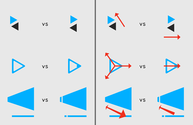
Consistent Color Palette:
Here's a great method of color communication using Dice's - Mirror's Edge as an example.
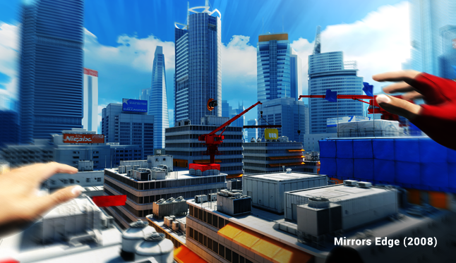
Mirror's Edge provided its players the option to use a guidance feature called runner vision.
It used the color red to communicate objective to the player. Each red object was essentially an advancement within the progression of the games design.
In short; It basically pointed out certain objects just to say "hey go this direction", and it more than properly directed its players through the games less-than linear layout.
Other games will run strips of color along walls and floors, or just as in this example, contrast certain objects to ask progression of the player.
Most multiplayer games will color each teams base the teams color as a method of sighting cross team awareness, or even to invoke a sense of possessiveness in players.
Color cues are truly the best way to spark intuition in our players. Making contrast king in terms of visual communication.
Id like to reiterate the importance of making sure, were not misguiding our players, or causing
problems within our design.
It's essential to remember the difficulties of mixing these cue colors into our default aesthetic color palette, because players may begin to heavily rely on them.
If they're used in non design essential areas of the playground, it can cause confusion, or render our design oriented placement unnoticed.
Identifiable Iconology:
Iconic symbols are wildly embedded in our daily lives. We've grown to understand that certain symbols indicate specific objects, functions, or oncoming circumstances. So it's best to bring this almost instinctive concept into our games.
An arrow will say to a player "hey, go this direction", and a skull and crossbones will invoke the player to think "whoa, lets not rush into anything here”.
This method is extremely easy to introduce into our games , and is relatively efficient in terms of design and implementation.
Interactive objects such as explosive barrels, or switches should be marked with parallel symbols, that suggest function to the player.
It's also important to understand the perceptive notion these symbols or indications present. Relative to placement or 'hint'; it's possible to confuse players.
Responsive & Indicative:
Responsiveness and Indication in the realm of surface embellishments are extremely easy ways to
communicate direct interaction, while giving a player the sense of depth.
It's important to communicate state to a player. Aside from check marking some hidden box within the UI. It might be a better idea to give our players the impression that the environment is alive and active by altering a certain object along with an event.
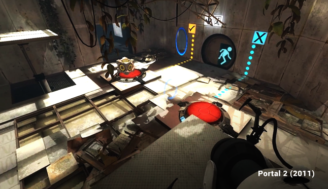
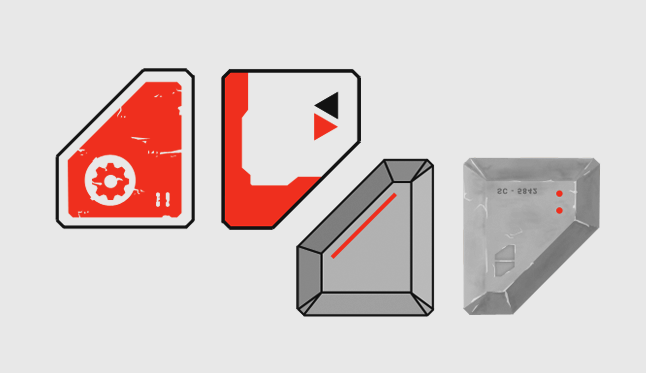
Valve's game Portal used indicative embellishments that communicated state as
a cube compressed one of the buttons (shown in the figure above). The embellishments would change color, and even flip through distinct symbols to illustrate success, or a need for growth.
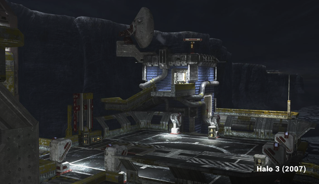
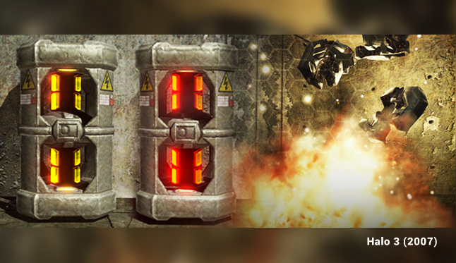
Another adequate example is the fusion coil in Halo; it had a set amount of regenerative health, and changed colors between yellow and red to translate its condition to players.
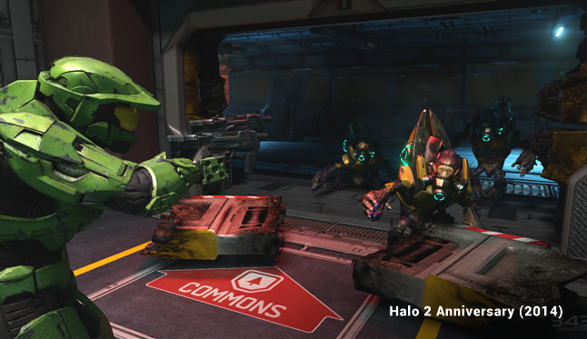
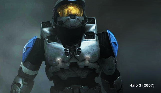
It used the same type of system on its player models for multiplayer; if a player was shieldless, their illuminations would become distinguishably brighter, which would then alert any interpreting player.
A Constructive Examination:
Read more about:
Featured BlogsAbout the Author(s)
You May Also Like
Latest News

Trending


Featured Blogs


