Daily news, dev blogs, and stories from Game Developer straight to your inbox
Sponsored By
The Basics of Localization, Part 5
Good UI in a game is sometimes hard to find. Great UI is even harder when it pertains to text. In Part 5 of my Basics of Localization series, I'll walk through the challenges of localizing UI for video games.
5 Min Read

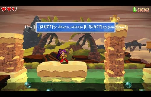
A little text overflow goes a long way. (Shantae: Half-Genie Hero [Early Access], WayForward, 2015.)
In my experience doing localization so far, the hardest thing to do is probably the UI. It's a welcome challenge because it tests my ability to describe things in great detail in only so many characters. Things like skill names and abilities can really whittle away at your patience as you rack your brain trying to come up with an acceptable 4-character term that was originally 20. (Trust me. It's harder than it sounds.)
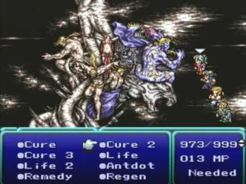
Six characters were allotted in the magic menu. The skill Antidote took a slight hit with character limits. (Final Fantasy VI, Square, 1994.)
Character limits are often really short because of the space allotted in a window. An ability name translated as Blizzard, for example, may need to be renamed Ice for spacing purposes. Fortunately, these usually mean the same thing, at least in most contexts. Other substitutes might suffice, especially if you have similarly-named abilities. So skills like Snowstorm or Freezing Chill, for example, can probably be named Snow and Frost, respectively.
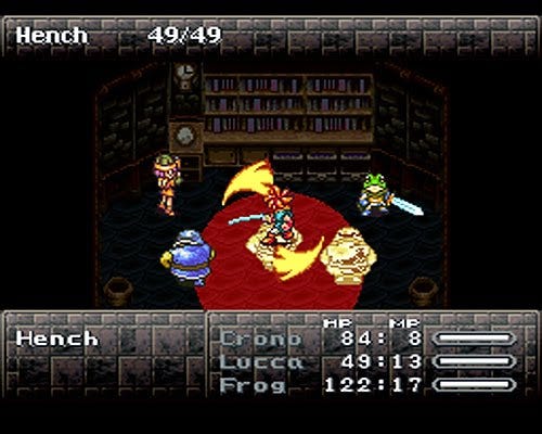
The Tech ability Fire Whirl was used twice: once between Crono and Lucca, and again between Lucca and Ayla. Despite the similar appearance and firepower, the attacks affect a different set of enemies. (Chrono Trigger, Square, 1995.)
Another challenging thing about localizing UI is not confusing two skill names. Let's say you have the skill Dark. Well, some players might go ahead and think that that's a Shadow-type magic attack. Other players might think it's similar to a negative status effect, like Blind. In a similar vein, Light could refer to an abbreviation for a Lightning-type attack, or even a positive status effect such as Float. Translated or edited incorrectly, you might use a Light spell on yourself, thinking that you'll be granted the ability to float...and KO yourself as a result because your character is weak to lightning. Whoops.
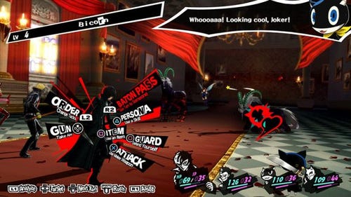
That UI, though. (Persona 5, ATLUS, 2017.)
As aforementioned, spacing plays a huge role in localizing UI (and all text, for that matter). Not all text boxes appear as rectangular windows. They could appear as squares, circles, triangles, and any and all geometric shapes out there. A triangle-shaped window might only be able to fit three characters, for example. So if you've got the text ATTACK in the triangle, it would need to be shortened to something like ATK to prevent text overflow. It's much harder to increase the size of the triangles, especially when it might overlap with other UI.
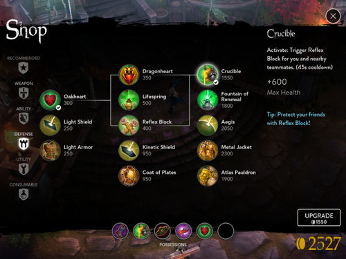
Imagine if the "Max Health" text on the right wasn't present. You'd have no idea what +600 meant! (Vainglory, Super Evil MegaCorp, 2014.)
Sometimes, localization teams will get UI strings without context. Say you get a string translated as "Raises %", for example. Well, raises percentage...of what? Strength? Defense? Magic? Speed? In instances like these, it's always best to get clarification about what a particular string means. And if "Raises %" is already too long, an alternate like "% UP" may be necessary.
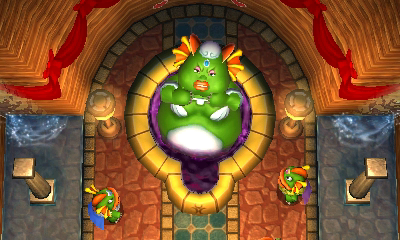
Oren, the Zora queen, bloats up because of a stolen gem. All references to her weight were removed in the North American English localization. (The Legend of Zelda: A Link Between Worlds, Nintendo, 2013.)
As with all dialogue, depending on the company you're working with, the client, and the target audience, there could be potential conflicts with topics like religion, politics, or sexuality. A skill name originally called Heavenly Light might be rechristened as Holy (no pun intended), but even that might be cutting it close. Localization teams may have to get more creative with skill names and change Holy to something like Pure or Aura to avoid potential controversy.
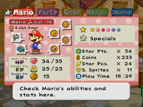
This game has some of my favorite UI. The layout's pretty clean for a lot of information. (Paper Mario: The Thousand-Year Door, Nintendo, 2004.)
At this point, you might be asking, "Well, if shortening and localizing UI is so hard, Michelle, why don't the devs just increase the character limits? Wouldn't that solve the problem?" Trust me, that's easier said than done. Speaking from a North American English perspective, characters in some other languages take up less space than their English counterparts. For example, say you have the ability Thunderstorm. (Yes, I've played WAY too many RPGs to count.) In Japanese, it's roughly 雷雨—a lot less space than in English. But to ask the developers to increase the character count or widen the text boxes? That could break the game in so many ways! There have been instances where a new font was developed specifically for a game to allow for more text, but more often than not, localization teams will have to shorten UI to the best of their ability. And sometimes, brevity is best for player comprehension. A skill name like "Anger of the Mighty Land Gods" could just be shortened to something like Earth or Quake, depending on context.
So, to sum it up: Localizing UI is hard! And sometimes sacrifices have to be made. The important thing is to get the message across as accurately as possible with the space you're given. It's hard, but it can be done!
Read more about:
BlogsAbout the Author(s)
You May Also Like