Daily news, dev blogs, and stories from Game Developer straight to your inbox
Sponsored By
Featured Blog | This community-written post highlights the best of what the game industry has to offer. Read more like it on the Game Developer Blogs.
The Art & Visual Language of Ikenfell
My approach to the art and visual design of Ikenfell, with screenshots and examples of my process.
15 Min Read

Despite being a fairly mediocre artist, I get a lot of comments and compliments on the artwork and visual design in Ikenfell. This makes me very happy, of course. Obviously, those who dislike it are much less likely to say so to me personally, but I love that lots of people are very receptive to the look and style of the game. I’ve been asked several times to talk about my approach to the pixel art, and what kinds of rules, palettes, and inspirations I use for the game. So this will be a large, orderless, and rambling post about all of that!
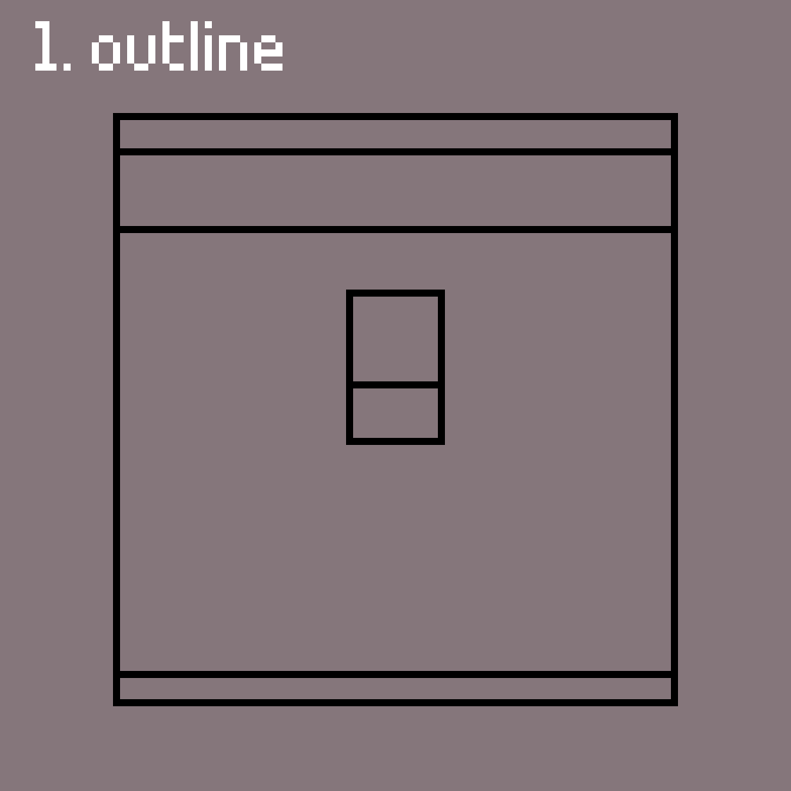
Outline
About Ikenfell
Perspective
Inspiration
Colours
Process
Characters
Portraits & Dialogue
Battles
1. About Ikenfell
Ikenfell is a heartwarming turn-based RPG about a school of magic and its troublesome students. It is currently in active development, and we're aiming for a 2018 release on Steam and the Humble Store. Humble Bundle Inc. is publishing the game.
Official Website / Official Press Kit
If you write about the game in a blog or article, please use assets from the official press kit!
A note about "good" pixel art
As with most art styles, there is a lot of contention about what good pixel art is and what best practices should be. I follow some general guidelines, but most of what I do is from just repeatedly doing lots of pixel art and tweaking my style until I get the results I desire. A lot of amazing pixel artists produce work that is far beyond my capabilities, but I do the best I can within my limits.
This overview is not about how to make good or popular pixel art, it is about my design decisions regarding my own game, my inspiration, and my reasoning behind them.
Now, let’s begin!
2. Perspective
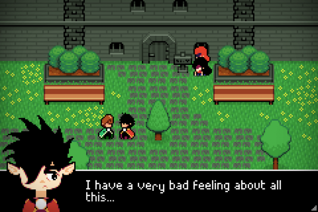
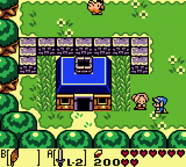
Ikenfell’s camera, like a lot of 2D games (especially RPGs), has a birds-eye view of the game world.
The camera is looking down at the world, if you imagined it in 3D, at about ~60 degrees (this is a rough estimate, in this screenshot alone you can see I am very liberal with the actual angle of objects). The projection is orthographic, meaning that as objects get further away from the camera, they do not actually look smaller (as in real life), they are “flattened” onto the screen.
 Often game developers will just make 2D games and take all this for granted, and just draw the art, but I like to think about camera and perspective a lot, as it’s one of the key relationships in the game between the player and the world itself. Knowing the details of this relationship can make the difference sometime when you’re making a visual design decision, as even technical details can help you highlight where and when it’s most important to break these rules.
3. Inspiration
Ikenfell’s visual design is inspired by several games. I found a screenshot from each game that was relatively similar to the Ikenfell screenshot I posted above, so you can easily see where I drew ideas from each!
Link's Awakening
I love Link's Awakening’s extremely reserved use of tiles, and efficiency with space. Every room has an interesting shape, the background tiles use a very minimal amount of antialiasing to occasionally introduce interesting shapes and curves, and rooms are often reduced to their very basic ideas. But you don’t want multiple rooms to feel the exact same, and Link’s Awakening does this wonderfully. Here’s a simple 4-screen graveyard in the game:
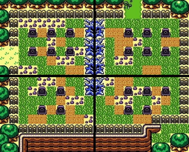
This simple area is wonderful. You get an off-purple colour and haunted trees to give you a sense of unease (ghosts will pop out of graves and attack you, but the visuals make you ready for it). The little rubble tiles and weedy overgrowth convey that this is an old, run-down graveyard, not well-kept. The cliff in the bottom screens gives you a sense of location (the graveyard is on a raised-up plateau, giving some sense of the burial rites of whoever owned these graves). The exits to the left and top have different terrain types, indicating that this graveyard is a bridge from one area to another, so we know we’re leaving our previous location. And, finally, despite the 4-rooms containing all the same elements, they are each differently shaped and detailed. You have multiple paths to walk through each room, so there is no correct path, just a strange haunting area to navigate through (while avoiding mean ghosts).
I could talk this much about every single screen in Link’s Awakening, so I’ll stop now, but this kind of overthinking is what drives a lot of Ikenfell’s inspiration. What a gorgeous game.
Pokemon Ruby/Sapphire
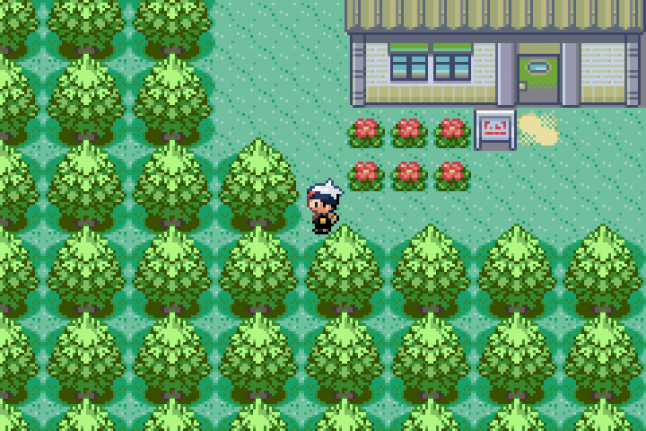
While I am not particularly fond of the character designs (or the pixel art in general) of Pokemon Ruby/Sapphire, I do like their buildings and interiors a lot, so they served as inspiration for a lot of Ikenfell’s architecture.
I like how, to create the least amount of view-obstructing details, these games often just eliminate the side and bottom walls of interiors. In this screenshot, there’s some subtle shadows on the side to give a sense of the ceiling’s height, and the bare minimum amount of details scattered about to give a sense of this character’s lifestyle:
Interiors were often cramped, but so many buildings in this game have completely unique artwork, which was very inspiring. When a building or a house looked completely different from others, I was always inspired to search it, and it was always pleasing to explore its interior with its wonderful new details. This bike shop, with its tiled floor, yellow/orange highlights, thin interior walls, and details scattered about was such a cool looking little area:
This game inspired me to research dozens and dozens of building styles and designs, and always to try to make new houses, buildings, and interiors look and feel distinct.
Mother 3
The simple lines, bold flat blocks of color, and almost childish flat look of Mother 3 wonderfully disguises its immense cleverness and wonderful use of space. I thought this game was a huge step-up visually from Earthbound, and if, after playing, you go back and just look at a few rooms, you start to see how nicely arranged a lot of them truly are.
Just like in the above screenshot, this screenshot below shows another night-time scene. Rather than use a real lighting system (difficult on a small system like the GBA), the game uses beautiful blue/purple palettes for dark areas.
The game just has this wonderful way of breaking up monotony as well. In the next screenshot, it’s a simple room with a stairway leading up to a door. But the building is run-down, so they create little 3D indents in the walls, break off pieces of the siding, carpet the stairs, stain the walls, and just create a series of interesting edges that turn a room that would look very boring into a very visually appealing place to walk through. All you have to do here is hold right, but somehow it feels like so much more, this place has a history and you can feel it down to its very skeleton.
The dark outlines around characters and objects in Ikenfell is very inspired by Mother 3, as well as the bold colours and inner-edge lighting. If you look at this side-by-side comparison (Mother 3 on the left, Ikenfell on the right), you can see how solid objects have dark outlines at their edges, but edges inside the sprite use a highlight colour instead, rather than another dark line cutting across them.
I really like how minimal this is, makes objects seem whole, and gives a strong sense of shape and body to things without cluttering them up with detail. If all the edges of an object use dark line, even in their interior, they tend to look really messy and ugly when done at such a low resolution.
Minish Cap
This game is so utterly gorgeous, I wish I could do it any justice by saying I’m very inspired by its visuals, but I can’t really. I often look at dungeons, buildings, forests, and mountains of this game when creating artwork for Ikenfell, but rarely can I even come close to making it look even remotely as good.
When colouring, I like to look at this game, because it does a wonderful job of ramps. The way these trees darken closer to their base is just beautiful, and the little way so much detail is suggested rather than shown is expertly done. Notice how the grass is mostly flat, but there are just a few tufts here and there?
Minish Cap, like Mother 3, also makes tremendous use of huge bodies of flat colour. Detail is often suggested with little bits, like the clouds in the screenshot above. It also serves a helpful gameplay purpose: very often, flat coloured areas are places you can walk, and highly textured objects and tiles are solid. I take great inspiration from this when pixelling Ikenfell's scenery.
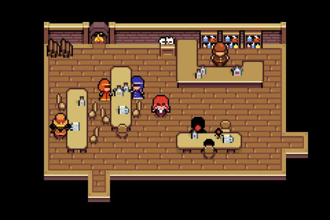
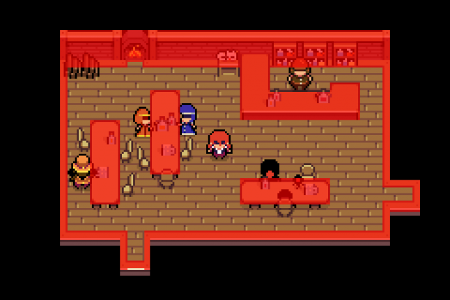
Ikenfell actually does the inverse of this. Often, floors and the ground are textured, but objects like furniture and walls are flat, so they look like big obstructing blocks of colour, and you know you cannot pass them. If we highlight all the large flat blocks of colour in this room, we can see a very clear shape, making the room very easy to read, despite being cluttered with a lot of details and characters.
So while I take a lot of inspiration from the games above, and it is very clear how they inspired me, I quite often will deviate from their rules where I feel it works best for my game. By doing so, I have a huge amount of other screenshots and locations from those games I can look at for reference, but I’ve managed to give the game its own unique look and feel, despite having very strong influences.
4. Colours
I find colouring very difficult, and it often takes me a ton of experimentation to end up with something I’m happy with. In Ikenfell, lots of the areas will still probably be changed and re-coloured a lot before the game is done, but I still have a few patterns I find myself repeating.
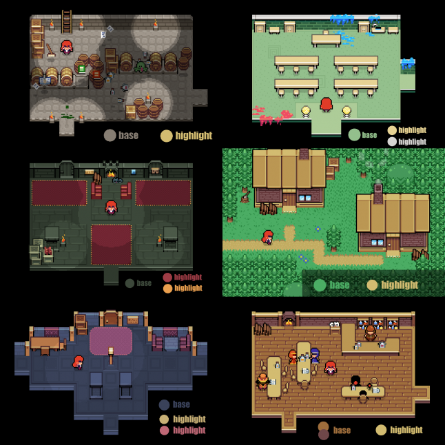
Most areas of Ikenfell can be divided into two colour groups: a base and a highlight. There is usually one or two base colors, and one or two highlights. Here are a few screenshots and their respective main colour pairings:
5. Process
Here’s an image that shows my general process when creating environment tiles for a new area. I usually pixel a room, and then break it up into tiles after I know what I want it to look like. Then I can use those tiles to piece together new rooms.
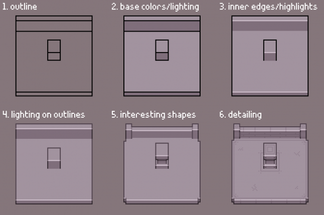
Here is an animated version of that same image, so you can see how each step improves the look:
This example environment doesn’t really have much colour. Sometimes I colour it right away, other times I’ll just work with values (like the above example) and then colour it after. It depends how I’m feeling, and how complex the tiles are.
6. Characters
Since the entire game occurs in a single place, the titular school of magic itself, it’s quite a contained story. This makes character design really fun, because I don’t have sprawling cities or huge towns to worry about. There are probably only about 30–40 characters in Ikenfell, and each has a unique design. There is no character template I use, I pixel each one from scratch, and usually have a couple others next to it for reference so I can make sure it fits in the game.
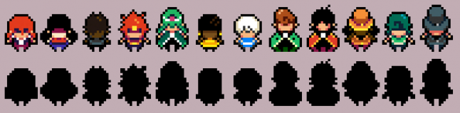 Here you can see twelve of the game’s characters and their respective silhouettes. The legs are the only thing that they really all have in common, and looks kinda templated. If I was able to start the game from scratch again, I think I would like to play around with size more (make kids shorter, have fatter characters be fatter, and taller characters be taller, muscular/etc.) With so few characters, though, they’re all very identifiable, so I’m pretty happy with them like this.
Not much else to say here. You’ll notice that most characters also follow a two/three-colour scheme. The choice to leave out eyes was because their sprites are too small: eyes ended up just looking the same on all characters (which I didn’t like), or they were comically large. Since the game has portraits during conversations, I felt like it was more important to emphasize their faces and expressions there.
Speaking of which…
7. Portraits & Dialogue
For a good several months of development, Ikenfell actually didn’t have portraits for dialogue. The sprites would just move around and have conversations, and that was it. I didn’t have confidence to draw large character portraits (I am terrible at drawing humans and anatomy), and I already felt like the game was becoming too large for me to handle.
But, on a whim one day, I drew little portraits for each of the main characters in my notepad, with a pencil. I loved how these little drawings looked, so I drew them again with a few expressions, and I couldn’t unsee them. I decided that it’d be a lot easier to pixel them if I drew them in pencil first, then translated that to pixel art, which is how I’ve done most of the character portraits now.
Here are a few and their respective silhouettes. Notice that every single character is asymmetrical. I learned early on that if a character’s left/right side is a mirror-image, they look really creepy and strange. This is probably normal art school stuff, but I learned it the hard way.
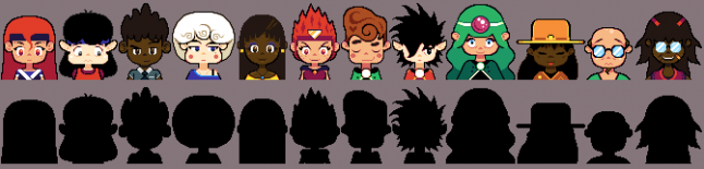
I’m very happy I did this. I think the characters come alive so much more when you see them talking and expressing themselves like this, and now I can’t even imagine the game without it.
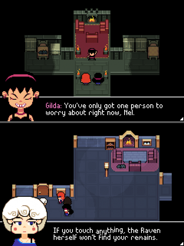
Here you can see how they look in action. The portrait and the textbox slide in, but there is no text immediately. Your eye goes to their face, so you first see their expression. Then the text prints out, and your eye naturally moves to follow it. I pushed the face down into the textbox, instead of on top of it, to reduce how much screen space the dialogue took up as much as possible.
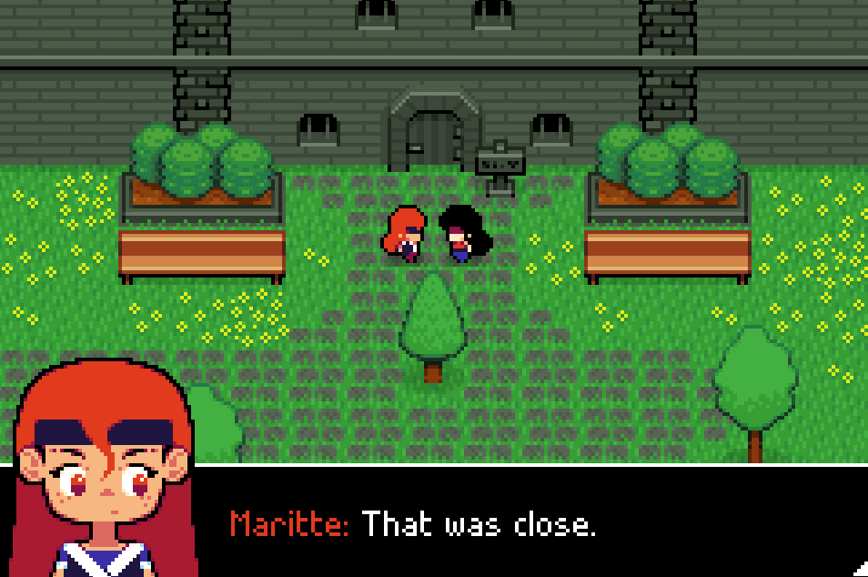
Characters can only speak in short sentences this way, longer sentences being broken into multiple chunks, but this allows me to shift between micro-expressions while they talk. Here you can see Maritte’s anger transition into more of a general frustration, which is a lot easier to notice than if it only had the text.
8. Battles
When I originally was working on the game, it was actually an action RPG, more like Link’s Awakening. It was quite a few months into development before I had some issues with this, and transitioned the game into a turn-based tactical RPG instead.
The reason for this was that I didn’t like how, because the gameplay took place in the school itself, all the rooms had to be designed for fighting and maximum movement. Interesting room shapes and cramped spaces suddenly weren’t viable when I wanted them to be, because real-time fighting wasn’t very fun or interesting in those kinds of rooms.
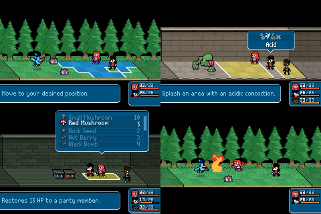
So I moved battles into a completely separate screen, which allows me to design them however I want, while also designing the overworld to be whatever shape I want as well. The battles are much different than the overworld. Suddenly the graphics are huge and details, and the characters are much more animated and alive!
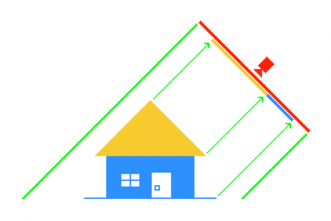
These battles are 12 x 3 tiles, so they are much more horizontal than vertical. Because of this, characters can also only face left and right. This means I can flip animations, greatly reducing my workload. You’ll also notice that the battlefield is skewed as well, but why?
If we remove the skew, it becomes readily apparent:
Without the skew, we have a problem with occlusion: characters on a tile immediately above another character are almost completely covered if the sprite is large. As soon as we skew the battlefield, though…
We no longer have this problem, since characters can only ever be vertically aligned if they are two tiles apart, and most sprites aren’t tall enough for that to be an issue. I also think it simply makes battles look more dynamic and exciting anyway.
Thanks!
I hope you enjoyed reading this! There’s a lot more to talk about, but this is a simple overview to explain a lot of my graphical choices while designing the game. I might do some smaller posts talking a bit more about the technical details of how I approach the pixel art, but this was a good introduction.
I can’t wait until you can all play this game! I’m having so much fun working on it, I hope you enjoy it when it is released. Please email me if you have questions about anything, my inbox is always open.
![]() Artwork by Darcy Dee
Artwork by Darcy Dee
Read more about:
Featured BlogsAbout the Author(s)
You May Also Like
Latest News


Trending


Featured Blogs


