Featured Blog | This community-written post highlights the best of what the game industry has to offer. Read more like it on the Game Developer Blogs.
Shaping Emotions: Utilizing Shape Language and Symbols in Level Design
An exploration of the emotional responses to primitive shapes, and how they can be utilized in level design block-outs to convey theme, tone, intention, and further inspire the artistic direction.

Posted by Author: Source
THE SHARED EXPERIENCE OF ART
How is it that a work of art, a song, a book, or a game can leave an emotional mark that is so uniquely personal, and yet shared by many others? Effective works of art are able to tap into an inherent understanding in the observer or participant, and speak directly to their natural shared experience of being.
As a member of the game development community, we strive to create experiences that are relatable, effective, and personally engaging. Video games are unique in that they incorporate visual and audio arts, as well as providing authorship directly to the player. By handing off a portion of the experience’s creation to the player, it is all the more important they instinctively understand the space they inhabit.
In this article we will explore visual language, how certain shapes convey meaning to the player, and how we can build a scene that utilizes that language.
SPEAKING IN SHAPES
MOLLY BANG / ANDREW LOOMIS
Molly Bang wrote a wonderful book exploring the qualities of shapes and our emotional response to them: “Picture This: How pictures work”. In it, she describes her experience of illustrating a Red Riding Hood story using only the most basic shapes to convey emotion.
“I first decided to represent Little Red Riding Hood as a little red triangle and then asked myself, “Do I feel anything for this shape?” The figure is not exactly fraught with emotion, yet I knew I felt things about it that I didn’t feel for others. It isn’t huggable. Why not? Because it has points. It makes me feel stable. Why? It has a flat, wide, horizontal base. It gives a sense of equanimity, or balance, as well, because its three sides are equal. If it were sharper, it would feel nastier; if it were flatter, it would feel more immobile; and if it were an irregular triangle, I would feel off balance.”
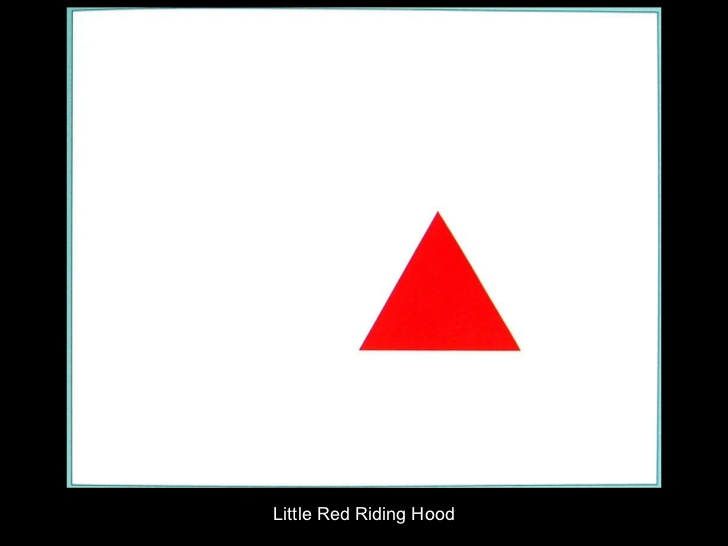
By understanding the feeling produced by the most basic of shapes, like the triangle above, we are better equipped to create levels for games that communicate intentional tones using core primitive shapes.
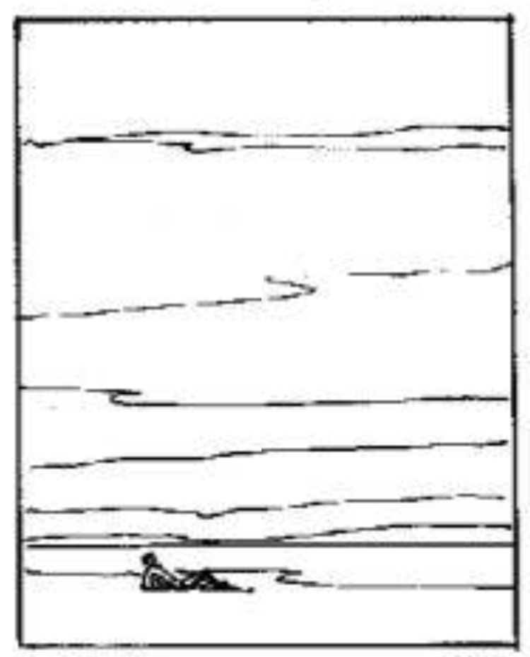
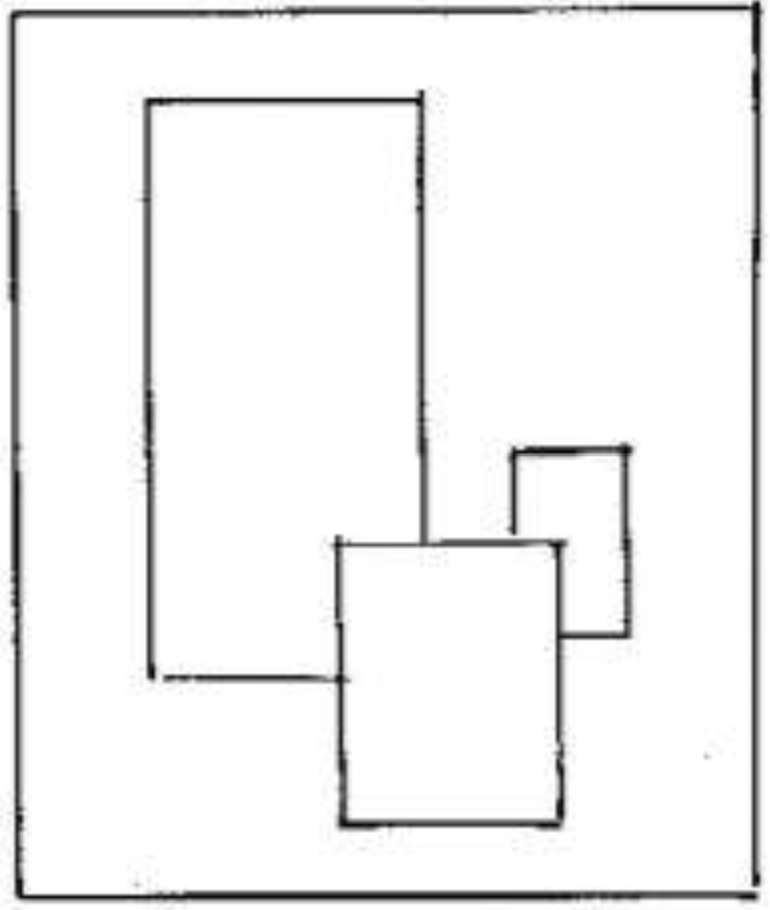
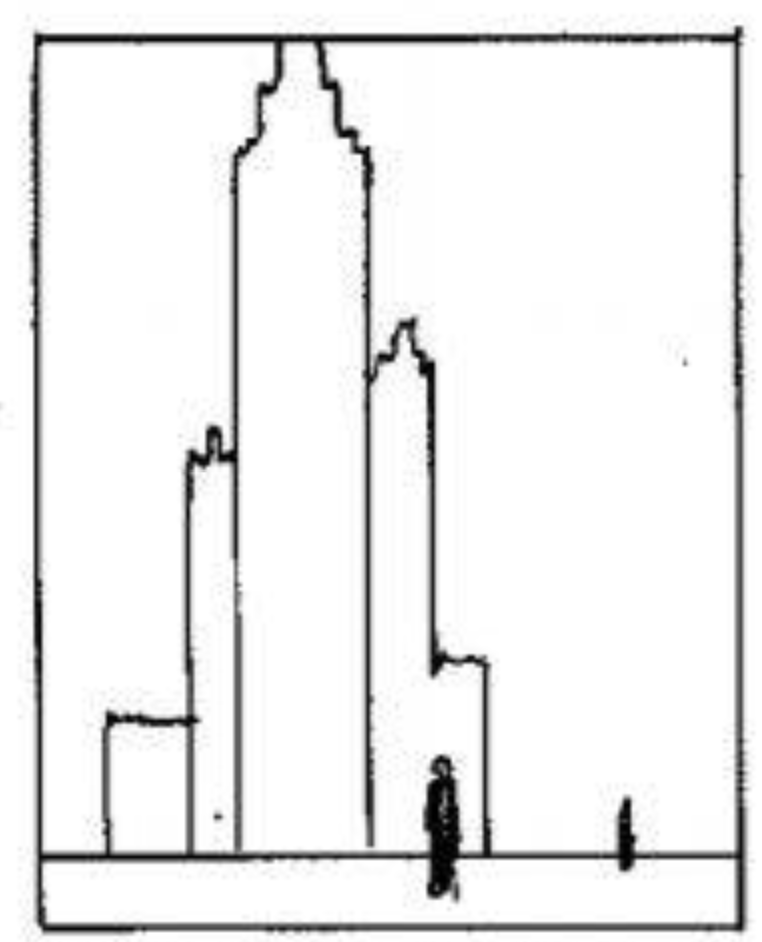
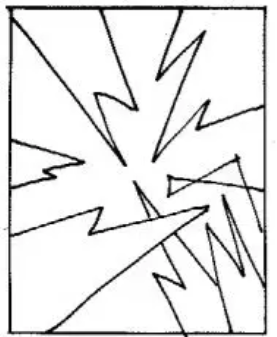
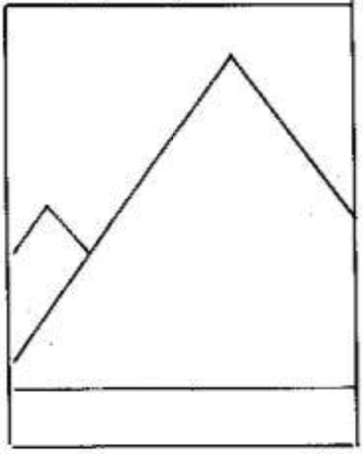
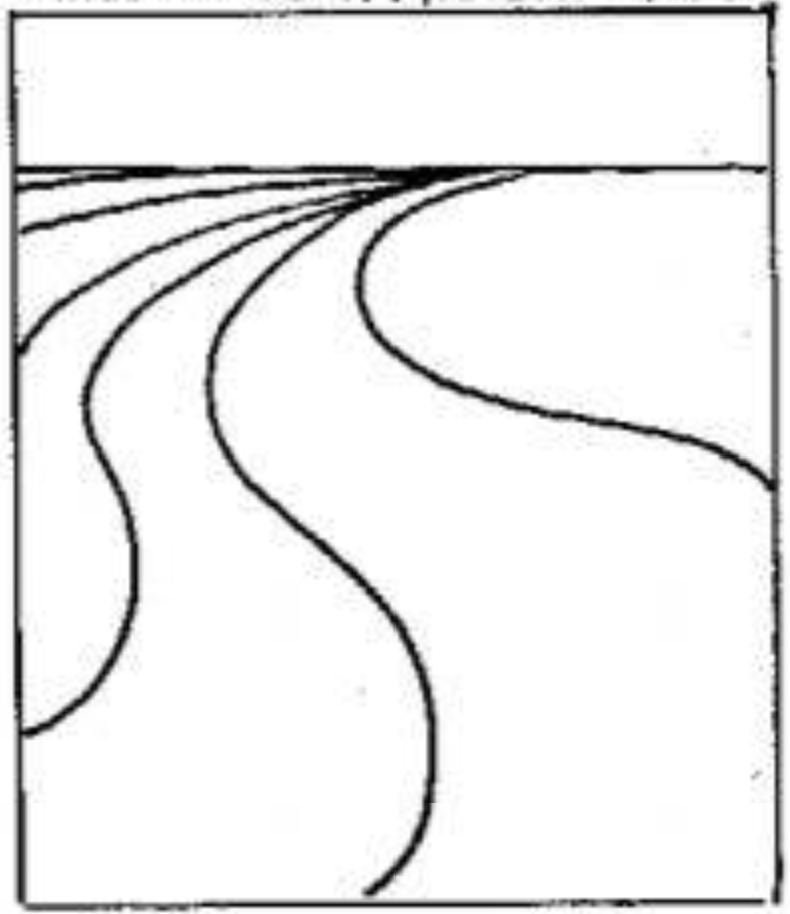
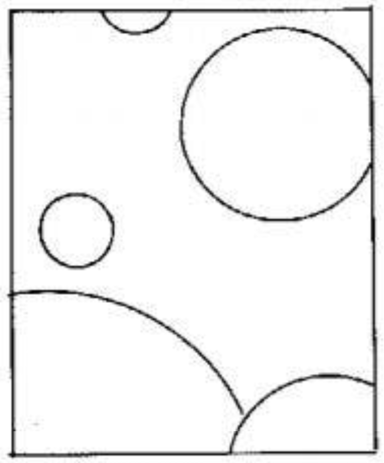
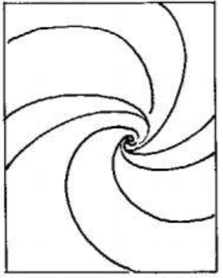
Andrew Loomis is also an illustrator and writer. In his book “Creative Illustration,” he has broken down shapes into categories with archetypal descriptions of the emotional responses. In the chart below I’ve condensed some of Molly and Andrew’s assessments of shapes, and the reactions they can evoke in the observer, along with Andrew’s illustrations from the section “The Relationship of Line to Emotional Response”.
Shape | Molly Bang | Andrew Loomis | Andrew Loomis Illustration |
Horizontal / Flat |
|
|
|
Rectangles | N/A |
|
|
Verticals |
|
|
|
Diagonals / Angles |
|
|
|
Triangles |
|
|
|
Sharp Points |
| N/A | N/A |
Curves / Grace |
|
|
|
Circles | N/A |
|
|
Spiral | N/A |
|
|
Size |
| N/A | N/A |
Repetition |
| N/A | N/A |
Randomness / Chaos |
|
|
|
We can add to these lists ourselves from our own experiences and interpretations by identifying how shapes make us personally feel. Observing the commonalities between different interpretations, and our own, helps us to identify what primitive shapes emotionally communicate.
ORDER / CHAOS
The subject of order and chaos is unique in shape language, so I’ll take a moment to discuss it on its own.
The mind will always have an easier time learning something with structure and order. In a study at Carnegie Mellon University, novice and master chess players were asked to memorize the positions of chess pieces on a board. If the pieces were positioned from an interrupted match, the masters’ recall far exceeded the novices’. When pieces were placed at random, the masters were no better recalling positions than the novice players. Competition memory experts find ways to take unstructured information and create mnemonics or imagery to sort information into a retrievable order.
The mind relies on pattern recognition to learn and retain information. So when we create disorder and chaos in layout, visuals, information, music, motion, etc., it naturally challenges the mind, expends energy and focus, and bends the emotional state towards discomfort, anxiety, and fear.
Each sculpture here depicts the same subject, falling water. Increased complexity makes it harder to take in the whole image and recall it. If I were to ask you to draw each of the sculptures from memory, which would be most accurate?

Too much chaos is completely incomprehensible, leaning towards the emotional responses of confusion.
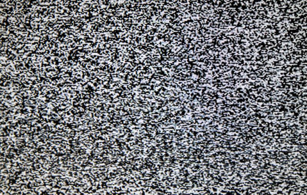
Even in static, the mind still attempts to find patterns, locate faces, or see relationships that only exist from random chance. Now that we have some context around the emotions raised by specific shapes and patterns, let’s take a look at how they feel when used in the context of a video game.
EXPRESSION THROUGH PRIMITIVES IN VIDEO GAMES
Based on the analysis above, let’s look at the impact specific shapes have for a video game character, and feeling they give off to the player.
FLAT
Stable
Grounded
Still
Intentional
Strong
Trustworthy
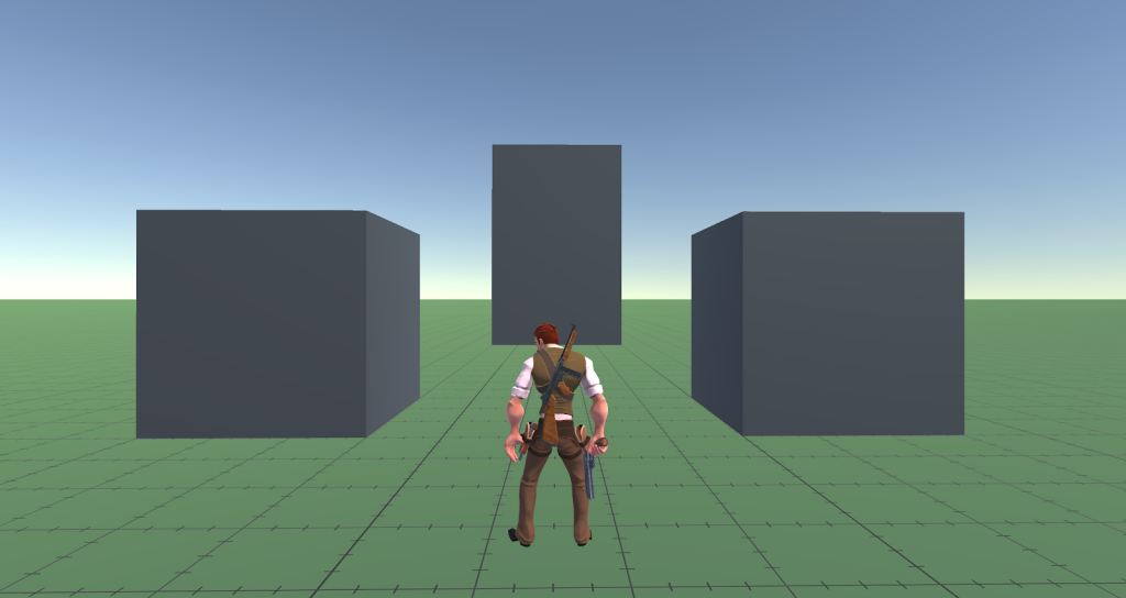
They don’t look like they’re at risk of shifting, or collapsing. They are structured with a strong frame. They are smooth with clearly defined edges and boundaries. They are easy to see, understand, and mentally map out. Because of this they feel trustworthy.
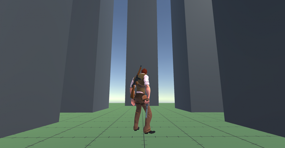
VERTICAL
BENEATH
Wonder / Awe
Humility
Vulnerability
Aspiration
Caution
pasted image 0 (10)
Not being able to see the top creates unknown factors. We don’t know how far it reaches, or what may be at the top. The top is above its center of gravity, making it more prone to toppling, though maybe not at immediate risk. Regardless, there is more for the mind to process and consider, which can possibly raise some anxiety. Its size is humbling too, stretching to the sky / heavens, places that are out of reach literally and figuratively, reserved for the powerful and worthy.
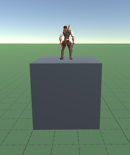
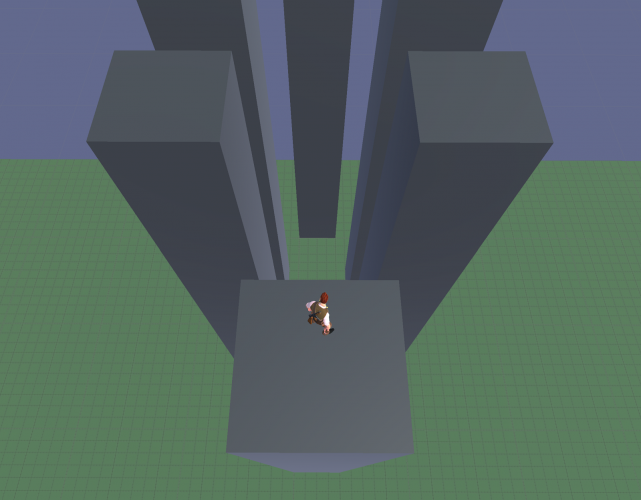
ABOVE
Power
Dominance
Potential Energy
pasted image 0 (11)
Standing on top gives another feeling. We’re being lifted above. There is more information to see about the environment from up high. To a bird, it’s a place to observe comfortably with relative safety. For someone susceptible to injury from falling, it can be frightening. There is power in height. It takes energy to reach heights.
DIAGONAL
Dynamic
Unstable
Risky to stand on
Under tension or pressure
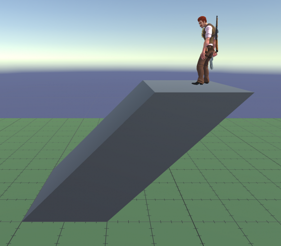
pasted image 0 (12)
This shape no longer feels as stable. This is because of our shared understanding of gravity trying to pull downwards. This structure may very well be sturdy, yet the mind does not trust it as well as the rectangles example above. The association to gravity is not conscious, but the understanding of the effect of a leaning structure is understood, and the resulting emotion that we have to an object toppling is provoked.
TRIANGLES / PYRAMIDS
Triangles are a more complicated shape, so we’ll break it down to a few different examples.
EVEN RATIO
Stable
Strong
Rooted
Sharp
Inspiring
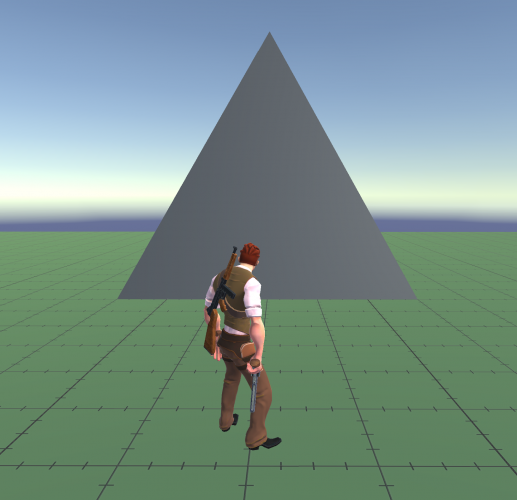
pasted image 0 (13)
Here is a shape that is very balanced. It doesn’t block our view as much as a rectangle, and doesn’t seem very prone to falling. The shape supports itself and feels stable, but also communicates a slight sense of danger from its sharp point on top. It contains diagonals which direct our attention up, and potentially beyond.
INVERTED
Unstable
Dangerous
Risky
Uncomfortable
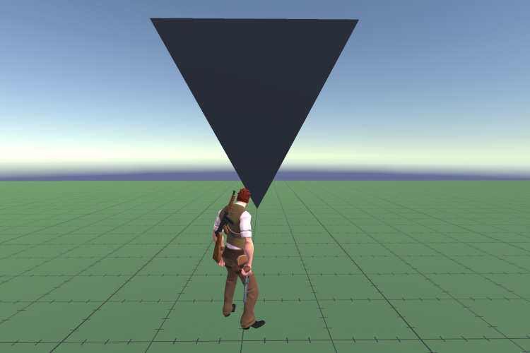
pasted image 0 (14)
Changing its orientation changes the feeling of it. Its diagonals now indicate potential movement from instability. This object may fall from a lack of a grounded base. It is uncomfortable to be around or to stand underneath. It is dynamic because any face can become its new grounded side.
COMPRESSED
Grounded
Immovable
Climbable
Conquerable
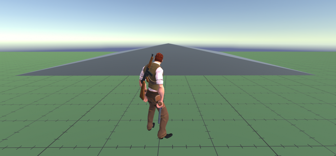
pasted image 0 (15)
With the base as the dominant feature, this feels more stable and stationary. The point is not as dangerous and can be traversed without much issue.
SPIKED
Deadly
Hazardous
Sharp
Scary
Creates distrust
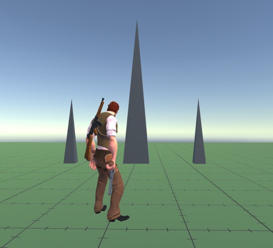
pasted image 0 (16)
This is much scarier. Now we’re looking at associations to things that can poke us, tear our skin, harm us. They are teeth, needles, stabbing instruments.
ROUND
Easy to map
Easy to navigate
Soft or Smooth
Natural / Organic
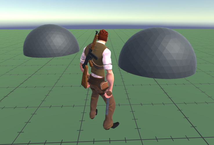
pasted image 0 (17)
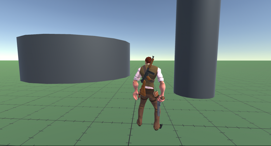
pasted image 0 (18)
The half sphere or cylinder shapes seem softer. They can’t cut us. There is less of a threat. There is equal flow around them and they are easier to navigate, requiring less mental energy to comprehend. They have much of the benefit of the pyramid without threatening points. Organic and natural features frequently have roundedness, or are soft and vulnerable.
SPHERES
Has Utility
Is Moveable
Possesses potential energy
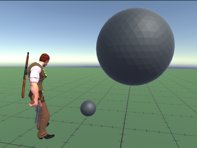
pasted image 0 (19)
Varying the size changes our relationship to it. Both have potential motion. They are unpredictable because gravity can potentially move them in many directions. The smaller sphere is manageable and seems like it could be utilized. The larger is a threat under certain conditions, or a tool in others.
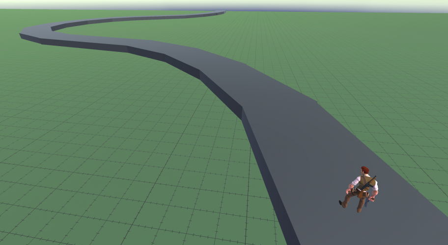
CURVATURE
Calm
Pleasing
Natural
Flowing
Easy to navigate
pasted image 0 (20)
A path with curves feels less engineered, more natural. It has flow that requires soft and minor adjustments to steer and remain on track. It feels gentle and catering, welcoming. The mind can focus on the curiosity of the space and the destination when the path is easy to map and to understand.
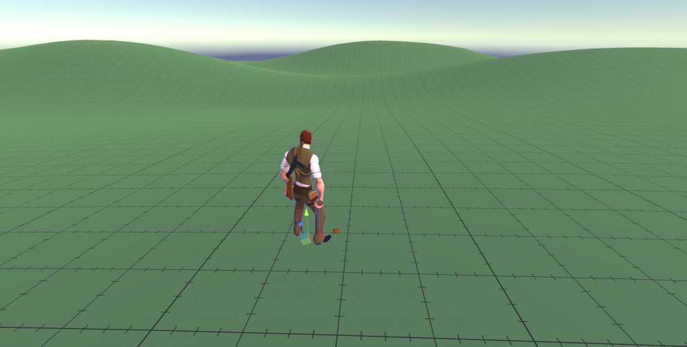
pasted image 0 (21)
There is a natural grace, and ease on the eyes to the curves of a landscape. It is comfortable to look at and mentally map, to navigate and conquer. The curves blend into each other in predictable ways allowing the mind to relax and focus. There is little threat of cliffs, or falling.
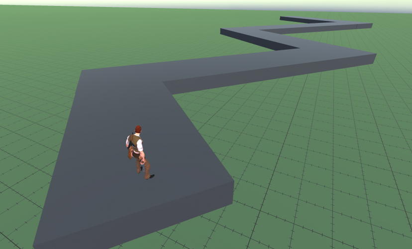
ANGULAR
Harsh
Conflicting
Sharp
Redirects
Erratic
Chaotic
pasted image 0 (22)
A path with hard edges requires greater conviction and intention to navigate. It is more precise and less forgiving. Lack of attention could lead to falling off. There is more at stake when navigating the angled path, more energy needed to shift momentum.
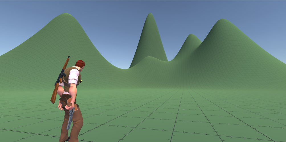
pasted image 0 (23)
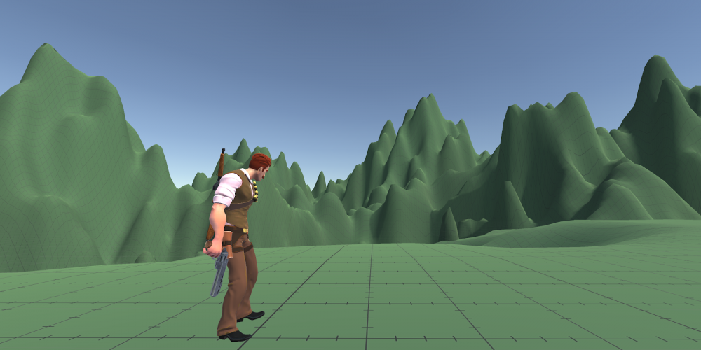
Angles and points are more difficult to mentally map and take in due to their complexity. They come with a greater sense of danger, and require more energy to overtake and traverse.
pasted image 0 (24)
Increasing the complexity increases the sense of discomfort, difficulty to understand, and energy to navigate. The apparent risk and danger increases.
ORDER
Understandable
Memorable
Recallable
Patterned
Manageable
Easy
pasted image 0 (27)
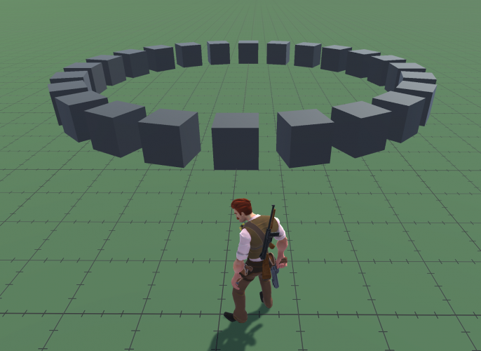
Because we think in patterns, ordered shapes are easier to understand, pleasing, recallable, and comforting. They can be consumed at a glance and described with ease.
CHAOS
Unpredictable
Difficult
Requires energy
Generates anxiety
Uncontrolled
pasted image 0 (28)
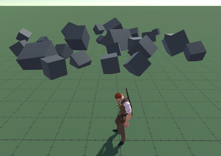
When playing a game, the player has much to focus on in real time: goals, conflict, survival, strategy. Chaotic elements reduce the ability to focus on all things collectively, which is why they have the potential to emphasize stress emotions.
BEYOND SHAPES
Now that we have a common language about shapes, how do we know what shapes to use at what time?
In telling a story, or crafting an experience, theme and tone can help inform what shapes to use so that they work in tandem with each other, or possibly in conflicting contrast, to communicate the underlying emotion in the content.
When developing a tone, keeping it as relatable as possible will help in creating effective emotional beats. Relatability is important for an audience to be able to emotionally project themselves into the piece, and become personally invested. No player has had the literal experience of taking a bathysphere into the ocean to visit the city of Rapture, as in Bioshock, but everyone has had the experience of arriving somewhere new without a sense of what to expect. It’s this mystery of arrival that we are able to emotionally latch onto as a player that makes us relate to it with importance.
Symbols are everywhere in expressive content because any symbol comes with its own relatability within the natural experience of being. By knowing how to break down subject matter into its basic relatable emotional components, we can better discern what theme and tone to aim for, and therefore what shapes to use. Let’s widen our lens a bit for now and explore relatability in some thematic symbols.
IDENTIFYING RELATABILITY
All people have some relationship with water, fire, air, earth, day, night, moon and stars, darkness, light, animals, family, society, music, to name a few. They are so common that they find their way into the symbology and myths of all cultures across time, carved on pyramids, sent in tweeted memes, and independent of any specific language. Their role in life is so consistent that, from culture to culture, the symbols and myths inspired by them frequently mirror each other.
The body returns to the earth after death, so it’s no surprise that multiple cultures have a mythological world of the dead that exists under the plane of the living. If we were a race of beings living without gravity, these themes of the “underworld” would likely not exist. The understanding of “the underworld” as a symbol of death is in part derived from gravity and its ability to draw organic matter into soil.
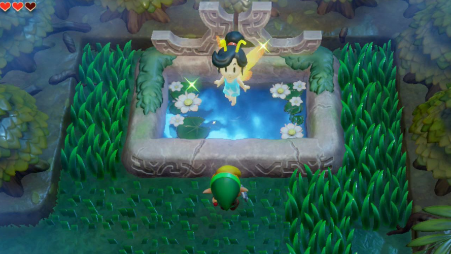
Water sustains life, and therefore it is comforting to have nearby. It’s the first sound we hear in the womb. As a symbol, it can represent cleansing, growth, or purity, to name a few. These are associations we inherently and instinctively make. When Link finds healing fairies in lakes, it makes sense to us unconsciously. We identify the location as potentially restorative in nature using our innate shared understanding of its symbolism. The presence of water in the scene helps to lead our understanding towards the conclusion that this is here to help us.
pasted image 0 (29)
SETTING THE TONE
It’s important to choose the tone for the emotional journey early in the creative process. The tone will help the artist find the specific shapes, symbols, and tools that connect the audience to the emotional weight of the piece. Because tone is not specific to any medium, I’d like to explore it outside of games through a form that is quintessentially narrative: language and prose.
Edgar Allan Poe was a master of his poetic palette, and is a good case study on how to craft a sensory experience with tonal intention. He also wrote a piece that breaks down his creative process for writing “The Raven” which can be a great jumping off point for discovering how to isolate tools that evoke emotional responses.
THE RAVEN
In “The Philosophy of Composition”, Edgar Allan Poe explains his process, choosing a tone, and writing holistically around it.
“That pleasure which is at once the most intense, the most elevating, and the most pure is, I believe, found in the contemplation of the beautiful. When, indeed, men speak of Beauty, they mean, precisely, not a quality, as is supposed, but an effect—they refer, in short, just to that intense and pure elevation of soul—not of intellect, or of heart—upon which I have commented, and which is experienced in consequence of contemplating the “beautiful.” … [M]y next question referred to the tone of its highest manifestation—and all experience has shown that this tone is one of sadness. Beauty of whatever kind in its supreme development invariably excites the sensitive soul to tears. Melancholy is thus the most legitimate of all the poetical tones.”
The high elation we feel in the presence of beauty, and the depression of its loss, is one of our commonly shared emotional understandings. Let’s explore a couple of the tools Poe used to evoke a sense of melancholy in the reader:
REPETITION
“As commonly used, the refrain, or burden, not only is limited to lyric verse, but depends for its impression upon the force of monotone—both in sound and thought. The pleasure is deduced solely from the sense of identity—of repetition.”
Melancholy is inherently a low point, a loss of drive and energy which flattens the peaks of expressiveness. The repetition and predictability of a refrain in this context has parallels that can be drawn to melancholy. Lack of movement, inability to change, feeling trapped in a single thought or feeling, a “burden.” Regardless of how far the verse explores and travels of its own, it is destined to return to the same fate.
“Then the bird said “Nevermore.”
By forcing the reader back to a point of futility over and over, he can leash the reader, mentally preventing them from getting too close to the beautiful Lenore, and with each repetition, further into a sense of despair.
“With such name as “Nevermore.”
“Nevermore” as a phrase, even before its repetition, has a way of negating the journey, making the effort to mentally wander in prose seem futile. Coming back to it over and over further amplifies this. And the Raven itself is just a beast, not an intellect that could be reasoned with…
“Quoth the Raven “Nevermore.”
VOWELS AND CONSONANTS
“Having made up my mind to a refrain, the division of the poem into stanzas was of course a corollary, the refrain forming the close to each stanza. That such a close, to have force, must be sonorous and susceptible of protracted emphasis, admitted no doubt, and these considerations inevitably led me to the long o as the most sonorous vowel in connection with r as the most producible consonant … In such a search it would have been absolutely impossible to overlook the word ‘Nevermore.’ In fact it was the very first which presented itself.”
The sound of the long o and r has a certain sensation as well: with its fullness in the chest, releasing the -or sound creates a feeling of exhalation, a sigh, a movement downwards, a deflation, especially when placed at the end of a phrase; nothing follows to reinflate the lungs. This sensation of -or, when combined with repetition of the phrase, leads the reader to “deflate” at the same point of every stanza, reinforcing the mental and physical expressions associated with melancholy, emotional downward deflation.
By locking in on the tone and emotional impact of the piece early on, he was able to create devices that not only created sensations that were individually experiential, but layered and worked in conjunction with each other. He did this before he wrote a single word. In fact, “Nevermore” was the first word written.
When we are able to create games with this kind of intentionality, it can help direct our thought process towards designs that complement each other, and generate more effective emotional investment. As an illustration of the idea, let’s break down a thematic symbol into its underlying relatable components and see how we can apply it to a mission’s design.
EXPLORING “DAWN”
The “Dawn” for example, is a very relatable experience. It happens for everyone every day.
As a source of inspiration, let’s turn to the Carl Jung avenue of thought, a scholar of cultural symbols and their underlying meanings. “The Archive for Research in Archetypal Symbolism” collects symbols found across various cultures to identify their shared meanings. Here are some excerpts from their breakdown of the “Dawn” in “The Book of Symbols: Reflections on Archetypal Images.”
DAWN EXCERPTS
“[D]awn, the beginning of daybreak … signals the inevitable resurgence of light. Whether alluding to the incipient universe, or to the momentary flicker of an idea or feeling in its earliest apprehension; whether naming the interlude of communion engendered by the pristine clarity and shared focus of the whole of creation poised at the brink of sunrise, dawn evokes annunciation, beginning, approach, coming into being.”
“[D]awn may … restore the form and texture of an ordered world … [E]very dawn is a new creation, crafted by the deity from the transformed chaos of “night”.
“[T]he initiatory ordeals of baptism are brought to a conclusion at dawn when the ‘newly born,’ washed in the fount and dressed in pristine white robes, assume their new identity.”
“In ancient Egyptian mythology, the red streaks of dawn represent the blood of the cow goddess Hathor as she labors to deliver her calf – the sun – who is born anew each morning.”
To each of us, the dawn represents a literal beginning, the birth of a new day. It reveals the changes to a world previously hidden by night, the morning dew on a flower, nighttime wildlife. In lateral associations, it is the start of a new job, new relationship, a re-birthing of self.
Inns in video games frequently represent a place to recharge and restore the player’s worn resources. This points to the healing nature of a sound night’s sleep, but it necessarily resolves with the dawning of a new day. We accept the restorative context as an expectation just by the associations we have around the role of the Inn, rest, and waking into dawn.
Thinking about the natural and symbolic meaning of “Dawn”, if we were to craft these associations into a gameplay experience, what decisions might we make?
DESIGN IDEAS: "DAWN"
The player is starting on a new quest, having just made the decision to pick up their call to action, perhaps it’s the first level in the game.
The player’s character doesn’t begin at full speed, starting at a forced walk. This can generate sensation akin to waking, stretching before reaching full momentum
Youthful props have their place in the environment. New plants blooming, children playing, the building of a house.
A new character has joined you, mysterious and unknown, uncertain of the possibilities.
The player has not yet had an opportunity to practice new abilities, taking the first steps in the actualization of their new role
The music is soft, soothing, but slowly building
All these elements borrow directly from the sensations commonly felt in association with the dawn, and new birth. The elements above lend themselves to the emotional feeling of beginning, and coming into being for the player, all by reflecting on how the concept of “dawn” resonates emotionally.
If we were to layer some of these ideas together into one, we might have a new quest begin with the introduction of a new party member. This party member might be physically building something, perhaps carpentry, as you discuss the journey ahead. This new party member could be a mentor designed to teach you new abilities. By layering new beginnings in different contexts, we would be reinforcing the theme across all layers, making any contrast we add later (i.e. the end of the quest, the burning of a house, the death of the mentor) all the more emotionally impactful.
By choosing the tone of dawn, the literal time of day isn’t specifically necessary. It’s a symbol with a commonly shared emotional weight, and it’s the emotion that we are tapping into more than the literal event. This is why we could still potentially set the “tone of dawn” in a spaceship setting, where there is no planet to revolve around, and no literal morning.
As an exercise, try playing through the opening level of Bioshock Infinite and identify various references to “dawn” as a symbol.
IDENTIFYING ASSOCIATIONS
It is not necessary to have a book of symbols to inform us of the significance of the subject matter we choose. We are well within our ability as emotional beings to discover the association we personally make with tones, subjects, symbols, and stimuli from our own experiences. However, by reading and learning about how other cultures and people experience symbols, we can enhance our ability to identify commonalities, and utilize them in our art in ways that broadens its relatability.
Like Edgar Allan Poe, understanding what emotional layers you are attempting to evoke is very important when starting to craft the content. For example, if “pride” is an emotion you want to evoke, spend some time thinking about what images, experiences, sensations, or thoughts you personally associate with this concept. Here are some general examples of times in my life I’ve felt pride.
I’ve built something that worked as intended
Relatable Association: Satisfaction in Creation
I’ve helped a friend to accomplish a goal
Relatable Association: Elevating Others
I’ve solved problems that I could not solve in the past
Relatable Association: Measurable Improvement in Skill
So, what symbolic icon has an overlap of these ideas that we could use as a tonal core? Maybe an “Artisan.” An artisan develops greater skill over time, makes things that elevate others, and takes satisfaction in the making of their creations. An artisan carries an inherent sense of pride.
Using the artisan as a source of inspiration (not necessarily the literal job title / role), let’s play out a mission scenario in a game that can generate a sensation of pride:
The player is tasked with aiding a party member.
There is a blocked passage on the road ahead to a mountain village, the party member’s endangered home, and only this party member can clear it. But first they need their weapon restored.
The player must gain resources by completing increasingly difficult puzzles
The player forges the weapon themselves piece by piece
On equipping the party member and bringing them to the path, the party is ambushed. The player draws the enemy’s attention, granting the party member their opportunity to get to the goal. The player suffers some personal cost (to imprint greater significance on the success of the party member).
On mutual success, the weapon is triggered, clearing the field of enemies and destroying the blockage.
On fulfilling their purpose, the party member rewards the player and departs, climbing into the mountains ahead
As serving in the symbolic role of “the artisan”, the player has had “Measurable Improvement in Skill” by completing difficult puzzles to acquire raw materials, “Satisfaction in Creation” by making the ultimate weapon, and “Elevating Others” by helping their party member rise to their place in the mountains. If executed well, these elements can create a sense of pride in what they’ve accomplished, as well as an attachment and personal stake in the success of the party member.
Further emotional contrast can be leveraged from this experience later in the game if the party member again finds danger (i.e. their mountain village falls to ashes, or the party member betrays the player). Once there is an emotional personal entanglement, effective experiential options grow exponentially.
The player’s mission is only one layer that can draw inspiration from the symbol of the artisan. By identifying the symbolic meaning of the artisan, we can build language into any layer: environment, context, plot, sound, etc.
The Artisan
Provides a valuable service
Is admired
Is envied
Takes on students
Is isolated without comparable peers
Is an inventor, creating things that have not been seen before.
Let’s get back now to implementing the idea of the “Artisan” into the shape language we discussed at the beginning.
SHAPE LANGUAGE: THE ARTISAN
A great example of the artisan symbolically layered into environmental language is in Hateno Village, The Legend of Zelda: Breath of the Wild.
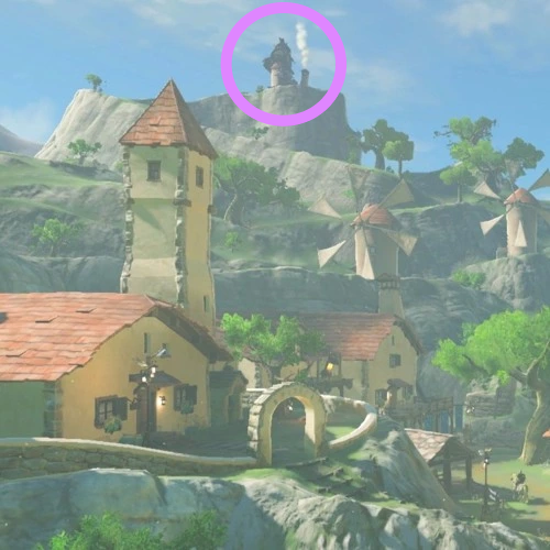
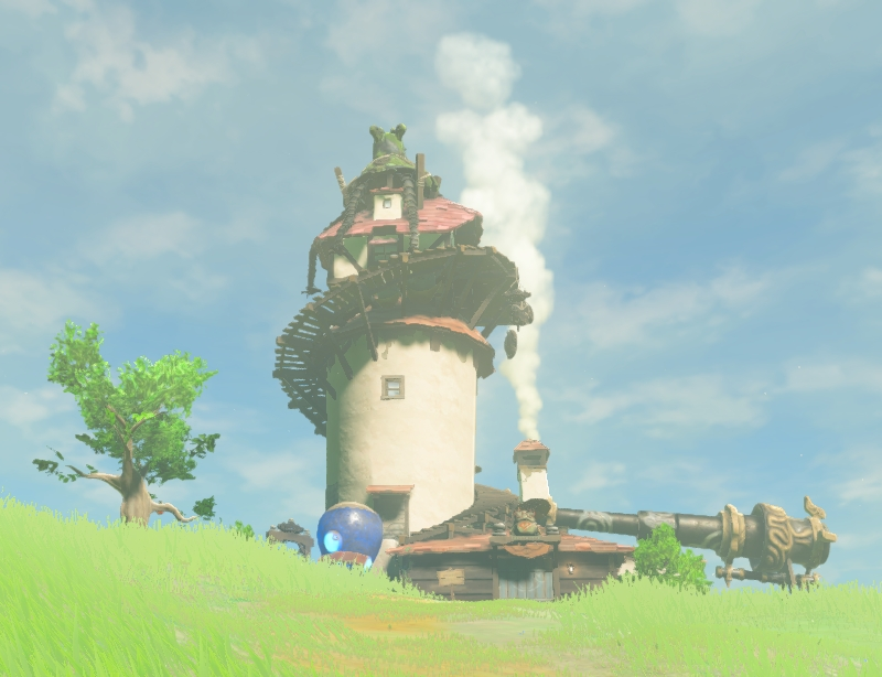
The environmental and visual language of the scene makes the house of the technological expert / artisan very clear. Its elevated position shows that it is admired and possibly envied. It is isolated without any comparable peers. It is adorned with inventions and details that are not seen on any other buildings. The long and winding path still generates a connection and utility to the town below. These are all elements of the breakdown we created above.
Just by the characterization of the physical building, it can be understood what kind of person we might expect to be living there. By honestly identifying the core qualities of an artisan, we have unintentionally made some of the design decisions that went into the Hateno Ancient Tech Lab.
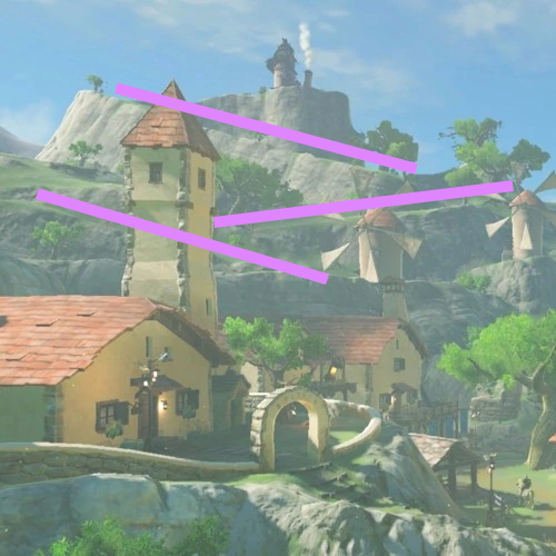
Now, in the context of the shape language we’ve discussed earlier, the Tech Lab has strength, a sense of permanence and stability. This in part comes from the flatness of the ridge it sits on. It contrasts to the diagonal path below, emphasizing the flatness of its perch. Its silhouette against the sky gives it the most striking horizontal line in the composition.
Diagonal lines leading up to it give it a dynamic sense as well. This is a place of action; there’s something to accomplish up here. The lines don’t point to the house, but rather run perpendicular, supporting and cradling it, giving it greater grounding and strength.
As we mentioned, it feels as though the house is admired. This is the emotional response to its verticality in the scene, using some of the identifiers we’ve explored, like “Wonder”, “Awe”, “Strength”, “Energy”, “Dominance”, to name a few.
The round bright smoke coming from the chimney softens it, makes it seem less intimidating and in keeping with the clouds close to its perch near the sky. If the smoke were dark and sooty, it would create a different emotional response.
CHANGING THE ARTISAN'S TONE
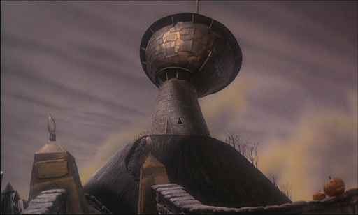
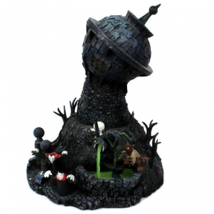
Now, what if we wanted to change the tone to give it the identity of an unstable or mad artisan. Maybe we’d have something that looks more like Dr Finkelstein’s tower in The Nightmare Before Christmas.
pasted image 0 (31)
This still has the characteristics of the artisan as we’ve established for the Hateno Ancient Tech Lab. Its elevation makes it seem admired, it is isolated without comparable peers, a unique and improbably top heavy building. But now we have a building that is at an angle, lopsided and irregular, past its prime.
PUTTING IT TOGETHER
We’ve explored how to identify symbols, find their emotional roots, and design content that is evocative of a specific theme. Now that we have a set of tools to use, let’s make visual compositions based on a specific theme. In keeping with the topics and subject matter we’ve discussed, it seems fitting to continue from Molly Bang’s analysis of Red Riding Hood, and the symbol of the wolf “Stalking” in the woods. I’m going to break down the root emotional impact of being stalked as I personally perceive it.
Being Stalked
Discomfort
Paranoia
Being loomed over, dominated
Betrayed, not safe in an otherwise normal location
Exposed
Loss of power
Need to flee, find shelter
Feeling trapped
Loss of control
Because this is an exercise specifically in shape language, I’m going to focus on using basic primitives for the most part and avoid using many colors (just green, grey-scale, and red for Red Riding Hood) or pre-made assets. We’ll also represent red riding hood as a pyramid as a call back to Molly’s work in visual language.
THE JOURNEY TO GRANDMOTHER’S HOUSE
Starting in a place of normalcy gives the player a baseline understanding of the world before venturing into the potential danger of the quest ahead, so our first scene will be Red Riding Hood’s house.
Red is a small innocent girl living in the woods, so let’s start by using easy going, carefree visual language in the terrain, soft rounded curves. Because our scene needs to build from a theme of “stalking” too, we’ll elevate the house and make it especially visible with little to block someone’s view of it from a distance. We’ll place red fully visible front of it. A foreground framing element can help give us the sense that we are looking at her from a hidden position.
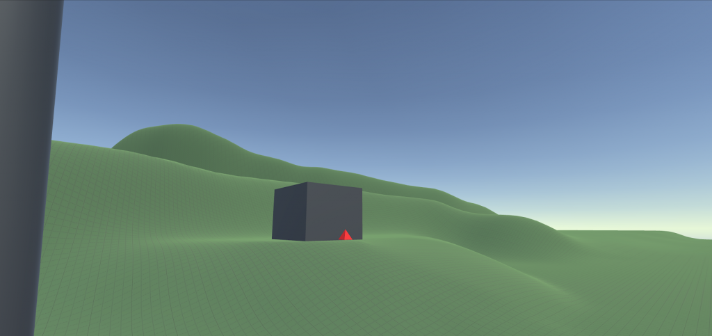
She lives in the woods, so we need to set the scene accordingly. We want a home that feels like it has a sense of security, stability, and intention. We’ve established that we can obtain this by using rectangular and vertical shapes. Round shapes can lend us additional the softness to the scene.
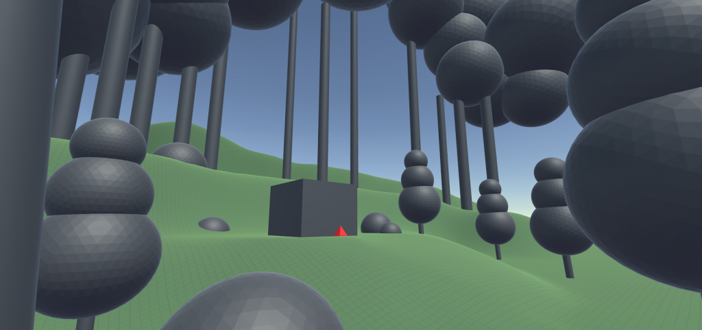
The trees and round foliage all have repetitive visual qualities. This makes any one individually less meaningful, and in contrast makes Red and her house the most unique visual elements to look at. Also, by positioning her close to center frame, it helps to further establish Red as the focus for both us and the wolf.
Red is about to partake in a quest. Diagonal lines pushing from left to right, along with the slope of the terrain, help to define an intent of movement, so we can slant the trees to give them a dynamic quality, and draw a path from the house to indicate her planned direction.
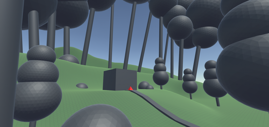
I’ve created some space around the house for some shapes that can communicate a looming presence, and develop a feeling of uneasiness.
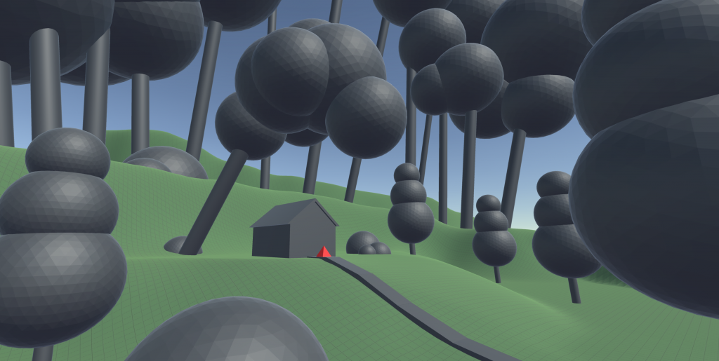
The strong diagonal orientation of the tree makes us distrust it. Maybe it’s safe, or maybe It could fall over. It is disconcerting, but it’s unclear if it is an immediate threat, or a sheltering entity.
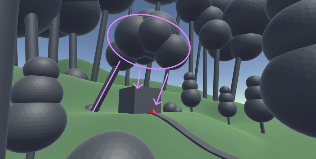
The tree invades the house’s space, and stares down at Red from a strong elevated position of power, out of Red’s line of sight. It puts pressure on her as a subject that deserves focus, a gravity of importance. By creating this gravity here, we can leverage it as she continues on her journey.
There are endless ways to set the scene using these visual elements. What elements would you include to evoke the feeling of being stalked?
INTO THE WOODS
By entering the woods, we leave the security of the home behind and venture into the unknown. In this sample, we’re not looking to put a literal wolf in the scene, but rather the emotional impact of uncertainty as to whether Red is being watched or not.
When we feel like we’re in a place of possible danger, feeling exposed with no place to hide is very uncomfortable. So we can start by building a path with no forking directions, nowhere to go except from beginning to end. By placing it in a valley, it makes the path weaker than the dominant space above.
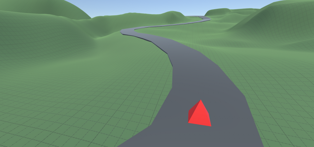
Within the scene, we want to generate a feeling of distrust, not specifically danger or safety. Shapes that evoke both feelings can be used to contrast and balance each other, round and sharp.
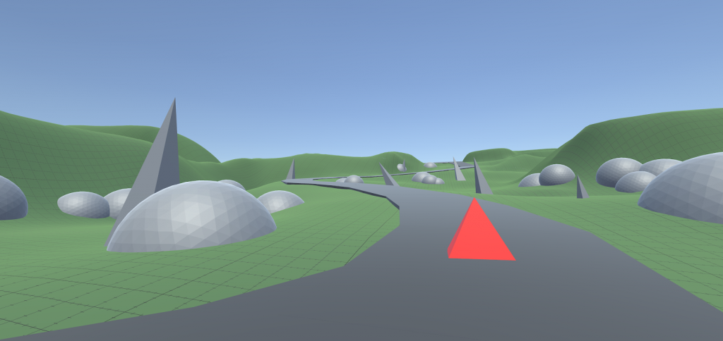
With both soft and sharp features around it, Red is encouraged to remain on the path, as it is easiest to navigate.
The way the terrain curves, it looks somewhat inviting to explore, so let’s establish more inaccessibility, rigidness, and sharpness to our boundary, and make the safety of the path most appealing. If we use rectangular shapes, we will communicate a sense of structure and immobility, and putting them at slight diagonals will help establish agitation and risk. Ideally there is no place Red feels like she could climb these rocks.
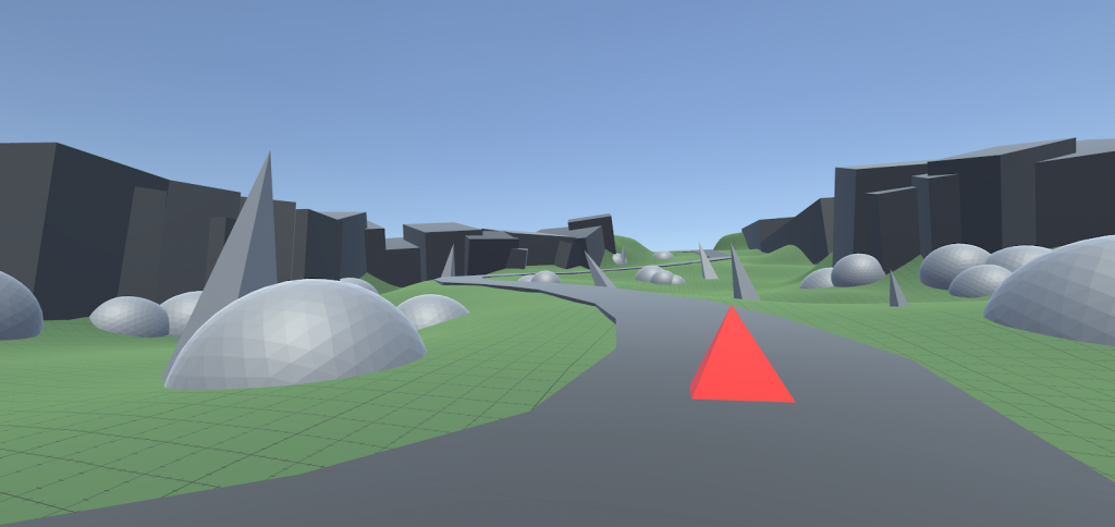
The clearest destination now appears to be the opening between the rectangular rocks in the distance, towards the smooth terrain. Wandering off the path doesn’t feel particularly rewarding.
Elevated locations can reinforce the imbalance of power between the upper and lower spaces, so let’s make a couple of vantage points that are hard to see into, and could very well contain an unwanted audience.
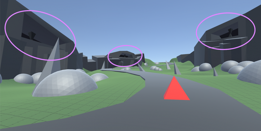
Placing some physical features inside the vantage points establishes that objects can exist inside, and that maybe someone is waiting there. To further strengthen that idea of an possible additional presence, we can put some ambiguous figure-like shapes in the environment. By having more elements in the scene, it becomes more difficult to quickly identify whether any single figure is a fallen tree branch, a stump, or a wolf waiting to pounce.
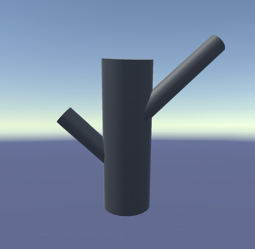
Here’s a simple figure we can use for that.
Once we scatter them around the environment, we have something like this.
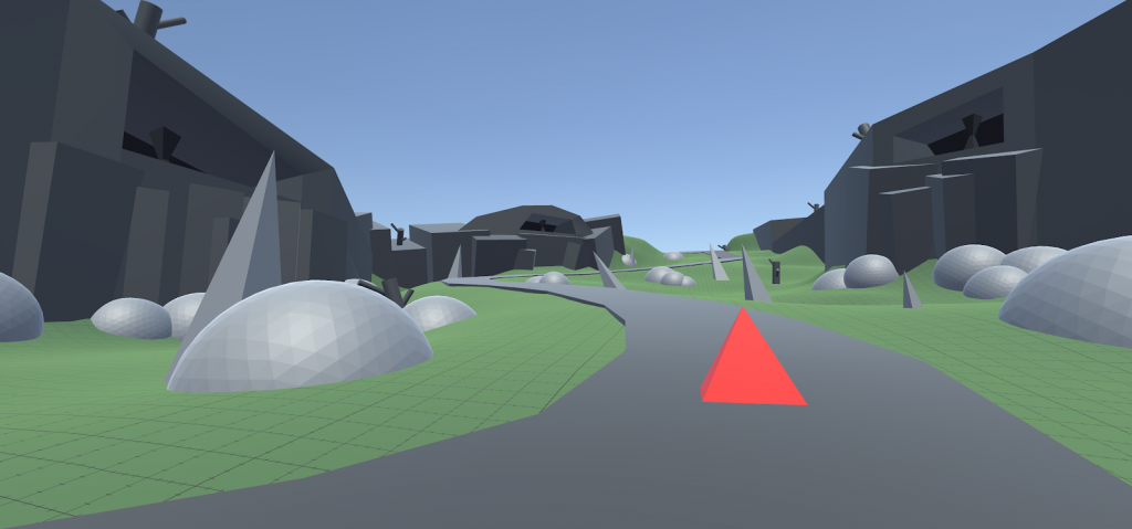
Now when we scan the scene, our attention is triggered by these structures and unknown shapes, and a potential need to double check what they are.
Be careful not to put too many. Too much visual distraction will start to move towards static, making the scene too difficult to understand and can weaken the audience’s connection to it. It might even be strongest with only one or two of these figures. As you create, always feel free to revise and try new things.
It’s not much of a forest without trees. If we place our trees with a low hanging density of leaves, we can enclose the space even further, increasing Red’s feeling of restriction, and blocking her view of the sky plane, isolating her further.
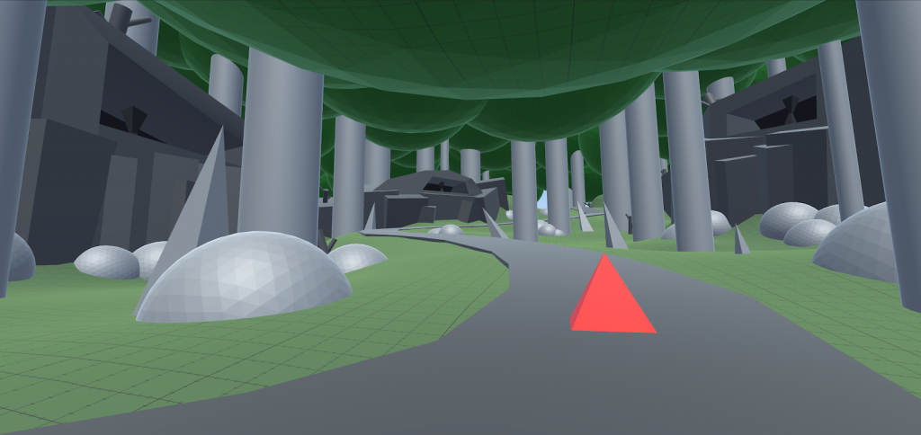
The visual language of our path places Red in a position of exposure and weakness compared to the rocks and vantages looming around her. The path ahead is a mix of comfortable shapes and hazardous ones, making the peril of the journey uncertain. The dark crevices and obscured figures add a sense of paranoia and uncertainty to the scene.
How would you construct this scene using the visual language we’ve been discussing? What descriptions would you have included in the sensation of “being stalked”?
THE CONVERSATION WITH THE AUDIENCE
We as people are widely diverse, and yet so very similar in the way we perceive, react, and understand. As you continue to create, dig down into the sources of your inspiration honestly so you can stack your palette with meaningful and genuine insights. Take notes on your emotions and read them occasionally. Meditate and observe how your mind flows.
There’s no way to “make” an audience feel a specific thing, or hit a certain emotion. As creators, what we are attempting to do is provide stimulus that is relatable and meaningful, to start a conversation with the audience. By tapping into symbols and shared understandings, we become better equipped to present relatable imagery and experiential cues that unconsciously invest the audience in our world. As you create, the stronger the sense you have of what you’re trying to say, the more effectively you can use every aspect of the game development landscape, visuals included, to communicate that point with the audience.
APPENDIX: SHAPE DESCRIPTIONS
Horizontals:
“[G]ive us a sense of stability and calm”
“[Like] the surface of the earth or the horizon line”
“We humans are most stable when we are horizontal, because we can’t fall down”
“Shapes that lie horizontal look secure because they won’t fall on us”
Repose
Calm
Quietude
Peace
Tranquility
Verticals:
“They imply energy and a reaching toward the heights or the heavens”
“[Vertical structures] require a great deal of energy to build … They will release a great deal of energy if they fall”
Dignity
Power
Permanence
Stable
Awe
Wonder
Dominance
Potential Energy
Humility
Vulnerability
Aspiration
Caution
Diagonals:
“[Gives] a feeling of movement or tension to the picture”
“[Diagonal] shapes that lean towards the protagonist feel as though they are blocking or stopping forward progress, whereas shapes leaning away give the impression of opening up space or leading the protagonist forward”
Agitation
Confusion
Clash
Insecurity
Action
Strife
Dynamic
Unstable
Risky to stand on
Under tension or pressure
Rectangles
Stability
Strength
Unity
Grounded
Still
Intentional
Strong
Trustworthy
Triangles
Even Ratio
Permanence
Security
Stable
Strong
Rooted
Sharp
Inspiring
Inverted
Irregular triangles feel off balance
Unstable
Dangerous
Risky
Uncomfortable
Flat
Flatter, feels more immobile
Grounded
Immovable
Climbable
Conquerable
Spike
“We feel more scared looking at pointed shapes”
“Our skin is thin. Pointed objects can easily pierce us and kill us”
Sharper feels nastier
Deadly
Hazardous
Sharp
Scary
Creates Distrust
Circles
Immensity
Vastness
Eternity
Motion
Equality
Deliverance
Spheres
Has Utility
Moveable
Possesses potential energy
Curves
“[W]e feel more secure or comforted looking at rounded shapes or curves”
“Curved shapes embrace us and protect us”
Grace
Charm
Movement
Natural
Easy to map
Easy to navigate
Soft or Smooth
Calm
Pleasing
Flowing
Easy to navigate
Angular
Harsh
Conflicting
Sharp
Redirects
Erratic
Chaotic
Spirals
Motion
Power
Excitement
Size
“The larger an object is … the stronger it feels.”
Repetition
“[G]ives us a sense of security, in that we know what is coming next”
“[Relentless repetition] is perhaps even more horrifying in its monotony than randomness is. It implies a cold, unfeeling, mechanical quality, whether human or inhuman.”
Order
Understandable
Memorable
Recallable
Patterned
Manageable
Easy
Randomness / Chaos
“[Randomness] is more challenging and more frightening for most of us … [We] have to adapt and react again and again”
Instability
Uncertainty
Unpredictable
Difficult
Requires energy
Generates anxiety
Uncontrolled
Read more about:
Featured BlogsAbout the Author(s)
You May Also Like

