

Daily news, dev blogs, and stories from Game Developer straight to your inbox
Sponsored By
Featured Blog | This community-written post highlights the best of what the game industry has to offer. Read more like it on the Game Developer Blogs.
Postmortem: 15 Coins design process - Part 1
[Our journey of creating a minimal yet modern and fresh looking iOS game described in this postmortem - going from mockups to the distinct ingame look of 15 Coins]
8 Min Read

To speed things up, here's a...
Little summary
The idea of 15 Coins was introduced to me by my genius partner Blake Johnson sometime in the first week of January 2014.
I was really enthusiastic when I first checked it out. This was exactly the kind of game that I believed in with its simple, yet truly enjoyable nature. I didn't want to work on another cute 2D toony game that my level of skill is nowhere near to compete with any other comparable project on the market and takes 100's of art assets to even come close to finishing.
He said this will be done in a month - perfect ! Well, it wasn't done in 1 month, but 3, which is perfect in my gamedev schedule (3x times the work we think it'll take)
What we started with
When I loaded up the Unity WebPlayer for 15 Coins I was greeted by the following. Didn't look spectacular. Did look simple. Did look perfect to get my hands on it. Immediately. Because it played supernice already in its prototype form.

Game premise
Your ship (light green) is always moving forward and all you have to do is tap to turn left and right to collect the coins (orange circle). Clones (dark green) are spawned that follow the path you've traveled. Crash into them and it’s game over. Collect a power-up to temporarily freeze and destroy the clones.
Getting inspired
The first thing I do when I get to work on a new game ? I search for reference pictures. At the moment (April 2014) I have 1147 reference pictures of games and illustrations gathered in my "reference_various" folder. Whenever I see something beautiful somewhere online, I just save it. Well I'd like it to be that easy. Most of the time I'm using my iPad, so there's this little break inbetween.
I randomly browse that folder at least once a week. Just to remember what awesome and supernice looking things others created. Often it's just color schemes I fall in love with. Or the use of certain shapes, effects, textures...really anything that triggers my "uuuh that looks so nice" antennas.
How we continued
Initital brainstorming mockups
Usually I'm the type of person that gets superexcited really quick. So minutes after I was done testing the prototype I was already working on some first ideas since these 6 colors just laughed at me, waiting for a new makeup.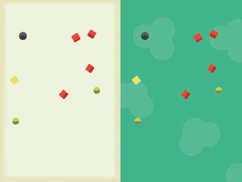
I just took all the shapes that were in the prototype, colorsampled one of the references I had in my folder and called it done for now. It was just about getting into the right mood. It certainly looked better than the prototype art and was ready for further iterations. I sent these off to Blake and he enjoyed them for the moment.
Since it was such a simple game idea getting any new artwork in there to test it out on our mobile target devices with the use of Unity would prove supereasy.
Iterating and making it more game-ish
Personally, I really love bright colors. Colors that are quite close to burning your eyes, but still match together nicely. My friend Daniele (Creator of Goscurry) once described my color choice as "weird and audacious" - nothing to add there.
I've always been fascinated by mixing things, too. I totally enjoy certain aspects about some retro games, styles, pictures, shapes and colors and create something else out of it. So that's why I just scratched the initial ideas and worked on something that looked more like a game to my eyes.
Thoughts while iterating
So let's analyze these 4 iterations for a bit. I certainly enjoyed a very pure approach to recent games. so having only shades of colors to describe some sort of fake 3D feeling was a personal trend that I've noticed here and there.
The yellow thing is the coin that needs to be collected. I made that a very prominent color so nobody misses it. Pink with the particle trail was supposed to be the player and red the clones. I wanted it to keep in a similar color tone so the connection between these 2 elements would be emphasized. Blue is the freeze powerup that should help the player. Even on the small picture one can tell that having the player and its enemies at pretty much the same color is a thing that can be optimized (read: stupid).
Changing the background is something that totally sets a different mood for a game of our nature so I just had to experiment with that, obviously. The white really made the bright colors pop so much better. I really enjoyed that !
Forgot the coin counter - d'oh
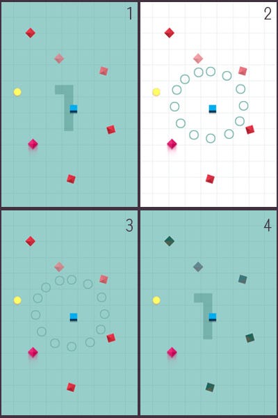
Oh and the big 1 is the coin counter - it indicates how many coins you selected so far. I didn't get that "little" detail in the prototype until Blake explicitely told me so :D
At one point I decided to try using no numbers or letters UI within the game, at all, to keep it really simplistic. That's how the little circles in picture 2 and 3 came onboard. This idea fit really well and we just needed to make sure it stays in the background and is not confused with enemies or powerups while playing the game.
Picture 4 is an effort to make the clones stand out more from the rest, which kinda worked in a way but still I wasn't jumping all over in happiness.
Looks cool, but...
Basically I was super happy and proud with the bright white setup. It looked fresh, simple, modern and I could really not ask for more at this point. But since we were that early in development and nothing was really set in stone I just had to try one more thing - which used a totally different approach. With my general thought of "keeping it simple" I felt I could push it even more. Since the game felt so simple and honest in its core setup I threw it all away and went for a flat look, no more fake 3D or anything.
What we ended up exploring
To keep in mind all these iterations happened within a timespan of 2 hours. We had a skype conversation and while Blake was working on the actual game I constantly annoyed him with new breakthroughs (for me more than him :D) that by hindsight helped us getting closer to our design choices.
Just one more iteration, ok ?
Apart from bright colors I also love a certain color tone. It's something between red and orange. I don't know why or where this came to start. I just really love a certain mixture of these 2 colors. Whenever I see this color, I squeak in joy, so I came up with this mockup:
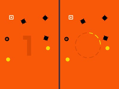
It doesn't really matter what element is supposed to be what, right there. But the colors felt really cozy and warming to me and I just had to show this to Blake.
Which one shall we pick now ?
This was really worrying me. I had 2 mockups that I felt equally satisfied and proud with. I mean, I never worked on a minimalistic game before and I was afraid I couldn't come up with anything, at all. Here I am with 2 ideas I felt strong about, so I couldn't be the one to decide which one we should focus all our energy on in the next months.
Blake liked the white mockup (Blake: I like that) but when I showed him the orange one his words showed just that 3% more intense excitement (Blake: I like that a lot) that really made the decision. That was enough to convince me, really. We've known each other for some time now, so what seems like a really tiny detail to an outside person, means quite a difference for me. At least I'm convinced it does - haha :D
This could really work
Once we decided on that mockup, it didn't take Blake long to implement the first batch of graphics into Unity and setup a TestFlight build for me to check out on my beloved iPad. I thought "wow, that looks really neat on the device" and so I went back to my reference folders and studied some more games. Since we now had a basic setup of the look we were shooting for, I needed to step up my game and do a more intense research for upcoming and needed effects (particles, animations, transitions). We really wanted to put juice in the game, which I had never done before, so I needed to learn. A LOT. But it was awesome :)
Well and of course. UI. Waaaah, on every game I had the luck to work on UI is my nightmare. Because it is never clear in the beginning what the scope of the game will be and what kind of stuff will be visible on every screen, I manage to create the initial UI screen looking quite alright but as soon as stuff needs to be added, it all falls apart.
Just the beginning
If you enjoyed reading through this posting until now, thanks a lot. I didn't even put half of my weird thoughts in there. Sometimes I did and deleted it 2 minutes later.
However, I really want to continue and write about the challenges we met while turning the mockup into a fully functioning game.
If you would liked to follow my journey as an indie developer, follow me on twitter @fabi_smith
Thanks a lot
~ Fabian
Read more about:
Featured BlogsAbout the Author(s)
You May Also Like
Latest News

Trending


Featured Blogs


