Daily news, dev blogs, and stories from Game Developer straight to your inbox
Sponsored By
Featured Blog | This community-written post highlights the best of what the game industry has to offer. Read more like it on the Game Developer Blogs.
Level design: Doom's "horseshoe" 2
A technique in 3D level design I've never seen discussed before, so let's discuss!
3 Min Read

28/02/2015 CAVEAT: There is a problem with this article, see the note at the bottom
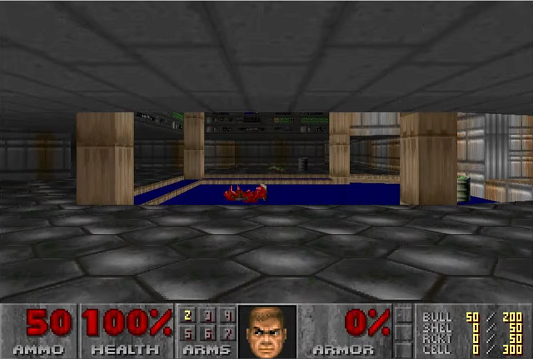
Alright so if this sight is anything but immediately recognizable to you, then you need to stop reading about level design and play Doom 1. Here's a picture of the whole level; this starting room is in the middle:
.png/?width=700&auto=webp&quality=80&disable=upscale)
Now, I never thought much of the beginning of this game. It's clear that the ceiling texture and the framing of the pillars are a three-dimensional "Hey look what we can do!", but I didn't think there was much to think about in terms of the way through the room. But I was recently watching the very good Double Fine "dev play" with John Romero, and it has turned out that I was wrong:
Romero says the room is a "horseshoe". He uses the word like oh you must have heard of this level design technique. But I didn't know about this!
.png/?width=700&auto=webp&quality=80&disable=upscale)
So, the horseshoe is a very simple way of making sure that the player is likely to look at every wall of a room, which they wouldn't necessarily do if was a straight line to the exit. This might be useful if you'd like them to see something specific, or to take in their environment properly. It also gives a subtle sense of progression: I saw the exit, then I went somewhere else, and it brought me around to the place that I saw. This isn't sophisticated psychology or anything, but it does feel a bit different from just forwards, in the direction you're looking, the whole time.
Here's another example in a room that you enter at a slight angle:
.png/?width=700&auto=webp&quality=80&disable=upscale)
I have just set up a Tvtropes page for this thing - and I encourage you all to add to it if you have any examples. It's very easy, and it means that this concept might last for longer than this blog post. Some level designer a few decades from now might stumble across that page and say - "hey, yeah, I'll do that!".
Final note: Doom's level design is obviously historically important and certainly intriguing on a number of levels. I spent some time trying to "read" it and watching Liz Ryerson's cool talkthrough of the episodes. I came to the conclusion that, in the grand scheme of things, the design is not that interesting. It's certainly required reading for students of 3D level design, and anyone wanting to design a game that takes advantage of new technology, but it just doesn't seem very clever to me (in comparison with, say, Super Mario 64). I claim that there isn't much merit in this rather famous send up of modern shooters:
.png/?width=700&auto=webp&quality=80&disable=upscale)
Because, yes, modern shooters are idiotic - but bringing back item-hunting, backtracking, and obscure secrets is not the way to improve them!
Everyone knows Doom is chock a block with fun trivia and clever uses of technology, but are there interesting challenges in it, that's what I'd like to know. Tell me what you think, and please, if you can think of other uses of the horseshoe, post them below or add them to the tvtropes page!
ADDENDUM: A day after this was released John Romero got in touch to say that the horseshoe shape is the "whole level", rather than the room. He said that the points made here are still quite valid. but, er... I guess it's down to the rest of you how to think of the "horseshoe" in future.
Read more about:
Featured BlogsAbout the Author(s)
You May Also Like