Featured Blog | This community-written post highlights the best of what the game industry has to offer. Read more like it on the Game Developer Blogs.
Level Design Breakdown: Ghost of Tsushima Gameplay Trailer
Ghost of Tsushima Level design analysis. Production workflow deep dive; From creating a layout to blocking out in Unreal Engine 4.

Hello everyone my name is Eduardo Tassi and I’m a level designer and lecturer based in Rome, Italy. This article is a level design breakdown of Ghost of Tsushima gameplay trailer released in the last Sony State of Play on May the 14th.
The purpose of this analysis is to try to understand the design intentions behind the level created by Sucker Punch Production; I can definitely say that this work was a great way to improve my level design skills and I'd suggest giving it a try to anyone who is interested in level design. As a remainder, this is a personal analysis and all opinion expressed are my own, Ghost of Tsushima is the property of Sucker Punch Production & Sony Interactive Entertainment.
PRE-PRODUCTION & LAYOUT
For this breakdown we are going to focus on the Shipyard scene showcased in the trailer.
Pre-production and layout were my very first steps, whenever I start to design a level I always make research and find references in order to establish some guidelines for the design. I’m a big fan of Japanese historical settings, so this part was all the more interesting to me.
After having done some research it was now time to put together a layout to better understand the structure and spaces of the level, watching the trailer footage multiple times was a big part of this process. This method put me in front of a number of interesting challenges that I had to overcome:
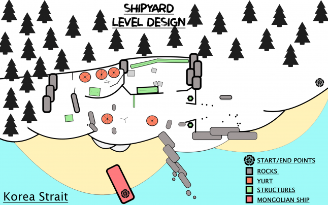
Understand how the spaces were subdived for each specific area;
Managing verticality was especially interesting, since the level is layered in different sections: Sea, Beach, Shipyard and Mainland. I also had to adapt the areas not showcased in the trailer to the main playable one, this part required a lot of guessing based on chunks of references from the gameplay footage.
Ghost of Tsushima looks super detailed;
From a level design standpoint the architecture is pretty simple but at the same time very polished and with a lot of props. In my analysis I focused my efforts on the structure and functionality of the level, cutting down details helped me with better managing each spaces. You won’t see many of the props showcased in the gameplay for this particular reason.
Ghost of Tsushima has an open world environment. Level design for these games is quite different because you have to manage affordances based on different gameplay styles, while also taking into consideration the composition in relationship with the surrounding environment;
The gameplay features Day and Night sections, this partitioning helped me to better understand the affordances inside the level and how these are closely related to each encounter. Some composition elements also change when night comes, the lights are masterfully placed in order to enforce the player stealth approach and help them navigate through the environment.
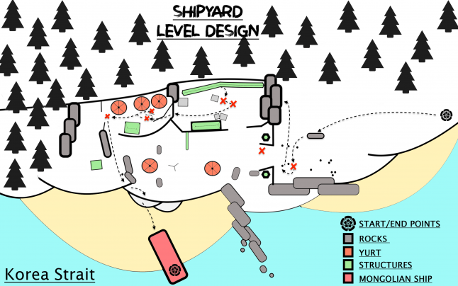
Night stealth approach
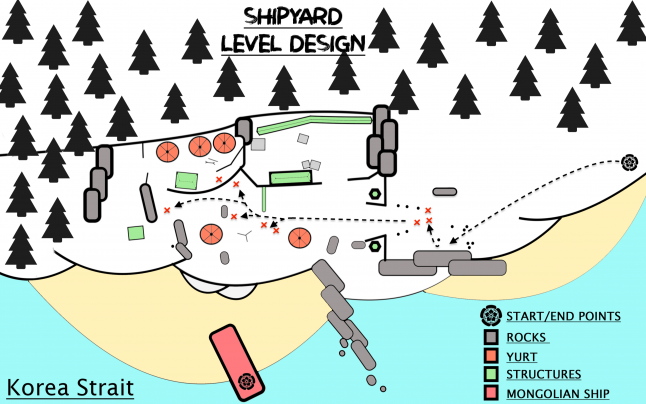
Daylight combat approach
BLOCKOUT
The final step of production was creating a blockout on UE4 based on the layout and references that I had.
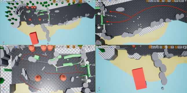
This was a highly iterative process, the previous 2D layouts helped me with establishing good references for each space, but when it comes to blocking out a level there’s always room for improvement.
The UE4 Mannequin helped me set up some metrics of reference; 1.80m for the character + 1x1m for the camera and its position. Although in Ghost of Tsushima the camera placement is slightly different, more centered to the right, I feel that with these standard metrics I have achieved an acceptable result.
I used a third person controller in order to test the level, it was fascinating to study all the different use of point of interests. The main gate for example function as a point of interest to guide player attention from both inside and outside the Shipyard.
GUIDE LINES
Guiding lines are an effective way to study a level, allowing a better understanding of composition and the purpose and relationship of each space. These are the guide line analysis of the Shipyard level based on some screenshots from the gameplay trailer.
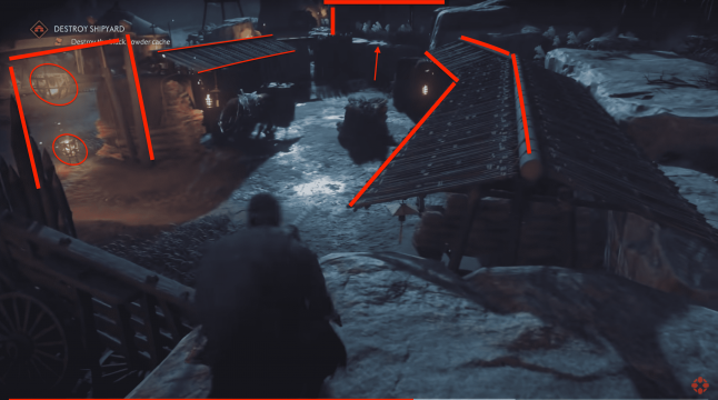
You can notice how verticality supports a stealth approach, allowing different types of affordances to tackle each enemy encounter.
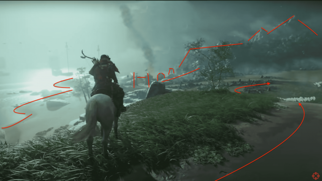
I really loved the use of landmark and vantage points; The beach and the environment help navigate the player toward the Shipyard, while the yurts and the big gate function as point of interests to capture the player attention.
.png/?width=700&auto=webp&quality=80&disable=upscale)
Ghost of Tsushima designers also did an amazing job by using light sources diegetically into the environment, you can especially notice this in the night section of the level. The torches and campfires are placed in order to help the player understand its position inside the environment, while guiding her towards each encounter.
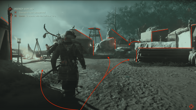
Direct combat also offers many affordances for the player. Each enemy is strategically placed according to its archetype and level structure.
RECAP
Overall I really enjoyed experimenting with this kind of production workflow! I feel like there’s still a lot going on behind what was presented in the trailer, I can't wait to experience this level first hand and spot all the differences compared to my analysis!
Ghost of Tsushima looks very promising, I’m especially looking forward to seeing how Japanese classic movies, like Akira Kurosawa ‘s cinematic style have influenced the level design of the game!
For more info please feel free to contact me on twitter: @tassi_eduardo
-Eduardo Tassi
Read more about:
Featured BlogsAbout the Author(s)
You May Also Like


