Daily news, dev blogs, and stories from Game Developer straight to your inbox
Sponsored By
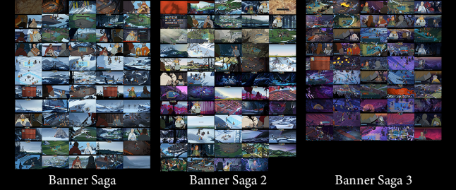
Learning from and Improving: Banner Saga Trilogy-a UX/UI Analysis
Looking at the "Banner Saga" game trilogy by Stoic studio. How does the game blend a visual novel with chess-like strategy, what new solutions can we learn from it, how can we improve it?
26 Min Read
"Banner Saga" by Stoic studio is a fresh take on the visual novel genre, that combines unique audiovisual presentation, storytelling, player choice and turn-based strategy all in to one. It has a number of simple and intuitive solutions, which make the game easy to control. There are also many opportunities for improvement, so let’s jump right in and see what we can learn.
“Banner Saga” The Basics
Themes and Ideas: Viking inspired, survival, leadership, end of the world, prejudices in society, grey morality of hard decisions, loyalty, parenthood.
Interaction type: third-person, control over a group of characters, firs-person narrative choice, indirect commands by point-and-click.
Camera type: 2D, isometric 2D.
In-game Time: Day count timer, move count timer. Game will wait for player input indefinitely.
Main screens: Travel screen, conversation screen, location screen, heroes tent, hero screen, battle board.
Win state: Progressing to the end of the story.
Fail state: Loosing a key battle. Almost all battles can be lost without getting a fail state.
Fun Factor: Challenge, story, player choice affecting story, unique audiovisual presentation.
How is challenge created: Player decision outcome is ambiguous, imitating real life choices. Limited resource shared between heroes and caravan they protect - the player has to choose who to prioritize. Tactical combat challenge with different enemy types and hero strengths and weaknesses. Story decisions impact hero raster, making the player change battle tactics.
Visual Elements: animated 2D, parallax backgrounds, hand-drawn illustrations, mix of vector and raster images, pre-rendered cutscenes.
Visual presentation: inspired by works of Eywind Earle and Disney movies, banners as the main UI theme element, flat shaded character art, detailed background illustrations, subtle animations on heroes and environment.
Color: subdued color pallet on characters, red used for important UI elements, predominantly natural, low saturation color pallet.
Font: Minion Pro for story text, Vinque used for numbers and most UI text, custom rune-like font for map and location names.
Games with similar elements: Visual novel genre, Fire Emblem, Final Fantasy Tactics.
UI screen-by-screen Analysis
Banner Saga has many different game modes and screens. I’m going to go over only some of the main game ones. This will help identify a trend in the game’s UI/UX design without being slowed down by the sheer amount of UI elements. To preserve momentum, a good or bad solution is described in detail the first time it’s encountered and mention only briefly if it appears again later on.
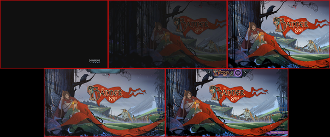
The game starts of in a spectacular fashion, fading in to a paralaxing landscape scene. This is the start menu and it does several great things. It establishes the unique visual presentation right away, demonstrating the hand-drawn illustrations and parallax. All of this is accompanied by the atmospheric soundtrack, which sets the stage for the rest of the game. The player can click and drag to move the scene left and right to see the parallax effect, which is a nice touch. The themes of Disney inspired Viking influenced lore are clear and well presented in the first few seconds.
All 3 games start this way and each has it’s own tone appropriate start scene. Let’s analyze the UI that goes on top of them.
There are three main UI elements here: text menu on the right, banner with text on the left and banner with a promotion at the top. The game throws a multitude of different styles at us straight away. While this is an effective solution to distinguish different modes from each other, it is to the detriment of overall style and immersion. Let’s see if there is a better solution that will fix these problems.
The main menu is plain text that is a bit hard to see with the illustration as a background. Choosing a bolder font option or giving it a background would help make it more readable. Overall, the menu suffers from too many options on screen. “Credits” is duplicated in the “Options” menu, so it can be removed. “Recap” and “Tutorial” option in the later games, can be grouped under “New Game”. “Heraldry” is a seldom used option and it can go in to both “Options” and “New Game”.
NOTE: Always look for opportunities to make your menu options less spread out. Try and think how often and in what situation an option will be used and design the layout based on that. Look at it with a cold mind instead of your gut feeling; just because the amount of options doesn’t annoy You, doesn’t mean the player base will feel the same. It’s challenging to let go of what you feel is right. Always check your solutions with player testing and analytics – it’s the only sure way to see if you’ve got the correct answer to a problem.
If the menu wasn’t so tall, the game modes on the left, could be included on the right. This would open up more of the illustration and keep the menu organized. As they are now, the options are also unevenly spaced away from the edge of the screen, with the left side far away, the top promo banner extremely close and the right menu in the middle.
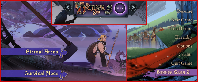
The promo banner at the top has it’s own style distinct from the other on-screen elements, with arrow buttons, navigation dots and a minimize option. It is more prominent than the background illustration and the menu combined. This is a clear violation of the importance hierarchy from the player’s perspective. The most used solution in other games, is to put promotions at the bottom as text or small images. Implementing this standard practice here would help the UI feel less intrusive.
Let’s look at the “Options” pop-up menu next.
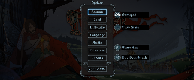
The options appear as a popup window and look the same throughout all the games. The element consists of several button options in the window and some additional buttons on the right and sometimes left side of it.
The visual elements give no indication of what kind of option they represent or how they behave. This can lead to confusion and frustration for the player. The options on the right lead out of the game and open a web address, except the “Gamepad” option. Some of the options in the middle open new windows, but “Fullscreen” does not. Despite “Resume” being highlighted by default, there is no keyboard support for menu navigation here or in the main menu.
This is a confusing setup that fails on multiple levels. It is not communicating clearly with the player and breaks the rules it previously establishes. This can be fixed by abiding by the basics of UI design. Similar options can be sectioned off visually just like the “Quit Game” option. Visually similar options must behave in a similar fashion. Turning “Fullscreen” option in to a toggle switch that has “on” or “off” indication would make its behavior more clear. “Gamepad” must be turned in to a square button and added inside the window.
Having additional options here that are unrelated to the game, adds to the complexity of the menu. The buttons on the right are just as prominent as in-game options, which causes confusion. Having them at the bottom of the window and made less visually prominent would help solve the issue.
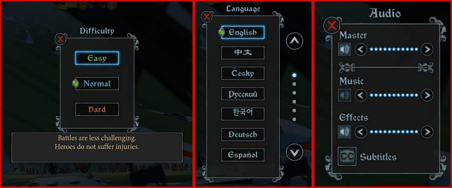
If we click on some of the options, a second pop-up window appears, replacing the main one. Here, the buttons can have a green gem on them, to indicate which option is selected. The “x” button on the top left corner closes this window.
Unfortunately, these windows suffer from the same missteps as the previous one. Window size and element spacing varies wildly. Some elements are outside the window, other inside with no obvious reason for it. The text window is out of proportion to its content. An easy fix is to have a set of design guidelines that all elements of this type follow. Keep the window/content spacing consistent throughout and keep all elements inside the window for simplicity.
A better solution for the “x” button, would be a back arrow. An “x” is most frequently used to close things or cancel them, not work as a back button as it does here. Used in this context it creates needless ambiguity. Notice also that the main options window did not use an “x”, instead the “Resume” option at the top closes it.
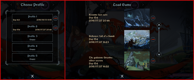
The “Load Game” option displays two windows – one for choosing a profile and the other for choosing a save point in that profile. The save file descriptions provide several types of information to make choosing the right one easier. We also see a new UI elements “-” for deleting profiles and an “x” at the bottom for canceling.
Continuity is again broken here. For some reason, the “x” button is on the bottom and has a different design than before. The window background is missing in the second screen. Fixing these missteps would provide a smoother player experience.
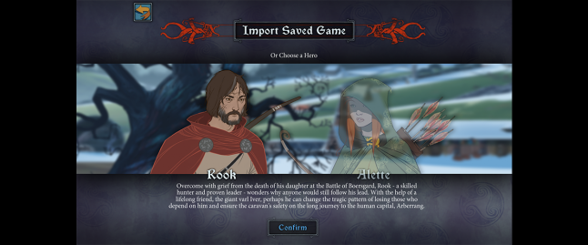
Before starting a new game in the sequels, we get a hero selection screen that also doubles as a save import screen. It has a nice visual representation of the heroes we must choose between. The screen is straightforward and theme appropriate.
We can make it better, by working out the small problems. Text seems to hang in the air and not aligned properly between elements. It is also condensed, which makes it hard to read. Proper spacing between elements and a simpler background will make blocks of text more clear. There also seems to be a persistent horizontal alignment problem with the UI, where large amounts of space on the left and right are left blank. A UI that adjusts to the height and width of the screen would make the composition less awkward.
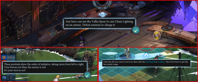
The battle tutorial has its own unique UI elements for teaching the basic game mechanics. The windows are easy to see due to the dark background and highlight combination. Pop-up windows are sometimes accompanied by icons pointing to elements onscreen. Simple, flat-shaded elements are a great choice for a fully illustrated backgrounds. This contrast creates ease of use and clarity that is essential for UI.
NOTE: Tutorials are one of the most important and challenging parts of the game to design correctly. It’s hard to teach complex mechanics to players in a short amount of time. Avoid the most common mistakes when designing them. Show more than you tell – people don’t like to read. Mix action with explanation to keep the player interested. Let the player repeat an action several times to learn it. Get inspiration from other games with great level design, to see how to teach mechanics effectively.
What can we improve on these screens? First, the text. It’s small, abundant and hard to read. Long stretches of time where a player is reading without taking action creates frustration and boredom. More so if the text is uncomfortable to read. Perhaps a fixed window with larger text would be a better solution, so the player doesn’t have to hunt for the checkmark button every time he is ready to move forward.
Most of the icons are animated, including the checkmark button. This calls attention to the icon but in excess can be very distracting. Removing animation on some of the elements will allow the game to communicate visual element priority much better.
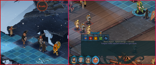
A battle in Banner Saga starts with a paused state that allows the player to survey the battle board and note the position of the two forces. The player can reposition their heroes within the area marked with blue tiles. Clicking on a hero brings up their stats, for both player and enemy units. The “Ready” button at the top will start the battle.
All the battle boards have beautiful paralaxing backgrounds and animated isometric rotoscoped units. This attention to detail creates that Disney feel the game is known for; it’s a great visual presentation that makes the game unique and instantly recognizable.
There is a bit of confusion that can occur at this stage. It is not obvious that the friendly units can be repositioned before the battle begins. Making this fact more obvious by starting with a unit already selected would have made this option clearer.
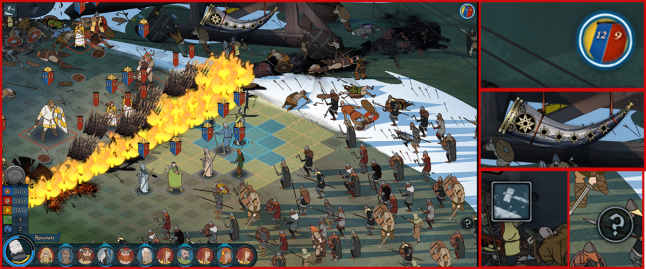
When the battle starts, we get to see the full UI. It consists of persistent UI elements on the edges of the screen, animations that play briefly and context UI that appears in reaction to player action.
Top left has a button that brings up the options window. Top center has a horn or staff element that serves as a special ability meter. Top right has a button that toggles hero stats on the board on and off. Bottom right has a help/hint toggle button. Bottom left houses the main hero and battle order UI elements.
The game does a great job of integrating the board UI in to the background illustrations. Subtle dark squares mark the board edge; unit squares are outlined to give a better idea of their size and position; filled blue and yellow squares mark the range a hero can walk. A selected hero has an animated circle under them. Movement and position planning is very well communicated.
Banner Saga also uses a very easy to understand board indicator for strength, willpower and armor. A banner-like UI element is placed on top of the hero and fills or empties accordingly. While the numbers might be hard to see, the color bar they accompany is a great way to communicate hero state at a quickly.
What can be done more effectively here? Currently, the player has to hunt for UI icons all over the screen space. Placing them together in the top right or left corner would be a good start. This would allow for faster access to less frequently used features and free more screen space for the battle board that can itself get crowded.
The horn or staff element can be moved to the bottom of the screen, so that all the battle related UI is easy to keep track of at a glance. As it is right now, the player has to constantly shift his eyes from one corner of the screen to the other to keep track of the available options.
The UI elements don’t seem to follow one visual style. Some are illustrations, other are flat shaded – this lack of visual cohesion makes distinguishing elements from the background harder. It adds to the background noise that detracts from the overall experience of the game. Making all the UI elements flat shaded and simple would allow them to stand out from the background. What the game would loose in visual splendor it would gain in usability – the UI elements should not be the visual center point of the game.
The one improvement that would help with unit positioning is outlining. Isometric illustrations always run in to the problem of overlapping. It’s hard to see and click on a unit when it is obstructed by others. Placing an outline on top will help alleviate this problem.
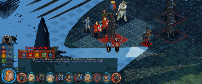
Moving on to the unit order and information panel on the bottom left. We see that there is a vertical line with current friendly hero stats and a horizontal line that shows the stats of any selected unit, including special ability description. On top of the vertical hero stats there is a round frame that will display the player chosen heraldry, which is a nice thematic touch. The currently selected unit portrait is also helpfully outlined in the move order.
This UI section has a lot of information confined in a small space and thus hard to get right. The more elements the player has to pay attention to, the higher the chance of confusion and frustration. This element will be one of the most widely used during battle, so let’s see if we can improve its ease of use.
Overall, the UI is a mix of themed illustrations and flat shapes. This tonal inconsistency makes it look random or unfinished; it breaks player expectation and makes the important information hard to see. The UI would benefit from a clear visual design based on information priority. Currently, many of the elements have the same size and compete for attention.
Making both stat boxes (current hero/selected unit) vertical would allow for quicker side by side comparison. The text description is currently awkwardly aligned in the text box, so positioning it with more space between the lines and equal borders, would increase readability.
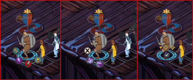
The last UI solution we’re going to look at here is the action buttons. Banner Saga has them in a unique position around the acting hero on the battle board. Executing an action requires selection and confirmation which is a good way to prevent mistakes. Most actions are color coded to the stats they depend on, which is a great solution that increases ease of use.
Overall, this is a great UI solution and there are only a few minor things that can be improved here. Some buttons appear horizontal instead of arranged in a circle, this breaks continuity and sometimes makes the buttons hard to see. Keeping all the UI elements of this type arranged in a circle would provide faster navigation. Some actions can only be canceled by clicking outside of the buttons, which is not very clear and would benefit from an “x” button we see used for special abilities.
Moving on to the location screen, we can see that all of them follow an identical UI pattern. On top of a parallax background there might appear an outlined blue text, outline only or hero portrait element. A great solution here is making conversation options have the shape of a chat bubble and the portrait lets the player know, who the conversation will be with.
Light text with a light glow is hard to see on a light background – this destroys any usability the text button has. The decorative type is hard to read, which is made worse by positioning it on a wavy line. A better solution could be found for location close-ups. Text on a banner or chat bubble background would be best here.
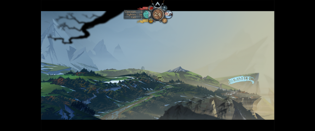
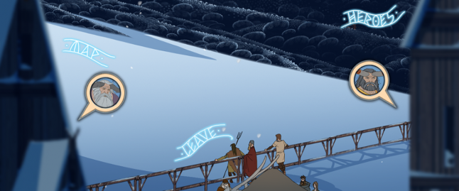
When we leave a location in the game, we are treated to a beautifully illustrated landscape travel scene. Just like on the map and location screens, towns are marked by text. Player progress is illustrated by an animated caravan with a banner, moving through the landscape. There is a persistent UI element on top, that houses different types of information and buttons.
The UI is designed in a way that maximizes immersion and keeps the focus on the caravan and the background illustrations. If we were to take this concept further, the town names could also be removed. There are other locations that are not marked by names, so removing town names will not significantly impact the experience.
Let’s take a closer look at the main UI element on top.
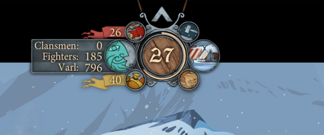
The center element counts days and shows day progress. On the left we have the information side, with renown, caravan information - number and type of followers and morale, and supplies. On the right we have an options button, a camp button and a map button. The whole element can be minimized by pushing the up arrow on top.
This is a complex element that can be improved by minimizing the number of elements it has and using importance hierarchy to position them. The intention was clearly to make this element as unobtrusive as possible, so let’s see how we can do it.
The visual design of the elements is a mix of in-game object and metaphoric elements. Choosing only one would make all of them more easy to use and provide a sense of cohesion to the design.
To see what elements can be removed, we need to think about what information and actions are useful for this particular screen. If the focus is on the caravan survival and getting to the next settlement safely without starving, then supplies and day progress are the most important elements. Number of days doesn’t play any role in the story or gameplay, yet it has the most prominent place. We can replace it with the morale icon and either remove the irrelevant day count or add it as text to the caravan numbers on the left. Alternatively, the center number could be counting down the number of supplies to add to the immersion and survival feel of the journey.
Renown is spent in shops and hero tent, so it can be removed from this screen, since it’s not relevant. Even the caravan numbers breakdown can be removed if we wanted to reduce the UI impact even more. We can compose all the remaining elements horizontally and place them at the bottom, so they don’t draw attention away from the travel scene.
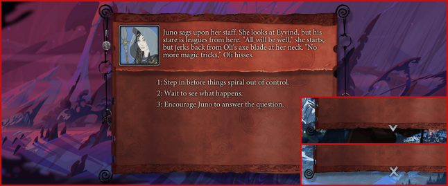
Occasionally, a text message or banner will appear on the screen. Text updates players on caravan status like deaths or morale. A banner appears when there is an event of some sort. The upper part of the banner will have text description and an image on the right, with lower part housing the player options to react or an x/down arrow to move forward.
The banner unrolls in a nice quick animation to display the text. The font used here is easy to read even when there’s a lot of text. This pop-up window does it’s job while still displaying some visual flair.
If we try to improve on this solution, we can keep with the text based navigation and remove the x/arrow button at the bottom of the banner. A text message like “More”, “Next” or “End” would work just as well, while preserving the design metaphor of text for navigation.
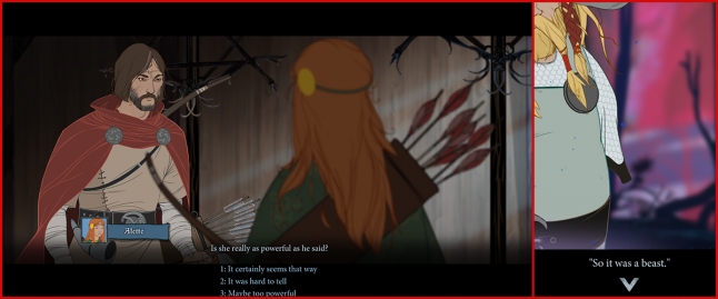
Conversations make up a big part of the game. They are presented in a very cinematic way, with the camera switching points of view between those who are talking. The window consists of minimalistic UI at the bottom of the screen and most of the space is dedicated to the illustrations. On the bottom left there’s a portrait icon of the hero who’s speaking, their name and text. Navigation is done with a down arrow and text choices. Hero portraits in the main scene are subtly animated and set on a blurred background; sometimes weather effects are layered on top. This is a unique cinematic twist on the standard visual novel presentation, that helps the game feel like an animated movie.
The text sometimes has trouble fitting in the horizontal black lines, so it jumps up and interferes with the illustration. This can be solved by displaying only dialog or choices, but not both together. Using an answer selection dialog wheel Mass Effect style, would also allow to fit more choices in to the horizontal space.
Another unusual UI choice here is to use a down arrow to progress the dialog forward. Not necessarily a bad solution, but a right arrow would be more intuitive.
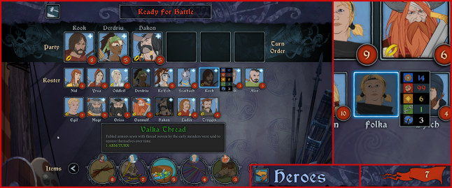
The heroes screen appears before every battle and can be accessed from the camp. It’s one of the most complex screens in the game, containing lots of different information and UI metaphors. It can be broken down in to three sections: top – buttons and passive elements; middle – heroes and party composition; bottom – items. The top can display either an option button and a “Ready for battle” button, or a back button with screen name and renown count on the right. The middle contains hero portraits with a name underneath, which in turn display a quick stat popup on hover, injury recovery time, item icon, level and promotion icons. The bottom section has a scrollable ribbon of items with level requirements and owner portrait if applicable; the item information is displayed on mouse click.
How can we make this complex screen more useful to the player? We can start with the same approach we’ve taken before – simplify and order by importance. The first thing a player will do on this screen, is decide on what type of team is required. This makes the stats pop-up very helpful, but perhaps it can be turned in something you can toggle on and off. The stat information can replace hero portraits, since we have hero names underneath and seeing their portraits is not the most important information on this screen.
We can get rid of section names by replacing them with a more intuitive visual design. Make the party order slots round just like they appear in battle, while keeping the heroes below in a square frame. This would visually separate the two sections and make them easier to understand at a glance. Hero names in the party section at the top can be removed to reduce information load – they are duplicated in the section below.
The item section appears a bit awkward, since most games reserve equipping items to the hero screen. Perhaps the same can be done here, to keep the screen focused and less busy.
The overall visual presentation of the screen could benefit from variety. Making the buttons have their own unique design, for example, would help them stand out from the popup screens and all other elements that use the same frame style.
In terms of layout, the screen adapts an unusual approach. Player action proceeds from bottom to the top, instead of the usual top to bottom. Hard to judge how this affects the player experience; perhaps switching elements to proceed in a more natural top to bottom way would make the experience faster and less awkward.
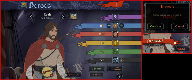
Clicking on a hero portrait takes us to the hero screen. This is another information heavy screen and therefor has a complicated layout. The top is reserved for the back button, screen name and renown count. On the left side, we have hero navigation, with name and level, hero information button, hero portrait with subtle animations, equipped item and kill count, promotion banner if applicable. On the right, there are stat banners and buttons, available points and a help button.
The game uses a great solution for different stats – color-coding. Colors are used throughout the game to communicate abilities and stats at a glance. The flat shaded color helps the UI stand out no matter how small the element is.
In terms of optimization, we can clearly see that not taking advantage of the full screen width detracts from the UI. Having more negative space would have allowed for less clutter and made the screen more cinematic. Since the main goal of the game is to create immersion, having less UI elements is key. Several elements here can be repositioned to increase usability.
Hero navigation and information button can be moved to the top banner to take advantage of that space. Screen name text can be removed as it serves no useful purpose.
Rearranging the different hero stats by importance could greatly improve this screen. The violet stat is actually a button that shows a heroes’ special ability. It will be rarely used, so it can be displayed without a banner and placed closer to the bottom of the screen. Grouping related information will help make it easier to find, so having kills and skill points together will help increase UI readability.
On the visual presentation side, we can see how not having a specific button style can be a hindrance. There is no easy way to tell if something is an icon or a button. Having a distinct button visual design will eliminate this uncertainty. The stat banners could also be redesigned to have a shorter tail end, so that they do not interfere with other elements on the screen.
NOTE: Always make a clear visual distinction between the different types of interactive objects in your design. Don’t make the player guess which element is active and which is passive. The difference might be clear to you, but for every intuitive person who gets it, you’ll have one who is frustrated and confused. Your goal is to communicate with all types of people as effectively as possible.
There are many pop-up windows that can appear on this screen. The item is a button that brings up item navigation, pressing a promotion banner brings up an information window and two confirmation windows, each stat can be pressed to bring up a boost window, the hero information button also brings up a pop-up.
This variety and volume is a natural result of a complicated game, but that does not necessarily mean the UI has to be complicated. Breaking things down, rating items by importance, eliminating less important information and using both text and icons can drastically improve information delivery and ease of use.
Summary
Banner Saga is a great example of how hard it is to balance UI with an immersive game; of how interesting and unique gameplay can give rise to a large volume of information that is hard to communicate to the player. It’s a great example of the important role UI can play in the overall game experience and how easily it can hinder it.
The most common UI/UX missteps in this game:
Inconsistency of element behavior and visual design
Bad composition and spacing of elements like text and buttons
Ineffective mix of visually themed and simplified UI elements
Lack of clear visual information priority
Most effective UI/UX solutions in the game:
Unique and memorable audiovisual presentation
Intuitive hero battle UI
Unique and immersive conversation design
This game is a great example of how to create an experience that feels unique and stands out among the crowd. It iterates on the familiar formulas seen in other games, but takes them in a new and interesting direction. A great gem to study if you are looking to create a unique experience of your own.
Read more about:
BlogsAbout the Author(s)
You May Also Like
