Daily news, dev blogs, and stories from Game Developer straight to your inbox
Sponsored By
Icon design rules you should know
A picture is worth a thousand words. A well-designed one is worth even more. We see them on road signs, in restaurants, airports and apps. They can save time, lives and also ruin them and create confusion.
4 Min Read


A picture is worth a thousand words. A well-designed one is worth even more. We see them on road signs, in restaurants, airports and apps. They can save time, lives and also ruin them and create confusion.
Icons are interpreted faster than text, are easier to spot, take less space and require less translation efforts. A wall of text blurs in to a single mass because of shape similarity, but icons are shape-diverse and look good even in groups.
So how can we design the most effective icons that look great and convey their message?
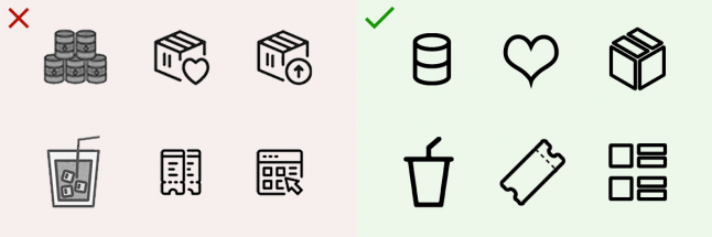
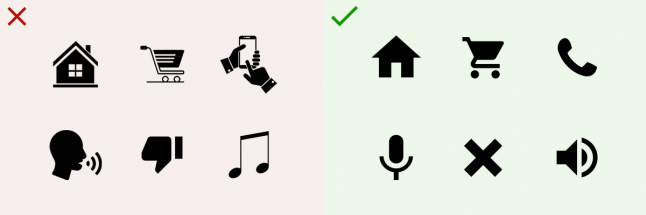
1. Avoid similar shapes for different icons

Icons with similar shapes look like they belong together/do similar things. Be aware of that when you create another square shaped icon for your UI. You’re not taking full advantage of the benefits icon shapes can give.
An icon should be easy to distinguish from all others by it’s shape alone. Make the shape too similar and you increase confusion and the effort it takes to understand the message.
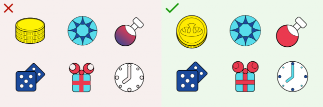
2. Minimize icon complexity
The more elements an icon has, the less contrast there is, the more time and effort it requires to be identified. It looks like a jumbled mix of shapes from a glance.
Sometimes you might want to make your icon unique or add some flare to it. Make sure you’re not doing it at the expense of readability and clarity – keep it simple and clean.
3. Keep a consistent visual style
When UI elements break the style rules they establish, the experience feels disjointed and unprofessional. Even small changes in styles can make icons look like they do not belong in the same app or are somehow different from the rest of the UI.
Contrast in visual style draws attention to itself. You don’t want to do that accidentally. Make sure to design icons side-by-side and check frequently if all your elements look like they belong together on one screen.
4. Don’t rely on text
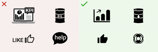
This makes the icon redundant, unclear at small sizes and locks it to a single language. Text can also look messy and reduce icon clarity.
This mistake is commonly seen in larger icons and app logos. If you must include text, then do it as a label underneath the icon.
5. Don’t reinvent the wheel
Many millions of hours were spent creating and testing already established icons. Even if they can be improved, chances are people know what they mean due to encountering them so much.
Using the same icon shapes can feel tired and uncreative. Don’t feel like you need to reinvent the wheel to impress. Usability is key and design should serve to improve it, not stand in its way.
6. Make the message consistent

Nothing stops work and causes anger and frustration as much as an improperly used icon or metaphor. This might surprise you, but there are apps out there that use the same icon for different functions.
It’s easy to make this mistake by mixing up inactive and active icons, without giving the user any way to distinguish between the two. Make sure you use the same rules and icons across all your pages.
7. Design for small size

An icon that looks beautiful when you design it, looses all it’s charm when it has to fit in to a small space. All those carefully designed details turn it in to a jumbled mess.
It’s tempting to flex your creative skills and add details to make your icon stand out and look unique. Remember, icons are not the star of the show, they are there to be useful first and look beautiful second.
8. Don’t rely on color for effect
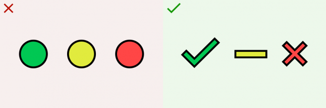
Colorblind people will thank you for it. While color is a great addition to an icon’s message, shape must still be the first thing that people notice.
Often times color can mask a design mistake you’ve made. If you’re compensating an ineffective icon with color, consider revising the icon.
Read more about:
BlogsAbout the Author(s)
You May Also Like