How we create a games interface
We are CoffeeCatGames and we'd like to tell you a bit about our game - Hazardous Space and its UI.

We are CoffeeCatGames and we'd like to tell you a bit about our game - Hazardous Space and its UI.
Speaking shortly, Hazardous Space in a 2D turn-based roguelike in the Sci-Fi setting. You can learn more about us in social media and Steam.
So, getting back to the UI. UI is a very tricky thing - it's like a good spy. If everything is okay, you don't pay much attention to it. But if there is something wrong with it - players will definitely say their "fie!", because it automatically becomes the pain in the neck.
The key is, that interface is not only nice pictures and HP bar over hero's head. It's a very complex system, responsible for engagement, player-game interaction, retention and lots of different tasks. If there is no i/o system - there is no game itself. UI becomes the link between the player and the game.
One of the biggest mistakes we made - we'd thought, that UI development is a very simple thing. Just put some icons here, some numbers - there, and that's it. Well, I do hope you understand, why it was so stupid and giddily.
.jpg/?width=300&auto=webp&quality=80&disable=upscale)
Our first prototype was very simple. We wanted to provide a simple and neat interface, that looks nice for inventory and hero management. We planned, that some players will use keyboard + mouse, another part - mouse only. Despite our inspiration sources were some old games, we used to look for some references from new games - they are more useful and common for player nowadays.
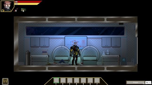
Ok, let's take a look on our first UI prototype. HP bar - top left corner, all skill panels are in the bottom part on the screen.
This old version was very simple - and we thought it would be intuitive and easy to use. Well, first playtests had shown that we were completely wrong. Our testers had been spending a lot of time in some aspects - like "how to assign weapons to slots" or even "whoa, where is the cross button to close"?
And now comes a bit more tricky thing. Our first interface version was completely separated from the game, it was 100% functional, but had no entanglement to lore and narrative. New UI system combines functionality and storytelling, the narrative if it can be said so. Look at it.
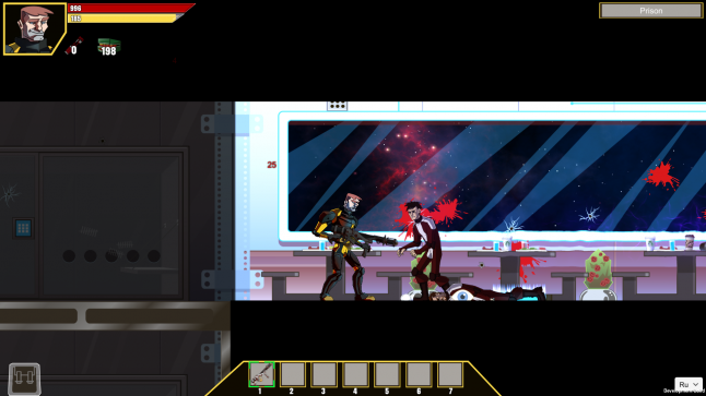
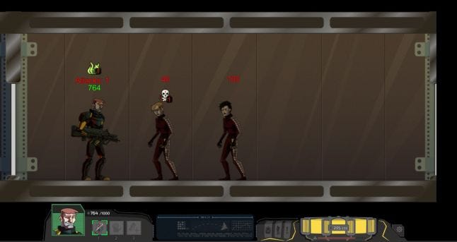 For the new edition, we invited a specialist, who had some experience in UI/UX design. Wonderful Lera contributed a lot to the project. She created a brand new UI concept - it is the suit of Max, our main character - but here you, the player, put on the suit.
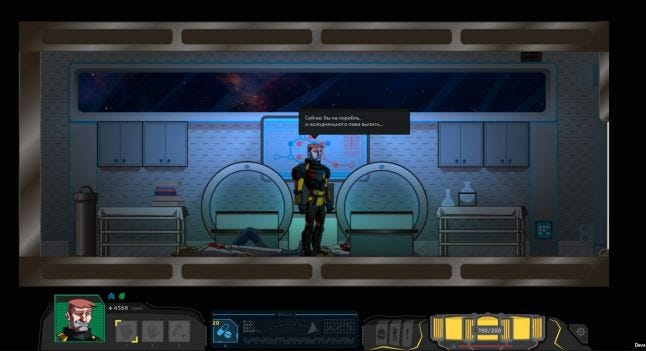
So, we have 2 logic parts into new interface: skill panel and HP bar, that includes health (left side) and energy (right side) panels. Right part of the screen contains other UI elements like:
- Inventory
- Suite Upgrade screen
- Journal with quests and log
- System menu button.
Now it's time to tell more about one of our key gameplay elements - energy and battery management. The simple bar turned into the stylized reactor, that gives "fuel" to your hero. The shape of the reactor is linked to the lore. Lera asked dozens of questions like "if such thing existed, what is it would be like?", "what is the possible look?", "which parts generate energy?", "what is the energy storage?" and lots more. The answers to all these questions gave us the clue to the current energy bar.
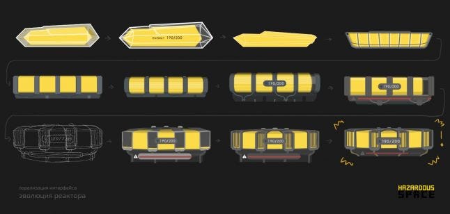 We have also upgraded health bar too. Added hero's reactions on in-game actions and health color indicator.
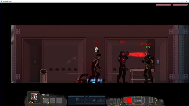
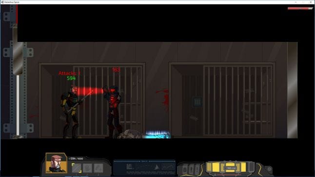
Another important part - skillbar, where we put all the skills and quick access slots. You can compare two versions and it won't be difficult to understand, why we migrated. New UI is more user-friendly and easy-to-use.
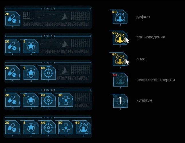
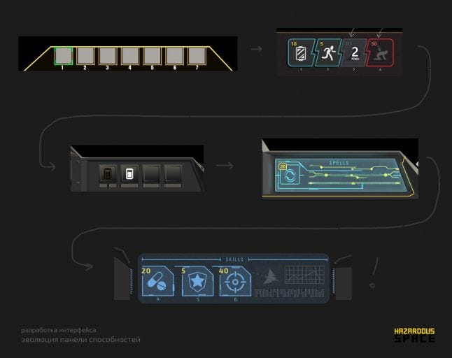 So, this is how we used tester's feedback and created new UI, fixing our main mistakes. We do understand, that there is much to be done, so we would be happy getting your feedback/comments!
Read more about:
BlogsAbout the Author(s)
You May Also Like
