Game Design in For Sparta: Improving the arena art while not distracting the player
In light of the newest update of my game: For Sparta, I decided to make a post discussing one of the improvements of the latest update as well as some of the Game Design considerations that went into making it.

Hello all!
In light of the newest update of my game: For Sparta (which you can get for Free before the launch here: https://gamecraftstudios.itch.io/for-sparta), I decided to make a post discussing one of the improvements of the latest update as well as some of the Game Design considerations that went into making it.
First off, some context.
For Sparta is our (my brother's and mine) latest game that will be released on March 22nd. So, to help improve the game before the launch, we decided to put it up for free on Itch while it's on Beta. We are truly happy with the support the game has been getting, and we have received lots of great feedback!
One of them mentioned the environment art, and how it could benefit from some more detail. Here is how it looked:

So, since one of our players mentioned a possible way to improve the game, we dived right in, and started experimenting with the possibilities.
The first obvious thing to do, was to litter the ground with small props like plants, rocks, marks and other random things. While it definitely can help make it look better, there is a pretty important consideration: Game Design.
For Sparta is, first and foremost, a game. That means that we, as developers, must be constantly thinking about how will the player perceive and react to everything in the game.
Every element you put in the game, is like a word in a poem.
You shouldn't randomly add pretty words just because you like them, but you must consider how it fits in the whole, and in our case, the gameplay.
In For Sparta, the player will be facing endless waves of invading Persians in a single-screen arena, so the most important game design requirement is being clear about the play area and what's in them.
When we add non-gameplay elements that take the player's attention, we must make the gameplay elements (enemies, bullets, collectables) even more evident! And that inflates the whole game's attention grabbers, polluting the visuals and confusing the player.
Instead, we took this opportunity to add elements that will enforce the game design requirements, particularly focusing the player's attention on the center of the arena, where the action will take place.
Here is the comparison of the old arena and the new one:
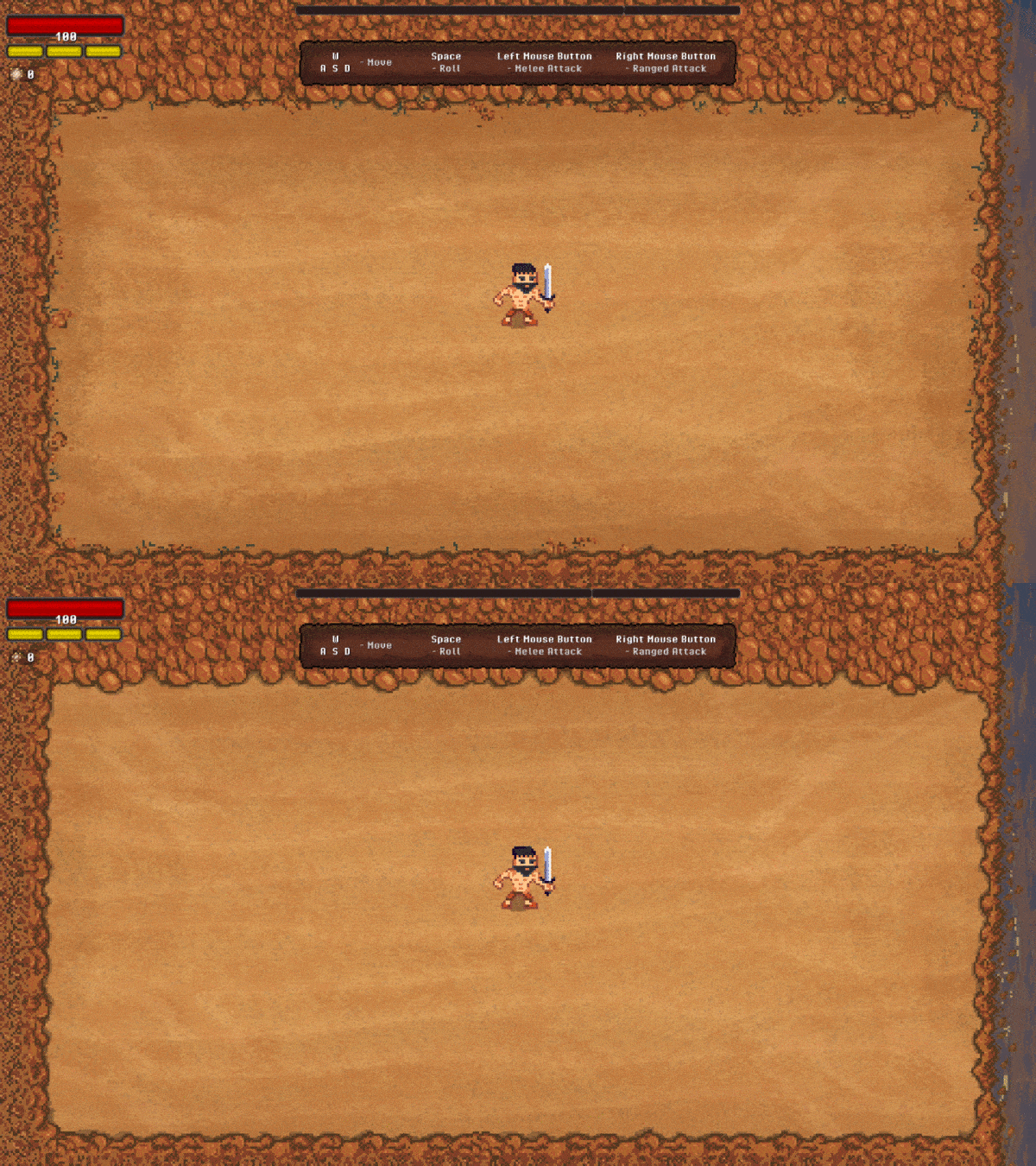
As you can see, we added a gradient that would make the center of the arena brightest area in the image, drawing the player's attention to it.
Not only that, but we did add those small props, but not where the gameplay-relevant elements will appear, so to not compete with them. This focus on making the borders look nicer will help the player feel the gameplay elements better while being more immersed in the fantasy of the game - and hopefully lead to an overall better experience!
What did you think about the change (and the motivation)?
I would love to hear your thoughts on this interesting discussion of game design and aesthetics. If you want to dive deeper into it, I recommend this video by Jonathan Blow:
I hope you liked this post! And I would love to know what you think about the game! :)
https://gamecraftstudios.itch.io/for-sparta
https://store.steampowered.com/app/1490180/For_Sparta/
I'll see you in the Pass of Thermopylae!
Bye!

Read more about:
BlogsAbout the Author(s)
You May Also Like


