Featured Blog | This community-written post highlights the best of what the game industry has to offer. Read more like it on the Game Developer Blogs.
Detect different iOS device types, screen widths and screen heights.
I got rejected because my iPhone code would not run on an iPad. I failed to meet the requirement 2.10 of the App Store Review Guidelines. I have to re-engineer my code to make it running nicely on an iPad. This post will explain how that was achieved.

I came across a dilemma when I submitting my first iOS app/game to the app store.
I got rejected because my source code would not run on an iPad. Apple's resolution centre sent me a message saying "We noticed that your app did not run at iPhone resolution when reviewed on iPad". I failed to meet the requirement 2.10 in the App Store Review Guidelines.
This was my first attempt at submitting to the App Store so I was really unfamiliar with the process and the guidelines.
If you find yourself in the same situation please read on. The resolution to this issue has been descibed in the Swift programming language.
Basically what Apple was letting me know is that the source code should working nicely across the iPhone and the iPad without any modification. I had to workout how I would make all my SKTextures, SKLabelNodes and SKPhyicsBody's display that same across the iPhone and the iPad which are different resolutions and screen sizes.
I set about to see what other people have done to get around this and the shortly answer is. There is no general guide to get your source code working across both iPhone and iPad when you are using SpriteKit. In SpriteKit you don't use Storyboards so the really cool AutoLayouts features are not available.
This is what I have put together after weeks of research on this topic. I used a combination of two things to make it work nicely and was detecting the device type (iPhone or iPad) and then detecting the screen width.
This is how it goes.
Step 1. We will create a new Xcode project using the Game template to explain this concept.
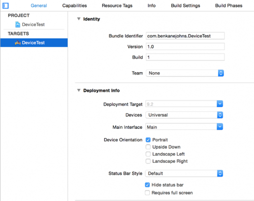
Step 2. Make sure your Xcode projects Devices is set to Universal. This option is located under the heading Deployment Info. Also de-select landscape left and right as this example will be explained using a portrait style app. See below

Step 3. In this explained I am going to show you how to change the font size of the SKLabelNode that is already in the Game template. We will be change the font size to my the text in the label look proportionately the same on both the iPhone and iPad. This concept can he applied to anything, like changing the size of an SKTexture or the position of it. You can even use it to change the size of an SKPhysicsBody.
Firstly we need to declare a constant variable called screenSize to detect the bounds to the current screen. This will detect the current screen width and height in points not pixels.
Swift Code:
import SpriteKit

class GameScene: SKScene {

    // Screen size detection
    let screenSize: CGRect = UIScreen.mainScreen().bounds

    override func didMoveToView(view: SKView) {
        /* Setup your scene here */
        let myLabel = SKLabelNode(fontNamed:"Chalkduster")
        myLabel.text = "Hello, World!"
        myLabel.fontSize = 45
        myLabel.position = CGPoint(x:CGRectGetMidX(self.frame), y:CGRectGetMidY(self.frame))

        self.addChild(myLabel)
    }
Step 4. The next thing we need to do is access the width of the current screen. We do this by creating another constant variable. This time is has to be done within the didMoveToView function as we need to call a property on screenSize called screenWidth. This is only detected once the app is running which is why we can do this inside didMoveToView.
Swift code:
import SpriteKit

class GameScene: SKScene {

    // Screen size detection
    let screenSize: CGRect = UIScreen.mainScreen().bounds

    override func didMoveToView(view: SKView) {
        /* Setup your scene here */

        // Access in the current screen width and height
        let screenWidth = screenSize.width

        let myLabel = SKLabelNode(fontNamed:"Chalkduster")
        myLabel.text = "Hello, World!"
        myLabel.fontSize = 45
        myLabel.position = CGPoint(x:CGRectGetMidX(self.frame), y:CGRectGetMidY(self.frame))

        self.addChild(myLabel)
    }
Step 5. Next we need to workout the current device type, iPhone or iPad. We also need to do this inside the didMoveToView function as it can only be worked when the app is running. We will create another constant variable and this will be called deviceIdiom. Here is a short explanation of what we are doing. To successfully detect the iOS type we use the iOS trait environment property UITraitCollection to expose the device type which is defined in the UIUserInterfaceIdiom . We will be looking for an iPhone trait or and iPad trait.
Swift code:
import SpriteKit

class GameScene: SKScene {

    // Screen size detection
    let screenSize: CGRect = UIScreen.mainScreen().bounds

    override func didMoveToView(view: SKView) {
        /* Setup your scene here */

        // Access in the current screen width and height
        let screenWidth = screenSize.width

        // Request an UITraitCollection instance
        let deviceIdiom = UIScreen.mainScreen().traitCollection.userInterfaceIdiom

        let myLabel = SKLabelNode(fontNamed:"Chalkduster")
        myLabel.text = "Hello, World!"
        myLabel.fontSize = 45
        myLabel.position = CGPoint(x:CGRectGetMidX(self.frame), y:CGRectGetMidY(self.frame))

        self.addChild(myLabel)
    }
Step 6. So far we have done two things, we have detected the screen width and detected the iOS device type. No we need to use these two pieces of information together to accurately display the font size of the SKLabelNode for each iOS device type. To do this we will use a combination of switch statements.
Swift code:
import SpriteKit

class GameScene: SKScene {

    // Screen size detection
    let screenSize: CGRect = UIScreen.mainScreen().bounds

    override func didMoveToView(view: SKView) {
        /* Setup your scene here */

        // Access in the current screen width and height
        let screenWidth = screenSize.width

        // Request an UITraitCollection instance
        let deviceIdiom = UIScreen.mainScreen().traitCollection.userInterfaceIdiom

        let myLabel = SKLabelNode(fontNamed:"Chalkduster")
        myLabel.text = "Hello, World!"
        myLabel.fontSize = 45
        myLabel.position = CGPoint(x:CGRectGetMidX(self.frame), y:CGRectGetMidY(self.frame))

        // Check the idiom to find out the current device type
        switch (deviceIdiom) {
            // Display myLabel with the appropriate font size for the device width.
        case .Phone:
            switch screenWidth {
            case 0...320:
                // iPhone 5 portrait

            case 321...375:
                // iPhone 6 portrait

            default:
                // iPhone 6 Plus portrait

            }
        case .Pad:
            // iPad 2, Air, Retina and Mini etc Portrait

        default:
            break
        }

        self.addChild(myLabel)
    }
Step 7. Before you call the desired font size for each device type and screen width you will need to either comment out or delete the following line of code.
Swift code:
myLabel.fontSize = 45
Step 8. Now we can fill in the desired font size for each device type and screen width. Once that is done you can test it out in the simulator. Test in the iPhone and iPad simulators to see the result.
Swift code:
 // Check the idiom to find out the current device type
        switch (deviceIdiom) {
            // Display myLabel with the appropriate font size for the device type.
        case .Phone:
            switch screenWidth {
            case 0...320:
                // iPhone 5 portrait
                myLabel.fontSize = 41
            case 321...375:
                // iPhone 6 portrait
                myLabel.fontSize = 43
            default:
                // iPhone 6 Plus portrait
                myLabel.fontSize = 45
            }
        case .Pad:
            // iPad 2, Air, Retina and Mini etc Portrait
            myLabel.fontSize = 58
        default:
            break
        }
If you were wondering how I worked out the the range of numbers I used in the switch case statements in step 5 I will show you where I found that information. There is a really helpful online resource called iosres.com. It shows you all of the iOS device types and compares the specifications. In particular the logical resolution which is a width and height measurement in points. Thanks for reading this post and I hope you found it helpful.
If you would like a further more indepth explaination on this solution and how you would apply is to a real life situation please check out my latest Udemy course How to create a Mr Jump inspired iOS game in Swift 2 for only $10. This price is for a limited time only.
Thanks
Ben Kane Johns
Read more about:
Featured BlogsAbout the Author(s)
You May Also Like


