Daily news, dev blogs, and stories from Game Developer straight to your inbox
Sponsored By
Featured Blog | This community-written post highlights the best of what the game industry has to offer. Read more like it on the Game Developer Blogs.
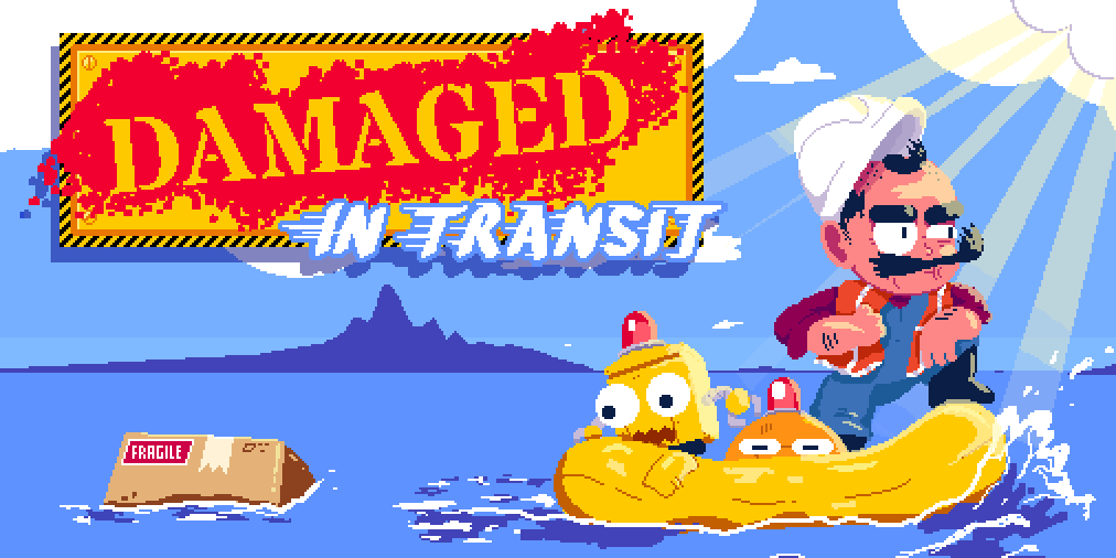
Designing the art of Damaged In Transit
A deep dive into the process of designing/animating all of the in-game elements from our new puzzle game, Damaged In Transit.
17 Min Read

[ CW: I end this post with a gif which flickers rapidly through some sprites — just mentioning in case you have a sensitivity to that kind of effect.
Also, any art, gifs, sprite sheets etc. in this post are property of the artist (me, Diego Garcia) or the developer, Wyatt Yeong, and may not be used or reproduced without permission.
This is re-posted from my original post on Medium. ]
Hi there! I’m Diego Garcia, an indie game developer and freelance game artist living in Brooklyn, NY. I also teach 2D Animation for Games at the NYU Game Center. I’ve just released a new game, Damaged in Transit, with the developer/designer Wyatt Yeong (@kroftee) and the sound designer Greg Heffernan (@cosmoddd). We’ve been working on this game for about a year and a half, and I’d like to go back and take a look at the way it’s grown over that time. I’ll only be talking about the in-game art here — I won’t be mentioning menu screens, story art, or marketing.
If you’re not familiar with the game, Damaged In Transit is a split-attention action puzzler. The player has to simultaneously manage two drones as they barrel through a series of dangerous landscapes making deliveries.
You can pick it up here if you want to give it a try before I dive into the process.
Part 1: Theming the Game
Wyatt approached me in August 2018 with a prototype for a game called Twin Sneaks, which he was picking back up after starting it during his studies at the NYU Game Center (which we both attended for our MFAs).

Original Prototype as of August 2018
Although it’s visually very simple, you can see a lot of the elements here. The purple and pink spikes are simple spikes, the orange panels are trip traps, and the blue & pink spikes are toggle spikes. You can also see a shield, the blue directors, brown wall, and the exit. Not only are the elements there — this map made it into the final game:
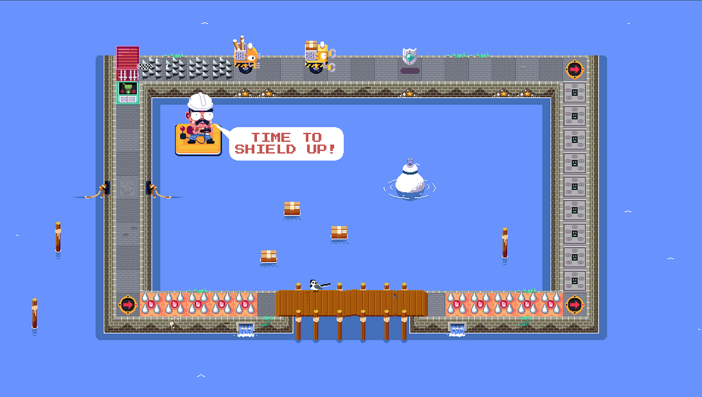
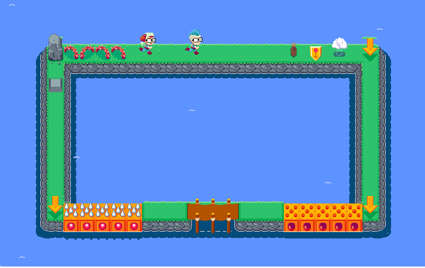
Level 1-20, Spike Proof
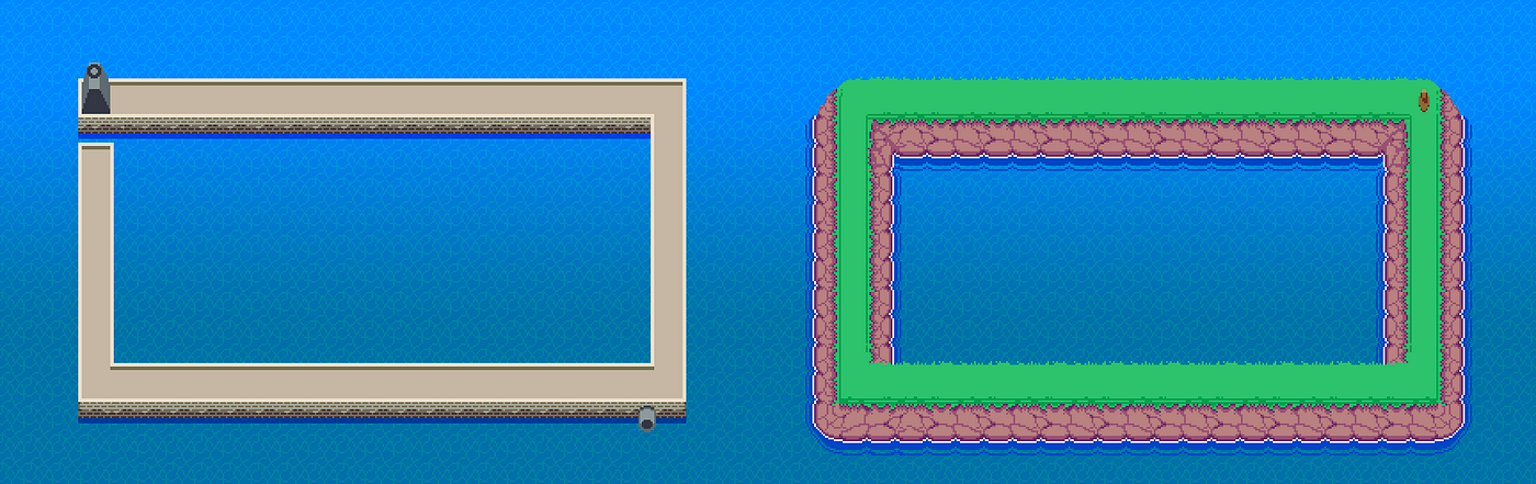
You can also see in the prototype that the world has an open-floor, dungeon feel. That was the original idea — a D&D or Zelda style dungeon full of traps that two adventurers are making their way through. I took that idea and made a few sketches and mockups. First I tried a simple dungeon, with 16x16 pixel tiles — here you can see the trip traps as a pressure tile, similar to the idea we ended up with.

Early Dungeon Draft, 16x16 Tiles
But I wasn’t happy with the level of detail at 16x16 tiles, so I gave up on this pretty quick and upped the resolution. I was also sketching the characters.
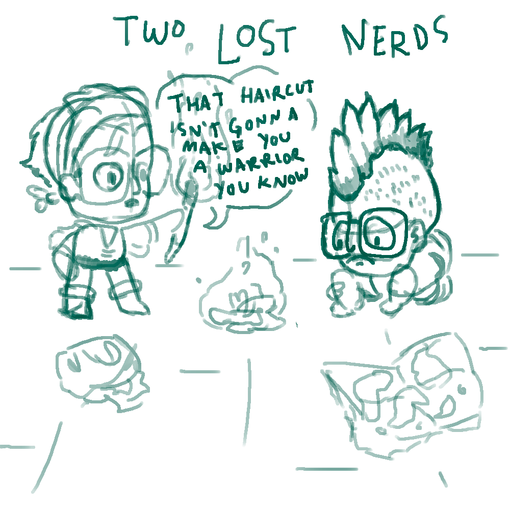
You can tell they’re nerds because of their glasses.
Since we were going for a dungeon crawling theme, I came up with these two explorers. I wanted to make them somewhat incompetent — the mechanic is that the player doesn’t control the characters at all, just the tiles that direct them to turn, so I had this idea that they would slip on a banana peel at the beginning of each level and be caught in an uncontrollable skid across each level. The player would be some kind of unacknowledged benevolent force keeping them safe. My 32x32 tile mockup ended up here:

Dark Dark Dungeon
I was looking at Link To The Past for inspiration with all of this stuff — I like the particular way it does perspective in dungeons — but its weird mismatch of top down and 3/4 perspective is pretty challenging to nail (I still struggled with it through the final version of the game). I like some things about this mockup — the gelatinous cube as the bouncy wall is fun, and I love the flame based trip trap. But the gelatinous cube also seems dangerous, especially if you’re already familiar with the D&D version. The directors are a problem too — in addition to them standing out against the weird dungeon perspective, the players need to step on to those tiles, so we’d get into some weird layering or need custom animation to have them interact.
Around this time Wyatt was ramping up playtesting again (he hadn’t done much since originally programming the prototype as a student at the NYU Game Center. Big thanks to the Game Center and the NYC Killer Queen community for this early playtesting), and was also noticing that the open floor plan of the maps made the game harder in a way that wasn’t particularly interesting. He suggested we try and only have floor tiles in places where the explorers could be sent, to make the puzzles a bit more readable. I tried a new theme…
original port town & island tile tests
I had been to Galicia (where my dad’s family lives) a couple months before we started working on the game and was thinking a lot about the seaside towns we visited. I started with an island concept and a port town concept. You can see on the island concept a pass at the director tile that is a little bit less of an issue re: the collisions I mentioned above. I was still flirting with 16x16 tiles, and still a little bit unhappy with it. I really loved this port concept, but we were still pretty attracted to the dungeon theme, and were worried about it feeling too random / not “gamer-y” enough, so we ran with the island idea a bit.
Definitely feels like progress. In fact, you can see some final designs in here — the bridge is getting close to the final design, and the tops of those big cube toggle spikes are basically the final toggle spikes. I love the vines as the static spike obstacles, and the big rock wall element. In the top right, you can see a number of failed director tile concepts — a higher res version of the low wooden one, some… thing…….., an extremely funny but terrible cloud that blows you in a direction, and a terribly boring arrow. I really preferred to keep the directors diegetic. That became easier when I decided to tweak this design and try a haunted island theme.

spooky
Looking back at this it’s actually pretty fun. I don’t think the lock and gate would have worked, ultimately, but I like the vibe and the characters a lot. The blonde character is repurposed from an example I made for the animation class I teach at the Game Center, and I figured I’d play with the designs a bit for this theme overall. The ghost director tiles made more sense than many of the previous attempts, but in terms of the player timing their actions, it’s not ideal that they aren’t centered on the tiles.
On the left, you can also see where I really struggled with the exit design for this concept. The warps were kind of cool, if a little tired as a concept, and very difficult to animate in pixels. I liked the seaplane — I imagined them taking off at the end of each level, only to crash into the next one. But getting it to fit in a tile and then animate the characters entering the plane was a big challenge. And ultimately, I was really missing the port…
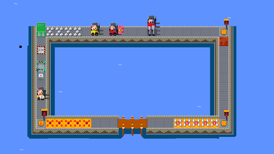
This is one of my early working files, and it’s um….. not organized so I’ll see what I can pull out. Here’s the early port (we were thinking of calling the game Port Panic or Hardcore Harbor at this time). The players were two forklifts and had to carry supplies around the port. I completely forgot about the forklift’s extendable wheels as a shield pickup alternative. It’s very funny!!! But another thing that was bugging us was that the players don’t actually control the characters, and so the concept felt a little off. That’s when we started thinking about automated delivery drones. I did a lot of googling of current amazon / startup drones, but also I just love Mega Man. I sketched a bunch of extremely rough concepts, just trying to get a feel for it:

lol
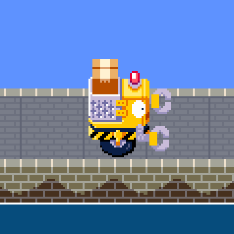
Then I tried a bunch of things in pixels, and ultimately got to our design that ended up being one of our two final drones, Ship. For much of development both drones used this original, yellow drone design. Here’s a gif of that progression (from the scattered half-layers I could still find….)
And I put in a bit of animation, so we can really feel the drone driving along the brick path:
Part 2: Communicating The Puzzles
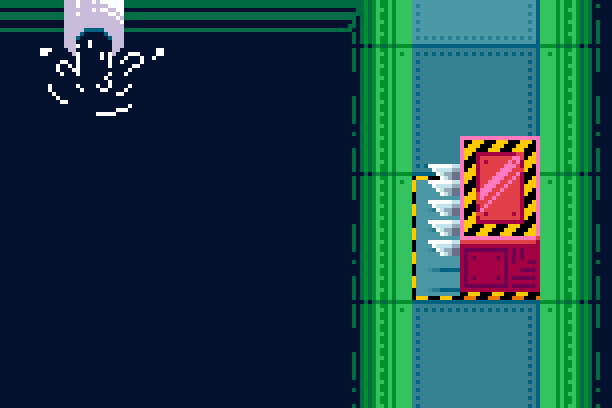
Around this time we also needed to begin finalizing some of our obstacle and element designs. I went through a ton of design for each of these obstacles. Here’s the lock, with some quick notes on why each step didn’t work:

The perspective was tricky here. We needed a lock that drones could pass through in four directions, so most of the gate style designs were too awkward and finicky. The drones would need to squeeze between or around walls and we’d probably need to do some complicated layering and z-sorting with each piece of the element, so we settled on the pylon idea. But with our perspective, some of those had a bit of an optical illusion — rather than feeling like it was rising in and out of the ground, it often felt like a top was sliding along the ground to reveal a key icon beneath. The final design tried to mitigate that illusion, which was further eliminated through the shadow and final animation on the lock:
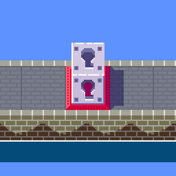
keys open doors
I went through a similar process with the trip trap…
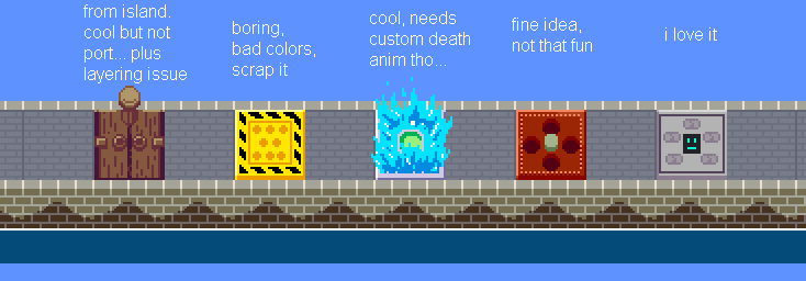
trip-trap progression
trip trap progression
I’m really happy with the final version — one of my favorite obstacles in the game. In the end we cut the middle frame that’s annoyed about being stepped on, because it’s not visible with drones on top anyway. We also re-used the individual spike pieces I had already made for the toggle spikes.

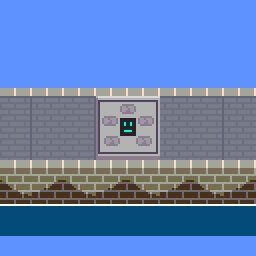
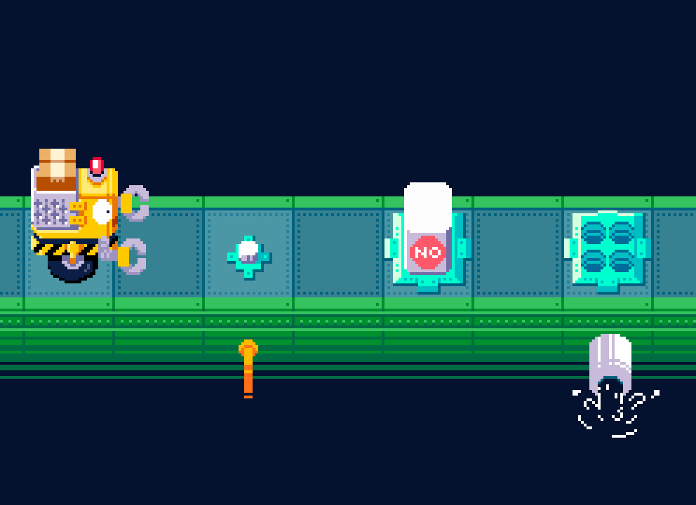
The directors, or arrow tiles, are the most important element. I loved the initial walk-sign inspired version, but it obscured the neighboring tiles a bit too much, and the simple, ground-only version was clearest anyway. I also had them pulse white with each button input for extra emphasis, and added a light digital pulsing glow to each (which we staggered on individual arrow tiles via code).
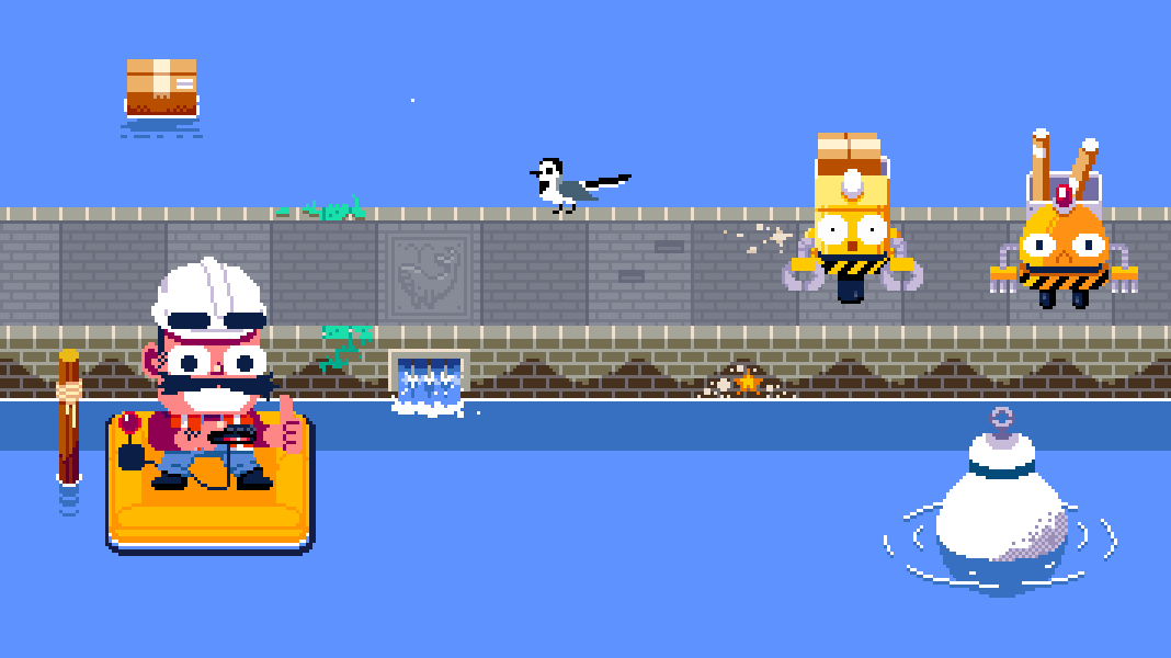
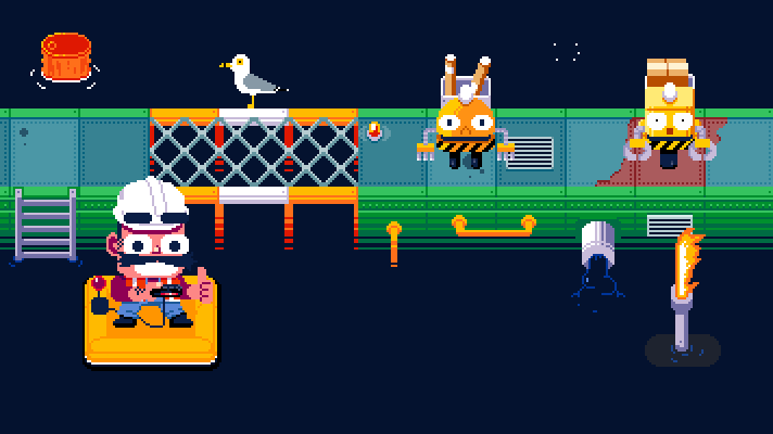
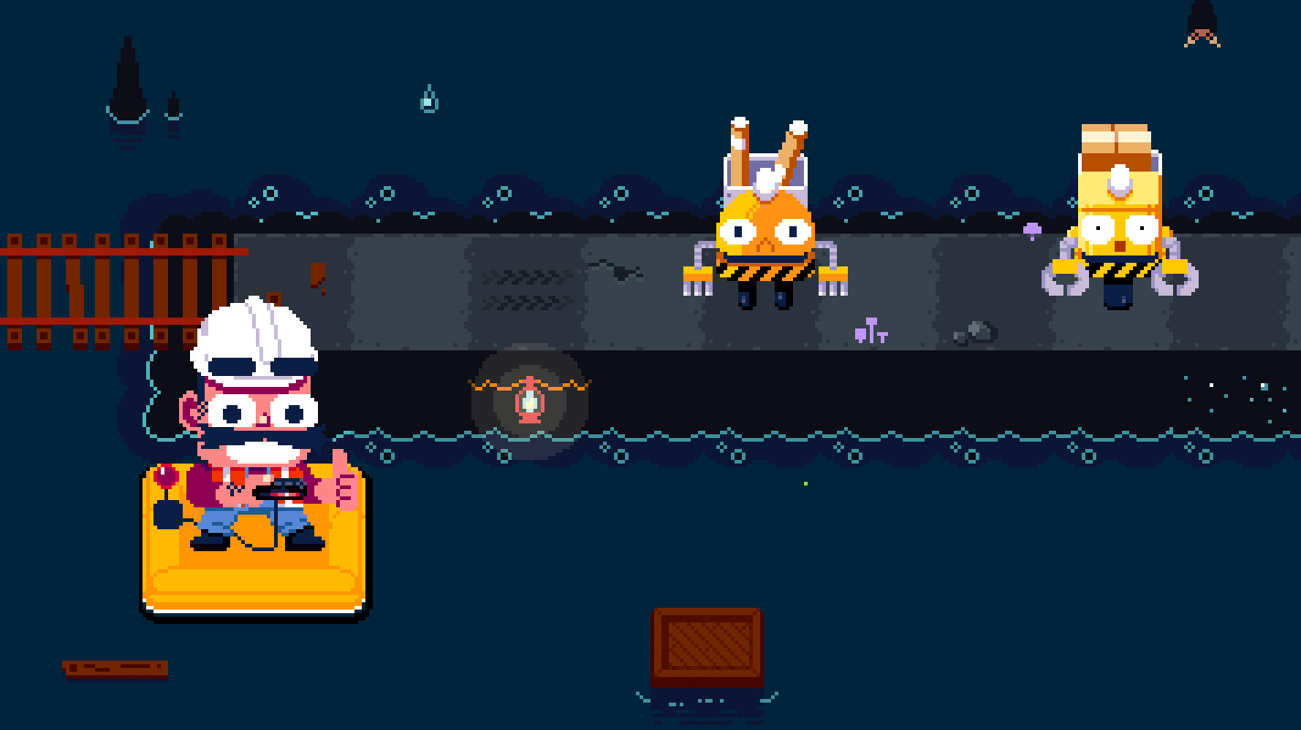
Part of that extra emphasis was necessity. At playtests, it sometimes took time for people to grok the fact that they were controlling the arrow tiles, and not the drones. The flashing helped. I thought it might also be nice to have a third character for the player to connect with. We even gave him a controller and had him press buttons every time the player did.
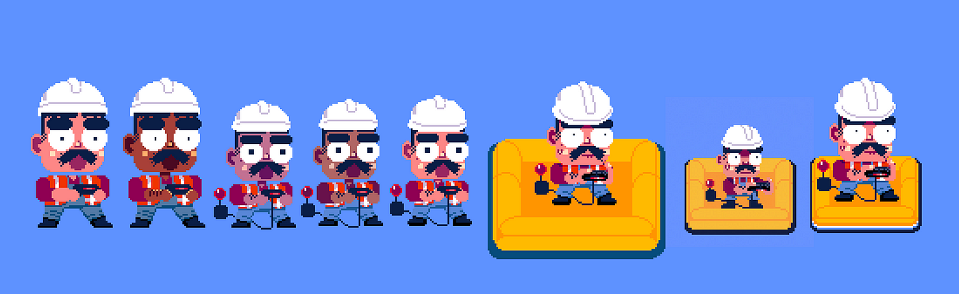
I must have tried some earlier stuff for the foreman, but these are all I could find in my files. I guess I settled on his concept pretty quick, but getting him to be the right size and perspective took some work. We very very briefly went with the smallest design but I could never quite get the detail I wanted at that size, so in the end we just stuck with the bigger one and shrunk the raft.

Without going into too much detail, here are a few more looks at design progressions of elements:
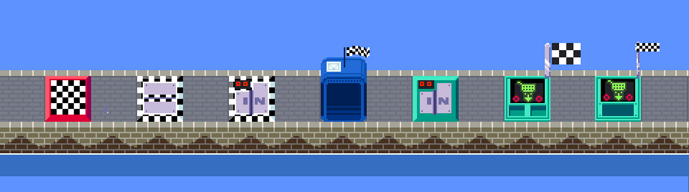
Goals. I looked at Lost Yeti a bit for these. I liked the walk-in mailbox but it was too obscuring and tardis-like.

The Boss. lol at this eggplant boss! I miss the big knife, too
At this point we had a pretty functional version of the game, with lots of final-ish designs in place, and were filling the game out with animations. One of the hardest ones to nail was the splash death — when a drone drives off the edge into the water. This had to work in four directions, and on any map layout. Here’s an earlier version of the splash death —

Pretty cool, but you can already see the issue — it overlaps with the harbor wall, and starts to really break the illusion of the perspective. So we revised to the final version:

The perspective is still a stretch, but this more cartoony, more vertical version solved most of the issues we were having and is pretty satisfying to look at. One interesting note about these sprites is that, because we had 5 different worlds with different “water” colors, we had to make this tintable — which meant separating it out into four layers. The untinted layer, the water base color layer, the water highlight color, and the water shadow layer:
separate splash sprite sheets (Ship only)… probably could have packed them more efficiently, but unity redoes it all anyway….
Part 3: Making The World(s)
While I was working on finalizing all of the art assets, Wyatt was pumping out levels and testing them at Playtest Thursdays at the Game Center. With so many levels, and the game sort of divided up into sets of new features, it made sense to divide it up visually into worlds. In my Intro to 2D Animation for Games course I used to lightly touch upon color theory, and how games use color palettes and world designs to break games up into memorable chunks. I started concepting some chunks of our own, and the oil rig came together pretty quickly. Here’s the “extremely rough” draft screenshot I sent to Wyatt, which…. is basically the final version:
But other worlds didn’t work so well. I tried a rough pass at a John Carpenter’s The Thing inspired ice world:
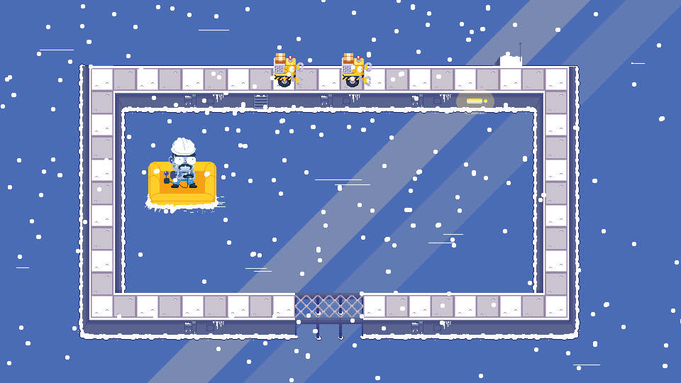
I liked this concept a lot, but it came with a bunch of challenges — obstacles kind of wanted to have alternate, ice covered versions, visibility was complicated, and we’d need a complicated custom animation to have the robots break through the ice to die. So that got scrapped for time, and I moved on to the remaining three worlds. Here are the roughs from our slack archives:
A lot of these are pretty close to final as well, but a lot of the specifics got tweaked. It took us many tries to nail down the colors on the oasis, the textures on the outer walls of the various worlds, and those kinds of details. But I had spent enough time noodling over the style with world 1 that I had a pretty good starting point, and getting to final world designs mostly wasn’t too bad.
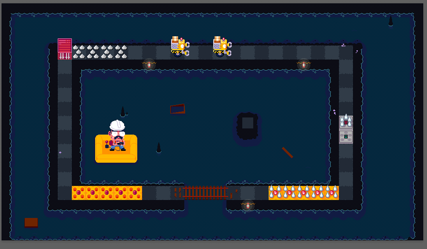
Around this point we finalized a lot more of the obstacle and element pieces. We created the button wall for world 2, which has one of my favorite visual gags in the game:
This is an early test -- the button was too small and easy to miss, so it ended up much larger.
We also needed an element that could bounce you from three sides, and kill you on one. This was my favorite design/animation that we cut from the game:
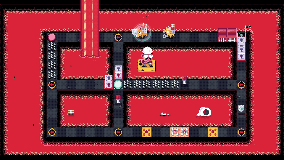
We also wanted to have this element rotate to match the player’s input, so this design just didn’t fit. Oversight on my part. We re-designed a few times and ended up with the standing rotary saw from world 3 — seen in the center of the map here:
You get it. At this point I was just designing obstacle after obstacle. Once I had done that, the game was fully playable. But in the above screenshot you can also see the decoration elements in each stage.
Part 4: Filling it Out
Making the deco elements was the last touch to make the art really come together. The backgrounds in our levels otherwise are just these huge stretches of empty water / oil / lava, so the space can feel pretty dead. I decided we would add some nice touches to do a few things:
Break up those huge swaths of single colors
Add some variation to the repeated tiles, for overall visual interest and to eliminate a feeling of “cheapness”
Make the universe feel a bit larger / like the space really exists and is interacted with
It’s fun as heck to draw birds and trash and stuff
I won’t go through my process on all of these, but I really love what it does to the world. I made a few gifs to show the early worlds in the days leading up to release:
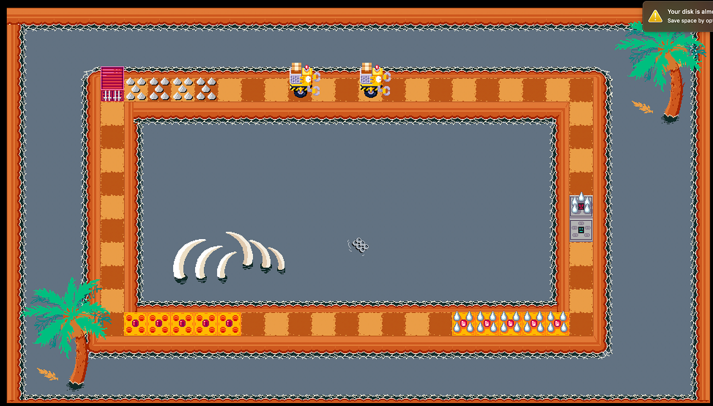
World 1 Decoration
Each world has a lot of variations on a few main ideas. In world one you’ll see a few things: Waves to emphasize the feeling of the background being liquid, Floating elements to break up the monotony of the water color (the box, the buoy), tile decorations to break up the repetition of the ground tiles (missing bricks, decorative whale tile, bird poop), and wall decorations (drain, moss, barnacles) for the same reason. The bird is there because I like animating birds, and it’s fun to scare things.
World 2 Decoration
In World 2 you see most of the same themes! The wave becomes a bubble because the liquid is thicker, and the drain looks super goopy and takes forever to figure out how to animate!
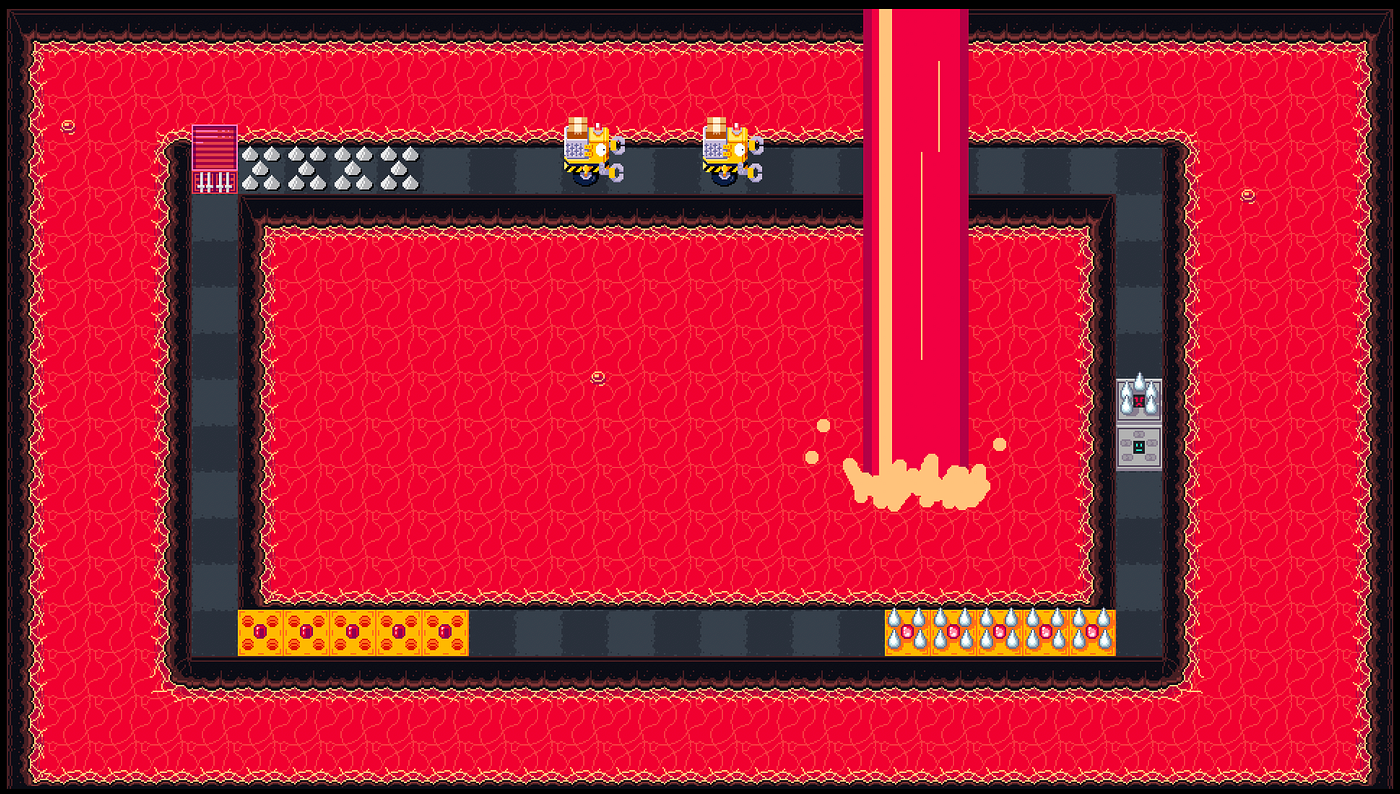
World 3 Decoration
We felt like the decorations really made the game come together. Wyatt even went so far as to write a simple custom shader for me when I wanted the robots to be able to pass behind a lava-fall.
Part 5: The End
That brings us to late last year, and the game is just about done. Of course, I still had to design the title, system & menu screens, finalize the font, make the button prompt icons across all platforms and controller types, write and draw the narrative comic interstitials that sandwich each world, create all of the marketing assets, create all of the various e-store assets, cut a trailer, and write this blog post. But hopefully this gives you a little bit of a look into the process of designing a 3/4 top down action puzzle game!
Thanks so much for reading! Get in touch with me here or on twitter if you want to talk about the game (or whatever else). And play the game!
Get Damaged In Transit on Steam: https://store.steampowered.com/app/1063120/Damaged_In_Transit/
Get Damaged In Transit on Itch.io: https://kroftee.itch.io/damagedintransit
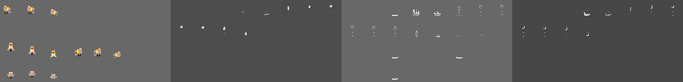
I’ll leave you with one last little gif. I make all of my pixel art in photoshop (mostly because it’s familiar, I usually recommend aseprite to my students), and my files get really big and really messy. Here’s one (that I had already cleaned up and combined layers/removed a bunch of stuff from… !!) with the layers converted to frames and exported as a gif. Bye!

Read more about:
Featured BlogsAbout the Author(s)
You May Also Like