Daily news, dev blogs, and stories from Game Developer straight to your inbox
Sponsored By
Conquest! 2.0 Improvements
This past month was spent improving the 2.0 interface. Read on for more information!
3 Min Read

This month was spent building on the improvements made for the 2.0 interface for Conquest!. Major changes were made to chat, the journal/log, private messages, and combat reports.
Since version 1.x Conquest! has used a pop-up window style to interact with players. In many cases, tabs were provided to allow players to switch between pop-ups to see additional information. For example, private messages were displayed on one tab and sending a new one (or replying to an existing one) was on another. This meant lots of scrolling and new players would often miss the tabs (and critical information).
With the changes made this month the designer and I created new windows to eliminate the tabs and help cut down on the scrolling. The effect is a much cleaner user experience.
Let's start with the new chat interface:

The tabs have been replaced with buttons with labels and the scrolling window has been replaced with a sleek semi-transparent background. I also doubled the chat and event history from 25 to 50 entries.
Here is the new log:

Rather than scroll up and down to see entries, players can now simply select the left/right arrows to quickly page through. We also added icons for each, allowing players to identify the entries or events visually. The player's journal works in the same fashion.
For private messages, players scroll through the messages on the left and, once selected, reply or delete it on the right:

With the old pop-up design, players had to scroll to see all the messages (and move between pages) and select a different tab to reply to the message. There was no preview function either.
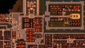
Perhaps the one I'm most excited about are the changes to combat reports. The old pop-up design was not large enough to show all the spoils, forcing players to scroll to find them. To view enemy troops and casualties, the 2nd and 3rd tabs had to be selected (with additional scrolling to see everything). Now, the most important parts of the report are visible at once:

Only enemy reinforcements are not shown on the main window, and those can quickly be accessed by the button on the bottom left. Attacking the wildlands was on a separate scene in Unity, which meant jumping to the kingdom screen to view the report (this happened automatically). Now the report displays on the quest scene itself which allows players to keep fighting without switching scenes.
Behind the scenes, I was also able to remove duplicate code by moving these new windows into their own class (versus being part of the Unity scene). This streamlined the development process for me and allowed me to add combat reports to the Quest scene (as previously mentioned) quickly and easily. During this process, I have also corrected some inefficient code, as I learn more about Unity as a platform. We are going to tackle spy, city markets, and questing next. Check back for updates to see our progress.
Sign up for the Conquest! mailing list here and follow the journey on Facebook or Twitter. Until next time, I hope to see you in the game.
Read more about:
BlogsAbout the Author(s)
You May Also Like