Daily news, dev blogs, and stories from Game Developer straight to your inbox
Sponsored By
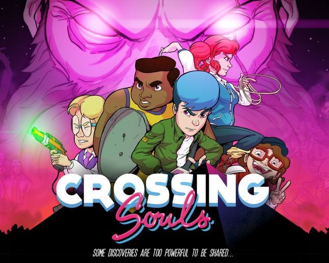
Fourattic cofounders Juan Gabriel Jaén and Daniel Benitez write in some detail about how they implemented the striking art design of Crossing Souls, in which modern pixel art meets '80s pop culture.
7 Min Read

The Gamasutra Deep Dives are an ongoing series that aim to shed light on how specific design, art, or technical features within a video game come to be, in order to show how seemingly simple, fundamental design decisions aren't really that simple at all.
Check out earlier installments, like this great Deep Dive on creating a new language for Planet Coaster, or maintaining player tension levels in Nex Machina, and achieving seamless branching in Watch Dogs 2’s Invasion of Privacy missions.
If you're chiefly interested in Art Design Deep Dives, check out this great one on the hand-drawn art and animation of Jotun, or this interesting inside look at how the Dead Cells team uses a 3D pipeline for the game's striking 2D animation.
Who: Fourattic cofounders Juan Gabriel Jaén and Daniel Benitez
Hello everyone! here we are, the art department of Fourattic to talk about Crossing Souls and the art decisions we made to accomplish its unique look.
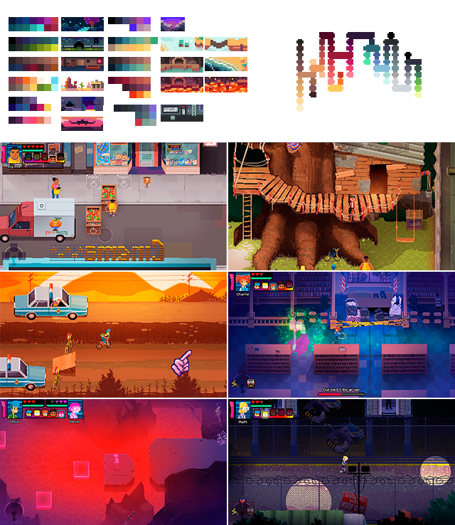
In Crossing Souls, we clearly wanted to represent an '80s aesthetics as accurate as possible, addressing both the traditional cartoons and the pixel art style in a single project.
It seemed a difficult task, but we had a lot of art and culture references from that decade as we spent our childhood absorbing that culture and those art styles were also two fields that we have worked on before.
That was basically our main art goal. Let’s explain our experience.
What: Modern pixel art with an '80s pop culture aesthetic
Hi, it’s Daniel Benítez here. I’m one of the Fourattic cofounders and I was in charge of the art direction, mainly focused on the environment and overall gameplay aesthetic.
The first scene that I designed for the Crossing Souls environment already contained the main directives of the art direction that we were going to follow: orthogonal perspective, "plausible" proportions between the elements of the world and a broad color palette that would lead to building it with a lot of detail.
Before and after Chris's house you can see that they are different only because of the polishment process.
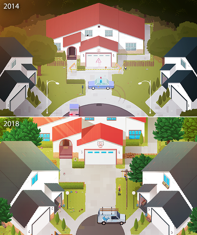
I decided to go for the details; I didn’t want to constrain myself. So I allowed myself to use a lot of different color settings connected somehow by gradients.
I usually do a minimalist color scheme before starting to create scenes in their final resolution to have a quick general vision of the full game palette. I wanted the player to feel like he/she was living the adventure of a lifetime by pushing them to leave the comfort zone behind. That sense that a lot of movies are reduced to this quote: “We are not in Kansas anymore…”. That’s why I ended up using so many colors in Crossing Souls.
Orthogonal perspective is sometimes a nightmare... After many tests, we solved it by creating shadows as visual support, without basing ourselves on the natural rules of shadow projection in real life. I used them to tell the player: over here, not here.
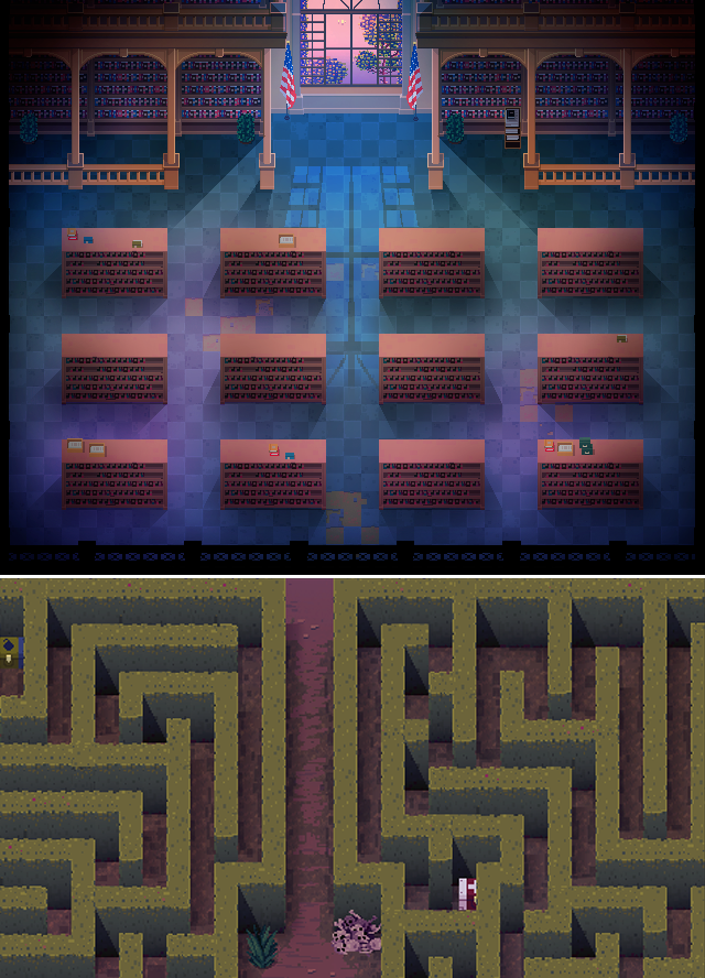
The doors were also a headache. As you can see in the image, I did not spare details by indicating the position of the doors respect to the floor or ceiling.
Finally, the platforms. We reduced the number of platforms in the game as much as possible because we knew how difficult it was to visualize them correctly. Their positions were designed to provoke an intuitive understanding of what would be the next step.
We tried different formations until we found some that made it understandable enough. And, even so, they are sometimes on the edge!
Another difficult task was the creation of a HUD with which, in a non-intrusive way, you could use 5 characters that could belong to two different realms.
At some points in the game, you can control two characters at once. So I asked the team to tell me what they thought was happening in the game regarding the use of characters just by looking at the state of a mockup gif HUD I did. After some iterations, and once they began to understand it, we tested it in the game, after a few days, testers began to use it without too many problems.
I think that for such a small group in our art department (two people) we have managed to make an incredibly ambitious project. If I did it again, I would change many things, not because the result has not fulfilled my expectations (it has done so), but because I have learned so much that I am eager to apply my experience.
Hi, I’m Juan Gabriel Jaén, one of the cofounders of Fourattic! I was Concept Artist and Lead Animator at Crossing Souls, and I’m here to talk about character design and animation.
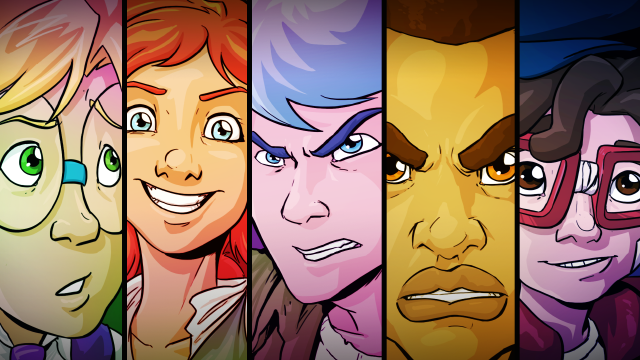
To create the characters in the game I made some sketches at first and then I worked with Pyxel Edit to find their final design. I like working with paper and pencil because I’m able to work many ideas quickly. I think it is the best way to approach a main design because it allows you to draw so many archetypes and throw them to the bin if it’s necessary without losing much time.
The rules I follow to animate characters here are marked by our orthogonal point of view. Our main references were Zelda or Hyper Light Drifter and games that have the same type of camera. So, with the players we implemented 4 points of view: Up, down, right and left. Left works like a mirror for right.
It’s necessary to work with the main characters in the best way as possible to make the players feel inside the game. That’s why our main characters have more frames per animation and more points of view.
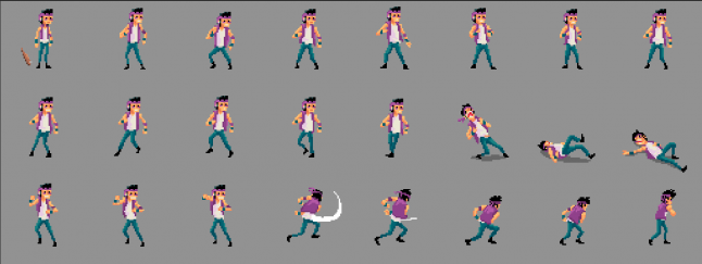
For enemies, watching other games we found one thing in common: All enemies are facing you (the player), so to optimize, we made only one point of view (¾ right, left will work as a mirror). Our combat is a soft component of the game and it worked well without more points of view. That allowed us to introduce more types of enemies and bring variety to the game.
For NPCs we only use fronts or backs in ¾ . With that pose you could cover 180º in each direction, when you talk with them it seems like the NPC is talking to you and to the main character at the same time. It could sound a bit funny, but thanks to TV shows it’s something we gladly accept to see.
With boss fights, the main problem was the camera. We work with pixel perfect format, that means that we only can make x2, x4… zooms and that’s too much. So most of the bosses were designed thinking about making them understandable and seeing the gameplay inside the camera shot.
For the cartoon cutscenes I worked the animation frame by frame in a traditional way, using lines and flat colours and optimizing the frames as much as possible. The problem here was that there were too many cutscenes to animate and only one animator to do that. But this retro way helped us a bit in the final look, adding VHS and glitch effects to reduce the HD.
All of this is hard handy work but I’ll do it again. I’m self conscious about how much work I can afford. But for someone who wants to try it for the first time, traditional animation is more work than it seems and it needs some pre-preparation and schedule time to do it in the best way if you are doing it alone.
About the Author(s)
You May Also Like