

Daily news, dev blogs, and stories from Game Developer straight to your inbox
Sponsored By
Applauding early cinema: a look at Escape Plan's Art Direction
A short and speculative analysis of Escape Plan's nostalgic Art Direction, guessing on references which might have inspired the game's visual expression.
3 Min Read

I love early slapstick humour animation. I love the look of it, the sound of it, the feel of it, the laugh of it. - And because of Escape Plan, I can now say that I love the experience of it.
Escape Plan assigns the player to lead two slow-paced characters through a range of fast-paced booby-traps in order to escape an evil scientist, who wishes to "recycle" them into sheep. The game was released for PS Vita in 2012 by Fun Bits. To me, it appears as an original game world as well as a delightful tribute to early 1900s animation.
Below is a speculative moodboard I've composed of visual references that might have factored in to Escape Plan's nostalgic Art Direction. Escape Plan's character designs reminded me slightly of the rubber-hose characters of early 1900's animation, as well as more recent Ghibli character designs. The game's story seem to reflect the theme of the "looney" scientist, i.e. the iconic Frankenstein (dir. J. Whale, 1931). The industrial elements are brought in based on the industrial setting of the game world, with the concept that machinery might symbolize a factory, or "the creation of something". Frankenweenie (dir. T. Burton, 2012) is brought in as an example of a contemporary project which might have worked with the same references. However, seeing as both these projects were released in the same year, Frankenweenie was most likely not present in the game's actual reference imagery. Then again, what do I know?
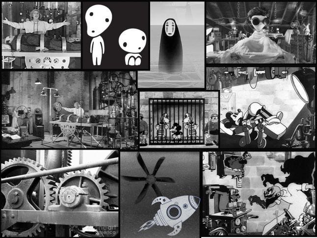
Escape Plan's monochromatic palette gives a shout out to film noir and to early 1900's animation. Character design in particular, as it revitalizes the beloved rubber-hose anatomy and aesthetics.
Skip to [02:00] in the video below to check out character movement (or watch the whole thing if you'd like, it's gorgeous).
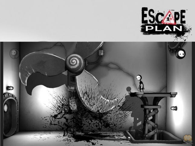
The game's level design is elegant and readible, yet rarely fails to surprise. To experienced gamers this might be a no-brainer, but for a newcomer like myself at the time when I first played this game, it clearly defined what an interactive environment should strive to achieve: engagement.
The elegant level design is complimented by chunky props and architecture which seem to be based off of the typical "rough sketch"*. This mashup between the elegant and the rough create a decluttered visual balance, which arguably presents the player with a communicative and more enjoyable game environment.
It is well worth mentioning the level titles, as these also reflect early cinema. While the rest of Escape Plan's design carries an illustrative style, the title screens are presented in defined grays. One could argue that the use of more abstract title screens helps balance the overall Art Direction, giving the player a visual break before continuing into the iconic world of Escape Plan.
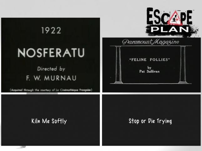
Within composition: 1) Opening credits for Nosferatu (dir. F. W. Murnau, 1922). 2) Opening credits for Feline Follies (dir. P. Sullivan, 1919). 3 and 4) Level titles from Escape Plan.
If you're interested in further exploration of cinema credits history, I recommend you check out this.
Also worth checking out:
*"rough sketch" referring to a spontaneous and vibrant-looking drawing which has not been worked over or refined, but is simply appealing by its roughness.
Read more about:
BlogsAbout the Author(s)
You May Also Like
Latest News

Trending


Featured Blogs


