Daily news, dev blogs, and stories from Game Developer straight to your inbox
Sponsored By
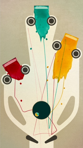
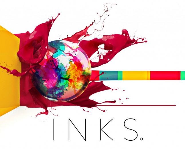
Inks turns pinball into a canvas for gorgeous abstract art
“I wanted the levels to look like they could be printed and hung on the wall," says developer Luke Whittaker. "It’s basically about making a beautiful experience for people.”
6 Min Read

Pull Quotes - "I wanted the levels to look like they could be printed and hung on the wall."
“We realized we could take the gracefulness of the game and pare it down, not only stripping back the graphics to something elegant but taking the gameplay back to its core.”
State of Play’s latest iOS release, INKS, is a creative and beautiful twist on a standard pinball game. Rather than have the player hit bumpers and pads and targets, you use the ball to smash into pockets of paint, and watch them explode into beautiful flourishes of color. The ball then leaves a trail as it ricochets around the table.
At the end of each level, you’re presented with a thumbnail of your artistic creation to preserve for posterity...or share with your friends. It’s a clever take on a familiar genre, and immediately feels more tactile and distinctive than the average pinball game.
Creating a distinctive aesthetic is an important but challenging part of creating any game. Capturing the right style can make the difference when it comes to the emotions a game can invoke. Throughout its time as an iOS developer, the State of Play team has done a successful job of creating experiences that look truly delightful.
Its first puzzle adventure game, Lume, was made entirely out of paper and card, and the studio that would go on to win a BAFTA for Artistic Achievement for its work on Lumino City. INKS is quite a departure, veering away from the company’s usual route of puzzle adventure games.
Gamasutra talked to State of Play co-founder, Luke Whittaker, to find out more about how the idea came about and what was involved in creating its unique look.
GOING BACK TO BASICS
 The idea for INKS has been around since the development team worked on Lumino City. The team created a real pinball table for one of the puzzles in the game, using wood, paper, and miniature lights.
“We had so much fun making and playing it, that it kickstarted an interest in pinball,” explained Whittaker.
The team visited their local arcade bar - The Four Quarters in Peckham, London - as well as attended the national pinball championships for research. Their weekly ‘Google Fridays’ collaborative event led to experimenting with different game themes and devising the basic concept for INKS.
“We realized that real pinball tables are insanely hard and stressful. Especially as you’re sinking money into it,” noted Whittaker. “They basically start you on ‘hard’ mode from the off, because you can’t just make a simple table and add to it mid-game.”
As the team realized, there’s nothing intrinsically complicated about a ball and two flippers, but decades of pinball table design has meant that the game has switched from the simplicity of old fashioned tables to much more convoluted experiences that can detract from the purist experience.
Whittaker explained, “we realized we could take the gracefulness of the game and pare it down, not only stripping back the graphics to something elegant but taking the gameplay back to its core.”
CAPTURING THE RIGHT STYLE
That could have been a fairly uninspired experience, but it’s State of Play’s use of paint that has made INKS stand out more prominently. Besides the clear comparisons that can be made to Jackson Pollock’s work, inspiration came from many artistic sources. Whittaker credits Matisse’s Cut-Outs, and the minimalism of Bauhaus graphic design as instrumental in forming INKS’ look. Spanish painter, Joan Miró’s surrealist paintings also played a role in the team’s approach to providing the levels with more personality.
From a game design perspective, it’s Bridget Riley’s Op art that directly influenced the design of the ‘black holes’ of the game - traps that pull the ball into them.
“I wanted to create something which simultaneously looked like something you wanted to avoid, something which looked like it pulled towards the center, and yet I also wanted it to look good and be in keeping with the style,” explained Whittaker. “The concentric chevron rings seemed to answer all the questions. They even have the weird op-art effect where if you stare at them, they seem to be rotating even though they’re static.”
Whittaker was also inspired by a piece of artwork by Sam Van Doorn - a drawing machine constructed from an old pinball machine - with INKS reflecting some of that style.
PUTTING IT ALL TOGETHER
 Originally, the game was going to be more mechanical in layout, with the inner workings of the table laid bare. The thinking here was that when hitting the wall is such a common event in pinball, why not make doing so one of the rewards? That led to a number of pockets of paint being placed around the outskirts of each table, encouraging players to experiment rather than focus too strongly on hitting the paint-filled bumpers.
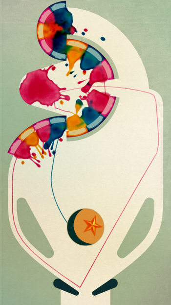
Each time you hit a paint pocket, a splash of paint explodes outwards onto the table. None of the splashes are pre-rendered. That means each hit reflects the force and angle in which the ball has hit it, leading to an unique look every time.
Such fluidity means that if the ink hits a bumper or other barrier, the flow is interrupted and it has to find a way around it. A hard hit forces ink to travel further outwards due to the pressure.
To create the effect, early concept sketches were conducted in a simple yet effective fashion. “By dropping ink onto paper and watching what happened,” explained Whittaker.
Concept art was then developed on an iPad Pro with an Apple Pencil, allowing Whittaker to blend watercolors over a template. Paint was then dragged around to demonstrate how the ball would change while going through it. Splashes were created using shaders in Unity, before developer, Daniel Fountain, tackled the physics required to get the feel of the ball in motion just right.
Fountain spent a long time experimenting with modeling how paper responds to ink. The team had to consider how ink moves and lays itself down in patterns. They also looked at how drops fly through the air and land, along with how paper reacts to becoming wet. Fountain created virtual paper which gets wetter whenever a splash lands, adjusting the ink so that it flowed more heavily in those areas until it dried.
“I wanted the levels to look like they could be printed and hung on the wall,” said Whittaker, “It’s basically about making it a beautiful experience for people.”
About the Author(s)
You May Also Like