

Daily news, dev blogs, and stories from Game Developer straight to your inbox
Sponsored By
Featured Blog | This community-written post highlights the best of what the game industry has to offer. Read more like it on the Game Developer Blogs.
Reworking PUNCH-OUT!! for Mobile: An Extremely Deep Dive into Election Year Knockout
Literally every design decision in excruciating detail. Our goal: Zero compromises to gameplay or humor.
37 Min Read

The games in the long-dormant Punch-Out!! series are a rare thing to behold. In spite of their lasting appeal and swarms of die-hard fans, they represent a style of game that is rarely tackled by other developers. When we decided to make one ourselves, we quickly found out why.
These games are known for their complex character-driven fights with dozens of hidden tricks that players are still finding to this day. They have a history of being developed for underpowered hardware and have to rely on advanced visual and animation techniques to punch above their weight - literally and figuratively. They are extremely high-scope projects to take on. This may be the reason so few games of their kind are attempted.
The effort required to do it correctly is hard to justify for what amounts to a single player, deterministic arcade experience in our modern world of multiplayer physics sandboxes and endless emergent gameplay. It's what Punch-Out!! does with its mechanics and charm that makes it so special and, in spite of its nature, infinitely replayable.
It has been our goal for the last two years to breathe new life into this beloved franchise and bring it to a new audience on mobile devices. We are extremely proud (and surprised, honestly) of how well we were able to take a six-button game and shove it onto a phone with literally zero compromises.
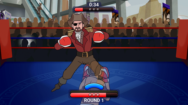
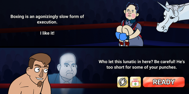
I present to you: Election Year Knockout. Let me show you how we did it.
The analysis of what came before us

Image credit: Najzere, StrategyWiki
Before we begin, it's useful to do an analysis of our source inspiration, including the original gameplay we plan to retarget. If you're already an expert on all things Punch-Out!!, you can skip to the next section.
The core gameplay loop in Punch-Out!! is a timed battle in multiple segments where your goal is to reduce your opponent's health to zero using a limited set of boxing moves. Behind the scenes and hidden from the player is some likelihood that your opponent will get back up upon being knocked down. Likewise, the player can get back up when knocked down as well. Fighters are lined up in a progression sorted loosely by difficulty, with a rematch each after you beat them all. The difficulty of each character is not always dependent on things like health or punching power. Punch-Out!! is what we call a "puzzlebox fighter," where each new opponent is as much of a riddle to poke at and explore as he is a test of your reflexes and skill as a boxer. This is an important distinction, as other games in this style do not feel "like punch out" when this puzzlebox aspect is missing.
The player and the opponent are both stuck in the middle of the screen, where all of the action takes place. This static arcade setup works very well on mobile, perhaps better than other boxing games that allow free movement, as it frees up the screen's entire real estate for player input.
Despite the complexity of each opponent you face, the original game's controls are very simple. Across the various versions of Punch-Out!!, there are left and right body blows that can also be thrown high by holding forward. You can block incoming punches. You can dodge left or right, or duck downward. There's a dedicated button for throwing a knockout blow when you have the resources to do so. Arcade Punch-Out!! and Super Punch-Out!! on the SNES go a step further and assign different speed and damage to each type of punch. This is all of what you, the player, have access to for the entire game.
There's assuredly much more to these games in the minutia, but we now have enough of an analysis to make a translation to touch screens.
Getting things to work on a touch screen
Your phone is a very limited gaming device by its nature. It's a black rectangle with a screen you can touch, and it has an array of other sensors to detect motion, impacts, and sound. While some great stuff has come out using those other sensors, I personally don't like motion control in games and we can't rely on every phone having high quality sensors - if they have them at all. Instead of looking at the limitations of mobile gaming and working around them, we decided to look at what phones do well and lean into those strengths.
First and foremost, we had to make punching feel good. If we couldn't, none of the rest of this would be worth it. In terms of puzzle design, Punch-Out!! rarely distinguishes between different punches, and that's probably due to the control scheme they use. The differences in punch types are a bit abstract on a controller and therefore less reliable to build puzzles around.
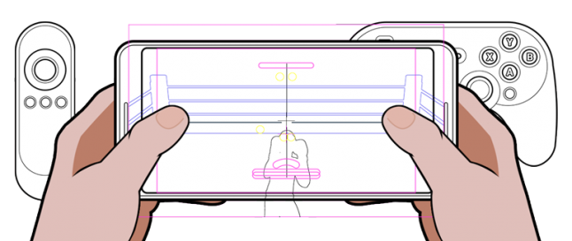
On the phone, it's different. Tapping the screen is a very literal action, much more so than pressing a button on a controller six feet away from what's happening on screen. That doesn't mean adding virtual controller buttons to the screen works any better, though. Virtual buttons provide no tactile feedback, requiring the player to visually calibrate his finger location constantly. To avoid this problem, mobile games often simplify their controls to use a single touch anywhere on the screen.
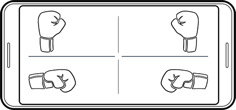
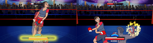
It turns out if you divide the screen into quadrants, it works just as well as face buttons on a controller while still providing that literal interpretation of the player's intent. Tap the top right quadrant for a right jab. Tap the bottom left quadrant for a left hook. We knew we were on to something good when we got this crucial part implemented. It felt perfect, and we didn't have to reduce any of the complexity that makes these games so much fun to play. More importantly, we avoid discrete virtual buttons entirely. The player can express specific input intents this way without ever having to worry exactly where his finger lands.
This quadrant input system also allowed us to differentiate ourselves from the games that inspired us. It has never been our goal to make Punch-Out!! directly, but instead go our own direction given an established formula. Designing our puzzlebox fights around properly using left, right, high and low punches leans into what makes a touchscreen fun to use while opening up new possibilities for level design.
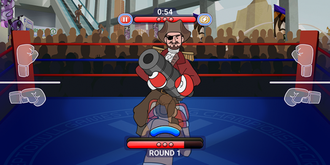
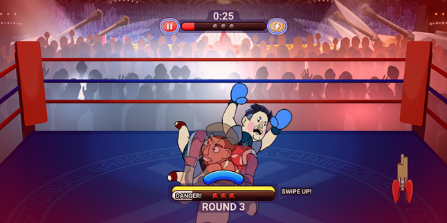
The other thing touch screens do well is the swipe input, but it can be a challenge to implement correctly. Sometimes, other games try to use swipes as a primary input. However, swipes take energy to perform. Repeated swipes will only make a player tired and frustrated. Thankfully, dodging in Knockout is a rarely-performed action with a long cooldown, so mapping it to left and right swipes makes sense. Even more rare is the powerful star punch. In Knockout, we turned this into a screen-spanning haymaker and mapped it to an upward swipe. We spent a lot of time perfecting the technical details of the swiping motions in our game to the point where they felt invisible to the player. I'll go into more detail about that below.
Finally, blocking. Because blocking logically prevents you from punching, we can overload the basic tap input. In our game, the player character will block if you hold both thumbs down on each half of the screen at the same time.
So at the end of it all, we had an input system that preserved every aspect of Punch-Out!!'s core gameplay, one that remained intuitive while avoiding virtual buttons of any kind. Best of all, we were able to do our own unique designs as a result of the control change. It truly is a full, unrestricted console gameplay experience on a touch screen device.
Specific game design problems and their solutions for mobile
Making a mobile game requires much more than just a transliteration of a console control scheme. Following are multiple smaller design lessons we learned along the way, grouped into the best order I can manage:
Game speed - Mobile gamers are not the same as on PC or console
Mobile players have different expectations for their entertainment compared to PC and console gamers. When we originally designed Knockout more to Punch-Out!!'s blueprint, we learned that the game felt way too slow. On console it feels fine, but for whatever reason the experience just lagged behind when it was on a phone in our hands. You never quite realize how much downtime there is in the Punch-Out!! franchise until it's pointed out to you.
We reacted by ripping out anything that got in the way of the player having fun. We replaced the downtime in the Punch-Out!! formula by expanding its risk/reward system. This fixed the engagement problem we were seeing by always ensuring there was something for the player to do or react to. I'll go into further detail about this in the section about changes to the Punch-Out!! formula.
Our next major change was to the game's round timer. We originally had fewer, longer rounds with seconds ticking by in real time. One of our publisher friends suggested reducing each round to about 45 seconds. We pushed back on this at first, but ultimately saw the wisdom in their suggestion. The newly increased pace of the game felt way better when the breaks happened around the time they suggested, but it still felt too restrictive when the player was on a roll.
As a compromise, we increased the round timer but made the seconds tick faster. This is something Punch-Out!! does as well, and though I suspect it might have originally been some kind of hardware limitation on the NES, they tellingly kept it for the Wii remake of the game. Importantly, the seconds slow down when you're engaged in your attack combo. This adds urgency when you're winning, provides relief when you're losing, and gives you the agency to dictate the flow of the fight yourself.
Of course, a publisher isn't necessarily thinking about such game design considerations when making a suggestion like this. Mobile gamers do prefer shorter bursts of action, it's true, but a publisher's real goal is to show you an ad every minute or so. Certainly, they've spent thousands of hours studying exactly how big of a bite to give players each time to make them feel fulfilled but refreshed enough to play a little bit longer. So long as it feels good as a player, I'm in.
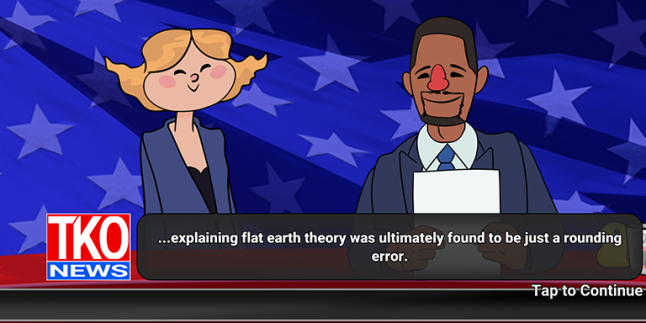
The increased pace drove us to add other ways to rest and relax the player between fights as well. The extra effort put into these sections between the main game scene also allowed us to further distance ourselves from our source of inspiration. For instance, there is a surprising amount of story built into the news reports that happen at the end of each fight. Little bits of world building packed with humor pervade every moment you're not fighting. We've found players naturally seek out these tidbits when they need rest, and it likely prevents churn among the population of gamers that appreciate it.
Or maybe it increases churn in players who hate story in their games. I should test that... Let me know in the comments below what you think.
Changes to the Punch-Out!! formula and going our own way
Part of our work in removing things that got in the way of the fun involved replacing Punch-Out's "knockout blow" and "star punch" systems with our own risk/reward system.
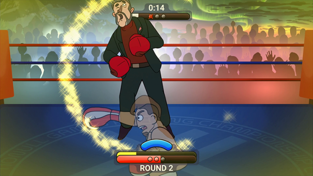
Punch-Out!! has had these two systems throughout its history. The first one, found in the arcade version of the game and later Super Punch-Out!! on the SNES, requires you to fill up a power meter by punching your opponent. Once you fill up the meter, you can throw one of several "knockout blows" to do massive damage to your opponent.
The NES version and its Wii remake use a "star punch" system that encourages the player to explore each character and take risks to earn stars. Stars can be used to throw an uppercut, and (in the remake) multiple stars used at once increase its damage.
 Image credit: GameXplain
Both models are fun, but there are drawbacks to each. The "knockout blow" system is well suited for the arcades. It's simple to understand, and the gameplay loop is fairly quick. However, we thought this would be too straightforward for a modern game of this type. The number of strategies you can attach to it is limited, and the risk is a little too low for the reward you get from it. You do lose some of your power meter when you get hit, though.
The "star punch" system is a clear evolution, but the developers went a little crazy in the punishment department. Earning the stars is very fun and using them is meaningful, but taking a hit destroys stars you've accumulated. This rewards high level play, but is absolutely frustrating to new players and downright rude by modern sensibilities.
After a few iterations, we settled on our own approach. We kept the power meter concept, but limited its utility. Punching still fills the meter, and the meter is still used to throw the haymaker (our version of a star punch). In our model however, using the haymaker also consumes the power meter. The game then becomes a challenge of how to most optimally fill the power meter multiple times per fight. It is a resource management puzzle with multiple ways for the player to solve it.This specifically rewards offensive play by design. As newer players will tend to stick to more defensive play like blocking and dodging, the power meter acts as a carrot on a stick in front of players to lead them to more effective strategies as they learn the game. Instead of blocking or dodging everything, players begin to learn counter punching as a means to preserve and build their power meter for their most powerful attacks. We reinforce this by not draining the power meter when the player gets hit.
We use the power meter to encourage riskier play with defensive strategies as well. Blocking consumes a small amount of the power meter, and will immediately remove the haymaker from play if you've powered it up. Over the course of play, you learn that you can also time blocks perfectly to massively fill the power meter. Combined with counter punches, counter blocks provide a skilled player with resources he can use to dictate each fight like a coordinated dance.
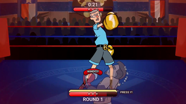
Finally, we replaced the stamina hearts from Punch-Out!! with a stamina meter in Knockout. This has been controversial to some of our more casual players as they tend to want to mash the screen to win, but it serves an important game design function. Besides, if they just chill they find out the stamina comes back pretty quickly when they idle. While this all does discourage mashing, it also encourages mastery of your resources available to you as a player.
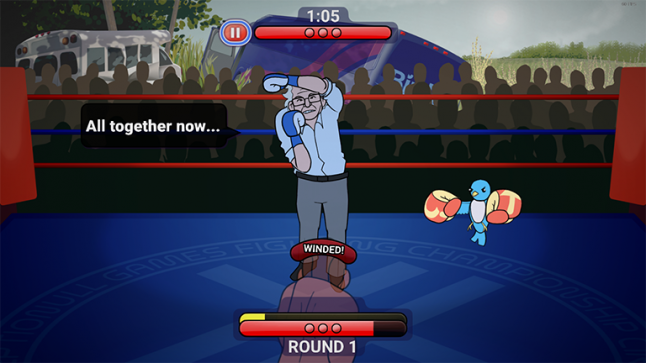
Punching too often (and especially missing your attacks) will wind the player and root him in place. You must block an attack to get your stamina back, or otherwise wait out the exhaustion. However, because punching also builds your power meter, you quickly learn that you're trading stamina for a chance at your haymaker with every attack. If you want to risk becoming winded to increase your other resource, you can.
Additionally, we made it so the haymaker instantly refills the stamina bar upon a successful hit. This means the player is even more heavily encouraged to go on the offense - just with a strategy in mind. When you become skilled at this balancing act, you're in a constant cycle of risking your health to trade stamina for power, then wailing on your opponent with the haymaker, which immediately allows you to risk more stamina.
With this new system, we believe we've meaningfully improved upon the systems found in the Punch-Out!! games. Election Year Knockout is faster, more dramatic, and feels oh so much better when you land those perfect combos to play your opponent like a fiddle.
Aspects of the original design we didn't touch
One of our unsuccessful experiments was to take away health from the player upon a successful normal block. This felt awful. I'm happy to report this feature does not exist in the final game.
For the time that it was a thing, it sunk every game design decision it touched. It had a good intention behind it, of course. We wanted to discourage players from standing frozen in fear, holding up a block. Besides, if our goal was to encourage aggressive play, wouldn't it make sense to discourage defensive play?
No. Absolutely not. We discovered that defensive play is an important stepping stone to aggressive play. When you first encounter a new opponent, you're more likely to be patient so you can learn the AI's patterns and how it reacts to you. Without the ability to do this, the game feels very unfair.
Besides, there is already a punishment for defensive play - we just didn't consider it to be one at first. The round timer is constantly ticking. If you don't eventually go on the attack, you move into the next round. Your opponent is able to withstand a fresh set of knockdowns. It's a small thing, but it's important. We don't have to consume player health during the learning phase of each encounter, because the time pressure is already enough to encourage the player to make a move.
Besides, we found there is a better solution to the original problem of having a player constantly block. We give the opponent an unblockable attack. A fair and well-telegraphed unblockable attack forces the player to change strategies, especially when we can ramp up the damage on said unblockables.
Technical and artistic constraints of smartphone fragmentation
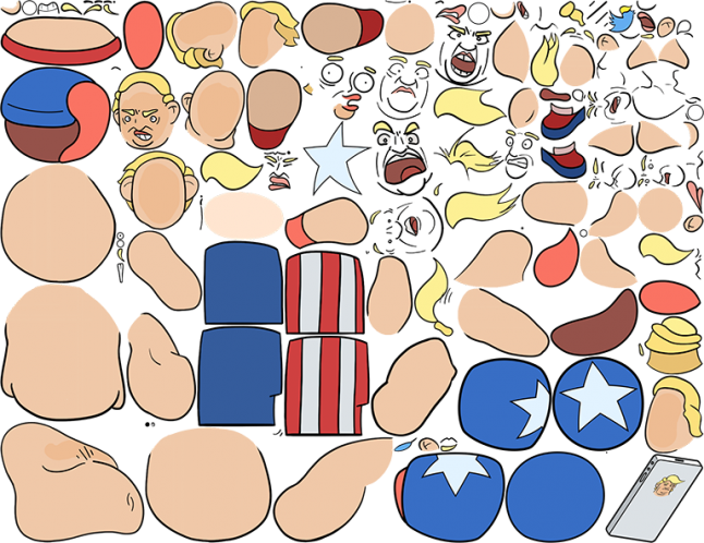 All of a character's poses and turn-arounds had to fit in a single texture.
Fighting games suffer under low frame rates more than many other types of games. So, even while targeting a mobile platform, it was imperative for us to achieve 60fps on as many devices as possible. This meant we had to be smart with our choice of engine and art style from the outset. Additionally, it was very important to be under 100MB if we wanted to stand any chance of competing against other apps both on our players' devices as well as the app stores themselves. The larger the game, the less likely it is people will download you and the more quickly you will get uninstalled when a player runs out of disk space.
That was our true challenge. We had to make a game that stood up reasonably against Wii Punch-Out!!'s visuals under very tight constraints with an average of only two artists and two programmers active on the project at any given time. I'm proud to say I believe we achieved this, even as my artist brain screams from its cage about being so much better now than when we started. At PAX, we even had a player ask how we made the 3D models work so well. Our game is all 2D animation. Maybe he was just being nice, but it made me feel good about our work.
Speaking of, the big 3D engines were not up to the task two short years ago. I'm sure Unity and Unreal have improved greatly since then, but they weren't performant enough to count on them when it came to the more underpowered devices in our test cabinet. Besides, 3D was an awful lot to ask of our art resources. Instead, we relied on a C++ game engine called Cocos2d-x for our foundation, and used Spine by Esoteric Software as our animation middleware.
Cocos is already blazingly fast, and Spine is equally impressive in the performance department. Spine is also great to work in as it's presented like a 3D animation program, but optimized for 2D. As our two artists were also traditional animators, this allowed us to use Spine's tween animation capability without using it as a crutch. We could rig and animate each key pose as needed to provide believable motion in the round while still taking advantage of the benefits inherent to frame-by-frame animation - all while saving a lot of disk space.
There are a surprising number of players with very low-end phones. Most of them are from places outside of the so-called "Tier 1" geographical markets or are entry-level consumer products from places like Best Buy and WalMart. Some of these devices limited our RAM allocation to as low as 24MB, and the slow CPUs required us to ensure everything we needed was available in memory without on-demand loading. We still had to target HD resolutions on these devices, too. We ended up making a low graphics quality option for anything we detected as too small for our standard 2K assets, leaning heavily on our art direction to cut corners in terms of resolution without appearing blurry on the lower target.
 Bleed space filled with art to accommodate the widest and tallest screens. 21x9, 16x9, and 4x3
There's also the problem of mobile device fragmentation to contend with. For the most part, this has to do with boring stuff like platform-specific billing APIs and whatnot. From the presentation side, this meant we had to build out enough visual information beyond our 16x9 play space to account for screens of different sizes. Tablets are closer to a 4x3, and new phones are as wide as 22x9. This meant we had to keep all important action within that 16x9 area, but produce all backgrounds and cutscene animations with both tall and wide extremes in mind. While this doesn't impact performance, it does mean we have to use some of our precious RAM budget for it.
Building a user interface with this level of fragmentation is a challenge as well. A static map scene, for instance, has to fit within the 16x9 space without looking like something's missing when viewed ultra-wide. Health bars and input graphics, on the other hand, have to be registered to their respective sides of the screen without regards to the 16x9 interior. There are two benefits to this. First, for our input quadrants, the graphics denoting their placement remain in reach of the player's thumbs. Second, moving the healthbars away from the action on taller screens allows for the character art to shine through while ensuring the added vertical space doesn't feel useless.
Specific input considerations
That's no button
Let's go back and talk about our input quadrants for a moment. I mentioned earlier that our punch inputs can be triggered anywhere within a screen quadrant without the need for tapping a specific onscreen button. This is a pretty wild deviation from player expectation in an action game, even on mobile. To get players to buy into this change, art was needed to present new players with "fake virtual buttons."
Players are well-conditioned at this point in history to try tapping anything and everything they see. So while the game doesn't require you to specifically tap any particular button area, getting players used to the quadrant concept required presenting them with something familiar. Over a short amount of time, having a visual aid that looks kinda-almost like a button allows them to just play the game and completely forget they ever thought a button was there to begin with. We designed the quadrant inputs to be "invisible" to the player following the same logic. So long as the game is reacting in the way they expect when they tap it, they naturally learn the quadrant system without necessarily knowing it exists.
Even so, there is still a (very small) contingent of players that have asked for discrete virtual buttons. There haven't yet been enough of them for me to pursue any accessibility options around this. I suspect they are an extreme case of "it's different I don't like it," but please let me know what you think in the comments.
Different swipes for different folks
There is also a curious problem with swipe controls that I'd love to take another pass at in the future. Our solution for swipe controls handles things pretty well in my opinion, but... Well, let me tell you what we found first.
We started getting strange reports from players that swiping wasn't working. Through testing, we discovered that a significant minority of players do not swipe the screen in the same way as the rest of us making the game. We had built a system that expects the player's finger to be moving when it touches the screen. Instead, these players are holding their fingers on the screen for a heartbeat before making the swipe motion.
The reason this is incompatible with our game is because we have a built-in automatic punch feature that goes something like this: In order to detect the difference between a punch and a swipe, there is a milliseconds-long delay while we poll for the finger's movement on the screen. If that tiny delay passes without incident, we read the player's intent as a punch. Without this, the game would feel "laggy" as the only time a punch could be read is when the finger lifts and the touch ends. We find that when a player is really into the action, taps become longer and more forceful, only making the situation worse. If we auto-punch in that situation, the game still feels very good to play.
The thing is, this contingent of "delay swipe" player doesn't even know they're doing it. This is just how they always swipe. There doesn't seem to be a preference for Android or iOS here, either. To these players, when they go to swipe and the game interprets their hesitation as a punch intent, it's frustrating. Remember too that the first rule of UX is if the user doesn't expect the game's reaction, it is our fault as the developer for not having done a better job. If I get more time to work on the game, solving this is where I'd spend most of my time.
Tablets cannot be an afterthought
On a separate note about swiping, we learned we have to account for screen size when determining if an input is a swipe or not. This makes sense in retrospect, of course, but there are some things you don't think of until you test it. When we played the game on a tablet, swiping felt wrong somehow. It turns out, our initial implementation had a deadzone measured in canvas resolution. This distance required to trigger a swipe could be as much as 2.5x larger on a tablet when measuring like this. What we really wanted was a real-world distance, not a screenspace one. Once we fixed this, everything felt fine again.
Return journey to the desktop
Running on a Smart TV
Once we were happy with the mobile version of the game, we decided to port our work to TV operating systems (Android TV, Amazon Fire TV) and, eventually, onto PC.
We already had the beginnings of controller support when we started working on the TV version, and we originally planned to polish that up and call it a day. It turns out instead, we found most people on these devices wouldn't have access to a controller in the first place. So, we began a plan to include Smart TV remotes as input devices. This led us down a rabbit hole, and led features that were very important for the base game as well.
Smart TV remotes are pretty standardized, much to our surprise. You get a d-pad, an action button, and a back button guaranteed. So long as we designed around that and still honored the menu button when it exists, we could have a TV release without requiring anything more than the out-of-box experience.
The problem with this was we only had one punch button, and I mentioned earlier how we based the entire game on quadrant-based touch inputs with four primary punch attacks. Simplifications would have to be made.
While our boss was experimenting with these remotes in-hand, he realized he could pitch something else he'd been considering for a while. Casual Mode. You see, through our experiences at conventions and random playtesting, we were still seeing a decent portion of mobile players who were severely new to gaming. They were excited about the game and its concept, but there was still that barrier to entry they couldn't quite overcome - raw experience and its resulting skill.
While our most casual players were willing to cookie-clicker their way through the first couple of levels, you could see that spark of imagination as the game's difficulty ramped up and they were forced to incorporate defensive play into their strategy. These players couldn't continue forward given the game's intended quadrant punch mechanics, but they were happy to try dodging and blocking in an effort to become more than mere button mashers. Our boss's idea was to give them that leeway: Election Year Knockout could totally be a one-button experience without being a mashing game.
We took a couple weeks to flesh out Casual Mode and separate it meaningfully from the newly rebranded Classic Mode. We locked away anything that was detrimentally affected by the simpler controls, such as the achievements and the harder "EX" fights, and focused on the linear experience that let you play the entire original game without the pressure of using strategic punch placement. Because you still have to dodge and block, Knockout on Casual Mode remains an enjoyable challenge that becomes more about timing your punches and knowing when to alternate defense with offense to win.
First things first, alternating left and right punches were mapped to the remote's single action button. This looked more pleasing than sticking with a single punch, but it also solved a problem where some of our characters would get smart to repeated punches from one side. Of course, some of the animations no longer line up perfectly if you allow a hit from the unintended side, but it turns out that didn't matter at all. So long as the impact animation was clear, popping immediately upon hit, you would still believe the punch connected.
Second, we had to change how blocks worked. Since we were no longer requiring directionality for punches, there was no longer context for directionality in dodging. We added a new "neutral dodge" animation to the player and set it to always dodge directional attacks from the opponent. This neutral dodge was then mapped to left and right on the remote's d-pad.
For blocking, we looked back to Punch-Out!! for inspiration. The original input was two thumbs, one pressed on each side of the screen. We decided to let the player hold down on the d-pad as an alternative. This is different from holding up, as Punch-Out!! does, but we wanted to reserve the up direction for the last remaining important input. That's where the haymaker goes.
This control scheme works surprisingly well. Way better than we thought it might. With the exception of some of these TV devices having the worst GPUs ever, it's a fantastic experience. We made sure to let the players enable the entire game by connecting a real controller, but we're happy that players on remote are still getting something close to the original game.
Except people on Apple TV. That touch remote, man, we couldn't figure that thing out. We didn't want to fragment ourselves further by making an Apple TV version that required a controller, either. So, Apple TV is out.
Mobile benefited from the easier difficulty option
Casual Mode went on to become an important feature for the mobile version of the game, too. The things that make it enjoyable for new players on TVs have also helped us obtain players that would otherwise never try the harder version of the game.
On a touch screen, casual mode is truly a one-finger experience. We remove the quadrant indicators and maintain all controls from the base game, just without requiring directionality in the player's strategy. When the player has mastered this version of the game, we prompt him to switch back to Classic Mode to hunt achievements and play the EX fights.
Controller implementation - finally
As far as real controllers go, the original Punch-Out!! controls work pretty well with our quadrant punch gameplay, but we saw an opportunity to make things better anyway.
Can you believe there hadn't been a game of this type on a modern controller yet? The last one we got was on the Wii, and it utilized (shudder) motion controls. Even the option to use buttons has you playing on a fancy version of the NES controls by turning the Wii remote sideways.
We decided to keep the original controls intact, but simultaneously map the four punches to the four shoulder buttons. High punches use the bumpers, low punches use the triggers, and the quadrant input gameplay we love so much remains perfectly intact.
Block is mapped to B / Circle. Haymaker is mapped to Y / Triangle. Punch-Out!! veterans can still use the other face buttons for left and right punches, holding up to throw jabs. It's win-win.
We did run into platform-specific problems when implementing controllers, though. Annoyingly, the same controller can present itself with a different name or identifier depending on what you plug it into. Mac computers and iOS phones wouldn't even recognize the PS4 controller until, with extreme luck, an OS update just so happened to enable them while we were developing the game. Different Android phones would confuse themselves as to which buttons were which depending on the manufacturer and OS version. And Windows, hoo boy, Windows would throw out everything we'd done on the other platforms to make anything with an analog axis behave unexpectedly. It was a real mess, and a real challenge to sort out, and we are NOT going through that ever again.
If you find yourself trying to connect some weird third party controller and it doesn't work, please send your findings to our support email so I can immediately get right on ignoring you with extreme prejudice.
The keys are, like, right next to each other
All of this work paved the way to a proper PC version of the game.
We finally had to answer a question we had been purposefully putting off until later: what does a Punch-Out!! game's keyboard controls look like?
Seriously, think about it. There aren't that many boxing games on PC, and those that are do not share much in common with our game. The one everyone talks about and perhaps the closest to our own gameplay is another mobile port, Real Boxing. In that game, they chose an arcade cabinet setup that unfortunately requires a lot of hand travel. They have three levels of attacks. Jabs, mapped to I and O. Hooks, mapped to L and Semicolon. And Uppercuts, mapped to Comma and Period. This really doesn't work very well, as they are not anchored to a common key of any kind. Keyboard controls have to be implemented without the expectation that your player can look down to re-register his hand position. No, we were going to have to solve this on our own.
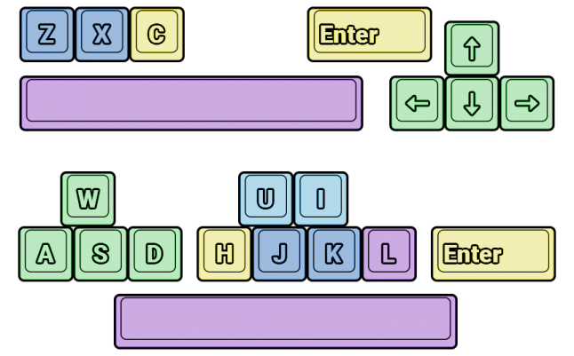 Multiple keys are bound to the same command simultaneously to accommodate different play styles.
We ended up with a rather unique solution, with two simultaneous mappings like we did with the controller shoulder buttons. The first uses the Arrow keys as its base, as this is what most players expect. We then decided that Z and X are the typical action buttons on keyboards when arrows are in use. Add the haymaker on C and space to block, and you're set. Arrows dodge and you can hold up to throw jabs instead of hooks, like Punch-Out!! does. It appears most people understand this mapping without too much trouble, as a ton of game engines and emulators have been using this setup for two decades.
Our second, concurrent mapping is for the people that turn to WASD controls by default. They do the same thing as the arrow keys do, and then we register our other inputs to the J homekey. J and K are the hook punches, and you can move up a row to U and I for jabs. This is my preferred control method personally. We mapped block to L and Haymaker to H to minimize hand travel.
With so many options available on PC, we ended up putting the control mappings on the pause screen. Our game has plenty of tutorials as you play, but they only play once and we had to account for people changing control methods partway through. I think it's a good compromise.
How to avoid looking like a mobile game on Steam: don't be
Of course, being on a larger screen meant the game had to look its best. We couldn't use the same memory-saving tricks from mobile on the PC without looking like we had cut corners.
A little bit of planning saved us a lot of time here. Even though we were targeting mobile, we always kept in mind the possibility we'd be on console or PC later. We kept rigorous backups of our full-quality assets at every step of the way, and always kept our art source files in case we forgot something. Being able to pull from these archives for 4K-worthy assets, and indeed working at that high resolution to begin with, was very important to making Knockout look like it was always supposed to be a PC game in the first place.
Of course, a good port isn't just about bigger textures. Touch screens are NOT monitors, and it's somewhat rare wherever the two user interface paradigms meet. This meant it was also important while developing the mobile version to be aware of how any UI would have to be interacted with on a controller or a mouse.
Our campaign map scene and our customization menus were all made with multiple input methods in mind. Anything we knew wasn't going to make the port, we didn't worry about. This included our in-game store, as microtransactions in a PC game are pretty foul.
The only things we revisited for PC were the Title and Pause Menu scenes. These are very important pieces of the UI where you have to tailor the experience to each platform for the best results. A list menu is terrible on a mobile screen where you want the most important button to be large and tappable. Those large and tappable buttons on the other hand look awful when blown up to a large monitor or TV. The rule seems to be: if it feels wrong, it probably is. It's always worth the extra effort to make your game feel at home wherever it's being played.
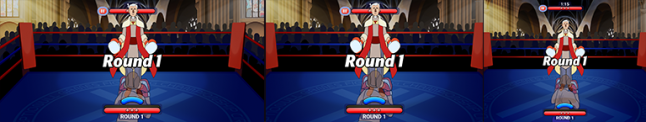
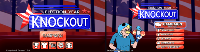 The title scenes differ by platform by necessity. Mobile on the left, desktop on the right.
The port to PC is another area where our art direction saved us some headaches. I don't want to be mean to anyone who worked on it, but a game like Real Boxing suffers when played on a PC given its realistic art style and mobile-quality assets. It's kind of the opposite problem pixelated styles have, where they look amazing on large displays but often suffer substantially on smaller screens or on devices that don't match an integer multiple of their design resolutions. Our 2D cartoon style is a bit more evergreen and flexible here, so long as our assets remained crisp and avoided banding and stippling on the large displays.
Final thoughts: Where we go from here, and things I would improve
There you have it: a way too in-depth breakdown of the game design decisions that went into Election Year Knockout. I would call it a post-mortem, but really this has all been discussing what is (hopefully) the beginning of this product's life. That said, there are some things I wish I could revisit and fix if the market allows me the opportunity.
One unexpected side effect of designing for mobile is the disparity of the game's difficulty between platforms. In particular, the input delay we worked around given mobile hardware and input methods simply doesn't exist on PC. I imagine it's a similar problem to developing an online fighting game with rollback netcode, only to find your players complaining the game has gotten a bit too easy in local play (or intentionally laggy, like in the case of some NetherRealm games). In our case, we did not change the vulnerability windows between mobile and PC. The PC version can thus feel a little too forgiving to veterans of the NES era.
I also wish I had the time to use the extra safe area art from the mobile version to improve the camera on the PC port. On mobile, we didn't leave ourselves any room to zoom out the camera - only zoom in, and adding a little extra camera motion would have benefitted certain actions in my opinion.
On mobile, I really wish I could have handled button mashers better. There is always a point at which you have to take your player aside and say "no, you have to do better," but mobile gamers have been coddled - even trained over the years - to expect reward for little to no effort. Reaching the hearts of these players and convincing them to have the patience to learn a complex game is an area of ongoing research for me.
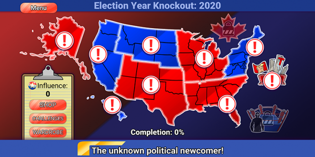
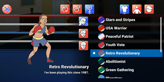
Oh, and adding more content. This whole time, I haven't talked about the game's actual content because that hasn't been the focus of this article, but I'd love to add more characters and campaigns. Just imagine - time travelling leaders from around the world all wanting a shot at the presidency through boxing. My mouth waters thinking about designing those fights. I'd love to continue making non-partisan fun of the comedy goldmine that is politics, in the tradition of JibJab and Celebrity Deathmatch before us. Or, take a side step into another area worth lambasting. Youtuber Knockout, anyone?
And finally, hey. Nintendo. Call us. We made a really good mobile version of a style of game you've abandoned. Players still love it, and everything we've done with our own IP has been a love letter to you and your history in our own way. Also, we'd like to be approved for Switch pretty please.
---
Election Year Knockout is available on Steam, Google Play, and the iOS App Store.
http://www.electionyearknockout.com/
Read more about:
Featured BlogsAbout the Author(s)
You May Also Like
Latest News

Trending


Featured Blogs


