


Daily news, dev blogs, and stories from Game Developer straight to your inbox
Sponsored By
Featured Blog | This community-written post highlights the best of what the game industry has to offer. Read more like it on the Game Developer Blogs.
Five tips to create a stand out game app icon
The app icon: a tiny element that plays the biggest role in how your app is perceived. Creating a great mobile game is tough; crafting a captivating app icon may be equally as challenging. Check out these 5 tips to create a stand out app icon.
6 Min Read

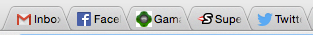
If you are a self-proclaimed multi-tasker like myself, you probably have 20 plus web browser tabs open at all times -- perhaps even a ‘bookmarks’ list that rivals a small library’s. To help navigate through my web clutter I look to favicons -- you know, those little symbols we all subconsciously use as markers to maneuver tab to tab.
You’re likely seeing the Gamasutra favicon at the top of your browser now:
We as humans naturally seek out visual cues like favicons to readily interpret value, purpose and intent. In the app store and your smartphone, these cues are seen in form of the ‘App Icon’.
Effective app icons are like good first-impressions. They are not only captivating and memorable but also exude positive experiences. But as we’ve seen again and again condensing all this into a small square is no easy feat.
Let’s examine several well-crafted game app icons that catch the eye and also the install.
Think outside of the box
There are thousands upon thousands of apps vying for consumer attention -- risk creating a generic icon and you may end up blending in with the rest. Plan to get creative if you want to stand out.
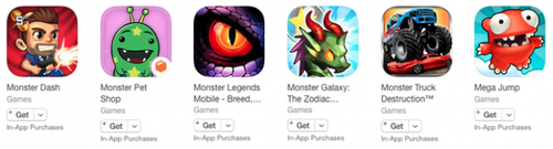
Jelly Button’s Pirate Kings achieves this with the use of borders. Borders add a layering effect to icons that is visually intriguing and can lead to a higher concentration of views. In the example above, the pirate avatar and surrounding gold coins look as if they are pouring out, creating eye-catching levels of dimension. Sticking out like a sore thumb is a good thing in this case!
Stay away from words
“A picture says a thousand words” -- so let your artwork do all the talking. Avoid using words in your app icon if at all possible.
Take the example above: Pocket Gems Chasing Yello’s icon depicts a distraught fish being chased by its eager owner. The user can quickly decipher what the gameplay may entail without having to pause and mentally break-down text. The absence of words is also much more aesthetically pleasing to see on the phone’s home screen.
Remember to keep scalability in mind as well. Text-centric icons become terribly difficult to read on smaller device screens.
Brand your app icons
If you have a series of app titles, consider tying their respective icons together with a single element. This will help instill a brand consistency that will lend to loyal and returning users.
Zynga stamps their app icons with their iconic dog silhouette. This allows users to quickly identify new Zynga titles simply at a glance. Whether you decide to use a consistent background or brand logo across your icons, find one ingredient that will get users to instantly recognize and credit you to the app.
Limit your colors
When choosing a color scheme try to limit your selection to one to three colors. The goal here is to design an app icon that is vivid and not visually overwhelming.
If blue is a must have color, use it wisely and only in the right context. It is an extremely common color in the app store and can dilute your apps presence if surrounded by many other blue themed icons.
Social Point’s Monster Legend icon follows these principles quite well. The icon mainly consists of two vivid colors and provides a deep contrast that allows it to stand out in its surroundings.
Be simple yet unique
Above all, strive to keep your icon simple. Many attempt to portray their app’s depth by stuffing too much detail in what should remain light and concise. You’ll notice all the examples we covered above only consist of 1-2 main elements max. Don’t overload -- It will cheapen the overall perception and quality of your app.
In addition to keeping your icon straight to the point, it is important to take note of the competition. Designing an app that resembles another will confuse users. Be sure to differentiate your icon with unique shapes and colors that stand out from the pack.
Read more about:
Featured BlogsAbout the Author(s)
You May Also Like
Latest News

Trending


Featured Blogs


