

Daily news, dev blogs, and stories from Game Developer straight to your inbox
Sponsored By
Featured Blog | This community-written post highlights the best of what the game industry has to offer. Read more like it on the Game Developer Blogs.
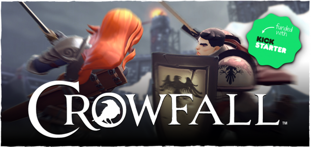
Crowfall: Branding From the Roots Up
Learn about ArtCraft Entertainment's brand development process used to create throne war MMO and Kickstarter success, Crowfall. We dissect and pass on insights for logo creation, visual identity and the impact of community.
11 Min Read

Establishing a new game company and an intellectual property can be very challenging in today’s very saturated game market. With the volume of new games being released, it has become increasingly necessary for teams to leverage brand awareness for their continued success.
I am a champion for early brand development because it serves as more than just a means to sell your product more effectively. You are literally crafting the DNA of your product, and it can help bring the creative teams under one common product vision. The earlier you can nail it down, the better.
This is the process we followed when creating the brand and identity for Crowfall, an upcoming fantasy MMO currently in development by ArtCraft Entertainment. As the artist who has been chiefly responsible for user experience across the Kickstarter campaign, the website and the game itself, I am in a unique position to describe the process that we followed and to pass along some helpful tips.
Starting the Brand Discussion
In order to create an effective brand it is necessary to understand its place in the market. You can start by asking some pretty basic marketing questions. Who is the audience for this game? What are its biggest competitors? What sets it apart? Even “best-guess” speculation is a good exercise.
While these questions do little to define the creative direction outright, they do assist in helping to envision the product in the market. Once you have a sense of where the product will be sold and to whom, you can begin to focus on the key creative ingredients that will drive its identity.
From just a few conversations with Creative Director/Co-Founder J. Todd Coleman, we were able to narrow Crowfall down to the following elements:
Gritty fantasy world
Hardcore gaming audience
Survival
Conflict
Stylized characters
Entertainment brand, not limited only to games (i.e. leave the option open for graphic novels, table-top games, books, etc. in the future.
Creating a Logo
Logo design is an art form of its own with many layers and subtleties. The goal of a logo is to try to encapsulate the elements of your product in a way that appeals to your target audience and convey its unique characteristics. People will associate memorable moments with your logo, and the most successful brands ultimately convert consumers into advocates who wear the logo like a badge of honor.
When I set out to create a logo I always follow these three basic principles:
Readability - The logo must be clearly readable at tiny and huge magnification.
Identification - The logo must have some element, whether font, graphic or color that makes it memorable enough to stand out.
Usage - The logo must be versatile enough to function in wide, tall, square formats as well as various color scenarios such as black and white/single color (when printed on merchandise, business cards, etc.)
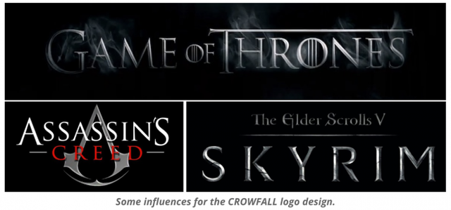
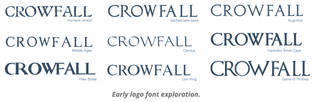
Once we established the core elements for Crowfall, I set out to design a logo that could support those traits. I began by scrubbing my font database for any typefaces that evoked the look and feel I wanted; this usually gets me 75% of the way there. I remember being inspired by the fonts used in Assassin’s Creed, Game of Thrones and Skyrim. I think they all do a good job of establishing the mood that I was trying to tap into: Crowfall needed to feel like a fresh, modern and mature fantasy property.
I selected a dozen or so font candidates and began experimenting with font weights and spacing in Adobe Illustrator. I often mash up multiple fonts if I like a particular letter from one set over another. From there, I created custom elements that helped to differentiate the mark. These included graphic elements and full modification to specific letters.
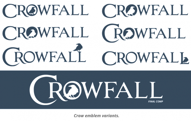
We liked the idea of embedding a crow silhouette somewhere in the logo, so I played around with that concept in various poses and configurations to find which had the strongest impact. We finally settled on the idea of the crow embedded inside the “O” of Crowfall, because we liked the balance -- and, as a bonus, it also gave us a great “abbreviated” version of the logo that would be recognizable to fans and would work great in other venues (much like the iconic Nike swoosh or Target’s red bullseye).
Crowfall has a very rich backdrop and the potential to be a wider multimedia entertainment brand. Because of this, we knew that the mark would need to work in various situations outside of the digital format. I kept the logo rendering flat which helps it to maintain readability even as a single color print.
Creating Identity
Having a strong logo in place is crucial, but the need to also create a consistent visual language to support that logo is often overlooked. Color and framing are incredibly powerful communication tools, especially when driven by the list of elements that define your brand.
“Survival” is a key component of Crowfall’s premise, and many of the initial concept paintings provided by artists Dave Greco and Allison Theus depicted a frozen and decaying world. When choosing the color palette, I leaned heavily towards neutrals and cool blues to help convey that tone. Traditionally, warm colors are used for major headers and primary call-to-action buttons.
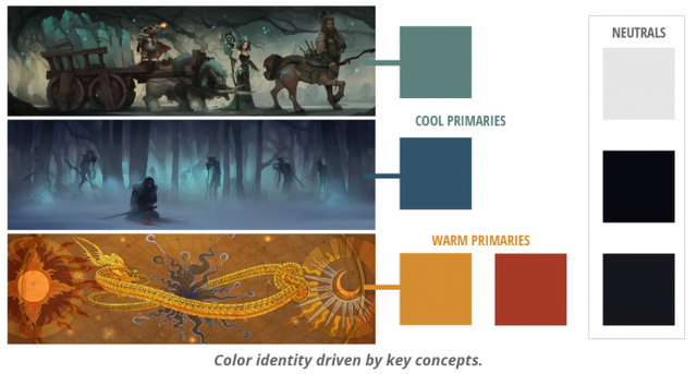
Todd made it clear that he did not want the presentation of Crowfall to look like your average fantasy video game property. We would not use things like scrollwork, gilding, parchment, wax seals and so forth in our iconography or framing. Many fantasy video games include these classic tropes to better engross you in the world experience, but Todd felt that they had been overused so much at this point that they wouldn’t help us stand out.
Instead, I took inspiration from the Game of Thrones Viewer’s Guide website. The bold, simple and modern framing does nothing to detract from the gritty fantasy world of GoT. The negative space created by its minimal scheme actually allows the photos and video clips to pop more than if they were surrounded by ornate details.
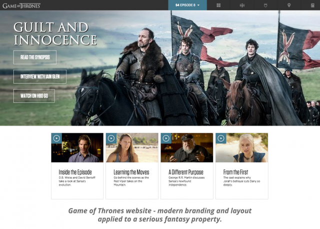
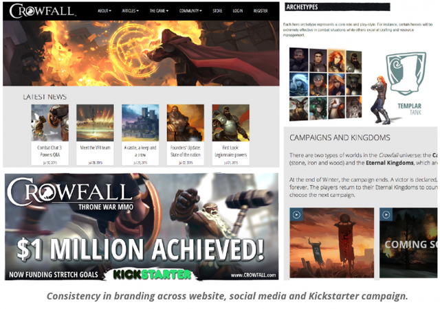
This approach translated to Crowfall very nicely. When superimposed against the simple framing, the stylish characters and colorful concept artwork burst with visual interest. I chose a readily available web font, Open Sans, for its variety of weights and modern presentation. I was able to spread this design and brand identity to the Crowfall website, marketing visuals, videos and the Kickstarter campaign. This proved to be very effective as it created a seamless brand experience across all media.
Branding -> Engagement -> Momentum -> Sales (hopefully!)
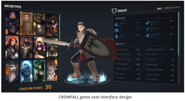
The early dedication to branding also provided far-reaching benefits to our ongoing development efforts. The positive reaction to the brand led to a similar minimal approach to the game’s user interface elements, further unifying the internal and external product definition.
It is difficult to say how much the branding specifically contributed to the early crowdfunding success of Crowfall… though it isn’t hard to believe that it boosted pre-launch user registrations and day one pledges in a material way.
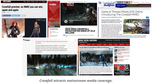
Branding and user experience are integral to how your game is perceived, so it’s impossible to carve out a portion (or a percentage) and say “branding made it XX% better!” In the end, though, the results speak for themselves. We were stunned (and overwhelmed) by the response as we hit our initial campaign goal by the third day. As of this writing, the project has earned over $2.7M in crowdfunding and continues to pick up new players daily. By creating a consistent and memorable brand, we have been able to grow our playerbase and turn a meaningful portion of that audience into our customers and brand advocates.
Takeaways
Creating a successful brand is a key factor in making your game memorable and professional, both of which are necessary ingredients to any successful crowdfunding effort or product launch.
If I could give you my top five pieces of advice on crafting your brand, they would be:
Your brand is your DNA. Understanding what makes your product special and who it can appeal to is vital to your success.
Logos should be readable, memorable and versatile. I recommend working in vector format for fast iteration and resolution independence.
Create a consistent visual language to support your logo and brand identity. Mood, atmosphere and attitude can strengthen the bond between your audience and your brand.
If you are making a game in a deeply-rooted genre, such as fantasy, don’t feel constrained to traditional visual cues. Draw inspiration from unlikely places if they are effective. For instance, I am constantly inspired by non-gaming brands and UX such as Apple, Amazon and Netflix.
Branding is not limited to a product. The people making Crowfall are just as much an active ingredient in brand recognition. When appropriate, use social media to put a human face on your product. Your audience could build a more personal relationship with the brand because they feel they know the people making it.
In contrast, here are some things you might want to consider and approach with caution:
Don’t overestimate the power of your brand and merchandise too soon. We spent a lot of time and energy on creating a global network of Crowfall shops online to sell apparel featuring the Crowfall logo. We thought this would drive meaningful supplemental sales based on the early positive reception to the game, but has since been a pretty dry well. We realize now that brand potential is not the same as brand power, so we have shifted our focus back to creating a great game. Merchandise will follow at a more appropriate time.
Avoid working in a bubble and putting on blinders as you create your product. Communicate with your audience and stay up-to-date with their interests.
Don’t get into a habit of rebranding. At certain points, your product or company may pivot and require a new identity. Each time you do this, your established audience is compromised. It is not impossible to bounce back, but in a lot of ways you are starting over. Think it through and commit.
Know the balance between being inspired and being derivative. One of the things I wish I could have done a little better would be to create a more unique typeface for the Crowfall logo beyond the crow emblem and maybe venture out a little further in terms of our website design. (We have done a lot in this regard, in the year since our Kickstarter ended). I think the overall balance of graphic design and painterly concepts ends up feeling unique, but we definitely wear our inspirations on our sleeves.
Don’t be upset if your brand does not appeal to everyone. You are trying to create a strong emotional bond with an audience. Depending on how strong that bond is, the size of that audience doesn’t have to be huge, just passionate. I have seen companies destroy themselves because they focused too hard on the audience they didn’t have versus the one they did and failed to cultivate. The Crowfall community is made up of individuals from all walks of life. Without them, our brand would hold very little value.
Thanks for reading and if you have any questions, feel free to post them in the comments section below!
About Billy Garretsen
Billy Garretsen is an established digital artist specializing in brand development and user experience. He currently works with game industry veterans Gordon Walton (Ultima Online, Star Wars Galaxies, Star Wars: The Old Republic) and J. Todd Coleman (Shadowbane, Wizard 101) at ArtCraft Entertainment where he contributed to the company’s Kickstarter success, CROWFALL™. Prior to that, Garretsen led a variety of creative teams at multiple game studios and start-ups, earning over 100 title credits for PC, mobile and console.
About ArtCraft Entertainment
ArtCraft Entertainment is an independent game development studio located in Austin, Texas. ArtCraft’s flagship title, Crowfall™, is a massively multiplayer online game of politics and conquest. One of the most successful crowdfunded games to date, Crowfall has amassed over $2.7 million in crowdfunding from over 27,000 backers to create a world in which players create mercenary armies, merchant guilds and noble houses to compete in the pursuit of glory, wealth and power.
Read more about:
Featured BlogsAbout the Author(s)
You May Also Like
Latest News

Trending


Featured Blogs


