Featured Blog | This community-written post highlights the best of what the game industry has to offer. Read more like it on the Game Developer Blogs.
Quick and dirty - a menu text effect
A quick way to add outline and highlights to texts / objects

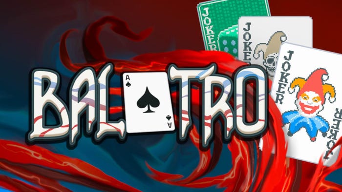
Just a quick tutorial on how to create an outline/ highlight effect. I like to use this effect a lot for menu texts/ mock-ups as it's quick to create and it looks rather nice.
The key to this effect working/ looking good is the right font. Choose a bolder/ thicker font to allow the inset to work.

You can use the same workflow on any sort of object - not just fonts. Buttons, icons or bullet points look nice with the highlight and a little gradient fill added to them.

Enjoy playing around with this one. I would suggest trying multiple stroke objects with decreasing stroke width to get double or triple outlines.

And for all those Gimp users - it's not that hard to create this kind of effect either. It's a different approach as there is no outline/ stroke feature in gimp but by using selections and growing and shrinking those you can achieve a very similar effect.

Enjoy!
Read more about:
Featured BlogsAbout the Author(s)
You May Also Like


