Daily news, dev blogs, and stories from Game Developer straight to your inbox
Sponsored By
Featured Blog | This community-written post highlights the best of what the game industry has to offer. Read more like it on the Game Developer Blogs.
2D Game Art For Programmers - Part 2
This is the second set of tutorials using free graphic tools like inkscape and gimp to create 2D game art. The idea is to construct the art with set elements like circles and square. I decided to split the 1st tutorial - just makes more sense.
4 Min Read

After the initial playing around with circles and squares, learning a little bit about the fills and combining objects [part 1] , I would like to move on to a basic scene.
Having more fun with gradients:
Let's take the gradient fill to the next level and work with colour and alpha to create a simple underwater background.


Hint:
Use the 'Page Up' and 'Page Down' key to adjust the order of objects [e.g. place the sea anemones in the mid ground behind the light rays.]
I would like to add more life to the underwater scene and create some fish. The basic principle when adding 'real' elements to a vector scene is to look at the shapes and 'deconstruct' them into basic elements like the circle, square, rectangle or ellipse.
I usually do a quick google image search for a reference image to get a better idea what I am going to create. In this case the 'yellow reef fish' search came up with a nice yellow longnose butterfly fish.
It works great as the main body is kind of squarish and the front has a triangular shape.
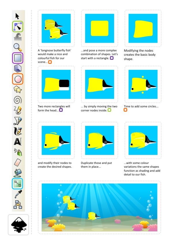
The same approach works the same with far more complex elements. It's a matter of seeing the 'building blocks'.
Staying in shape... the Clip Tool...
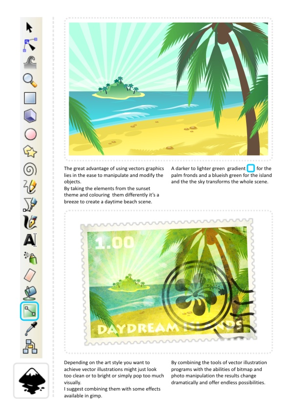
In line with the water theme let's go ashore and look at a sunset on the beach to introduce some more helpful tools and techniques.

This is our basic 'pop style' sunset with some modified circles and gradient alpha fills added to represent some rocks in the water.

One of the 'wonderful' things about working with vectors ist the scalability. Objects can be scaled up and down without loss, allowing for easy editing and adjusting of the illustration.
In this case the scale of the palm trees will define the viewer's perception of distance. Smaller palm trees will put the island further in to the distance while large trees will 'bring' it up close.

Btw. the clouds are the same shape as the island just squashed and coloured in a colour matching the sky gradient. Try reusing shapes even just slightly modified, recoloured, squashed, rotated or flipped to speed things up, add variation and make your scene more interesting.
Note:
A lot of the objects I am covering in my tutorials (like the palm trees above) working from predefined shapes (circle, square, star, etc.) is only one option. The freehand or straight line tool will create identical shapes but require a little more artistic skill.
For our detailed palm we need two 'more advanced' features of inkscape: Interpolation and Path Effects.

Varying the fronds, adding to the interpolation and checking some reference images can improve the look of the palms even further.
If you have similar screens to design for your game it makes sense to spend some time on the initial elements and then 'recycle' objects. This way you safe time and create a more consistent look and feel.
I quickly did a step-by-step to show the creation of the stamp border used in the illustration above:

Note:
The reason for ungrouping and combining the circles first lies in the restriction in Inkscape to only do a Union, Difference, Intersection, Exclusion or Division between two objects.
Tools like CorelDraw can do these with a group or even just several selected objects. Try around around a little see how your vector application handles these very handy commands.
I hope even these slightly more advanced features don't pose too much of a problem. Enjoy and stay tuned for more!
Read more about:
Featured BlogsAbout the Author(s)
You May Also Like