Featured Blog | This community-written post highlights the best of what the game industry has to offer. Read more like it on the Game Developer Blogs or learn how to Submit Your Own Blog Post
This Game Boy-era design choice deserves a comeback
Old games always have good lessons for modern designers—here's one you may have missed.

The year is 1999. Star Wars Episode I: The Phantom Menace is in theaters, and LucasArts is overseeing the release of a slew of games themed after the movie.
When you look back at games inspired by the first of the prequel films, the most obvious one that jumps to mind is Star Wars Episode I Racer. The podracing game was a smash hit, eventually going on to sell 3.12 million units across PC, Dreamcast, Nintendo 64—and Game Boy Color.
If you weren't around then (oh god some of you reading this were born in 1999 that's not fair), or just plain forgot, the Game Boy Color version of Episode I Racer did not play like its other cousins, as no Game Boy console was ever really great at rendering 3D graphics.
It traded the more thematic third-person races for top-down one-on-one duels. Players began the game only able to play as movie hero Anakin Skywalker, and needed to unlock other racers by winning different maps.
Upgrading your podracer was a more streamlined affair, and plenty of attention was paid to the built-in rumble pack—one of Nintendo's early methods for making controller haptics.
My brother and I were already obsessed with Episode I Racer on PC, and at some point we were gifted a copy of the Game Boy Color port. At the respective ages of 7 and 9, neither of us were exactly skilled at games like Racer. It was normal of us to repeatedly play the first few levels of a game over and over again, and never make it to the end.
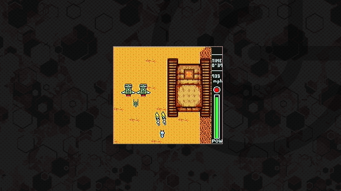
Now this is podracing. (Image via MobyGames)
But with Racer on the Game Boy Color we made it all the way to the Boonta Eve Classic—the climactic race seen in The Phantom Menace. It's the final stage in all versions of the game, featuring a map that plays as close as possible to what you see onscreen (and later in the Disney+ show The Mandalorian season 2.5 The Book of Boba Fett).
On PC, we'd raced the Boonta Eve Classic over and over again, with multiple wins under our belt. On the Game Boy, it was an impossible map. No matter how close we got to the finish line, Sebulba always shot ahead and won the day.
That didn't make sense. On the PC version of Episode I Racer, you could win the Classic with any character as long as you were good at the game. Here, it felt like the computer was cheating. We ran through all the racers we knew were "good" from the PC version of the game—Mars Guo, Ben Quadrinaros, and Ratts Tyerell—none of them could keep up with the despicable dug.
On paper, these were the racers with stats that could keep up in the Classic—racers lived on a vaguely normal power curve, and we thought the ones you unlocked later in the game would be the best performers.
I don't remember why, but I was scrolling through the racers one day, trying to find the best way to win the race. Then I scrolled back to Anakin—the very first pilot you started with. His stats looked different then I remembered (I can't recall if they changed over the course of the game or not), and a thought popped into my mind: Anakin beats Sebulba to win the race in the film. Was he naturally tuned to do so here?
Sure enough, he was. The very first racer we'd been given—one we were encouraged to replace at the earliest opportunity—was the one best tuned to beat the Boonta Eve Classic and unlock Sebulba. It was a nice thematic touch! With a game aimed at children, letting them recreate the heroics of the movie's young hero was a simple design move that would make a complex game more understandable.
Lately I've been thinking about that design choice; having one of the first characters or weapons a player receives in a game be the most powerful one at the end. Episode I Racer on the Game Boy Color wasn't the only game I saw use this technique. There's something more here that's worth revisiting today.
Harry Potter and the unusually good game adaptation
In 2001, Electronic Arts snagged the license for games inspired by the Harry Potter films, the first of which was due out in November of that year. In the run-up to the movie, it unleashed a slew of game adaptations across PC, Mac, Game Boy Advance, and Game Boy Color. Though the PC and Mac titles were the big 3D productions, the Game Boy Advance and Game Boy Color received unique adaptations of the film's story that took advantage of each console's strengths.
In hindsight, I despised the Game Boy Advance version. But the Game Boy Color adaptation was an incredibly robust top-down turn-based RPG. Of the three versions, it might actually be the strongest—its design encourages you to poke around the edges of Hogwarts, and the gimmicky collectible mechanics feel more natural in a game with levels and equippable spells.
The sprite-based imagery still looks incredible in 2023, and it had a New Game+ mode that let you keep your progression but replay the story.
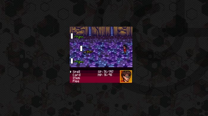
I swear this game was good! (Image via MobyGames).
I'm not the only one who remembers this game fondly—Nintendolife's Kate Gray penned a gushing retrospective on it back in 2001. Even though Harry Potter book author JK Rowling has descended into a spiral of frothing anti-transgender bigotry and soured many of my Harry Potter memories, I'm willing to give this spunky little RPG very high praise.
It's in the New Game+ mode that today's design topic pops its head up again. Over the course of the game, players learn more and more spells to use in its turn-based combat—but the spell Flipendo, which costs 0 mana—eventually scales up so much in power that it's monstrously effective, especially in New Game+.
Here again, pre-teen Bryant was baffled by this design choice. When you play games, weapons and characters are supposed to get stronger as you progress, right? You're supposed to discard the early tools you find, and replace them with stronger choices.
Over two decades later, subverting that expectation still feels like a fresh innovation.
A good idea with plenty of challenges
Cards on the table: I am writing this article fully aware that my fondness for these moments is channeled through the rose-tinted glasses of nostalgia. I'm not even 100 percent sure these design choices were intentional—they just might be how I interpreted them as an ignorant youngster.
If I were to make a comparison to other media, I'd point to how plenty of anime shows from the '00s aimed at young audiences made the most of similar tropes. The heroes of shows like Zoids: New Century or Medabots were young hot-blooded idiots who stumbled on some of the most powerful weapons of their fictional universe—but had no idea of their untapped potential because of plot reasons.
Designing a system like this can also be surprisingly complicated in modern role-playing game design. It's easy to create some math formula that makes a first-level spell or weapon jump up the power curve later in the game—but does doing so invalidate all the other choices a player made in their adventure?
Let's yank off those rose-colored glasses then, and think about the principles you'd need for such a system to work in the 2020's:
An element of discovery: If we look back at the two moments I remembered above, there's an element of surprise at the center of both stories. My expectations were that the tools I used at the start of the game would be discarded as I reached the end. Upending those expectations is probably the act that burned those moments in my brain, rather than any arbitrary number or percentage increase you'd apply to that mechanic today.
Stories about the "simple but mighty": Both Episode I Racer and Harry Potter and the Sorcerer's Stone feature child heroes who are underestimated by adults. I think you could pull this mechanic off without child heroes, but there's still necessary groundwork to lay here. These moments happen in fantasy worlds where characters underestimate the power of simplicity and earnestness—a system that made the most of this design logic would do well to do the same.
A host of other interesting choices: Remember, in Episode I Racer my brother and I thought we could win the final race with one of the other colorful cast of podracing characters. Making early-game characters or weapons stand out in the late game is as much about offering compelling alternatives. Heck, in the Harry Potter Game Boy Color game, it was probably just as viable to wander through New Game Plus with the flashier, more expensive spells—I just eventually fell back on Flipendo.
You don't want to undermine what "should" feel strong: I noodled over including the pistol from Halo: Combat Evolved in this article, but that weapon's surprising utility has been well documented by this point. I'd argue that maintaining the gun's strength in future Halo games would have ruined the feeling of other strong weapons. I think a more interesting, deliberate version of this in shooters is how the Gravity Gun gets an overhaul at the end of Half Life 2. You can make interesting moments by building players up with tons of power, then taking it away to make them work with the basics.
Nostalgia is a heck of a drug, but this isn't the only design lesson from the Game Boy Color/Game Boy Advance era that I think still belong in our modern world. Those little consoles punched above their weight on a regular basis!
Thinking about portability, efficiency, and a young target audience made for a great era in game design history, and now that the Switch and the Steam Deck are sending players out into the world with game consoles again, maybe there are more lessons to be gleaned from this day and age.
Read more about:
Featured BlogsAbout the Author
You May Also Like


