This interview has been edited for clarity
Cocoon quite literally asks players to carry the world on their shoulders. The paradoxical puzzler from Geometric Interactive is built around a world-hopping mechanic that allows players to plunge into whole realities housed inside mysterious orbs. The title was designed by Jeppe Carlsen, the lead gameplay designer of Limbo and Inside, who co-founded Geometric with the singular purpose of bringing Cocoon to life.
During a recent interview with Game Developer, Carlsen explained the idea for Cocoon's layer-cake approach to world-switching came to him in a daydream years ago. He became fixated on the idea, often conducting thought experiments to mull over what sort of puzzles you could create by allowing players to stack worlds and flit between them in an instant.
Eventually, Carlsen worked with the rest of the Geometric team to yank the idea into reality, building a rough prototype that he describes as "pretty dense" on a mechanical level but lacking "sophisticated" design elements. That early demo contained much of Cocoon's core DNA, including the top-down perspective and even some puzzles that made it into the finished game. Crucially, it also proved it was possible to implement seamless world switching in-game, allowing Geometric to green light a production that would take around six years to complete.
Realities ad infinitum
Because he'd spent huge swathes of time considering how the world-hopping could be implemented before production had even started, Carlsen explains that figuring out how the mechanic should work on a technical level was fairly straightforward. Once they had a working prototype, however, Carlsen was able to look at world-hopping from a new perspective and realized that doggedly pursuing complexity might actually harm the title in the long-run.
He notes that some of the best puzzles in the game simply challenge the player to take an orb or object from Point A to Point B by placing it inside another orb. They called this solution 'suitcasing,' because it essentially asks players to treat an entire world as a piece of luggage that can be used to smuggle items or entire realities past traps. That idea wasn't in the early demo, but became an essential part of puzzling in Cocoon.
"I was surprised at how fundamental that type of puzzle became in the final game and how I missed something that seemed so obvious," he says. "The beauty [of that solution] is that we didn't need to code anything because it's literally just a case of using the mechanics that already exist."
Key Killer Puzzle: One of the first puzzles in the game where you use the hierarchy of worlds within worlds to overcome an obstacle. This one is also almost identical in the final game vs original prototype.
Carlsen notes that sometimes it's impossible to see some of the more elegant ways to apply mechanics until they're laid out before you, and says that as production progressed it became increasingly clear "what this game wants to be." It's a tidbit that shows how the team were actually influenced by the very mechanics they'd created. "Even though it's me who made it, at some point it just became very intuitive in terms of what fits this game and what doesn't—without me even formalizing it or writing it down," continues Carlsen.
That almost symbiotic approach to design showed Carlsen it was important to introduce concepts to players in a way that felt natural—gently encouraging them to widen their understanding of how world-hopping could be used without burdening them with knowledge. "One component of [successful puzzle design] is how do you throw in concepts at a rate where people can keep up? With regards to the specific puzzles in the game that are utilizing the hierarchy of worlds, like the suitcasing puzzles, I noticed that people often had a hard time with those concepts," he continues.
"I eventually arranged those concepts like a 'mental staircase' comprising individual steps. So, what is the first step I could ask players to take that utilizes the hierarchy of worlds concept but is also the most general one I could come up with? That became step number one." Whenever players struggled with a specific puzzle, he'd "inject an extra step" to bridge the knowledge gap. Where suitcasing is concerned, that might require the creation of a puzzle with two exit portals, followed by one with two entry portals and an exit portal, and eventually another with an exit and an entry portal. Positioning those steps next to each other allowed Carlsen to increase the challenge without leaving players behind.
Trick or treat?
It's a mindset that encouraged Carlsen to take the "intuitive" path even when it required bending his own rules. For instance, he tells us that he'd normally never include a pipe puzzle—which simply require players to assist an object in rolling from two connected points—in his games, but in Cocoon they're fairly abundant. Although there are still elements of complexity (the pipes need rerouting and meander through a 3D landscape), he notes that Cocoon taught him that it's okay to include puzzles purely because they feel satisfying.
"At some point, I realized I don't need to do anything to trick the player here. Maybe the 'puzzle' is to just look at the landscape and take it in. We've noticed that people love the pipe puzzles. It's super satisfying for them, even though in principle there's no real puzzle," he says.
"Sometimes as a designer you're so keen on being smart and trying to trick people all the time, and while I do like puzzles that trick people—I make a lot of them—I think I've got to a point where I evaluate puzzles on more parameters than just 'is this challenging?' or 'is this tricking people?' It can also be 'does this connect them to the landscape they're traversing?' So, that might be encouraging them to pull a really heavy object that's an orb shape to teach them it's possible to actually carry orbs. That's what I'd categorize as an 'adventure puzzle.'"
Lift Powered By 3 Orbs: In the 2D prototype we sometimes added a big lift that would require all orbs to activate and then transport you to a new area. This was added for level design reasons, since a point of no return where all orbs are brought along is a great setup for introducing a new scene or puzzle concept. In the video you can see an example of how we in the final game turned these simple "progression lifts" into world building set pieces.
He notes those "adventure puzzles" can teach players about mechanics that will become essential without breaking immersion. After leaning into the concept with Cocoon, Carlsen began evaluating his puzzles using more parameters, including "can I make people smile?" That question birthed the title's jump pads, which players can smash down on to propel themselves forwards. It might not be a traditional puzzle, but it's a small, satisfying interaction that provides a moment of joy that connects players to the experience.
As Carlsen's perspective began to shift, so did Cocoon itself. He says that while the world-hopping mechanic remained absolutely fundamental to the experience and was heavily entrenched in the core design, he realized the mechanic didn't need to be constantly shoved into center stage. There was room to let other types of interactions breathe without needing to aggressively drive players towards the next big set-piece.
"At first I felt the game needed to be about jumping through worlds all the time, but eventually that became the secret ingredient. It's the spice that I'm sprinkling into the experience," he says. "Normally you'd say a game needs to show its true colors so the consumer knows 'this is what this game is,' but I think Cocoon became a counter to that traditional way of thinking."
Wrong answers only
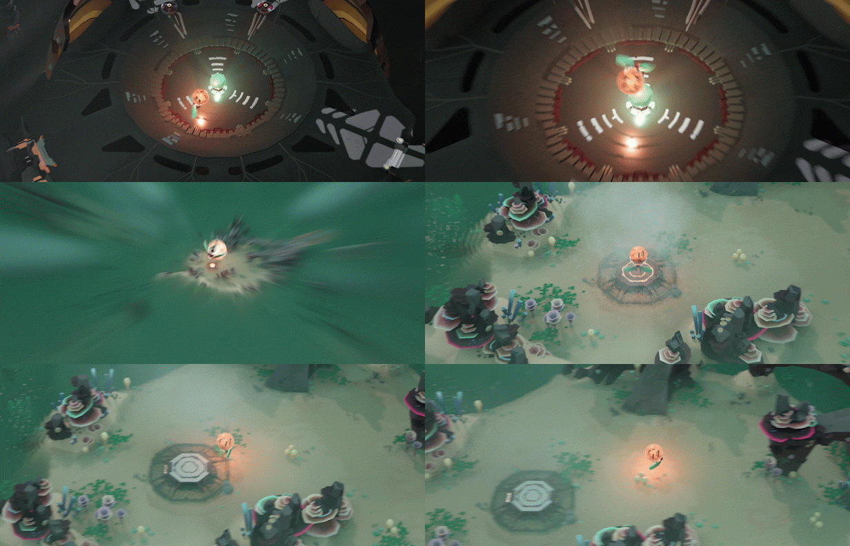
When players do switch realities, however, it was crucial to ensure they could quickly find their bearings. Carlsen says the team spent the vast majority of their time discussing how to make the many worlds of Cocoon readable. The result was the decision to ensure players could only hop worlds using specific jump pads that are placed at sites that have been heavily signposted.
"One thing we do from a level design perspective is make it so that you can only land in worlds at fixed points and we make sure to give you as much information in the single screen you land on without moving the camera at all," says Carlsen. "It has to be as informative as possible, so if there's a spot where you can leave an orb inside this world, frame it within that very first screen. It might be that we have made recognizable environments, but people don't remember where they've put stuff—especially in a hierarchy of worlds. We don't want players to have to start moving the camera."
Art director Erwin Kho explains that focus on readability is why the orbs are all color coded and feature incredibly specific biomes. If players forget where they've been, or where they've left an object (which, in this case, could be an entire reality), the experience would very quickly break down. So, when you place an orb inside another orb, you can still see their contrasting colors from outside of those realities, making it incredibly difficult to misplace an entire plane of existence.
As we discuss the challenges of manifesting puzzles and concepts that had spent years nestled inside Carlsen's hippocampus, the veteran designer explains that testing for failure was perhaps more important than testing for success. When dreaming up the puzzles in Cocoon, he would often push straight towards the solution to ensure his internal logic held up. But just because he could find the answer to a puzzle he'd created, it didn't mean the path forward would be so obvious to those outside his sphere of existence.
"I think, interestingly, what you end up having to do a lot is playtest to figure out what all of the apparent wrong solutions are so you understand what sort of ideas people are having when they interact with your puzzles," he says. "You have to polish those incorrect 'solutions' as much as you polish the actual solution. By that I mean when someone tries something that's incorrect, you need to be able to feed back to them that it's 100 percent wrong and repeated attempts will still be 100 percent wrong."
This is crucial, he notes, to ensure players don't become trapped in a loop of failure because the game has miscommunicated a concept. In another game, that doom cycle might occur because someone has included a door that players feel they can *almost* get through if they just timed a jump to perfection or completed a platforming sequence flawlessly, despite the fact the doorway was intended to be inaccessible. That hypothetical would represent a design misstep because, for whatever reason, players have been able to (wrongly) identify the door as a solution to a very specific problem.
"The problem here is they do it more than once so the game doesn't feedback clearly that it's impossible, which means you need to change it. That could be really annoying because when you begin changing parameters it might affect the proper solutions," he says. "But I think for puzzle games that's very much what the design is about—it's about the totality of the game and how it needs to communicate effectively."
Read more about:
FeaturesAbout the Author
You May Also Like


