
Featured Blog | This community-written post highlights the best of what the game industry has to offer. Read more like it on the Game Developer Blogs or learn how to Submit Your Own Blog Post
Understanding the Success of Fortnite: A UX & Psychology Perspective
As the former Director of User Experience (UX) at Epic Games, where I worked on Fortnite from 2013 to late 2017, I would like to share the different steps that were taken by the Fortnite team to build what would later become the success we now know.

Fortnite is one of the most successful video games in history, and this success fascinates and confuses many people who have made efforts to account for how a game could have become such a phenomenon so quickly. As the former Director of User Experience (UX) at Epic Games, where I worked on Fortnite from 2013 to late 2017, I would like to share the different steps that were taken by the Fortnite team to build what would later become the phenomenon we now know, through the lens of UX. My background in psychology, my occupation as a UX strategist, and my personal work on the game likely bias my perspective since we are all susceptible to unconscious biases. However, this analysis, unlike those that have been proposed thus far, is a firsthand account that was presented in several Game Developers Conference (GDC) talks that I gave before Fortnite was released, and in my book The Gamer’s Brain: How Neuroscience and UX Can Impact Video Game Design (2017).
The Fortnite team had a precise vision and collaborated very closely with the UX team to deliver a game that would be true to this vision and that would appeal to many different types of players. My contention is that the success of Fortnite is linked to their efforts in adopting a UX mindset. My goal here is to explain how to develop such a game UX mindset and build a UX strategy to help game developers around the world find success more quickly with the games they are crafting. This is especially crucial for independent developers who have fewer resources yet still compete with the thousands of games released every year.
I will detail here the three most important steps to develop a game UX mindset, which were taken during the development of Fortnite:
Understanding the player’s brain
Following a game UX framework (guidelines to usability and engage-ability)
Applying the scientific method & establishing a UX pipeline
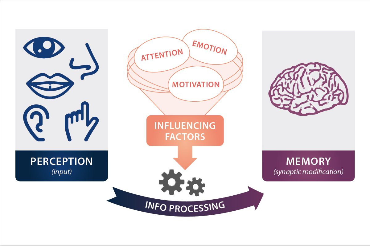
Simplified diagram showing how the brain learns
UNDERSTANDING THE GAMER’S BRAIN
This success story narrated through the lens of UX starts by understanding how the brain operates. Discovering and experiencing a video game, like anything else, happens in people’s minds. Thus, to anticipate how players will experience a game, it is critical to know the main capabilities and limitations of our brains. The study of mental processes (such as attention or memory) is called cognitive science. The diagram above shows a simplified version of what is going on in our brains when we learn or process information.
This process starts with the perception of an input (for example, a tutorial text) and as we process the information conveyed by our many senses (we have way more than five), our memory is likely to change. When we learn something, new synapses — the connections between neurons — are created or are strengthened. Everything you do in life — reading a book, watching a movie, chatting with friends, reading this article, etc. — is going to “rewire” your brain, because our brains are not hardwired in the first place. The brain is malleable, and thanks to this plasticity, we are capable of adapting to our ever-changing environment. Between the perception of a stimulus and the modification of our memory, a lot of things happen. Notably, the quality of learning will be affected by many factors, such as our attention, motivation, and emotion.
How much people pay attention when they process information is a critical factor to the quality of learning or retaining that information. The more you pay attention, the better you will process and retain what is going on around you. For each of these mental processes — perception, memory, and attention — I will explain our main limitations, and how we accounted for these limitations during the development of Fortnite. Keep in mind that the brain is extremely complex. We do not have independent linear channels that process our surroundings as shown in the diagram. It’s not even a process. We use a lot of terms from computers to explain how the brain works because computers offer a compelling metaphor, but the brain does not work like a computer. It is much more complex, and scientists are only just starting to understand how it works. I’m going to briefly explain the main limitations for these mental processes, but you can read more about this in this transcript of my GDC 2015 talk.
Perception
Perception is a construct of the mind, and one that is subjective. Take a look at the picture below. What do you perceive here? Color stripes? Maybe people? How about Street Fighter characters? Depending on your knowledge about this game, and even your personal connection to it, you are not going to perceive this input in the same way. And if you are colorblind, like about 8% of the male population, you rightfully feel excluded from my example (please accept my apologies!). No matter what we are designing, we need to make our product or system accessible for everyone; this is why, for example, we should never convey information exclusively through color.

Street Fighter II characters as minimalized by artist Ashley Browning
Perception is subjective. It depends on our DNA, our prior knowledge, our expectations, our culture, the context, and many other factors. This situation is problematic when we make a video game, because the game represents a series of stimuli that we want players to perceive the way we intended. If perception is subjective, how can we be sure that all the visual and audio cues in a game will be perceived as intended? To put it simply, we cannot. This is why it is very important to run UX tests, whereby we invite people from our target audience to test the game in development. Many types of tests exist, but to determine if our audience perceived the main elements of Fortnite as intended we mainly used surveys. For example, in 2013, we invited a few people to play through a prototype of the game, and then we asked them to tell us what they believed the icons were communicating. The original symbol that was chosen to represent traps in the game was not perceived as such by all players who tested the game then. Some players thought it looked like ammunition, or trees. Thus, the icon was perceived differently by the person who designed it and by the target audience who interacted with it, as I explained in my GDC Europe 2014 talk. As traps were a key feature in Fortnite, it was important to tweak this icon so that no player would be confused by this stimulus. After the UX test, we decided to change the trap icon to look like a bear trap. There are no bear traps in Fortnite, but in our continued testing, all the players we invited to test the game understood the new symbol. This situation underscores that people will have multiple perceptions for any given reality. This situation necessitates testing the main elements in a game, whether they are UI elements, character design, sound design, visual effects, or environment design.
Trap icon iteration (GDC Europe 2014)
Memory
Memory is another important component to account for. We are able to memorize a lot of information, and sometimes for a very long time. However, we also forget many things. In the late 18th century, the German psychologist Herman Ebbinghaus uncovered the exponential nature of forgetting. He established the now famous “forgetting curve“. To come up with this curve, he taught himself a list of syllables that didn’t have any meaning (to avoid any familiarity effect) and he varied the time in which he had to recall them all. The figure below illustrates what he found: once he knew the list of syllables by heart, if he recalled them immediately after he had 100% success rate.
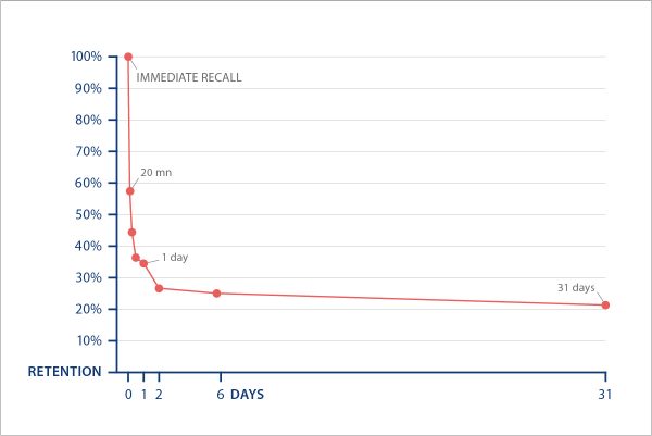
The Forgetting Curve (Herman Ebbinghaus, 1885)
After only 19 minutes, his success rate dropped down to about 60%, and after one day it dropped down to nearly 30%. This means that when you learn something that is not meaningful, and with no method of any kind, you are likely to lose about 70% of the content learned from one day to the next. This is pretty inconvenient, especially for video games since they are usually experienced over several days, sometimes weeks, or even months or years. Given that the human memory is limited, and that we are bound to forget many things, how can we ensure that returning players are not going to forget key information over time? Game developers apply many tactics to avoid this caveat, from repeating information to displaying contextual tutorial tips. However, the most efficient methodology to avoid the impact of the forgetting curve is to reduce the memory load in the first place. The more information is always available to players, the less there is to learn and remember, which underscores the importance of having a good heads-up display (HUD).
The HUD prevents players from remembering elements, such as what gun or abilities they have equipped, how much ammunition they have, or what their next objective is. In Fortnite, a lot of information is always displayed, such as what key to press to search an item. Players do not have to remember this information; it always pops up in the UI for them. Another example is the option for players to pin a recipe they are interested in crafting in their HUD. They do not have to remember what ingredients they need to harvest; they can simply concentrate on their objectives. Our memory is fallible. It can sometimes be very frustrating to come back to a game and not remember the controls, objectives, or how certain systems work. Alleviating players’ memory load is thus important to ensure that they won’t quit a game because they don’t remember some critical information to have fun.
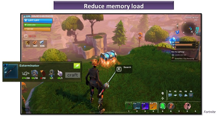
The HUD helps reduce the memory load
Attention
Finally, let’s talk about attention. Although we believe that we are good in analyzing our surroundings, we actually have pretty limited attentional resources. We are not able to carefully scan what’s going on around us. Rather, our attention works like a spotlight: we direct our attention to something in particular while we filter out other stimuli. Just like when you’re in a loud bar and you concentrate on only listening to what your friends are saying. This means that we cannot efficiently multitask, despite most of us believing that we can. When we try to multitask, we are missing a lot of information and we make mistakes, even though we might not realize it.
Watch this video for example:
Did you notice something surprising in the video? Most people don’t. This is what we call “inattentional blindness” in psychology and it’s a very powerful phenomenon: when we are focused on a task, we fail to notice stimuli that are not related to the task (even when a very surprising event happens!). Many games challenge players’ attention, which is fine once players master the game. However, asking players to multitask as they are discovering and learning about a game can lead them to miss out on important information. This is why it’s critical, for example, to avoid tutorial text about how to regenerate health as players are combating zombies. At best, players are going to be annoyed by the distraction; at worst, they won’t be able to realize that some information has popped up, let alone process and remember it. Since our attentional resources are scarce, game developers need to mind the cognitive load they put on players at any time, and more specifically when players are learning about something new, as this requires even more attention.
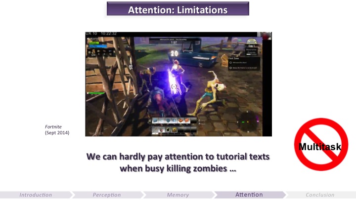
The myth of multitasking (GDC 2015)
In summary, when we learn and process information our perception is subjective, our attention is scarce, and our memory is fallible. This is why having a UX mindset, which places the end users at the center of the development process, is key to offering the intended experience.
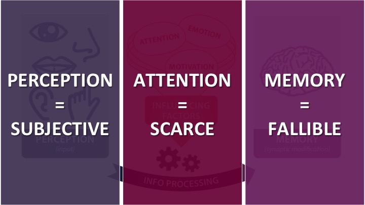
The main limitations of the human brain
A GAME UX FRAMEWORK
User experience is a term coined by Don Norman (former Vice President at Apple, author of the renown The Design of Everyday Things, 2013) in the 1990s to account for the whole experience the user is having with a product, system, or service: from the first time they hear about it, to when they buy or download it, when they interact with it, and what they later remember about it. Here we are going to focus exclusively on when players interact with the game. In an effort to anticipate all the frustrations that players can have with the game that aren’t by design, while offering the most engaging and fun experience, we use two main UX pillars in games: “usability”, and what I call “engage-ability”.
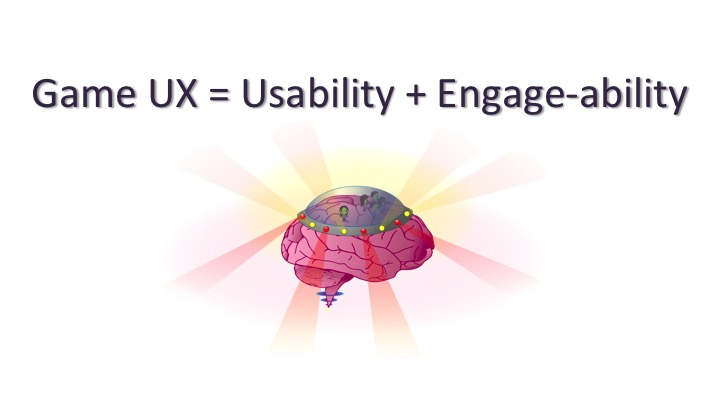
Game UX = Usability + Engage-ability
Usability
Usability is about the ability of the game to be used, which entails taking into account human limitations in terms of perception, attention, and memory. Usability is a well-known UX pillar and very precise guidelines have been established throughout the years in industrial design and digital product design. The most renowned list of usability heuristics (i.e. rules of thumb) was put together by Jakob Nielsen. In my game UX framework, I’ve adapted these heuristics to be more relevant and, well, usable to game developers who use their own vernacular. These game usability heuristics are as follows:
Signs and feedback
Clarity
Form follows function
Consistency
Minimum workload
Error prevention and recovery
Flexibility and accessibility
If you’re interested in diving deeper in these heuristics, I invite you to read the transcript of my GDC Europe 2014 talk. The goal of these heuristics is to ensure that the game is going to be as intuitive and easy to use as possible. We work to remove all the frustrations players might have that are not by design, such as difficulty navigating menus, unintuitive icons, or confusing systems. All the stimuli in the game (aka “signs and feedback”) need to be clear, consistent, and perceived as intended. We aim to minimize the cognitive load (i.e. memory and attention load) as well as the physical load (e.g. how many clicks to accomplish an action). We also try to ensure that players are not going to experience frustrating errors, or that they can easily recover from them when these errors are not where we want to challenge players. For instance in Fortnite, we want to challenge players in developing a strategy to survive while managing combat, harvesting, crafting, and building. We do not want, however, to challenge them in figuring out how to equip an item or to craft a weapon. Lastly, we try to offer various options — such as remapping of controls, subtitles, or colorblind mode — so that everyone can play. Throughout the development of Fortnite, we conducted countless UX tests to improve and polish the usability of the game.
Engage-ability
Offering good usability is critical for any product, including games, yet a game can be easy to use (i.e. the interface is intuitive and players can easily understand their goals and accomplish actions) yet boring. Unlike tools (such as a web browser or a software we use for work), video games are not a means to an end. We typically interact with games solely for the pleasure of playing them. Thus, if a game is not engaging, we are more likely to stop playing it, even if it’s easy to use. Don Norman speaks of “emotional design” to highlight the importance of any product to be more than just about functionality. But for games this emotional design is not merely important; it’s critical. Game developers often talk about fun or immersion. I prefer to use the term engagement and to refer to the ability of the game to be engaging, as it’s a more concrete concept to break down. Engage-ability is a fuzzier concept than usability; since we can never fully predict or understand why people do the things they do. Therefore, there aren’t any solid guidelines to achieve engage-ability yet. Throughout my work at Ubisoft, LucasArts, and Epic Games, there were three pillars I considered in order to improve the engage-ability of a game:
Motivation
Emotion
Gameflow
If you are looking for more detailed information on these engage-ability pillars you can check out my GDC 2017 talk.
1. Motivation
We do not accomplish any action unless we are motivated to do so. Thus, motivation is at the core of engage-ability. However, countless theories of human motivation exist, and we currently do not have any motivational theory that can account of all of human behaviors. Among the most important types of motivation, we can focus on two that are the most applicable to games: extrinsic and intrinsic motivation.
Extrinsic motivation is when you do something in order to get something else. It’s when, for example, you wait in the queue to get into a ride at the fair. Waiting in line is a means to an end. Video games often master extrinsic motivation: players need to accomplish quests, actions, or harvest many resources in order to be rewarded. Precise goals and clear rewards associated to these goals are very important to keep players engaged, such as what reward(s) can be redeemed after completing a challenge, or what abilities can be unlocked in a skill tree. But this is not enough.

Motivation in Fortnite (GDC 2017)
Game developers also need to account for intrinsic motivation, which is our motivation to do certain things just for the pleasure of doing them, not to get something else. The most reliable theory of intrinsic motivation we currently have is the self-determination theory, or SDT for short. This theory explains that we are more likely to be intrinsically motivated to do an activity when this activity satisfies our need for competence, autonomy, and relatedness.
Competence is mainly about having a sense of progression, whether this progression is skill-based (e.g. getting increasingly skilled at building fast) or not (e.g. leveling up and buying new skills that make us artificially more powerful within the game). If we do not feel that we are progressing when we engage with an activity, such as learning how to play guitar or trying to lose weight, we are very likely to abandon. This is why progression bars are so compelling. It’s not only because of the promise of getting a reward once we reach a new level, it’s also because we can see ourselves progressing towards a goal, and getting increasingly competent.
Autonomy is mainly about self-expression. Being able to choose your skins, your dance moves, or how you can overcome obstacles allows you to feel more autonomous. This is why sandbox games (e.g. Minecraft or Grand Theft Auto V), and games offering a lot of cosmetic options (when these options are meaningful to players) are often engaging.
Lastly, relatedness is about having meaningful relationships with other people in a game. Humans are a very social species, and multiplayer games often offer compelling relatedness. This can be either through competition, or cooperation. Although cooperation is often more engaging, which is why most competitive games offer cooperative options (e.g. playing in a squad, or playing in a team against another team).
2. Emotion
Emotion in games is mainly about what we call “game feel” and about offering new content. Game feel refers to how good it feels to interact with a game. It’s about its camera, controls, and characters (often called “the 3Cs”). It’s about the sense of presence, provided by an AI (artificial intelligence) that reacts adequately to what players are doing, a meaningful story, or great music, among many other things. Lastly, it’s about the physical reality of the game; how believable it is (rather than its photo-realism). I won’t get into any detail here, but emotion is also about the surprises and novelties that are offered to players. We need something new every now and then otherwise we get bored. This is why online games constantly need updates, new campaigns, modes, skins, or seasons.
3. Gameflow
Gameflow comes from the concept of “flow” in psychology, investigated by psychologist Mihaly Csikszentmihalyi. As he was trying to find out the secret to happiness, he noticed that those who were happier in life experienced the state of flow more often. You’re in a state of flow when you are deeply concentrated in doing an activity that is both worthwhile to you and challenging. You can experience this state at work, when being creative (e.g. if you like to draw, knit, or play music), and when you play certain video games. Jenova Chen is the game designer who has extensively explored gameflow, through games like Flow, Flower, or Journey. One of the main components of gameflow is challenge. A game needs to have the right level of difficulty so that the game is never too easy (otherwise we get bored), or too hard (otherwise we get too stressed out). That’s the main difference between the UX of a game and the UX of other products: in games you need to challenge the user. Game developers are carefully implementing frictions that are by design: players are going to encounter obstacles they will need to overcome. This is why multiplayer games need to perfect their matchmaking so that players at the same level of expertise and skills are matched together. Neither being destroyed in no time, or winning too easily is fun.
Gameflow is also about pacing, the rhythm of stress and pressure. A game needs some intense moments, and more relaxing ones. Many action games have “waves of enemies” for example, and in battle royale games players have relatively calmer moments to prepare, alternated with moments when encounters are forced as the map is shrinking. Last but not least, onboarding is paramount to gameflow. In order to enter a state of flow while playing a game, you need to understand what it is all about and how to succeed (or at least how to get better at playing). This is why onboarding players properly,through elegant tutorials that feel part of the game, will greatly impact the feeling of immersion. Onboarding is about making sure players are going to be competent in playing the game. Sure, they will make mistakes and probably die a few times, but if the game allows them to understand what happened and how to get better, they will be able to progress. Having a sense of progression is one of the main pillars of intrinsic motivation, as explained earlier. To learn more about onboarding, you can take a look at the transcript of my GDC 2016 talk dedicated to this topic.
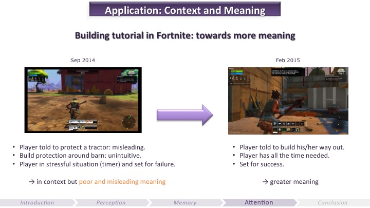
Evolution of the building tutorial (GDC 2015)
These usability and engage-ability pillars constitute a game UX framework that is very useful and practical to follow when developing a game. It can be used as a checklist to identify the most critical issues to fix, as well as the missing features or elements in the game to reach its full potential. There is no known recipe for successful games, but this framework offers ingredients that we know are critical to craft usable and engaging games. Game makers can use these ingredients to make their own successful recipe, depending on the kind of experience they want to offer and on the audience they are targeting.
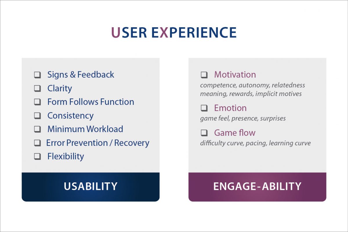
A game UX framework
SCIENTIFIC METHOD & UX PIPELINE
Knowing the main human brain limitations and following a UX framework is a great start, but it’s also critical to apply the scientific method and establish a UX pipeline in order to find and prioritize the biggest UX issues to fix. Solving problems is relatively easy. Finding and solving the right problems is what is difficult. And since humans are biased, relying on the gut feeling of different members of the game team (or even sometimes executives), all having their own subjective perception, scarce attention, and fallible memory, can lead to costly setbacks. This is why is it important to rely on UX research to identify and prioritize issues. UX researchers use the scientific method to pose hypotheses with the game team, design experimental protocols accordingly, and then gather and analyze data while removing as many human biases as possible. Once the most important issues have been identified, the team then needs to figure out why they are happening.
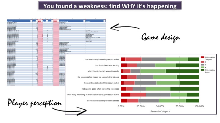
Design vs. Perception (GDC 2017)
For example, in the early days of Fortnite, during the closed Alpha online tests, some players were complaining that the game was too “grindy”. They felt that it took too long to harvest the ingredients they needed to craft more advanced items as they were leveling up. Where was this coming from? Did the game have a design issue? The system designers verified their math and concluded that the harvesting and crafting systems were correctly balanced. So why were players complaining? This issue kicked off a long investigation to find out why this was happening. If it was not originating from the design, then the hypothesis was that it could originate from players’ (subjective) perception. Many elements were thus investigated. One of them was the UI (user interface) for a feature called the “weak point system”. In Fortnite, when players harvest an object in the world (say, a pile of rock) a weak point appears, encouraging players to aim at it. As they scavenge the object, if players aim at its weak point they destroy it much faster. The problem was that in our early UX tests, we were observing players completely ignoring these weak points. This issue could be seen as trivial, but it potentially had a relatively huge impact in ripple effects, as the whole harvesting system was based off players using the weak points. Therefore, if they were not using it they were taking much longer than designed to harvest anything, which could in turn obviously impact their perception of the harvesting speed. This is why the team iterated a lot on this tiny UI element. First, it was made bigger and more obvious, as initially players were not even realizing that it was there. Once it was standing out more, players were spotting it but then thought it was a cue indicating to them which item they were currently targeting. In the end, designers removed the weak point from the initial experience in the “Save the World” mode (the player-versus-environment mode), so that players would have to unlock it in the skill tree. It thus became a meaningful reward with more fanfare, which overall did the trick. A majority of players were finally hitting the weak points after this change. At least in “Save the World” mode…

Iteration of the weak point (GDC 2017)
This iterative process was made possible also because the Fortnite team established a strong UX pipeline, which my former colleague Heather Chandler (former Senior Producer on Fortnite) and I explained in a GDC talk in 2016. We applied a scientific method to avoid falling prey to our biases as game developers and to objectively find what problems we needed to solve in priority during development, through careful UX testing and continuous online tests. UX research was entirely part of the production pipeline, and the team was tasked into fixing bugs related to UX research feedback. Having a strong UX focus means that it needs to be a priority for the team.
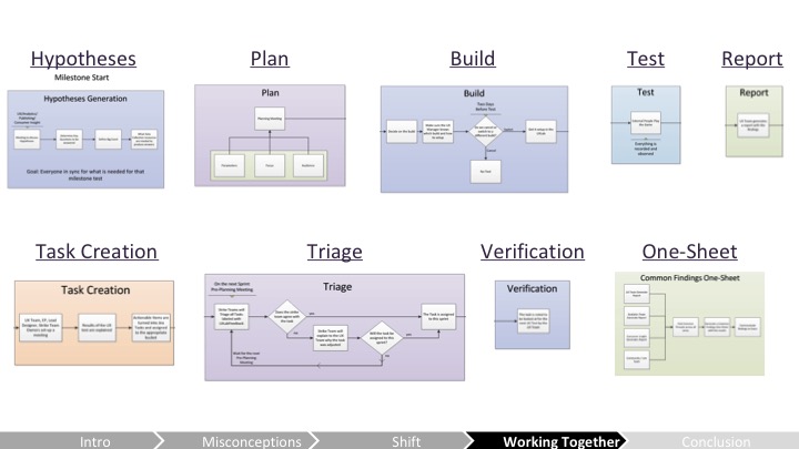
The UX pipeline on Fortnite (GDC 2016)
CONCLUSION: DEVELOPING A UX STRATEGY
Understanding the basics of how the brain works, following a UX framework, applying the scientific method, and establishing a UX pipeline allow game developers to reach their goals faster and more efficiently.
If you analyze a game like Fortnite through this UX lens, you can identify all the efforts that were made to make the game usable, to avoid as much confusion as possible, and to remove as many frustrations that were not by design. I explain a few examples in this video made with Ars Technica. In terms of engage-ability and motivation more specifically, Fortnite is a game where you always progress towards specific goals in the player-versus-environment mode (“Save the World”). In the “Battle Royale” mode in which players compete against each other, those who lose can quickly start again and hopefully get better the next round. The cosmetics options and dance moves offer good autonomy, as well as the “Creative Mode” in which players can build whatever they want. Relatedness is very strong in Fortnite: it’s a game where players can compete, cooperate, or just hang out. It has become more than a game; it’s a social platform where players chat, dance, are creative, or even watch a concert together. Also, well-known influencers and stars streamed the game early on, which made the game a must-try (although this is not something that can be anticipated during the development — luck also has a role). Regarding emotion, Fortnite has a very polished game feel: it is quite satisfying to interact with the environment. The world is goofy and encourages experimentation, as explained by Darren Sugg, Creative Director of Fortnite, in this Game UX Summit Europe keynote. The game also offers many surprises and mysteries. For instance, there is often something mysterious before a new season, which is raising players’ curiosity. Lastly, the gameflow of the game is polished, more specifically in “Save the World” mode where the onboarding has been carefully planned (see the transcript of my GDC 2015 talk and GDC 2016 talk explaining our onboarding plan and process).
Despite some lingering misconceptions about user experience and psychology, increasingly more studios are now trying to adopt a UX strategy, because of the objective guidance it offers. Making games is hard, and competition is fierce. UX offers a set of tools to reach our objectives faster and more efficiently. Building the user experience strategy for a project or a studio is more than merely applying certain tools and methodology; it’s a philosophy. All in all, it is about being in the mindset of placing the players (and not the business) first.
References:
Celia Hodent, The Gamer’s Brain: How Neuroscience and UX Can Impact Video Game Design (CRC Press, 2017)
Don Norman, The Design of Everyday Things (MIT Press, 2013)
Mihaly Csikszentmihalyi, Flow: The Psychology of Optimal Experience (Harper Perennial Modern Classics, 2008)
You will find references on game design, UX, psychology, and more, on my webpage celiahodent.com/resources
Read more about:
Featured BlogsAbout the Author
You May Also Like


