
Featured Blog | This community-written post highlights the best of what the game industry has to offer. Read more like it on the Game Developer Blogs or learn how to Submit Your Own Blog Post
Game UX Summit 2016 – All Sessions Summary
This detailed post describes all the Game UX Summit 2016 sessions, one by one. This event brought together 15 renowned speakers from various UX-related disciplines, from game studios and academia. The keynote speakers were Don Norman and Dan Ariely.

On May 12th 2016, Epic Games hosted the inaugural Game UX Summit in Durham (NC) – which I had the immense pleasure and honor to curate – to discuss the current state of User Experience in the video game industry. This event brought together fifteen renowned speakers from various UX-related disciplines: Human Factors, Human-Computer Interaction, UX Design, User Research, Behavioral Economics, Accessibility, and Data Science. The keynotes speakers were the esteemed Dan Ariely, and Don Norman, who popularized the term UX in the 90s.
Below is my summary of all the sessions (with the edit help from Epic Games’ UX team members – special thanks to Ben Lewis-Evans and Jim Brown!). You can also watch most of the sessions here. The Game UX Summit will come back in 2017: Epic Games is partnering with Ubisoft Toronto who will be hosting next year’s edition on October 4-5, 2017. If you wish to receive updates about the event or if you would like to submit a talk, you can sign up here and be on the lookout for #GameUXsummit on Twitter.

Each session, in order of appearance (click to jump to a specific session directly):
1- Anne McLaughlin (Associate Professor in Psychology, NC State University)
2- Anders Johansson (Lead UI Designer, Ubisoft Massive)
3- Andrew Przybylski (Experimental Psychologist, Oxford Internet Institute)
4- Ian Livingston (Senior User Experience Researcher, EA Canada)
5- Education Panel (Jordan Shapiro, Fran Blumberg, Matthew Peterson, Asi Burak)
6- Chris Grant (User Experience Director, King)
7- Ian Hamilton (UX Designer and Accessibility Specialist)
8- Steve Mack (Researcher and Analyst, Riot Games)
9- David Lightbown (User Experience Director, Ubisoft Montreal)
10- Jennifer Ash (UI Designer, Bungie)
11- Dan Ariely (Professor of Psychology and Behavioral Economics, Duke University)
12- Don Norman (Director of the Design Lab, UC San Diego)
1- Anne McLaughlin, Associate Professor of Psychology at NC State University
“Beyond Surveys & Observation: Human Factors Psychology Tools for Game Studies”
Watch the video
Anne McLaughlin kicked off the summit by talking about how a Human Factors method could be applied to measure and manipulate game experiences, without the cognitive biases that inevitably occur when we only use intuition or gut feeling. Signal detection theory, a classic of Human Factors, is one such method. Signal detection measures any game element you want – or don’t want – your players to attend to, such as elements of the HUD, the interface, or icons. Any time players have to make a decision under uncertainty is when signal detection theory can be used to help designers accomplish their goals. Signal detection theory is summarised in the figure below.
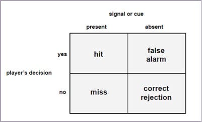
The Spy character from Team Fortress 2 offers an example where signal detection was made deliberately difficult (low salience cues) so players cannot easily spot a spy who has infiltrated their team. Anne went on to describe how to use Signal Detection Theory to test the impact of design decisions and shape player behavior. It is generally easy to detect hits and misses when a signal is present. For example, if a Spy has indeed infiltrated the team (signal is present), developers can easily analyze if the player’s decision was correct (hit – identify the spy and shoot) or wrong (miss – not recognizing a Spy is present).
However, false alarms are harder to detect and design around (e.g. when players believe there is a Spy but there is none) and so are correct rejections, even though these measures are just as important to the game experience as the hits or misses. For example, when developers want to make sure that players do not miss a signal, the tradeoff will be an increase of the false alarm rate, which can lead to player frustration. On the other hand, developers can use false alarms to increase tension, such as in a horror game (e.g. Until Dawn). Therefore, developers should consider and measure false alarm rates to inform design decisions.
In video games, the overall design can drive players to make important decisions. For example, games that offer health restoration and no friendly fire will encourage a liberal response strategy, where almost anything is worth shooting at, thereby increasing the false alarm rate. In games like Counterstrike on the other hand, the design encourages a more conservative signal detection because of the peer pressure of not harming your teammates and the lack of health restoration.
Anytime a person has to make a decision under uncertainty – find a signal in the noise – Signal Detection Theory can be used. So, consciously or not, game designers are manipulating the four quadrants (hit, miss, false alarm, correct rejection) by associating benefits or penalties with each of them. This has also implications on the art direction, because, as explained by Tom Mathews in his 2016 GDC talk, the color of the environment can have an impact on how easy it is to detect enemies depending on what color team they are. Therefore, the blue team or the red team can be disadvantaged depending on how well they stand out.

Anne concluded her talk by pointing out that she is not suggesting that games should be made easier. Rather, the whole point of thinking in terms of Signal Detection Theory is to ensure that gameplay matches with designer’s intent. How easy or how hard is up to them: they control the signal and the payoffs.
2- Anders Johansson, Lead UI Designer at Massive Entertainment
“My Journey of Creating the Navigation Tools for The Division: Challenges and Solutions”
Watch the video
Anders Johansson shared some UI design thinking from The Division; a third person co-op experience in an open world with a heavy focus on RPG elements, or – as Anders summed it up – a game where players run around a lot trying to find things. As such, Anders’ talk largely focused on the design iterations that were carried out on the navigational user interface elements in the game.
In early development, the team tried three different map prototypes: one with a top-down camera, one with a free camera, and one with a player-centric camera that used the character as the reference point. Initially they chose to go with the player-centric design because it gave the player a clear reference point to where they were in relation to the world around them through a direct camera-to-world camera mapping.
Johansson said that the UI team thought they had nailed the map prototype at that point, but it turned out to have critical UX issues. One of the reasons for this was that the game that shipped used a completely different camera system than the version that the map research was based on, and these camera differences left many of the map team’s decisions irrelevant or inadequate.
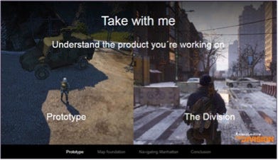
In order to address this, the UI team had to rework the map functionality, and learn to adjust it as the game progressed. As an example of how dramatic the changes were, the camera used to orient itself around the player, but in the shipping build, the map always orients North to avoid any directional confusion. The new map also has contextual elements (such as buildings) to help the player orient themselves, and the camera can even detach from the character to allow a full-screen exploration of the map. The team decided to remove functionality that allowed the player to run around with the map open because with the new camera system, players could not see their feet anymore. Anders’s core message here was that as a game evolves, the UI has to evolve with it based on the changing results of UX data.

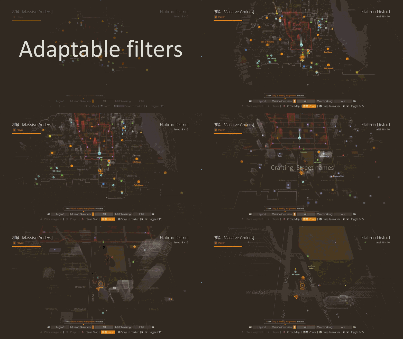
Another challenge Anders and the UI team faced was how to present overwhelming amount of information that was available on the map. There is a lot to do in the game, and without any filters the map would look like this:
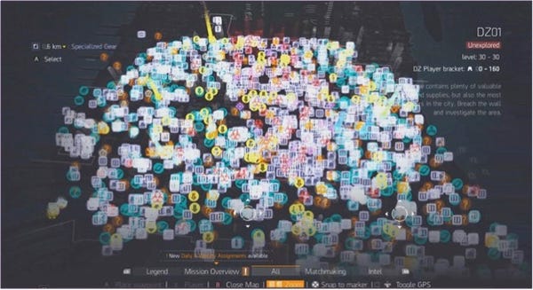
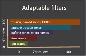
To get around this, like in many other games, The Division uses filters on the map. At first, the UI team allowed players to filter each individual map element, but playtest data and eyetracking heatmaps revealed that most players were unaware of this feature, and the players who were aware of the feature reported feeling overwhelmed by the amount of options they had. The UI team tried to find solutions from other games, but didn’t find any that were suitable for their cases until they looked at solutionsoutside of games, specifically from Google Maps which automatically filters content based on the level of zoom. This revelation led to the idea of The Division’s adaptable filter system.
After the core of the map was done and the main features were in, Anders noted that there were still some challenges left to solve. The most important being: what happens when players close the map? How can the game help players find their bearings without requiring them to continually open and close the map? To address this, the UI team tried to give players locational information, such as street names at intersections. Johansson noted that while players were able to read the signs, this method was perceived by players as a slow and cumbersome way to navigate. So the UI team tried adding key landmarks as points of interest (such as the Empire State Building), but this didn’t really work either because spatial awareness works differently in games (where players don’t look around that much and focus mainly on the reticule) than it does in real life. Next, the team gave the player an industry-standard 2D marker to follow on screen, but eye-tracking studies revealed that players did not really see the marker, or lost it quickly when they did see it, because it was not in a central position on the screen. Ultimately, the team decided to try a combination of ideas: they used an on-screen GPS marker that mirrored the marker on the mini-map, that was easier to see, and that included street names.

Anders said that they also added a “breadcrumb system” for indoor and in-mission navigation, that consisted of a 2D pulsing icon (to draw players’ attention), that moved toward the objective, and that left a trail behind it as it moved.

To conclude, Anders and the UI team tested many UI prototypes for navigation and only kept the most elegant and functional solutions, proving that nothing is easy, and that everything can always be improved.
3- Andrew Przybylski, Experimental Psychologist, Oxford Internet Institute
“How we’ll Know when Science is Ready to Inform Game Development and Policy”
Watch the video
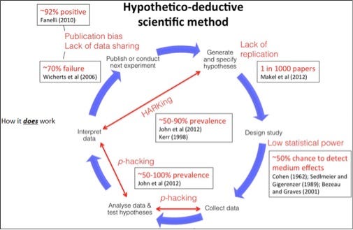
Andrew Przybylski presented a metascience perspective in his talk. He questioned how scientific research is carried out and the quality of scientific rigour, both in academia and the video game industry. Using scientific methodology implies that through a systematic view, observation and testing are rigorously conducted to understand the reality we live in and get closer to the truth. Having a hypothetico-deductive scientific process implies starting by generating hypotheses and research questions, designing a study to test the hypotheses, collecting data, analysing and interpreting the data against the hypotheses, and then publishing and sharing the results. This is the ideal of science and how it should work. Przybylski noted that in reality, however, published scientists are suspiciously successful at confirming their own hypotheses. Andrew pointed out that if you look at all these positive findings more objectively, you’ll find that in psychology, neuroscience, political science, cancer research, and many other research fields, studies suffer from a serious lack of replicability.
So why do we have this replicability crisis? According to Andrew, when looking at published work, many studies don’t have enough statistical power to accurately detect a signal in the noise, but often report one anyway. Scientists don’t necessarily do this on purpose though; humans have a natural tendency to perceive a pattern even where there isn’t one. There also isn’t any incentive to publish a research study in which the hypothesis is not confirmed, which biases researchers toward reporting positive findings, or even encourages them to generate the hypotheses AFTER data is collected.
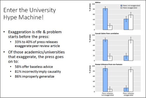
Przybylski said that universities are also part of the problem, because the culture of academia tends to exaggerate research, and then the media exaggerates the findings even more. For example, when a correlation is found, the press (and University PR departments) often make the leap of attributing a causal direction.
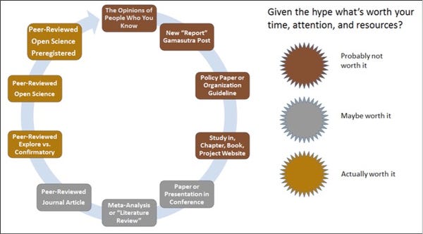
Andrew went on to give some advice and guidelines regarding how to interpret “new findings”. For example, if a study has a great story component, Andrew said that it is probably not worth considering. He reminded the audience that scientists and researchers are fallible human beings, meaning that 50% of published findings are likely to be false. If the data from a study is not easily accessible, it is another red flag that the information is likely not valid.
To help improve science, Andrew proposed a special track in several media outlets for pre-registered research, as opposed to submitting an article for publishing only after the research has already been done. It consists of three stages: In Stage 1, researchers provide their theoretical background, hypotheses, research plan, methods and materials, and their analysis plan. Based on this information, a peer review occurs in Stage 2, which can lead to a conditional acceptance of the paper and the registration of the hypotheses. Lastly, in Stage 3, the reviewers follow through on the research. Throughout this process, the data and materials have to be open, and null findings do not prevent the researchers from publishing their study (as is often the case).
Andrew concluded by proposing a few things that everyone can do to improve the state of science:
Read Richard Feynman’s Cargo Cult Science,
Carefully pilot basic scientific research before investing,
Demand and support open science; for example demand not more but better science at GDC,
Bring open science into your projects and contribute (a lot of tools today allow you to do that easily).
4- Ian Livingston, Senior User Experience Researcher, EA Canada
“Working Within Research Constraints in Video Game Development”
Watch the video
Ian Livingston shared some techniques that he used to apply what he called “good enough” research processes in game development. These techniques focus on providing the highest value to a project, given the limitations of immovable constraints such as budget, resources, and tools.
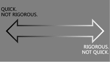
Ian said that two constraints are particularly important to focus on, those being: can it be done quickly enough to be useful in the fast moving world of game development? and can it be done rigorously enough to be trustworthy? Livingston noted that while balancing these needs may be difficult, the process can be mitigated, and a good balance between these two constraints is what he called “good enough research”.

Doing “good enough” research is not about being lazy or cutting corners. Ian made it clear that “good enough” is about understanding the tools you have at your disposal. How do you decide whether or not to accept a conclusion? It’s all about risk and about how confident you are in the outcome. Once you honestly accept the risk of an outcome being wrong, you free yourself to adjust the level of risk that you are willing to run. If you’re too rigorous, Ian explained, the results are going to arrive too late for the game development team to actually act upon your results, but if your research is done too quickly it might lack rigour and leave too much room for interpretation. As a game user researcher, you want to find that middle ground where the research is done quickly, but also with enough rigour that you have confidence in the results you share with the team.
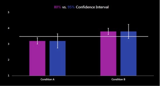
Ian went on to describe two tools that can be very useful for dealing with research constraints: confidence intervals and eliminating alternatives.
A confidence interval represents uncertainty, the grey area about the data you gathered. It helps define what level of uncertainty your team might be willing to accept. Confidence intervals can be calculated using the standard deviation (measured), your sample size (designed, heavily dependent on your constraints), and your chosen alpha (standard, traditionally 95%). Ian said that working in a grey area gives us the freedom to play with these parameters. In the made-up example below, imagine that the development team wants to know if something they changed made any significant difference, so they design a test to measure condition A vs.condition B. They look at the results in one case with an 80% confidence interval, and in the other case with a 95% confidence interval. At a 95% alpha they might not be confident enough to say that the two conditions are different, but at an 80% alpha they might take a riskier bet that the two conditions are in fact different.
Eliminating alternatives (rather than attempting to prove an outcome) is what Livingston called being efficient in your analysis. Let’s say a team comes to you to check if the game is too easy because they believe that players have too much health. You set up a test, bring players in, and after they have played, they also tell you that they find the game too easy. You could stop there and go back to the team to say “yes, the game is too easy so you should reduce health”. But this is a lazy way of doing research. If you spend more time researching prior to the test, you can design the protocol to test the different causes that may lead to the perception of the game being too easy. You need to identify a number of alternatives: too much health is one cause, but the players could also make too much damage, or have too few enemies, or have overpowered abilities, etc. so you can design a test that will explore these elements and eliminate the ones that don’t line up. Good research is about identifying alternatives and eliminating ideas that are not supported by data.
Ian concluded by saying that being a user researcher in the game industry is all about balancing rigor against the time it takes to conduct research. For Ian, doing “good enough” research is better than either of the extremes in a constrained environment.
5- Education Panel
Jordan Shapiro (Senior Fellow for the Joan Ganz Cooney Center, Sesame Workshop), Fran Blumberg (Associate Professor of Psychological & Educational Services, Fordham University), Matthew Peterson (Co-founder, CEO and Senior Scientist, MIND Research Institute), Asi Burak (CEO, Power Play)
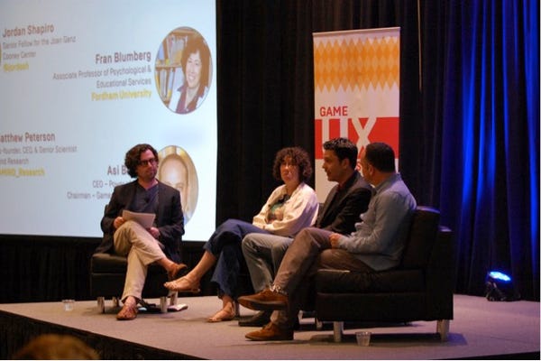
This panel, moderated by Jordan Shapiro, was an informal discussion about using games for learning. Making a great game is tough enough already, so adding another complex layer, learning, usually with a much lower budget than commercial game studios, makes it a particularly challenging area.
Educators and learning specialists have to figure out what children are actually focusing on when they play games. What impasses do they encounter? How do they overcome roadblocks? And ultimately, how can we apply these findings to the development of educational games? Games have the great advantage of providing instant, informative feedback on what children are doing, and why a solution did not work, thereby allowing children to assess their own performance. Games also have the amazing power to allow players to shift perspectives and to explore locations they might not be able to visit otherwise. Some games are even able to break the boundaries between the system and the world. One great example is the game Foldit, where players solve a real-world, scientific problem (folding proteins) through a video game.
During the panel, the issue of transfer was raised: how much of what the children are learning in the game is transferring to other situations? Things learned in the context of a game don’t always transfer to standardized or academic test results (even if we assume we are using the right tests to measure the things that really matter in order to be successful, which is another debate entirely). The panel noted that playing one game alone is unlikely to result in effective transferability.
Another challenge faced by educators is how to balance the level of challenge while keeping players and students both interested and engaged. It’s important that players maintain their thirst for challenge, and this is why considering UX is so important for educational games [Ed. Note: and games in general]. A well-designed user experience could turn the frustration of learning difficult things into a thirst for overcoming engaging challenges.
The panelists concluded with the idea that games are not a quick fix to education. However, with the right design and pedagogy, they can become a very powerful tool for education. There’s huge potential, but we’re only at the very beginning so there is still a lot of work to do in this area.
6- Chris Grant, User Experience Director, King
“A Kingdom Where UX Fairy Tales Really Do Come True!”
Watch the video
Chris Grant gave his UX perspective as someone who designs accounts, CRM, and marketing experiences, but noted that for the player, it’s the all about the game and the player’s experience. Originally, people in his position used UX to convert players with dark patterns, spammy e-mails, misleading or boring copy, and annoying push messages. According to Chris, this was the wrong thing to do, even if it did produce results. He said that in a lot of ways, the industry did things backwards: we started with the business goals first, and then we created the experience to reach these goals while hoping that this would meet the user’s needs. UX was a tool to get something: more users, conversion, more engagement… We were wrong, and as Don Norman reminded us: “all design, whether of a product, a company, a service or an experience is ultimately aimed at satisfying human and societal needs”. “All design” even includes the more “boring” stuff, like accounts, CRM, and marketing. So Grant said that we have to flip it around and start with the user’s needs first, and let that lead the way to our business goals.
Chris’s team wrote down 10 principles that guide their experience design at King:
Be crystal clear on player value.
Be truthful but not overwhelming.
“Showing” is better than “telling” is better than “asking”. Don’t ask players if they want to sign up for something, show them why it would have value to them.
Match player’s experience level. You don’t talk to the players the same way on day 1 as you do on day 10 or on day 1,000.
Match player’s expectations. There’s a time to be funny, a time to be cute, and a time to cut straight to the point.
Speak human.
Nothing boring.
Never cool forcool’s sake. You will end up being cool if you’re doing the right thing.
Flows, not screens. Always be aware of the context, the entire flow, including where the player is arriving from.
The final word comes at launch. We can never assume that players are going to be engaged.
These are great principles for the UX designers but ultimately, they have to drive business. It takes more than just principles to get to the results you want, so Chris showed some examples and described some results his team achieved.
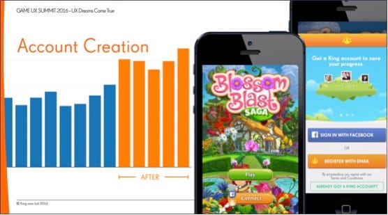
One example was about account creation on Blossom Blast. In this example, Chris showed how they increased the number of King account creations by applying the 10 design principles on the home screen. They initially had a very classic and historically efficient blue Connect button, as showed in the picture below.

They decided to turn the button orange to match King branding, but left the Facebook icon blue so players would still understand what it did. They also added a carousel that explained the value of connecting to Facebook: players could save progress, play across devices, and play with friends. Grant said that they saw a huge spike in conversion as a result of these simple changes (see picture below).
Another example was about the open rate for Candy Crush Soda Saga. King sent several push messages throughout the life of the game in an attempt to re-engage players. Chris noted that players opened the messages around the launch period, but quickly lost interest and tapered away. So the team at King once again applied the principles and tried a new approach; they sent the Bubblegum Troll character from the game to (whimsically) troll the players in their push notifications. Then, they added emojis to enhance the “fun” nature of these messages. These initiatives had significant results. Chris emphasized that they did not try to be funny in the beginning, and only employed this tactic after players were already engaged with the game and its tone.


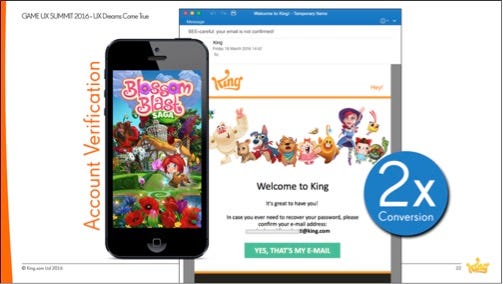
Chris described another example regarding account verification, which he argued is probably the most boring element in the player flow. The team again applied the 10 principles to improve its UX, and simply asked players to verify their account nicely, with a light and funny email.
Grant’s last example was about network sales, a very common practice in our industry. The team tried to make their Spring sales video more engaging, at a time of the year when most people care more about going outside than playing video games. They applied the same spirit with their Valentine’s day sales video, putting the emphasis on people that don’t necessarily have a Valentine. These humorous marketing videos were targeting a specific audience – those left out from these “holidays” – and their tactics paid off.
To wrap up, Chris emphasized the importance of working as a team: UX, developers, and marketing team together.
7- Ian Hamilton, UX Designer and Accessibility Specialist, Independent
“Accessibility for Disabled Gamers”
Watch the video
Ian Hamilton started his talk by explaining what disability is. He used the example of a person with cerebral palsy. Cerebral palsy is a medical condition, but it is not a disability. This person is also in a wheelchair, which again is not a disability. Just like a pair of glasses, a wheelchair is piece of assistive technology, something that allows people to go about their day. And this person was able to go about their day just fine, until they encounter some stairs. And that’s what disability is: when someone’s medical condition encounters some kind of a barrier which results in difficulty performing a task. These kinds of barriers – steps, shelves that are too high, red/green team colors – have been put there by another person, it was designed to be like that. We actually cause people to be disabled. Ian advocated that we can therefore remove these barriers and prevent them from occurring if we are aware of them. And that process is accessibility.
Accessibility is very important for two reasons in particular. The first reason is the human benefit. Games represent access to recreation, to culture, to socializing. If access to those things is restricted, then games are a powerful contributor to quality of life. The other reason is cold hard cash. The figures for disability are quite staggering; 15-18% of the population have some sort of disability in the US. Color blindness affects 8% of males. Difficulty reading affects 14% of adults. These are big numbers which equate to big markets: money to be made, money to be lost. And if accessibility is considered early in the development process, then improvements can be made both easily and cheaply.
“How is this relevant to UX?”, Ian asked. Well, the “U” stands for “users”. It doesn’t stand for some subset of users who happen to not have some kind of impairment. It means understanding our audience and removing the barriers that could prevent the enjoyment of the game for some. By using data tracking, we can track which accessibility features are used. For example, the development team from a blind-accessible game saw that their blind players were actually playing longer and spending more money than other players, so they were a very valuable audience. Playtesting, and specifically recruitment, can help in designing accessible games if you recruit participants with impairments in their ability to see, to hear, in their cognitive functions, or motor skills. If you can get some kind of representation of these impairments during user research, you can remove barriers in the early development stages of your game. Expert reviews, done by accessibility specialists, can also give you advice about your design.
Ian described an example using vision. Most people with impaired vision are not blind and their barriers usually consist of size and contrast.
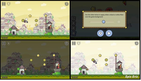 Increasing the contrast of the interactive elements of the game against the background is one easy thing to do. Implementing a contrast slider (which leaves control in the hands of the player) can also be fairly easy to accomplish, and is a feature that is useful to all players.
Ian used another example regarding hearing. Many players enable subtitles in games, not only because of a hearing impairment, but also for other reasons: perhaps English is not their first language, or perhaps they want to play with the sound off. About 79% of people state that they need subtitles. However, the quality of subtitles in games are not good. Decent size and acceptable contrast levels are rarely achieved, even though it would be easy enough to let players make these adjustments on their own. You can find more useful tips about subtitles in this Gamasutra article.

Ian used one last example with motor impairments, which put restrictions on some players in their ability to use a controller, permanently or temporarily. Avoiding unnecessary complexity in controls and offering some flexibility with button mapping – also useful for any gamer – can help overcome this issue. In the example below, the mobile game Into the Dead offers four different control schemes. For most of the development, the only option the developers considered was the tilt option (they thought it was the“most fun” option). Hamilton said that the other options were discarded until user researchers insisted on adding the other options for accessibility purposes. When they tracked the data after launch, they were surprised to realize that each option was chosen equally. Ultimately, they had improved the game for 75% of their players, not just for the players with motor impairments.

Accessibility is also about temporary impairments, such as a broken arm, and situational impairment, such as a noisy room or direct sunlight. Therefore, designing with accessibility in mind has human benefits as well as business benefits. Ian ended his talk by pointing out that over the age of 65, 50% of us will have some sort of impairment. Will we want to give up gaming then? Designing with accessibility in mind today is designing for our future selves too.
Check gameaccessibilityguidelines.com to learn more about inclusive game design.
8- Steve Mack, Researcher and Analyst, Riot Games
“Insights Hybrids at Riot: Blending Research and Analytics to Empower Player-Focused Design”
Watch the talk
Steve Mack talked about research and analysis in the context of League of Legends. The Insights team is the data organisation at Riot that empowers Rioters to make player-informed strategic decisions and products. They accomplish this by emphasizing two elements: hybridization of skillset and byembedding researchers into the development teams. Most Riot user researchers have a hybrid skillset (e.g. Bayesian modeling, eyetracking, hypothesis testing, survey design, and statistical analysis work) instead of being deeply specialized in just one area. Steve himself is embedded in the Gameplay team at Riot. They work together to improve the gameplay experience of League players and evolve the game.
League has been online for 6 years now, so the team is always trying to keep the game fresh and interesting. To that point, they do a Pre-season every year, which entails a lot of changes that will affect the game, such as introducing new game modes, introducing new champions, etc. Last year, as they were preparing Pre-season 2016, they were thinking about what they could improve, and decided to tackle Item design. Items may seem like a small part of the picture, but they are actually a huge part of Leaguegameplay. It’s a critical and complex core system that players interact with all the time. There are over 180 items with unique stats and abilities. They started by looking at the data, i.e. what items are bought for what champion at what point.
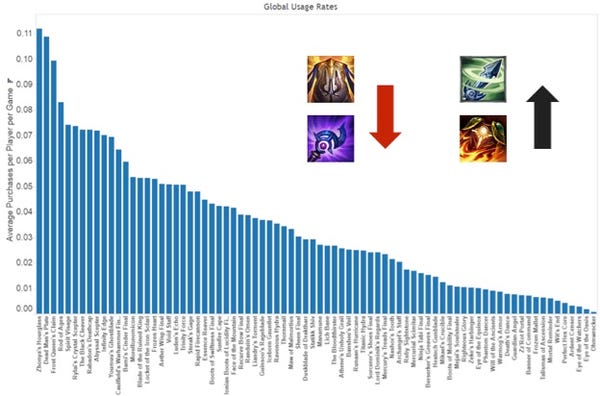
If an item is too powerful or too weak, it means that the system is not well-balanced, and that means that they aren’t delivering what the team intended for their players. To tackle this issue, Steve described the four-step process he worked on with the Gameplay team.
Step 1 – Figure out what good looks like. For the Gameplay team, a good item system provides items that support champions’ core functions, that interest and excite players, that do cool stuff (not just give raw stats), and are an avenue for meaningful choice.
Step 2 – Build the right framework. What would a meaningful choice look like in game for players? There are two types of items in League: the core items (purchased almost every game to help the champion fulfill its primary function) and situational items (purchased less frequently, depending on playstyle or game state). Both Core and Situational Items comprise the item ecosystem but the latter are more likely to provide meaningful choices.
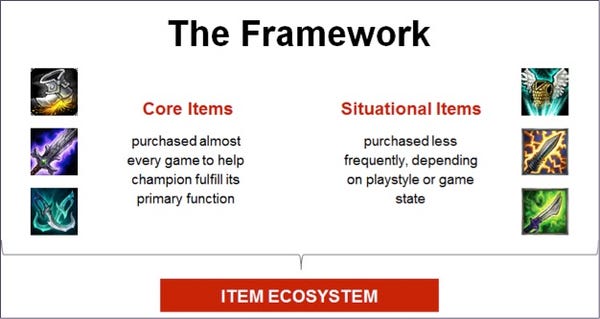
If this item ecosystem is too narrow, if the champions are always choosing the same items, then there’s not much choice going on. Players should feel like they have choice.
Step 3 – Operationalize your framework. How do we make this measurable and actionable? What champions interact with which items and how strong are these links? Looking at the data, the Gameplay team (along with their embedded analyst) first defined a threshold. If a champion purchased an item 40% of games or more, it was considered a core item. If an item was purchased in 5% of games or more, it was considered a situational item. The second piece of the puzzle was to find out how the players felt about the overall variety of items, and if they felt like they had an actual choice about what to purchase next. They explored this aspect through player surveys, where they asked questions such as “Overall how satisfied are you with the number of items you’ve seen being used in your games?”, or “Overall, how satisfied are you with the amount of choice you have in selecting your items?”.
Step 4 – Rubber hits road. How do you make good changes? When players buy an item, they have to consider the stats that are needed for the class they play. They looked to see if there were any classes that were in a bad spot. They found out that most marksmen were interacting with very few items in-game. This data was also confirmed with the surveys; players playing marksmen were particularly dissatisfied with the items for this class.

For Marksman champions, there was basically only one core item that all Marksmen were buying. They had a similar problem with situational items. Depending on which particular Marksman champion you were playing, you would choose one situational item. With all this data, and now understanding what was wrong, the Gameplay team reworked every single Marksman item.
As a result, they raised the number of items purchased by Marksman champions, and players became more satisfied in the surveys.
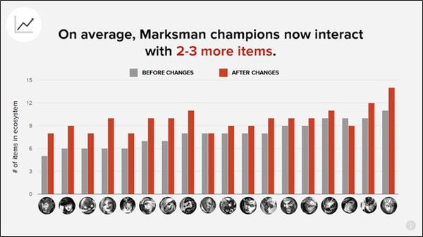

These encouraging improvements were met, according to Steve, thanks to the hybridization of skillsets and by having researchers embedded directly in the development teams.
9- David Lightbown, User Experience Director, Ubisoft Montreal Technology Group
“Hiding in Plain Sight: The Untapped Resource that is Helping Ubisoft to Make Better Tools”
Watch the video
David Lightbown started his talk by pointing out that one of the keys for better game user experience is iteration. In that regard, better tools UX allows for better iteration. Therefore, better tools UX affords better game UX. But how can you convince tool developers of the value of improving the user experience of game tools? David used examples from games to convince the teams he’s worked with, especially games where speed and accuracy are important, like DOTA2 and Counter-Strike. In this talk, David illustrated his points by using the examples of chunking and vision.
Chunking. Consider the chess study conducted by Chase and Simon in 1973. They showed that grand-master chess players are better than novice players at memorizing board layouts from real games, but are equal to novice players when the layout comes from randomly generated piece placement, which often created patterns that were impossible to achieve in an actual chess game. The reason cited for the grand-masters’ performance is that expert players cut the board into already memorized chunks from the thousands of chess games they played. Now, consider the RTS game Starcraft: Brood War. Expert players in that game play faster because they also use chunking to recognize patterns and react quickly.
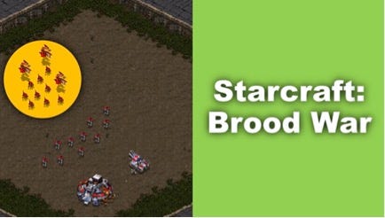
How does that relate to game development tools? One example David used is about the position/rotation/scale of an object. 3D artists have a specific chunk in their minds related to these parameters when they use software like Unity or Maya but they cannot directly apply these same chunks in software like Softimage which uses a different order.

Whenever you can, you want to offer the same visual representation of a functionality, and list values in the same order, so that the user can apply chunking. Another example David used is the hierarchy in an asset browser that was built for the Far Cry series. The folder hierarchy did not match the path for an object. By changing the appearance of the folder name in the hierarchy to exactly match the file path, it made recognition easier as consistency allowed for chunking transfer.

Vision. David went on to describe how we can use fighting games to explain human vision. If you look at eyetracking data from a professional Street Fighter 4 player (Sako), you can see that the gaze (white dot) focuses at the center of the screen.

Our central vision is very sharp whereas our peripheral vision is blurry. If the player focuses on his character, he can’t see the enemy, and vice-versa. So Sako keeps his eyes at the center to keep a general view of both characters at the same time and be able to react quickly and adequately. How does that apply to game tools? Consider research conducted by UXmatters on label placement, using eyetracking. The results suggest that the most efficient way to place labels is for them to be top-aligned or right-aligned, because it reduces saccades. Therefore, you would also want to apply these principles to your tools to avoid saccades, i.e. users having to look back and forth in between different sets of data (properties and values in an editor for example).
Better tools UX, with iteration, can help us make better game UX, concluded David. Game developers have a tendency to be very resilient but improving the tools will make their work easier and ultimately make them save time in their iterations.
10- Jennifer Ash, UI Designer (Destiny), Bungie
“It Came from UR: UX Lessons Learned on Destiny”
Watch the video
Jennifer Ash worked on Destiny production, and had had different positions including Lead User Researcher and currently works as a user interface designer. According to Jennifer, the advantage of having a new IP is to be able to explore navigation interaction before gameplay is complete. Bungie conducted user research very early on, having participants navigate through early environments. In order to verify that the environments gave the right cues, they asked participants what they thought the environment was: i.e. what is the space used for, what they assume it was about, what planet they thought it was, etc. They also checked if players were getting lost or confused while navigating the environments. These tests using concept art helped the team understand how the space was perceived and how it was used. The team also looked at how combatants in the environments interacted with each other and how they fit in the environment, trying to spot if the combatants were blending in too much, leading to players having difficulty seeing them.
Destiny is a very social game and user research allowed the team to see emergent social behaviors. In one playtest for example, players would see each other but were wondering at first if they were simply encountering an NPC. When they finally realized that they were interacting with another person, it clearly created a positive emotional reaction. Eager to try to enable these kinds of social behavior in the lab, the user research team asked the developers to join in some playtests and run around, do a mission, and interact (wave) if they saw players. This allowed the user researchers to check if participants understood that these were other players, and observe how they reacted. They had to be flexible in their testing (i.e. inviting developers to play) to explore experiential gameplay.
Building trust with the designers is therefore critical to get them onboard. Having designers watching skilled players having difficulties in the game helped the designers understand that they had to change something in the design to make the game more usable. Using videos in playtest reports also helped to give context and illustrate in a more powerful way the struggle players could go through. For Jennifer, it’s important to get the designers to watch the playtests and get them involved.
Another UX challenge the team had in Destiny was about Fireteams (a squad of up to six players that can complete quests together). Players were finding Fireteams fun and interesting but half of the participants were reporting having a lot of difficulty determining where the other players were. The user research team thus looked into the data and player pathing and discovered that players who were sticking together were the ones finding it was easy to find teammates. The groups were one player was wandering off made the whole group frustrated about the teammates whereabouts. So it was important to encourage better communication through gameplay about the waypoints so it would be easier for players to regroup.
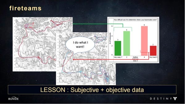
The research team also found out in the Vector visualizations data that players were getting killed a lot by the Shanks combatants (small flying drones), even though they were meant to be weak combatants, and merely annoying. However, it turned out watching the corresponding videos that they were often spawning behind the players or flanking them too stealthily, which was very frustrating to the players. So the research team suggested to the AI team that these combatants should always spawn in front of the players so at least they had more awareness of these combatants.
Another example that Jennifer used is looking into the kill/death distance data. Some combatants or players were getting killed from very far away, which can be frustrating and less engaging for the players. This informed the designers where these long-distance kills were happening so it could be fixed before launch.
The last example Jennifer used concerned patrols (downtime activity that allows players to gain experience and wait for friends). This feature was not easy to explore in the user research lab because participants did not have to wait for anyone to play, therefore this activity was better evaluated during beta. In sum, Jennifer illustrated with different examples what can be tested and when, but in any case it is important to have the trust and support of the development team to make the research even more valuable and actionable.
11- KEYNOTE: Dan Ariely, Professor of Psychology and Behavioral Economics, Duke University
“Free Beer: And Other Triggers that Tempt Us to Misbehave”
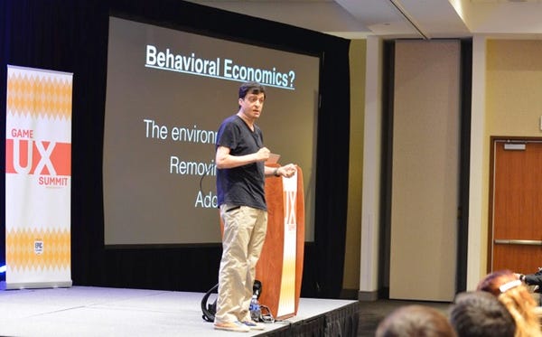
Dan Ariely’s keynote was about the methods that work (or don’t work) to induce behavioral change. Ariely’s first example showed that people could be convinced to stop smoking. However, it wasn’t information that smoking is bad for your health that changed behavior. Instead, the introduction of new taxes and rules that made it less convenient to smoke in public places, and the stigmatization of people who smoke are what ultimately helped reduce smoking. Another example Dan talked about was people brushing their teeth but not flossing, even though flossing is the more important behavior for improving dental hygiene. Why? Dan suggested that people brush their teeth for the wrong reasons: not to prevent tooth decay, but to feel minty-fresh.
If behavioral change does not come from giving people information, what does work? Dan gave the example from a PBM (pharmacy benefit manager) company that was trying to get people to switch from a branded medication to a generic one. Letters asking people to switch and explaining why they would benefit from doing so did not work. The PBM then tried to incentivise switching to generic by making it free to do so, and still, less than 10% of people switched. The PBM wondered if it was just that people hated the idea of generic brands. However, another explanation is that people just don’t easily change established behaviors. Change takes effort, not changing does not. “It is possible that people hate generics, but it is also possible that people hate doing anything”, said Dan. Therefore, if you want people to change their behavior you have to force them to make a choice. In Dan’s example, people had to reply to the letter or their medication would be cut, and this forced them to make a decision about whether they wanted the less expensive generic or more expensive branded medications, and this time, the results showed that people switched to generics at a rate of 80-90%.
What people do (or do not do) also relies on the environment around them and how that environment supports or suppresses their behavioral inclinations. Ariely called this behaviorism notion “untapped demand”. Dan used the example of saving money. Some people sign up for a savings account, and others do not. Is this because there are people who are savers and others who are not? In reality, people’s interest and motivation to save varies on a continuum. The saving behavior will therefore vary depending on the effort it takes to save or not to save. If we make not saving easier, then more people won’t save. This isn’t because they don’t intrinsically want to save, but because saving requires more effort than not saving. Ultimately, we can design an environment to make it easier for people to do the desired behavior. Designing the environment, removing barriers, and adding incentives can sway people from one behavior to another.
How can we structure life (or “gamify life” as Dan said) to help people behave in a way that will help them in the long term? One way is to use reward substitution, by immediately connecting a pleasant and motivating short-term incentive that motivates someone to behave for a long-term reward. The mint in the toothpaste is such example: people brush their teeth more for the benefit of having a fresh breath now than to prevent long-term tooth decay [Ed. Note: and video games are full of examples like these]. To make people change their behavior, we need to reward good behavior and penalize bad behavior. Here Dan specifically talked about loss aversion, random reinforcement, and regret. Regret is a psychological force driven by the contrast of where we are compared to where we think we could be. For example, Olympic athletes who win a silver medal have been shown to be less happy than those who win a bronze medal; the silver winner was close to gold, while the bronze winner is relieved to at least be on the podium. We need to determine which psychological forces can be used to encourage people to take their medication, to vote, to stop texting and driving, to sleep enough, and to eat healthily [Ed. Note: or make players have the game experiences we intend].
Dan also talked about trust as being very important in society. In a group of people, if everyone contributes to a central pot and everyone benefits from it, the whole group trusts the system and is satisfied. However, if at some point someone stops contributing – if only one person betrays the trust of the group – everyone ends up distrusting the system. Dan used the example of the prisoner’s dilemma game: when participants play multiple games, each with a new stranger, they tend to betray the other player more often than if they play multiple games with the same partner, because playing with the same partner means investing in a more long-term relationship. As the game progresses, the study shows that even the ‘partner teams’ tend to betray each other more because they know the game will soon be over, so there is no need to maintain a trust relationship anymore [Ed. Note: this stresses the importance of reputation systems and repeated interactions in games].
Consequences of betrayal are also important. Dan described another trust game in which one player receives $100 and is given two options: they can keep the money, or they can send the $100 to another player who will then get $400, and who can choose to keep the entire $400 or only keep $200 and send the other half back to first player. This game showed that people often are trusting: players usually send the $100 to another person, and the second player often reciprocates. But what if player 2 actually keeps all the money instead of splitting it? People are then often willing to lose even more money so that player 2 would get money penalties in return. This experiment shows that betrayal is a powerful emotion that often leads to a desire for revenge. Ariely used these examples to show that we could increase trust in our society by encouraging people to think about long-term relationships, about reputation, and about revenge when trust is compromised.
Dan concluded by pointing out that human behavior is not rational, and in order to understand it, we need to take into account psychological forces, emotions, and the environments in which people operate. As such, we could take elements from games [Ed. Note: which are structured systems aimed at producing certain behaviors] to change people’s behaviors and improve their lives outside of games. Game developers should have a lot to say about this and Dan hopes they will.
Learn more about Dan Ariely’s work: http://danariely.com/ and http://advanced-hindsight.com
You can also check out and apply to his Startup Lab Program
12- KEYNOTE: Don Norman, Director of the Design Lab, University of California, San Diego
“UX, HCD, and VR: Games of Yesterday, Today, and the Future”

Don Norman started his keynote by speaking about trust, one of the most important things in UX according to him. UX practitioners need to gain trust from the designers, the artists, and the entire development team. So, what is UX exactly? For Don, one of the most elemental levels of UX is usability testing. If conducted too late, however, usability testing is not efficient enough to improve UX, and getting the go ahead to conduct usability testing early on can be tricky because practitioners don’t want to be perceived as the UI police. This can make it difficult to build trust.
Norman continued by noting that every industry thinks they are special, that UX lessons from other industries don’t apply to them. But there are commonalities across all industries. The game industry is still relatively young, and is just starting to learn about UX, just like other industries did. When Don Norman started at Apple, their code base was known as “spaghetti code” because it was a such a mess that they had to throw it away and start all over again. Microsoft had the same problem. From Don’s point of view, the game industry is in the same state today: there isn’t that much process in the game industry yet, and people are afraid they will lose creativity if too much process is added.
Don moved on to another component of UX: human-centered design (HCD), with the critical word beingdesign. Don encouraged the summit audience to start by designing, not testing. Not many UX practitioners have the opportunity to test the design at the very beginning of the development cycle, when researching means going out and watching people doing the tasks in the wild so they can help designers design the system that will improve the way the tasks are carried over by the users. How do you know how people really play if you don’t go to their home environment and watch how they behave, what they are excited about, what is getting them engaged?, Don asked. Lab testing is an artificial situation that doesn’t quite capture that according to him. Norman pointed out that HCD has several components: research to determine what gets people excited and engaged, the development of ideas and designs, prototyping your vertical slice, and iteration.
Where do games come from? How do you develop a game concept? Don said it should come from a need, from understanding the players. But UX teams are often not involved in development, and seldom even represented at the executive level where important decisions are made. Norman asked us to challenge this line of thinking, and to prepare for these executive positions when they do become available.
Norman went on to explain why he never goes into a test with a preformed hypothesis, but focuses on parametric investigation to understand phenomenon by varying parameters and observing what happens as a result. He believes that the stage-gate process is one of the worst ways to test a design because you have to determine what your principles are, list your conditions, and state what you’re doing upfront. These preconceived notions could make it harder to assess the data and go back and change the design. You need the freedom to be able to tinker around to find out what works best. In his Design Lab at UC San Diego, they have a philosophy: observe, make, test. Norman said you should tinker around, then iterate, and only then should you start to build. You shouldn’t formalize your project on day 1.
Norman said that in his experience programming teams often want to program on day 1, which runs counter to the principles of design. The day your development team gets assembled, it’s already over budget and behind schedule. When you advocate to the team that we cannot start coding right away, the answer Don usually gets is “yes you’re right, we should observe, think about it more… but we don’t have the time. Next time we’ll do it properly, we promise”. But there never is a next time because you’re always behind schedule and over budget. Don suggested that we should remove role classifications (dev team, UX, QA) and focus on becoming one team, working together. Test, design, art, and code, all done by people who work together, who trust each other, and who understand each other. If the artist or the programmer has a new idea, the UX practitioners are there and can talk about it and challenge the ideas in terms of HCD.
Don then made it clear that usability is not about making games easy. Think about the game of tennis. It’s hard. You could make it easier by lowering the net, the balls could be bigger and softer. The problem is that it would be less engaging and less fun. Tennis, just like video games, should have the right level of challenge as determined by design. It is true that parts of the game should be easy: you have lines painted on the floor that show you when you’re in or out; those should not be hard to see. The difficulty should be in the goals and the quests, not in the controls or the UI. Games are unique because they have to accommodate a variety of expertise and that’s an interesting challenge in the game industry.
Norman pointed out that if the UX team doesn’t have the trust of the dev team, then design can become a battle of opinions. To avoid this, the UX team often shows stats, records observations, and writes reports. But if the developers don’t trust you in the first place, it doesn’t matter how big your report is. You have to gain the dev team’s trust in order for them to understand that you are a professional, and that your observations are not your personal opinions. Norman suggests that all devs should watch UX testing while it is in progress. If they watch the people they are more likely to understand the issues. If they react by asking “why do you let stupid people play the game?” you can reply: “well they aren’t stupid, those are the people who buy our games”. We have to develop for our customers in mind.
Going back to the idea of multidimensional teams, Don stressed that this type of team develops trust, and that leads to better products. An observation is data, even if you can’t put a number to it. Norman said that there’s a difference between what science is trying to do and what he is trying to do. Science is about finding the absolute truth, it has to be careful and precise. Don isn’t always concerned about finding the truth or the exact answer. Rather he is interested in two things: whether a design is good enough, and how to identify its big effects. Without the need for absolute values, you can test with small numbers of people and do fewer experiments.
Don views the present days as an exciting time for the game industry: both games and the audience are expanding. VR is very interesting, but hasn’t reached its potential. Right now, it’s good for architects, product design, automobiles, and medicine, but can we make a movie or a game in VR? We’re not so sure yet. Don pointed out that there are no menus or controllers in real life. How are we going to overcome that challenge to get away from the artificial controllers and UI? We’ll also need to overcome the simulation sickness issue. There’s a real potential in VR but it’s going to be a while before we unlock it. Norman is excited to see how it all develops.
For Don, UX is one of the most important areas in any product design group. It deserves a place at the management table. When that happens, UX practitioners will need to understand their users (basic theme of HCD) while not forgetting that they have other important users to understand as well: the management team, the engineers, the artists, etc. They have to understand them all, and speak both the language of developers and the language of business. The game industry is new, concluded Don, and represents huge potential.
---------------------------------------------------------------------------------------
Republished from http://celiahodent.com/game-ux-summit-2016/
Read more about:
Featured BlogsAbout the Author
You May Also Like


