Daily news, dev blogs, and stories from Game Developer straight to your inbox
Sponsored By
When was the last time you read on-screen text while playing a video game? For most of us, the answer is "the last time I played a video game."
4 Min Read

Sponsored by Monotype
This is sponsored content, courtesy of typeface design experts, Monotype.
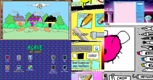
READING IS INTEGRAL TO GAMEPLAY
When was the last time you read on-screen text while playing a video game? For most of us, the answer is "the last time I played a video game." From the first introduction screen to the end credits, players read through the entirety of many game experiences, even if they don't really notice they're doing it.
Here's another question: when was the last time you noticed the type in a video game? Did you notice that type because it enhanced your experience... or because it was distracting, hard to read or confusing?
Even when a game gets intense and the pixels start flying, reading remains a fundamental part of the experience. Whether you're learning the backstory about the world you're exploring, or just glancing at the corner of the screen to see how many lives you have left, on-screen text is crucial to understanding and enjoying the game.
While type is only one element among many, the fonts in your game can add to the overall experience in many positive ways.
DESIGN AND HIERARCHY
Of course, the type in any game must be expressive, but it also must meet a certain standard of legibility--a player should never have to squint or slow down to read. This would interrupt the flow of the gameand negatively impact the user experience.
Many factors can affect the legibility of type in a game, from design elements within each individual typeface to the kinds of screens on which the game is being played. Two of the most important factors -- which a good designer will keep in mind regardless of genre or platform -- are scale and expected viewing distance. Small text is hard to read, but so is text that appears too large, especially if the typeface being displayed was not designed to optimize large sizes.
As a design element, legibility is second only to what's known as personality -- the emotional impact a typeface can contribute to the game experience. Certain type styles have come to represent certain genres; for example, the right distorted, evil-looking type will set the tone for your zombie thriller from the first menu screen.
Highly-expressive typefaces are sometimes more difficult to read, but techniques like hinting (the use of mathematical instructions to optimize how fonts display) can help improve legibility.
A WORLD OF SCREENS
As any designer knows, screens are made of pixels, which means they're too granular to be ideally suited to displaying the smooth lines of most letterforms. Good design groundwork can play a significant role in ensuring legibility, but type should always be re-examined, re-sized and potentially customized for each new screen on which it is displayed. This will preserve legibility and ensure a consistent user experience, especially if your game will be played on multiple platforms.
GLOBAL GAMES
Making sure your game is legible and is stylistically consistent in your native language can be tricky by itself. But trying to do the same in a foreign language, especially a character-based language like Chinese or Arabic, is an even bigger task.
The process of translating text into a different language for a different market is known as "localization." Style and legibility remain just as important, but a new array of challenges must be considered. Proper translation, verifying a complete character set, and the coding challenges inherent to character-based languages make localization tough to achieve. Often, specialized language and coding support are necessary to ensure that a font looks as good in a game environment as it did during the selection process.
Character-based languages are very different from Latin-based languages such as English. Some characters overlap, and even retroactively change those already displayed. If coding isn't perfect, text can interfere with itself or display in a less an ideal fashion, especially when two or more languages are displayed on-screen at once. Localization can be especially difficult to achieve with open source fonts, which may lack language, coding or legal support.
GREAT GAMING IS IN THE DETAILS
Typography is an entire discipline dedicated to perfecting even the smallest details in what, and how, we read. It's not usually a game designer's first thought when they approach a game, but it shouldn't be their last. With the right process, creativity and vision, good typeface selection can enhance your game's user experience dramatically, by infusing your game with more personality without distracting your players from the game experience itself.
Visit Monotype's website for an array of typeface design services.
Read more about:
Sponsor Resource CenterAbout the Author(s)
You May Also Like