Daily news, dev blogs, and stories from Game Developer straight to your inbox
Sponsored By
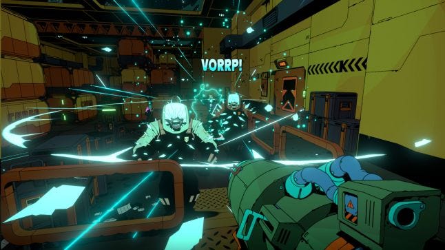
Void Bastards is a strategic sci-fi shooter of combing through dangerous ships for supplies, tasking you with knowing when to blast your enemies and when to cut your losses and run.
8 Min Read

This interview is part of our Road to the IGF series. You can find the rest by clicking here.
Void Bastards is a strategic sci-fi shooter of combing through dangerous ships for supplies, tasking you with knowing when to blast your enemies and when to cut your losses and run.
Gamasutra spoke with Jon Chey of Blue Manchu, developers of the Excellence in Visual Art-nominated title, hearing about how budgeting concerns helped forge the game's striking visual style, the gameplay elements that were enhanced by that look, and the thoughts that went into creating enemies that made sense within this comic book-like world.
Void overseer
I'm Jon Chey and, like the rest of the team, I did a bit of most things on the game, although the credits call me the design director and a programmer.
I started making games in 1996 when I was inexplicably hired fresh out of grad school as a senior programmer at the legendary Looking Glass Studios. I bumbled my way through some games with them, including some well known titles like Thief: the Dark Project and some less well known ones like British Open Championship Golf. Having been paid to learn how to make games I then learned how to manage a team when Ken Levine, Rob Fermier, and I started Irrational Games and landed the chance to develop System Shock 2. Eventually, we sold that business and I've been doing indie development ever since.
Mixing roguelikes & System Shock 2
Void Bastards was conceived as a mash up between System Shock 2 and modern roguelike games. Like, what if we took the moment to moment gameplay of an immersive sim shooter like System Shock 2 and put that into a framework where we were procedurally generating an infinite number of missions? So, it was a design idea to start with and we stayed pretty true to that concept during development (we think it turned out to be quite a good idea), although we threw away a lot of the narrative and setting that we started with (the game was initially called Ghost Armada and it was a much more gritty, hard sci-fi type experience than it turned out to be).
On the tools used to make Void Bastards
Pretty much straight Unity with some asset store plugins as well as the usual art creation tools. We use the Wwise sound engine and all the scripting is C#. Nothing too weird!
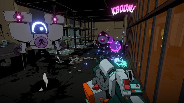
Creating distinctive visuals through crafty budgeting
So, there were two convergent thoughts that lead to our visual style. One was our art director, Ben Lee's, love of old-school sprite-based shooters and the idea that these could still look interesting today if we really bumped up the resolution of the sprites. The other was that we knew we needed to find a way of producing enemies and other assets much more cheaply than is standard for modern FPSs while still looking good. It's very hard to make skinned mesh characters look good without spending tens or hundreds of thousands of dollars on them, which is, of course, infeasible for indie teams.
So, those two ideas got together and resulted in not only sprite based enemies, but also a hand-drawn look for the world. The great thing is that we saved a ton of time on all fronts as a result of this (pretty much no textures in the game at all!) and we made a product that we think is visually distinctive and striking to boot.
 How the visual style enhanced gameplay
A problem in many detailed or "realistic" modern games is that the level of detail in the environment often gets in the way of the player perceiving the play space and the important or interactive elements. This means you have to spend even more time trying to make these gameplay-relevant objects pop out from your super-detailed background. Our backgrounds are quite sparse and simple, which makes identifying the things you need to know in order to play the game well quite easy.
Another thing to note is that because our enemies are just playing simple sprite animations, there's no expectation that they interact with the world in a complex, synchronized way. For example, when they get pushed around by explosions or other forces, we don't bother having them play a land animation that has to line up with the terrain or object they land on. That frees the game up to be faster and "more gamey" than it might otherwise be. Again, we can focus on the gameplay-relevant stuff (just let physics control the movements and not worry about animation synching to things).
The effect of the visuals on the game's potential audience
Obviously, standing out in a crowd is super important these days given the number of games being produced. But beyond that, the look and feel of a game tells players a lot about what they can expect from it and what kind of play style they might want to follow. Our world is grim, but also not too serious, it's sci-fi, but also a black comedy. Does that support the player's understanding that they will die a lot but that dying isn't too big a deal? I hope so.
On the flip side, we were aware that a sprite-based art style might lead some players into thinking that this was a typical 90s style run and gun shooter. So, we worked hard to ensure that when we promoted images of the game we heavily featured parts of the game that showed the greater strategic focus of the game like the star map, the ship schematics, and the crafting.
The visual design process
Void Bastards was designed iteratively using lots of prototype spaces and versions of the game. We started with immensely ugly but functional test beds, with parallel development of small art concept spaces. Only once we'd figured out what kind of spaces were interesting to play in did we bother building out final art.
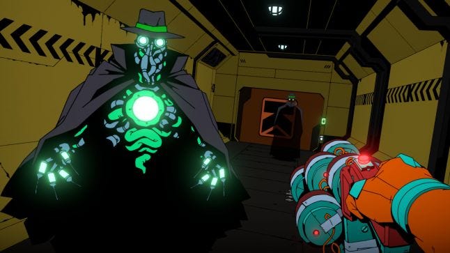
The sprite enemies were also iterated a lot as we developed their concept. The Janitor internal name is "alien," which reflects the generic concept that we started with - a sort of space monster, which then became a mutant human and finally evolved into the bored sanitation worker than we shipped with.
The UI was developed the same way - mocked up using generic widgets with the comic book styling added once we'd bedded down the functionality.
 On adding strategy elements to a shooter
We really like dual- or multiple-layer games like XCOM or the Total War games, and there didn't seem to be any examples of those kinds of games where the tactical battles were played in first person. Other attempts to marry strategy and first-person shooting we thought were marginally successful because they were trying to do both things at the same time, which can be overwhelming. Of course, there are tactical shooters with maps and planning, but they usually lack a larger context of what you're trying to achieve at a strategic level. So, we really wanted the player to have long-term goals, to plan which missions would be best suited to achieving those goals and then to have to think tactically within the mission (including deciding to abort or just not bother if that's the right call).
Because this kind of thinking often isn't required in shooters, there can be a bit of a learning curve for new players as they adjust their expectations to concepts like the fact that they can't necessarily beat (or even try to beat) every mission and that sometimes cutting your losses is better than pushing ahead and expecting that the game designer has ensured you can always win.
Designing the game's colorful foes
Enemies were designed to be provide a unique skill challenge, but also to be vulnerable to particular weapons, incentivising the player to craft their full armory. Because we have finite ammo, though, we also tried to make sure that each enemy could be defeated in multiple ways should a particular weapon not be available to the player. By combining the enemies in different combinations (which vary as the game progresses), we also tried to ensure that specific weapon loadouts wouldn't be the answer to all situations.
The visual design of the enemies tried to satisfy a bunch of different constraints. Since each frame and each facing was hand drawn by a single person (our art director), keeping their animation requirements low was critical - that's why a bunch of them hover instead of walking! By limiting ourselves to two basic sizes (tiny and normal), we simplified our pathfinding and what kinds of combat environments we could design. By deciding that the enemies were all initially human and assigning a different job to each, we generated ideas about what each would look like: the Screw (prison guard) would be a big hulking guy whereas the Zec (executive) would be a bespectacled administrator.
About the Author(s)
You May Also Like