Daily news, dev blogs, and stories from Game Developer straight to your inbox
Sponsored By
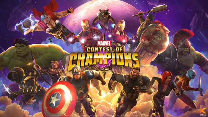
There are 6 basic things a video game landing page should have: Headline, Hero shot or video trailer, Call-to-action, Press, and Social proof. These are the landing pages from the top 10 video games of 2016, according to Gamasutra.com, and a quick review.
7 Min Read

A high-performing landing page can help your video game get downloads, conversions, newsletter signups, and much more. What are landing pages, you say? Here’s a basic definition of a landing page from Unbounce, the leading landing page and A/B testing service. From a gamer’s perspective, this is the best article I could find (from 2014) on landing pages for video games, from the IndieGameGirl blog.
Video game landing page basics:
There are 6 basic things a video game landing page should have:
Headline
Hero shot or video trailer
Call-to-action
Press
Social proof
About the game/characteristics
These are the landing pages from the top 10 video games of 2016, according to Gamasutra.com, and a quick review of each:
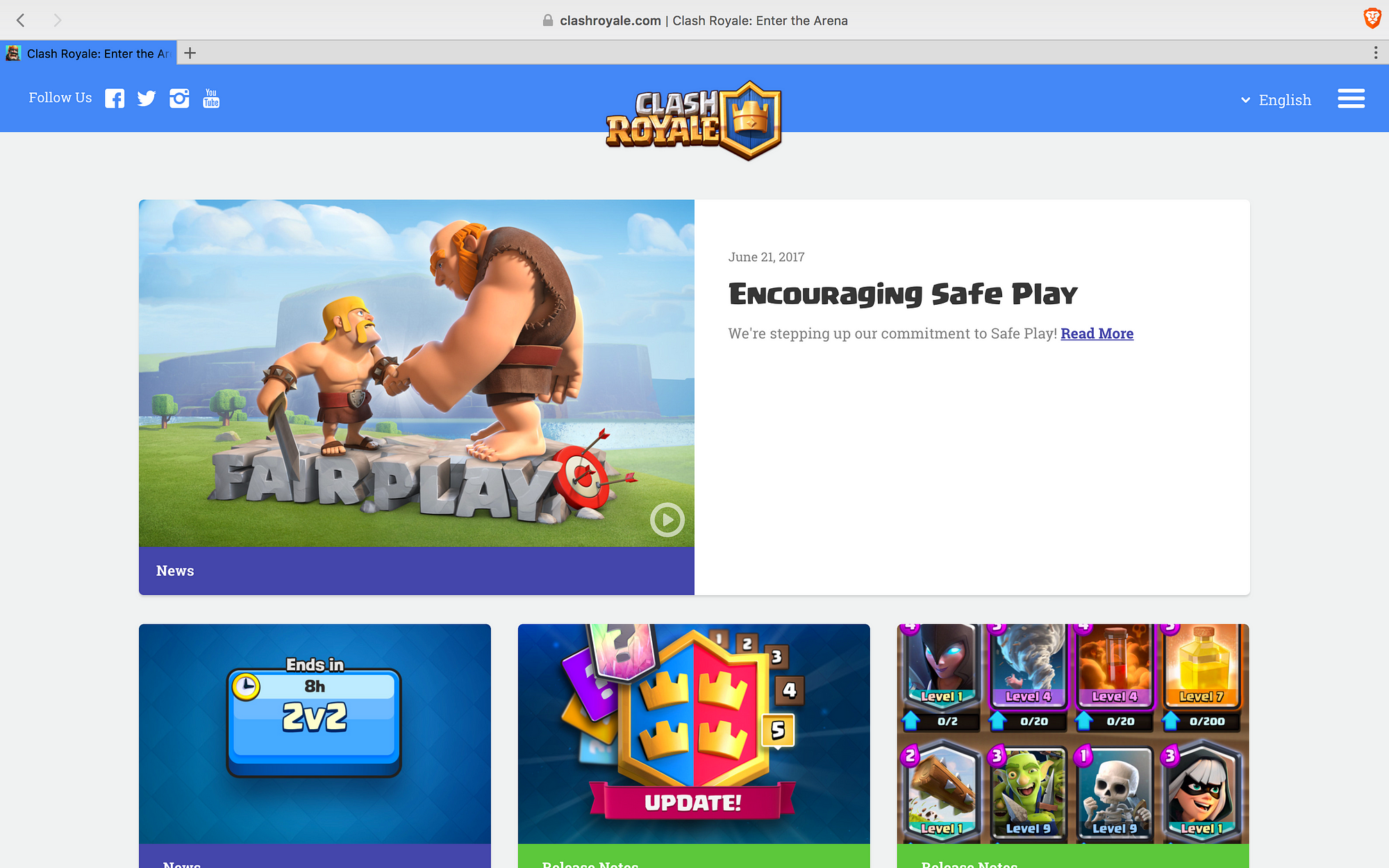
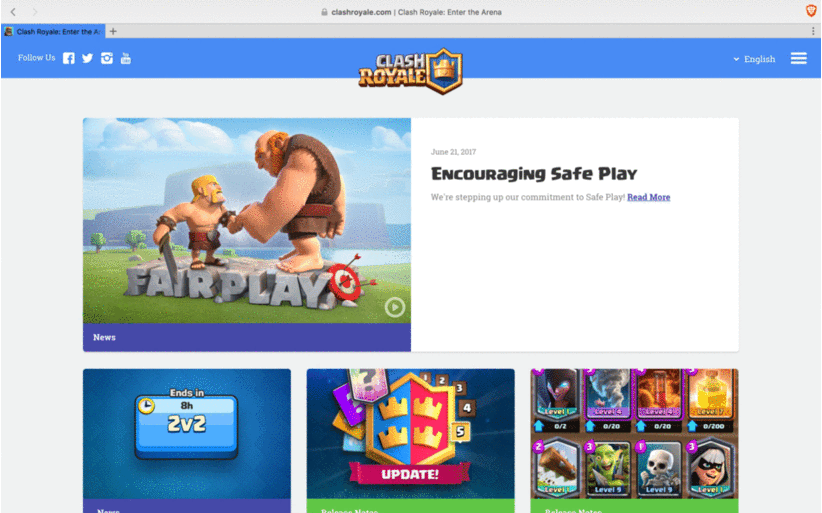
1.Clash Royale: the Clash Royale landing page is very simple, but lacks a definitive call-to-action at first glance. There is also no press. This just might be the case that they get their acquisition traffic from other sources and this landing page is used for news and support purposes only.
As you scroll down you get some social proof in the form of community videos. Then you get to the FAQ section — they must get a lot of questions, because this usually goes in the footer. Until we get to the footer do we see download buttons for the App Store and Play Store.
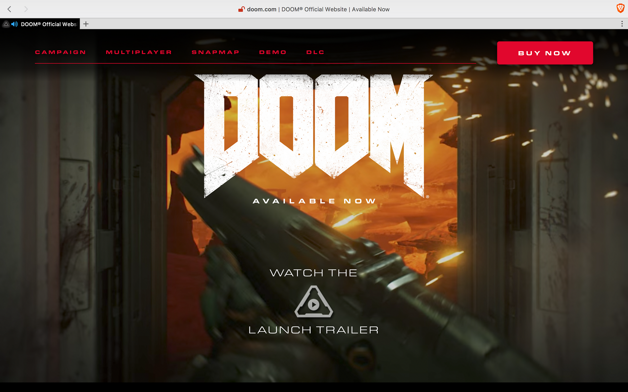
2.Doom: the Doom landing page is straight to the point — watch the trailer or buy the game with a clear Buy Now button. Although when you click the Available Now image, you get directed to the same page.
Scroll down and you can sign up for their newsletter. Also, no press. Like Clash Royale, they probably don’t need it. One downside is that they have horizontal navigation at the top to explain the game characteristics: Campaign, Multiplayer, Snapmap, etc. They should have made these sections scrollable.
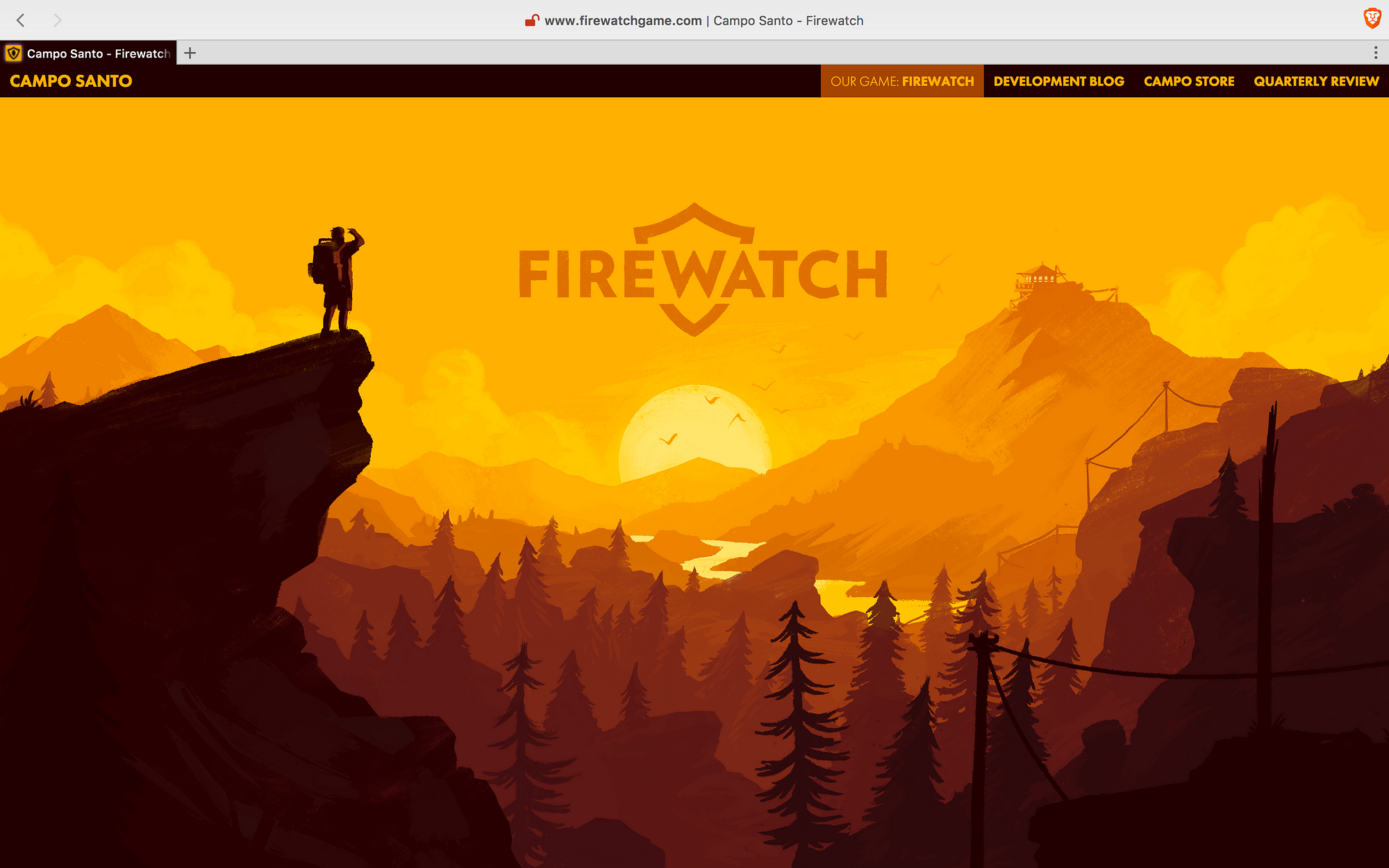
3.Firewatch: the Firewatch landing page is visually stunning, yet lacks a clear call-to-action. As you scroll down you get to see their social proof (awards), call-to-actions (although not clearly defined by another button color), and game trailer. They even have a bit of storytelling. Their merchandise store should have a better call-to-action. Overall, the page is so beautifully designed, that the buttons look like art, and not things you should click.
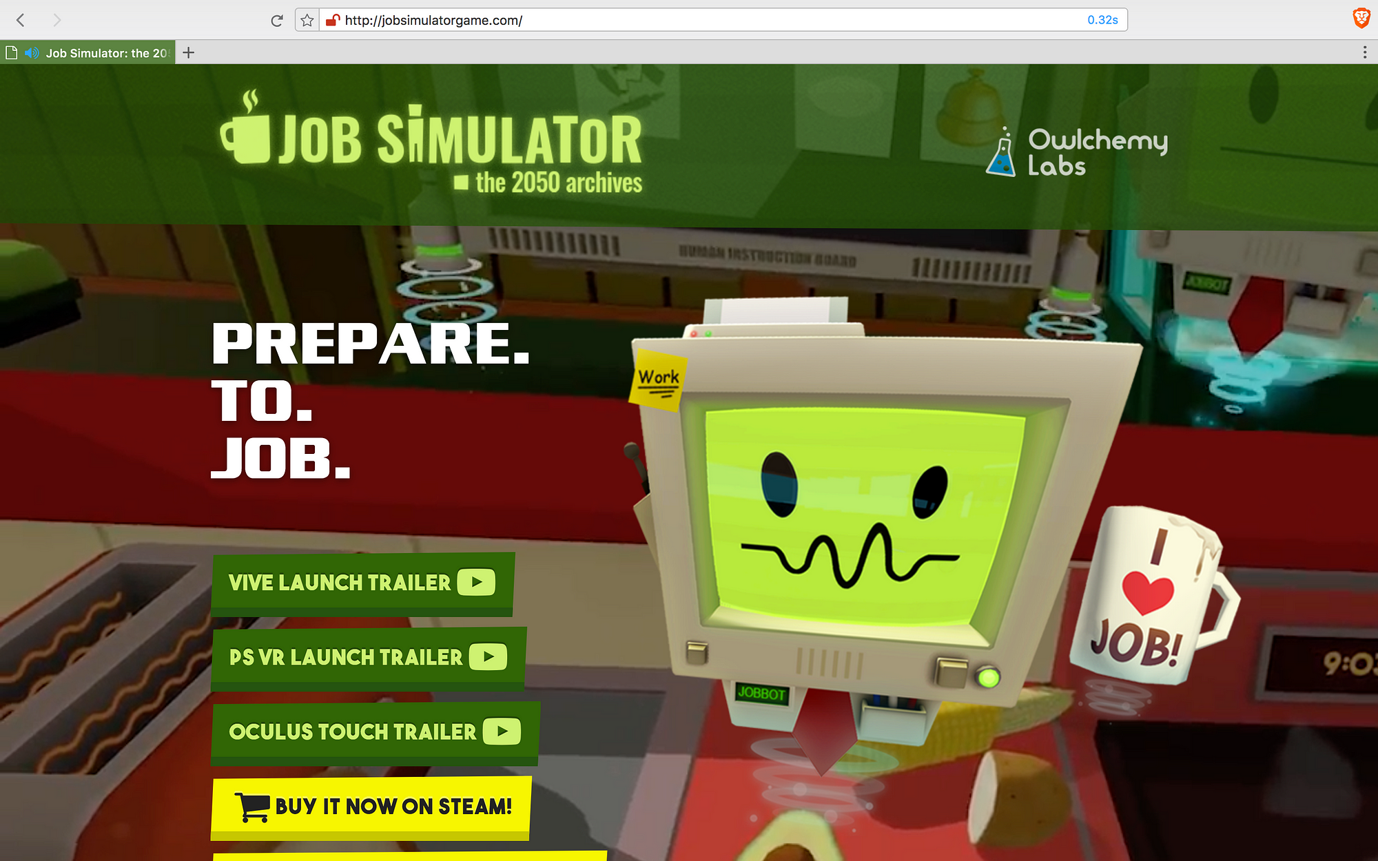
4.Job Simulator: the Job Simulator landing page is superbly designed to match their VR experience, but I wish their call-to-actions would be clearly defined by another button color, although hard since there’s lots of colors flying around. Another problem is they have 6 call-to-action buttons! They could use 2 buttons and then select your gear or store.
A very complete landing page, and they have lots to share, like their impressive awards section — 1 page isn’t enough! They check every box: press, storytelling, game characteristics, store, press kit.
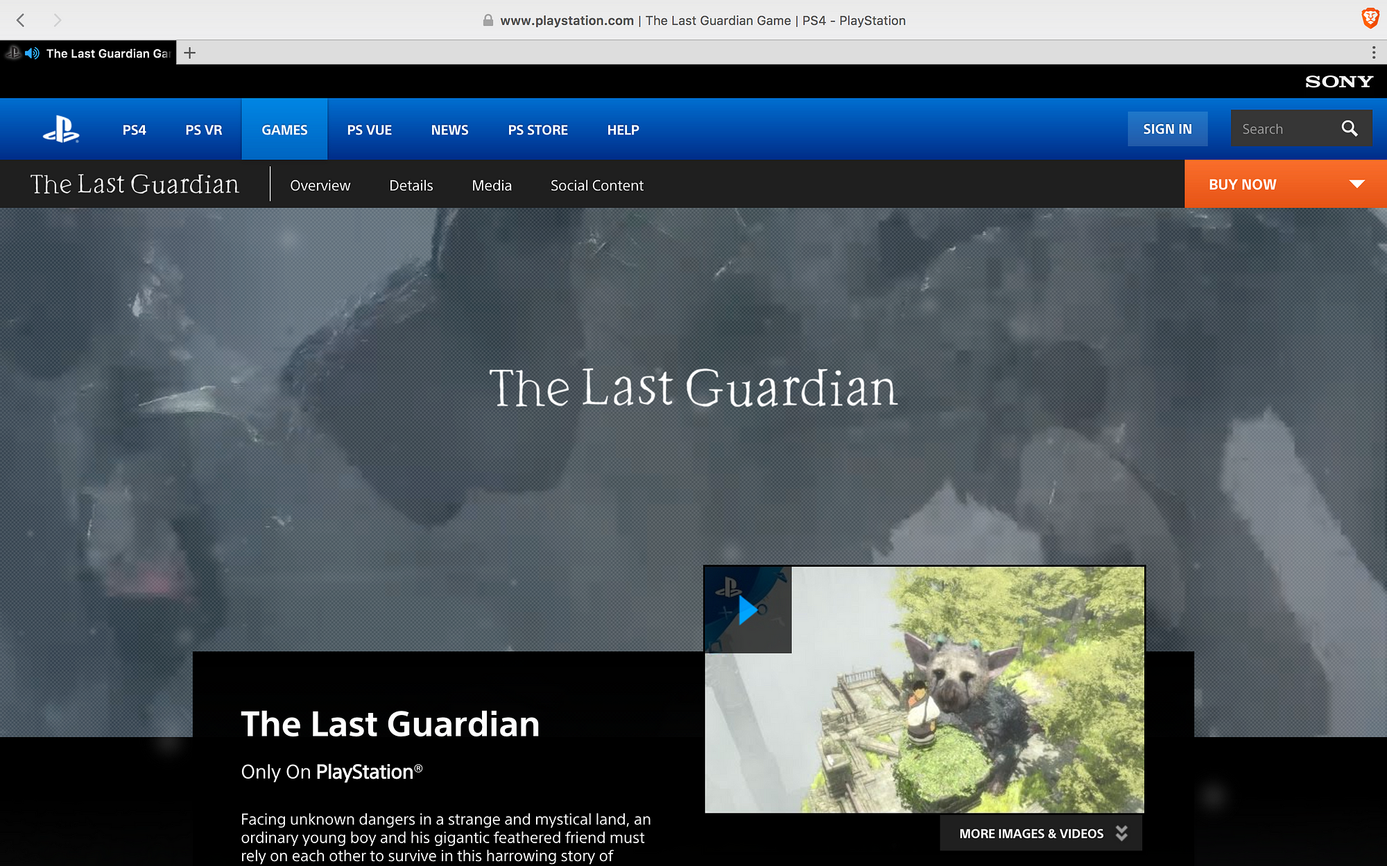
5.The Last Guardian: the The Last Guardian landing page is probably the least visually appealing landing page of this bunch. They’re part of the Playstation website, so it can’t be a standalone page. They have horizontal navigation, and their call-to-action button is not clearly visible.
As you scroll down they have all of the basics: press, game characteristics, media content and social proof. At the footer you can find the most visible call-to-action to buy the game. One positive is that the header bar stays fixed and the Buy Now button is ever present.
Enjoying this post? Sign up for our newsletter and get more content about Video Game Marketing for indies, developers, and marketers. Only 1 email per week, we promise ;)
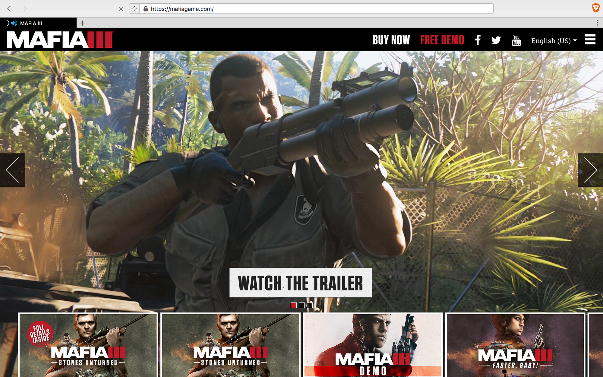
6.Mafia 3: the Mafia 3 landing page is all about showing you game screens and gameplay. The call-to-action is very clear — watch the trailer. They must feel (or with analytics, know exactly) that this is the best way for players to buy the game.
As you scroll down you they keep showing you more of the game, with one last call-to-action to buy the game before the footer, followed by a sign up for the company newsletter (not the game). No press or social proof here.
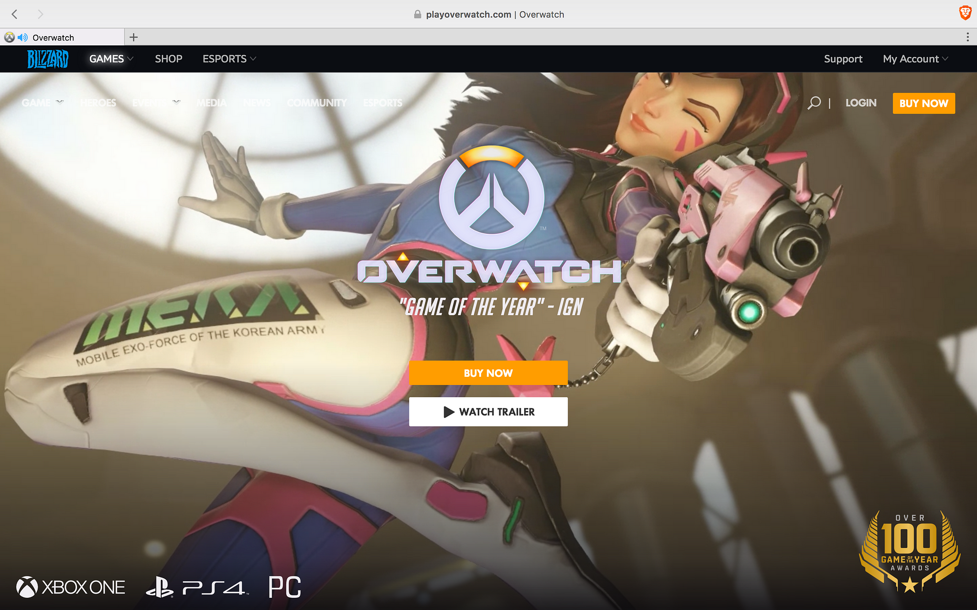
7.Overwatch: the Overwatch landing page is probably the best landing page of the ten. There are clear call-to-actions in the middle of the page to buy now or watch the trailer, with the buy now button in a stronger color. The background is video gameplay which looks very smooth. To top all that, they manage to get in some press with “Game of the Year — IGN” beneath the game headline.
They keep making the call-to-action buttons clear in every frame as you scroll down — View All News, Explore the Game, and Buy Now. They don’t however, include press or social proof (probably Game of the Year is enough). Also missing is a sign-up for a newsletter.
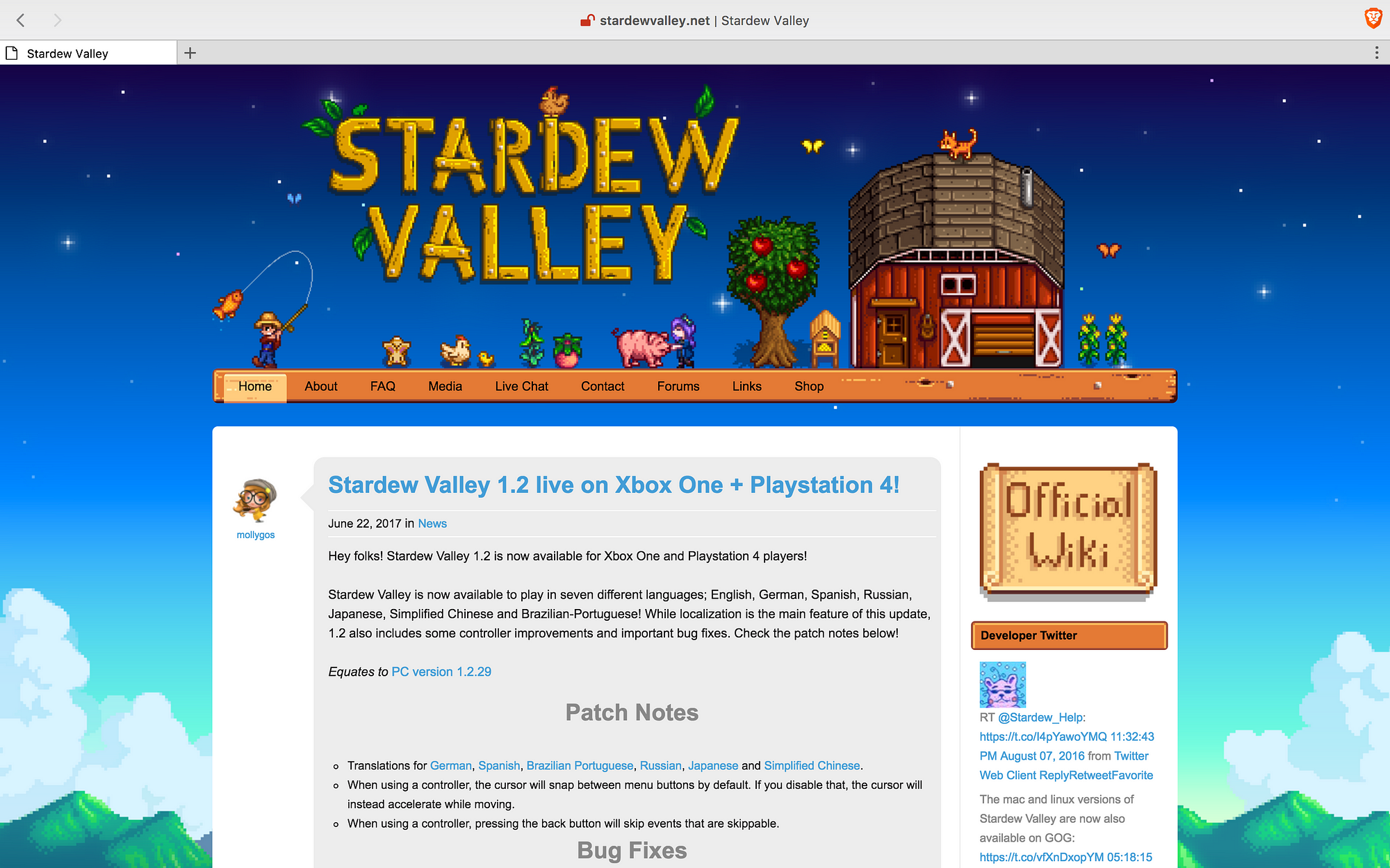
8.Stardew Valley: the Stardew Valley landing page is is really old school. It goes with the game esthetic, but they could do a little better. If you land there, you don’t know what you’re looking at. Is it a wiki page? Is it a dev blog? You have to navigate along the menu to find stuff about the game, media, and social proof.
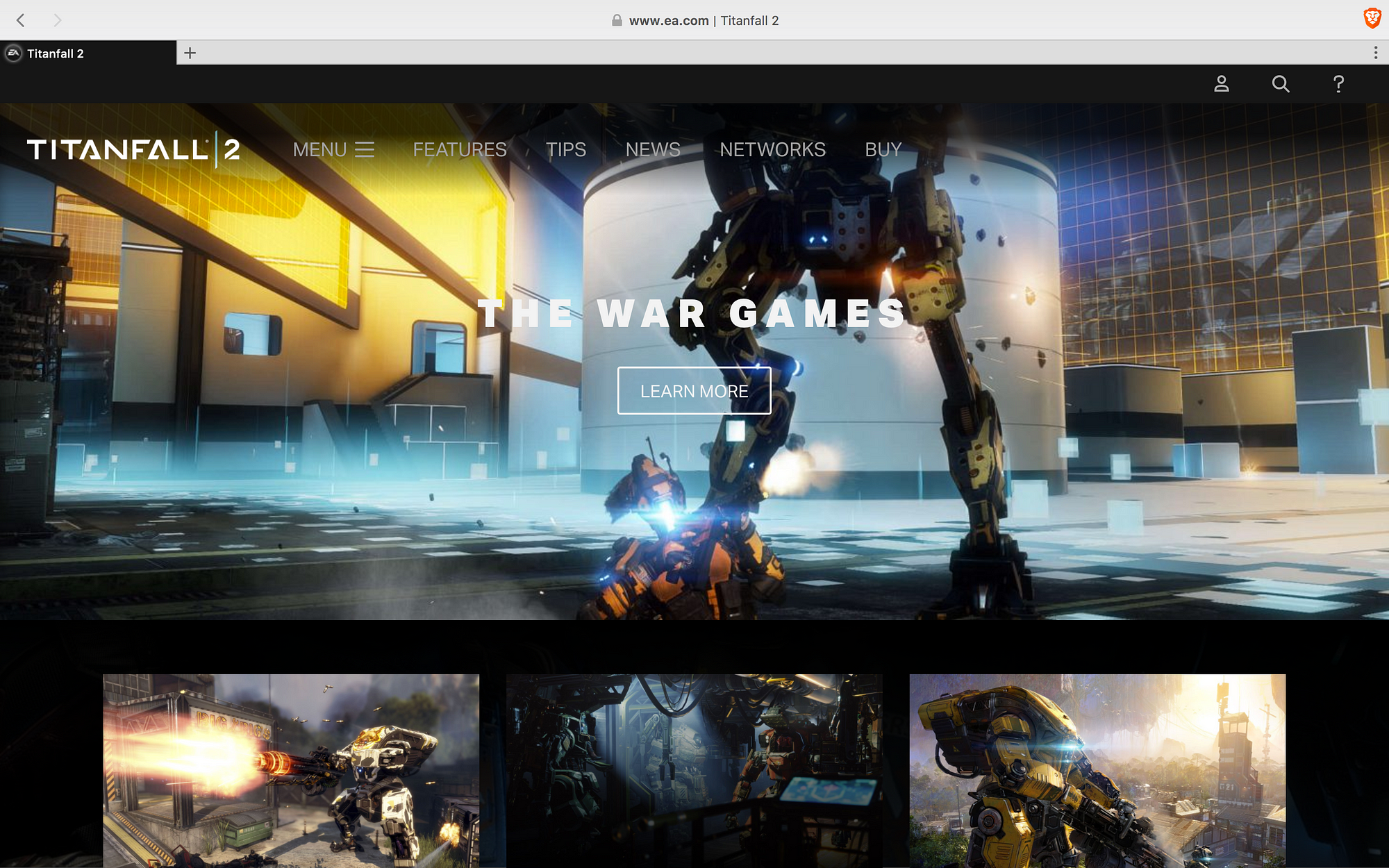
9.Titanfall 2: the Titalfall landing page is functional. Right now, the call-to-action button (Learn More) on the landing screen is sending people to news about the newest release. This is probably tactical as they went people to go there instead of buying the game or watching a trailer.
If you keep scrolling down, you get a screen that looks more like the original landing page, with the name of the game, a tagline, and two call-to-action buttons. Everything else is standard, but they don’t have any press. Before the footer you get a newsletter signup.
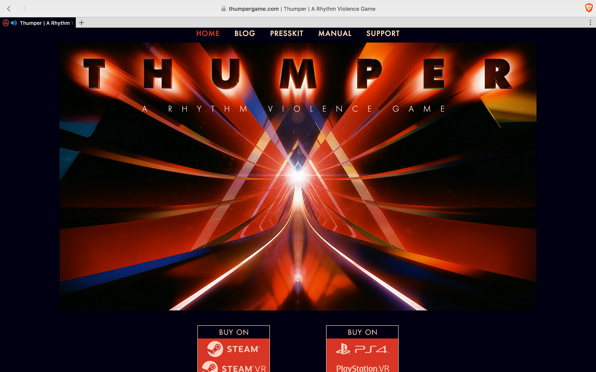
10.Thumper: the Thumper landing page is complete. Not perfect, but you have all of the essentials: headline, hero shot, call-to-actions buttons, press, social proof, and game charateristics. The Buy buttons could be exalted a bit more with another color, and the signup for the mailing list is a plus.
Conclusions. The good: Few of the landing pages have horizontal navigation and most send their navigation links to the footer so that you can concentrate better on what’s on screen. Curious that Thumper is the only one with a great headline (A Rythm Violence Game). The bad: Only 5 of them ask for your email, and only two are exclusive for the game itself, the other 3 are company newsletters. The ugly: Actually, not being ugly at all. Let me explain — the call-to-action buttons are the most problematic thing in all of the pages, as they’re not exalted over the rest of the copy, they more or less blend in with the design. You need something that pops to click on it. Overall, most of these landing pages accomplish what they’re supposed to do — either download the game or watch a game trailer.
Did you enjoy reading this post? Sign up for our newsletter and get more content about Video Game Marketing for indies, developers, and marketers. Only 1 email per week, we promise ;)
Read more about:
BlogsAbout the Author(s)
You May Also Like