Daily news, dev blogs, and stories from Game Developer straight to your inbox
Sponsored By
How can you create a cohesive branding that turns a game into a product? Find out how in this article.
4 Min Read

 Earlier this week I started the process of releasing Gun Rocket. Gun Rocket is my latest game, and the first one that I am charging for. As such, it has to stand out from my previous projects. In this article I will touch on some of the details that I believe elevate a game to the level of being a full-fledged product.
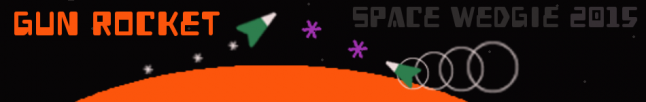
After iterating on base game mechanics (Gun Rocket was originally a bullet-hell style game), my first choice on the road to a product was picking a color palette. A color palette is a small set of colors that become the basis for your art. Every sprite, every menu button, and every piece of marketing material is informed by your color palette. The color palette for Gun Rocket is shown in the picture below.

Identifying a color palette immediately benefits the design team of a game. It gives a clear direction for artists, and it creates a cohesive look for all visual material. A color palette brings all art together under one brand of colors. Believe it or not, there are websites devoted to color palettes. Browsing a website such as Color Lovers until you see a set of colors that catches your eye is all it takes. You can always slightly modify a found palette if you need to!
The next detail that I sat down to decide was font style. Default fonts are only good for one thing: a text editor. Arial, Helvetica, and Times New Roman are all very clean, professional typefaces. They look great on a page. Here's the rub: a video game is not a text document. A game has its own feel and character. Adventure games can't use a newspaper typeface - they need a font that is more epic and bold. A pixel-style game needs a pixel-style font. An innocent, childish, silly game may look ridiculous in anything but Comic Sans. Typeface is a strong tool to identify the character of a game. Gun Rocket uses a typeface called Heavy Data. It adheres to a set footprint, but it also contains a light and fun element. It is not a font that takes itself too seriously, and it fit perfectly into the feel that I was reaching for with Gun Rocket.
The final detail that I will mention here is sound. A game's music and sound profile need to be clear and cohesive just as the visual elements do. The auditory theme of Gun Rocket is space. All of the music, therefore, is made up of synthesized instruments. Often the instruments will swoop between notes in a way that, to me, calls to mind the vastness of space. The audio effects are reminiscent of older arcade games to round out the sound profile.
Visual and auditory branding is essential to achieving a higher level of quality in video game development. If you plan to release a product, not just a game, I recommend identifying your color palette, font, and auditory themes early. In addition to creating a cohesive branding you end up with a well defined direction as you plump up your content.
This article was originally published by Jack Pritz here. You can explore Gun Rocket on Itch.io (Demo and full release), IndieDB (demo only), and Desura (pending approval). Follow Jack @jmpritz. Gun Rocket is a product of Space Wedgie, LLC.
Read more about:
BlogsAbout the Author(s)
You May Also Like