Daily news, dev blogs, and stories from Game Developer straight to your inbox
Sponsored By
"...we conceived the visual style as a key element to translate the emotions and feelings Norah is having on the Island. It reflects her admiration, fascination, and the discovery she is going through."
7 Min Read

This interview is part of our Road to the IGF series.
Call of the Sea follows a woman seeking her missing husband's expedition, and the otherworldly things she finds in her search through a lush tropical island.
Gamasutra sat down with Tatiana Delgado, Creative Director of the Excellence in Visual Art-nominated experience, to discuss how they sought to create a Lovecraftian adventure in reverse, the research that went into capturing a time period and personality with the characters, and the ideas that would give the land itself a kind of personality.
Who are you, and what was your role in developing Call of the Sea?
I’m Tatiana Delgado and I’m the Creative Director and co-founder of Out of the Blue Games.
I’ve been working as a Game Designer for 17 years. I’ve worked on different games on different platforms: PC, console, mobile, web… Some years ago, when I was conducting a Game Design workshop, some young developers showed me their own games. I was impressed by how good they were, but I was mostly surprised by their energy and passion.
That very moment, I decided to co-found Vertical Robot, a studio for VR games with some long time industry colleagues, and created Red Matter, a narrative-driven puzzle game. Post launch, I decided to move on and create a new studio dedicated to narrative puzzle games. This time, I was lucky enough to have an old friend, Manuel Fernandez, to bring onboard as a business partner. Call of the Sea is our first project at Out of the Blue Games.
How did you come up with the concept for Call of the Sea?
The concept for Call of the Sea comes mainly from the classic H.P. Lovecraft stories and pulp novels, but we wanted to give it a different approach. So, instead of having a passive subject that is drawn into madness by circumstances that she cannot control, our purpose is to tell a story of a resolute woman on a journey of discovery and acceptance. To sum up, a rise to sanity instead of a descent to madness.
On the other hand, we grew up with both adventure and puzzle games and we love them to pieces. You might say that Call of the Sea is our love letter to the genre and a way of deepening our own experience from the past and adding new dimensions to it. We hope to create a game for all of you out there who carry a nostalgic torch for the genre, as well as for new players who have yet to discover the joy of adventure games with puzzle solving.
What development tools were used to build your game?
Our environment artists had a deep knowledge of the lighting tools available in Unreal 4 and they used them to enhance the levels, point the player to directions, and set this eerie and fascinating mood to all the levels.
But everything has to come from a 2D concept first. Our concept artist, José Leote, working closely with the design team and the art director, Daniel Nombela, to set the lighting and general look of the level according to the story. There was a lot of communication between all departments to make sure art, design, and narrative worked hand in hand.
Then came the challenge to bring those environments with unique atmospheres to life, and Unreal Engine 4 helped us a lot overcoming this challenge. We used a mix between bake and dynamic lighting, combined with emissive materials, lighting materials, and volumetric fog.
What drew you to the art style you chose for the game? What made it feel right for the game's look and for the exploration of its themes?
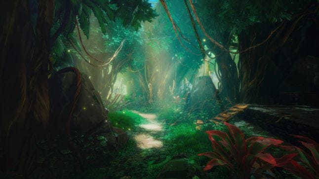
The overall look of Call of the Sea relies on bright, vivid colors and has a stylized look. Using this visual style, we’re trying to submerge the player into what may look like a dreamlike landscape.
Since the beginning, we conceived the visual style as a key element to translate the emotions and feelings Norah is having on the Island. It reflects her admiration, fascination, and the discovery she is going through. For this reason, the game is divided into chapters to allow us to tune the environments, weather, and make the light and general feel of the game evolve as the story does. When we design games, we have players' emotions in mind.
Can you tell us a bit about the process of finding the art style you wanted? What work went into finding a style that felt right?
We started with an art style quite close to the real vegetation in Tahiti. We had a Polynesian consultant, Yunick Vaimatapako, from the National School of Dance and Culture Ia Ora Tahiti. They were very eager to help us get the Polynesian culture into the game, and that’s the reason why the first environments in the game are quite similar to what you might find on a Pacific Island.
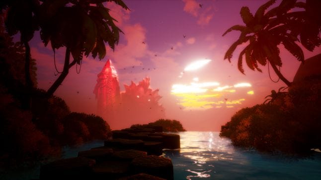
But as the game progresses, the Island shows its true face, moving away from the classic Tahitian structures to more fantastic elements, referencing lost civilizations like Atlantis or Mu.
Was there research involved in getting the look of the era down for the game? What did you research?
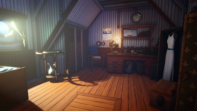
One of my passions is historical fashion design. I wanted Norah's aesthetics to correspond to that of a woman of her age from her time. We looked for references in fashion designs from the 1930s to make sure not only her outfit, but all the clothing of the expedition members were credible.
On the other hand, we used the Indiana Jones and the King Kong movies as references, concerning expeditions, equipment, and looks. Combining movie references with real life elements taken from photographs of real expeditions and adventurers of the 1930s, we tried to be as faithful as possible to the style of this era.
What thoughts went into choosing colors and lighting for the game to give it such a lush, vibrant look?
We drew inspiration from games like Firewatch and The Witness, with a strong use of color and light to create unique environments. Light is mainly used to indicate Norah’s evolution, and how she interacts with the Island, which is a character by itself that is alive and reacts to Norah.
Inspired also by other games like Myst and Riven that had mesmerizing and calm environments, we also wanted to provide beautiful places where the players could get lost and spend time exploring and solving puzzles.
What ideas went into the designs for the characters? Into giving them a personality and a place in time with just their look?
Since we were not going to be able to interact or converse with the characters, it was important that their personalities were very defined by their visual style. The only way to get to know the other members of the expedition is through images and texts. In this way, we tried to give them a recognizable visual identity at a single glance, but at the same time, that evolution was noticeable throughout the photos Norah finds of them, and she can see their tiredness during the time they spent on the island.
What emotions were you looking to capture with your visual style? What did you want the player to feel as they took your game in?
We wanted the player to experience what Norah is going through in every moment of the game. So, if the main idea behind the game was to explore a rise to sanity, we instantly knew that we needed to move away from the gloomy aesthetics and cold and pale colors that are commonly used both in Lovecraft's stories and in their adaptations to other media, and move to a colorful and lively environment. I think it really worked, and every player is drawn into Norah’s story by the visual style and Cissy Jones' amazing performance.
This game, an IGF 2021 honoree, is featured as part of the Independent Games Festival ceremony. You can watch the ceremony starting at 4:30PM PT (7:30 ET) Wednesday, July 21 at GDC 2021.
About the Author(s)
You May Also Like