Daily news, dev blogs, and stories from Game Developer straight to your inbox
Sponsored By
A simple breakdown of how shapes (and colours) can affect our perception of characters, items, and environments.
5 Min Read

I remember someone telling me that nearly everything in life can be boiled down to psychology; the science of behaviour and the mind. Why do we act a certain way, or why might one perceive something differently than someone else? It's just how our brains work. Things like subconscious behaviours and innate feelings stem from triggers like sounds and tastes, to shapes and colours.
Now, I'm not claiming to be an expert on psychology, but allow me to show you an example of how this kind of thing works. Let's take a look at the following three shapes:
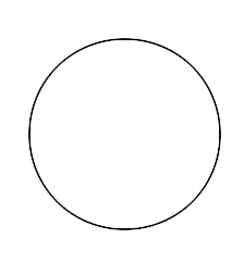


We have a circle, a square, and a triangle. Simple, right? What general thoughts come to mind when you see them? You may or may not have realised this, but everything we see can basically be broken down into these three shapes, and each of these shapes (and by extention, types of lines) are associated with certain feelings.
For instance, curvy shapes and lines might represent something youthful and energetic. In contrast, hard edges remind me of something that's stable or mature, whereas angles feel "aggressive", "dangerous", and maybe a bit more sinister. A blog written by Chris Solarski explains a bit more about the pre-connotations that we tend to have when we see these kinds of shapes, along with how they have influenced designs in the real world (can be found at the bottom).
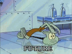
However, it's not just shapes that affect how we identify certain things; colours also have particular aesthetic associations as well. Way back in the early days of Spongebob Squarepants, there was an episode where Squidward somehow ends up in the future, and aside from the five clones of Spongebob, the biggest difference between the present and the future was that everything was chrome silver. Literally everything.
And Spongebob isn't the only form of media to portray the future in the classic silver colour that we're (mostly) familiar with. Many illustrated works of art in the late 20th century used various shades of silver, blue, and in some cases, green to colour the world of the future.


Deus Ex Human Revolution and Mankind Divided environment concepts
By combining colour schemes and shapes, artists can create unique atmospheres. As an example, cold, dark colours mixed with hard lines can create bleak environments such as a prison, or in some cases, an office building. In contrast, warm colours with reflective surfaces and curved edges can create a warm, worn-in look that's inviting to the viewer.
Items also adhere to this principle of colour/shape association. For instance, healing items, for the most part, tend to be curved and soft-looking, almost like gelatin, and are usually brightly coloured.

Similarly, weapons or any items of a violent nature are mostly comprised of hard, sharp edges, and cold, dark colours. Naturally, as there is no written rule declaring that "all healing items must be bright and soft-looking", or that "all weapons must be sharp and cold", there are many exceptions in real life and video games, such as rapiers and the arsenal of Halo 5.

Rapiers are a type of sword that is meant primarily for thrusting, while carrying an air of elegance.

Halo 5's collection of weaponry from each faction
There are three primary factions in Halo 5; the Covenant, the UNSC, and the Fore Runners, and each has a particular aesthetic, or theme, that translates into their weaponry. For example, the UNSC's guns (first and second columns from the left) are very blocky and utilise dull colours, whereas the Covenant's weapons are far more bright and curvy.
So now that we're aware of how items and environments follow this "colour/shape association" principle, how exactly does this apply to character design? Well, using these three shapes, can you guess what character this is?
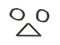
A little confusing? That's okay, let's a combination of a circle and a trapezoid!
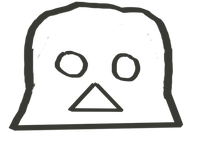
What about now? No? Alright, we'll add in another triangle and rectangle with a bit more detail.
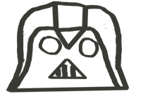
Okay okay, I'm not the best artist, it's true, but I'm attempting to draw Darth Vader. Simply put, Darth Vader's helmet, or rather his face, is made up of two circles and a single triangle (and a trapezoid + circle if you count the shape of the helmet).

![]()
But Darth Vader's face is made up of shapes associated with energy and youth! Granted, triangles are evil and only evil people use triangles, but Darth Vader is the face of terror in the Star Wars universe! He conveys strength and terror, how could he have CIRCLES for eyes? Well, now you're asking the hard questions! Although Darth Vader's eyes are very circular, they may also evoke feelings of unease; staring deep into your soul, never blinking, and always watching.
Despite each shape having its own associated connotations, combining various shapes together results in something else that has an entirely different feeling. It's important to remember that as artists and designers, using shape and line combinations can create unique characters that fit into your world.
Chris Solarski's article on the aesthetics of game art: http://www.gamasutra.com/view/feature/185676/the_aesthetics_of_game_art_and_.php?print=1
Read more about:
BlogsAbout the Author(s)
You May Also Like