Daily news, dev blogs, and stories from Game Developer straight to your inbox
Sponsored By
Featured Blog | This community-written post highlights the best of what the game industry has to offer. Read more like it on the Game Developer Blogs.
Today most popular mobile games have a progress map. This article is our walkthrough of making the art work of one Match-3 game map.
5 Min Read

We’re making map art for a Match-3 game recently(working as art vendor). Thanks to the excessive kindness of our client, we are allowed to post some unreleased contents here, to share the walkthrough of making one map, under the condition that we don’t mention their company and the upcoming game name.
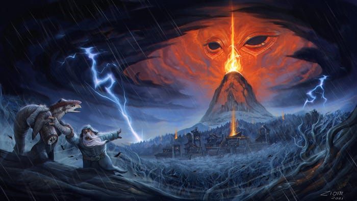
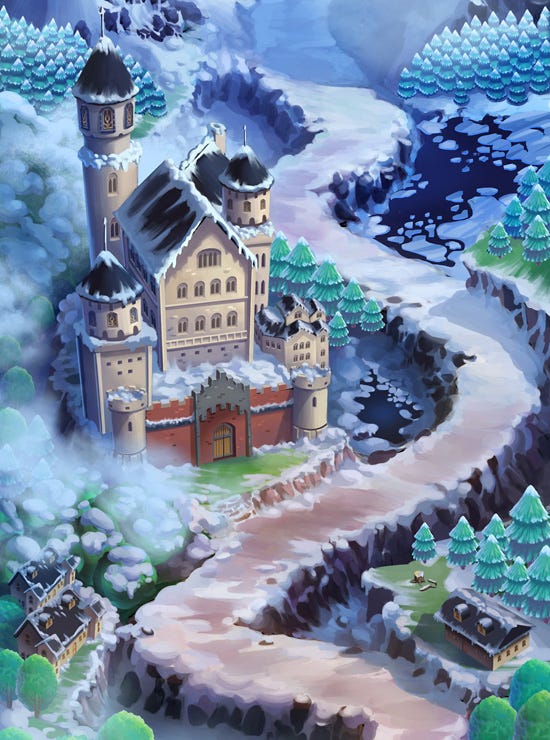
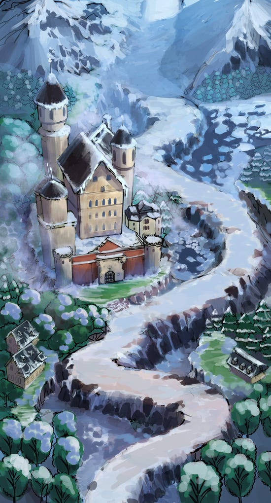
The game is for mobile, and the map is the popular vertical scroll format. This map features a difficult path goes through the wilderness of Bavaria area. The art style is like this:
1.Concept stage:
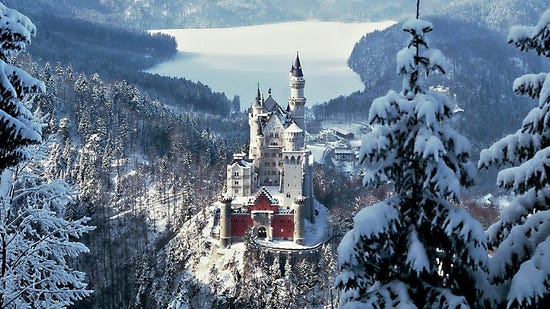
We get inspiration from photos of this area, and some concept art from Disney’s Frozen. The most prominent feature of this region is the beautiful Neuschwanstein Castle, frozen mountains, lakes.
2.Layout stage:
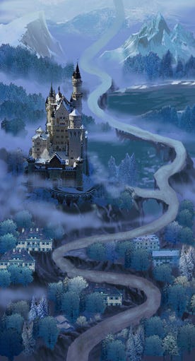
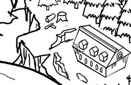
Before drawing line art for the map, we need to block out the layout in a quick way. We piece up some photos, adding some rough painting. You can see the perspective doesn’t fit into the final map, it doesn’t matter. When you make the rough layout for your map, you can use all the drawing styles which are convenient to you.
On this layout, we would mind the horizontal position of the path entrance and exit points(the client would specify it), because the path should connect seamlessly to the previous & next maps.
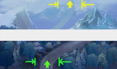
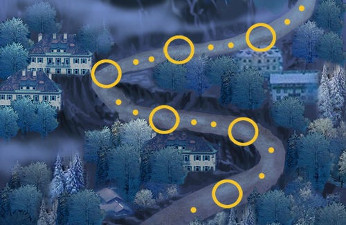
And the length of the path should be carefully planned, to accommodate the level nodes on it. The client would tell you there are how many levels on this map, and give you the level icon to place on the map. We would try to place the icons on the layout, the interval between levels should feel comfortable, not to make the path too crammed.
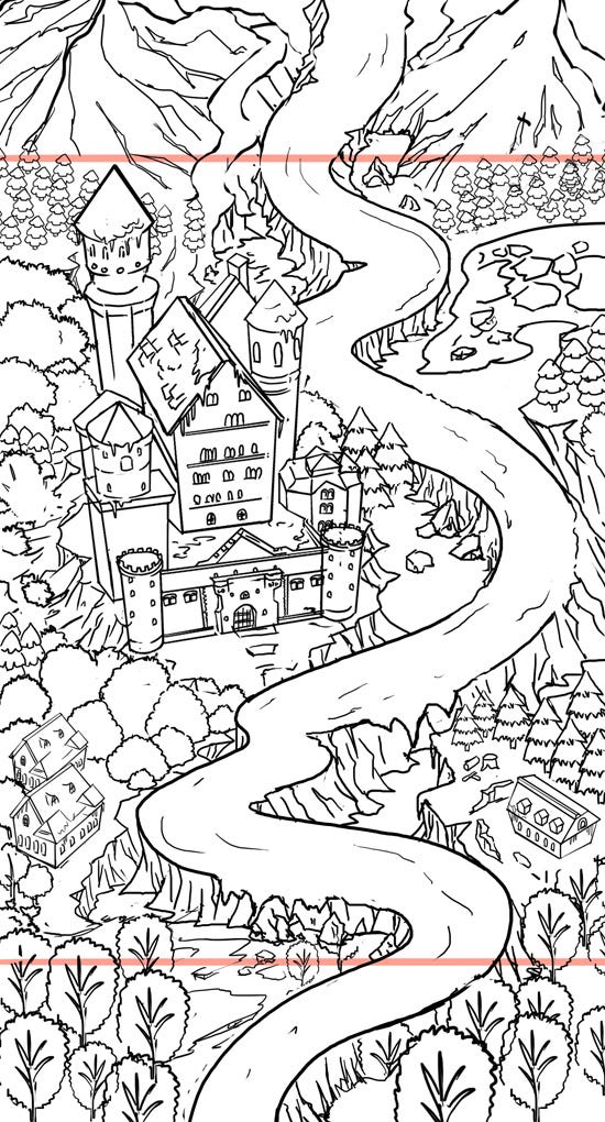
You may note that this map is a bit longer than an iphone’s screen. The bottom and top portion is used for map transition. In finished art, we paint these areas too.
3.Line art stage:
Line art is the basis we use it to color the picture, work up to the production quality picture which we use it in-game.
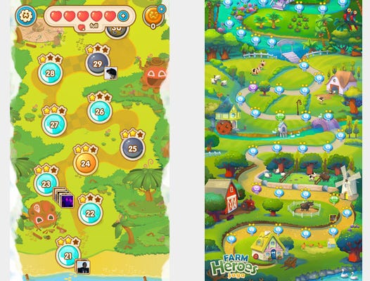
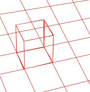
The line art should fit to the perspective of the project definition, for example, the perspective of Jelly Splash map is almost flat side view, while Farm Hero Saga map uses a 45 degrees high angle.
Here is the picture we use to establish perspective, of course this fit to all the previous maps of the game.
And at this stage, we should give everything well defined design. Actually we don’t make a single thing purely out of imagination, we always base the design on real world reference. And do some cartoonish exaggeration, to make the design fit to the style of the game.
And it’s important to populate the scene with small things. For example, if the scene is an old Chinese street, we can put in flag posts, stools, snack booth, barrels, lanterns. They would make the picture rich and interesting. For this Bavaria map, the landscape is dominated by mountains and woods, it seems not much small items could be added. Anyway, we try to add small things, like this ax and fire wood.
4.Color design stage:
This stage is to establish color & mood, not much to say, it takes around one day’s work.
5.Final painting stage:
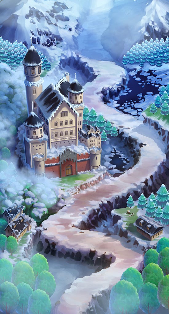
The painting style of this map is not lavishly rich, however, every single object needs to be carefully treated: to use a few gradient of color to convey the hard/softness of materials, to roughly depict every detail, to give light and backlight. It’s a work which demands great patience, because the picture is made for HD devices, that too many objects and too many details need to be treated. For I can’t post a whole HD map on this blog, I just post a few enlarged areas here:
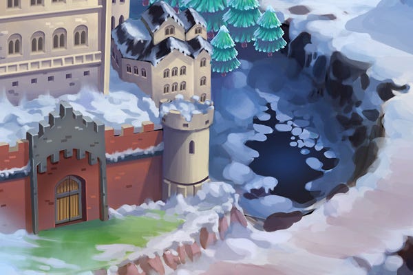
And each stroke should be crisp, no blur is allowed. For the map will be displayed on retina screens, all its details will be clearly seen. For this map, no photo texture is used, every pixel is brush work.
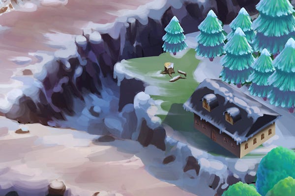
And we use lots of duplicated things. For example, we painted only three different trees. Then add more paint to each duplication, relevant to the position and lighting condition, that they don’t look repetitive.
One last thing is very important: to make things in layers. For example, here the castle, the houses, each cluster of trees, etc, all have their separate layers. The client would ask for a well organized PSD with unflattened layers, that they can make adjustments: you know, they always need to make changes in fine tuning the game play.
If you like this post, please see more of my articles and follow me here...
I would post regularly--one article every two weeks, about game art production.
Share this article:


Read more about:
Featured BlogsAbout the Author(s)
You May Also Like