Featured Blog | This community-written post highlights the best of what the game industry has to offer. Read more like it on the Game Developer Blogs.
How to use UX Patterns like Fitts's Law to sucessfully improve on your in-game UI.

Preface
User Interfaces (UIs) for action-oriented gameplay such as Overwatch and Battlefield have the unique requirement to provide the player with all game-critical information without distracting them from the game's action. In this article I will describe user experience insights that I obtained while we created Dreadnought’s combat HUD. Generally speaking this essay details how well-known user experience pattern analysis approaches such as Fitts’s Law can be modified to be applied to action game HUDs.
Before I go into detail I think I should mention a few prerequisites to get the most out of my observations I have made in the last two to three years. I will heavily reference a concept brought to life by Jef Raskin, a legendary expert in computer-user interface interaction; he coined the term “locus of attention” in his fantastic book “The Humane Interface”, which I will shamelessly use to avoid confusion about intersecting terms.
To give a short summary of what it means, locus of attention specifies the physical entity or location your mind is currently giving its full attention to, both in a conscious manner or unintentionally. Most other terms as for example “focus” or “target” imply a large degree of making a conscious decision to put your attention towards a specific place or entity. This is an important differentiation, because an ingame UI needs to be able to get the user to shift a player’s locus of attention, without them having to make a conscious decision about it.
I wholeheartedly recommend to read his book since it despite its age and technological advances made it still has a lot of insight a user interface or user experience designer can apply to modern digital interfaces.
Fitts’s Law can be applied to in-game HUDs, in a modified form
For those unfamiliar with Fitts’s Law, it is one of the most fundamental scientific methods to evaluate and make predictions about the practicality of any interactive element; both physical and digital. As such, it allows making relatively solid prognoses about the usability of a UI element even before implementation into a menu or game design.
The equation is centered around an easily measurable index of difficulty ID; essentially, it states that interface elements that require the user to travel a greater distance ( nominated as Amplitude A ) and if additionally have a smaller size ( nominated as Width W ) are more difficult to use, thus have a higher index of difficulty and vice versa a lower index of performance. Similarly, smaller distances and larger elements result in a lower index of difficulty. In the Shannon formulation [1] of Fitts’ Law the ID is then calculated as provided below (or in Fig. A).

Fig. A: The Shannon formulation of Fitts’s Law
For a comprehensive explanation I recommend watching this video [2] which illustrates the law well.
The Shannon formulation caters more strongly to active, conscious use of an interface, be it physical ( buttons on a device or machine, levers etc ) or digital ( all common UI components like menus, buttons, sliders, scrollbars & so on ) naturally, it is less suitable to gauge how a UI may perform passively providing information to a user’s conscience as the player might not actively look for this information. However, as I describe below, this can be achieved as well by making a few relatively straightforward replacements and modifications of the original equation. I further note that in the following I will denote both types of UIs as interaction-based (user manipulates buttons and so on) and information-only (user passively consumes information), respectively.
In order to make meaningful modifications to Fitts’ law it is useful to look at how the user will interact with interaction-based and information-only UIs. On one hand, when actively using any UI that requires pointer input, the user will effectively move their locus of attention to the UI element they choose to interact with. For example, clicking a button, opening a submenu will always require some degree of conscious effort, thus the required shift of attention is initiated directly by the user. On the other hand, for the purpose of an information-only ingame HUD, the shifting the attention of the user has to be triggered by the UI. Most notably, for ideal performance, our intent is to create a UI with its elements positioned in a way that they can pull the player’s locus of attention briefly towards themselves when needed, yet allow them to easily return to the ingame action with all the information to keep them performing well.
In essence, the alteration of the index of difficulty I propose for a information-only ingame UI denominates how well the UI element in question can shift the locus of attention and transport the information effective and fast enough so that the player can make good use of it.
It is important to notice that I am making assertions about action oriented games like Dreadnought, which traditionally have their inert locus of attention bundled at the centre of the screen. This is a crucial aspect to have in mind when designing UIs of this type, specifically due to the nature of how our brain filters out information in the corners of our vision; placing UI elements to the corners of the screen may result in potential decrease of user attention compared to what had been originally intended by the designer.
I will now go a little deeper into the actual modification of the Shannon formulation and its implications. To make Fitts’s Law viably predict usability through its index of difficulty we need to replace the original meaning of amplitude when dealing with an information-only UI. Our eyes move so fast and irregular to create our field of vision that we can disregard physical distance as a factor; we will replace it with a compound variable that is more catered to a information-only UI structure.
Amplitude A will from now on denominate the strength of a visual indication or signal alteration. A useful way to think of this amplitude A is as a way to describe our brain’s signal to noise ratio. The stronger the change in visual appearance of an element the more likely it will be that we shift our locus of attention towards it.
This also highlights why A is defined as a compound variable consisting of several parameters and variables, because the brain’s interest into a visual input may be triggered by change of size, color, movement, noise and so on of an object. To give an example that we may use in a HUD, A can include factors like the percentage in contrast, in- or decrease as well as the delta of a colour or brightness change or simply just size changes within the HUD; everything that would result in higher or lower visual stimuli and as such a quantifiable event which could in turn invoke the user’s attention.
All these factors may be multiplied together to give a better understanding of the actual gravity of an element’s index of difficulty. If you need further precision about which of your visual indicators make the largest difference to your amplitude, consider checking the same equation solely with this isolated parameter as its amplitude. This, in turn, would allow weighting each variable that contributes to A with a weight.
Additionally to amplitude we need to introduce a new variable to this equation: Distance D, which will provide the distance of the primary locus of attention of your game to the element in question. Your primary locus of attention is the focus area you have determined your user will spend most of their time having their full attention on. In FPS and TPS games this will most likely fall into the center of the screen. To give predictable results that match the accuracy of the original equation we will need to divide the distance with our compound amplitude.

Fig. B1: A modified formulation of Fitts’s Law for use in-game UIs
This has two distinct advantages. We can conclude through empiric measurements that UI components closer to the primary locus of attention do perform significantly better in invoking temporary shifts of the user’s locus of attention. In addition to that the closer this widget is positioned to the current locus of attention the further we can significantly reduce the actual amplitude to get it registered by the brain’s visual cortex, which then allows the player to stay focused on the actual gameplay
There is actually a very easy experiment that allows you to experience these effects first hand. All that it takes is time and a volunteer to help you out. It will require your full attention towards a single thing or task, so if you two might as well do this while you work. Your helper will need to wait with his tasked duty until they deem you being focussed enough on a task of your choosing. They should then start with a low amplitude trying to shift your locus of attention towards themselves. You will come to see that if your helper tries to get your attention with a low amplitude while being at the edge of your field of view it might take some time to get your attention. Similarly if they are closer and their amplitude is huge, you might even get startled through it. So there is a definite sweet spot your UI elements need to be designed for with respect to position and amplitude.
To illustrate this rather dry topic a little more vividly I will now describe two distinct cases where Dreadnought’s combat UI vastly benefited from a rework of UI components with a lower index of difficulty. The first elements I want to talk about are two of our most critical UI elements in the entire HUD; the player’s ship health and their ship’s energy. In our initial prototype we had placed both elements to the bottom centre of the screen. This happened with the intent to not stray too far from FPS shooter players’ habituation patterns; yet to also have the benefit of better visibility due to the elements being closer to the player’s locus of attention during heated gameplay. ( see Fig. C1 )
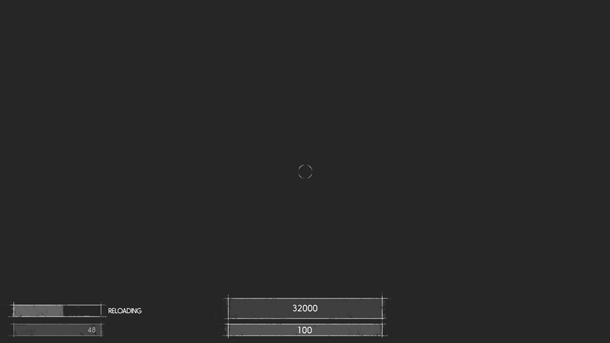
Fig. C1: Our original positioning for our health and weapons UI components.
Our internal testing brought concerns of the element not being visible enough. Our team members started to ask for the display to be moved to a place that was more commonly associated with health displays in first and third person shooters; namely the lower left and right corners of the view frustum. So what we saw that despite our hopes for a better than average placement of our UI elements did not give us the expected result; it just did not perform well enough to override the habituation of experienced players.
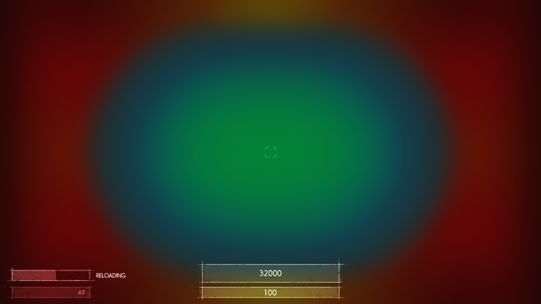
Fig. C2: Approximation to illustrate areas that will require higher amplitude
levels to shift the locus of attention. Green and blue denotes the areas a player
will actively scan when they are immersed into gameplay; red is the area they
will most likely not notice changes too well.
This triggered our team to think about evaluating and predicting the performance of elements of a information-only UI more carefully, which eventually lead to the insights summarized in this article. Notably, we started to tackle the problem through testing of how we could place the UI elements in a way that both breaks through the habituation of experienced players and similarly creating a better user experience for casual or completely inexperienced players.
What we ended up with has been a solution that both bolsters the fantasy of commanding a large space vessel; through stronger visual style as well as increasing usability. Moving elements into a position that made them present to the user at all times gained us the ability to briefly shift their locus of attention away from the actual combat without hindering their overall performance. In a nutshell we placed two arc slices mirrored around the area where the ship’s dynamic crosshair will reside in most of the heated combat situations. ( See Fig. D1 )
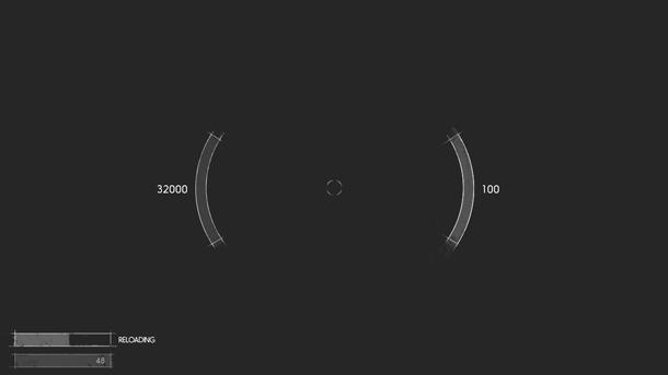
Fig. D1: Our improved health and energy widget.
It allowed us to greatly reduce the actual size of the elements since they were a lot nearer to where the player’s attention circled around for most of the time anyway; we also increased the signal to noise ratio by using coloured delta arcs to better illustrate critical drops in health or energy. This, in turn, helped to shape both our amplitude to more desirable levels without straining the user’s eyes; managing to anchor the element within a minimal distance to our primary locus of attention. In the end users benefitted by being able to react a lot quicker to certain combat situations. ( See Fig. D2 )
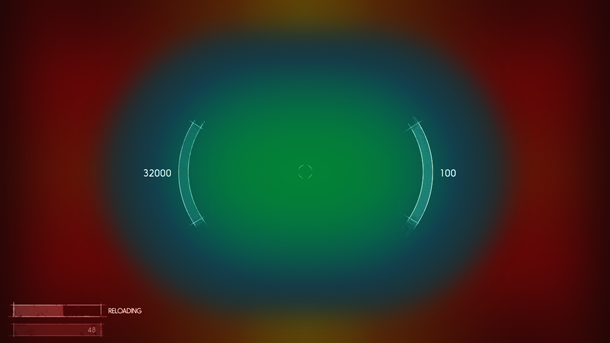
Fig. D2: Our improved components clearly reside nearer to the center of the primary
locus of attention.
As shown in Fig. D3 we managed to significantly reduce the index of difficulty. These improvements of at least 400% are achieved through the combination of both our amplitude improvements of roughly 4.5 times the amplitude we had used in our old component as well as the optimized positioning.
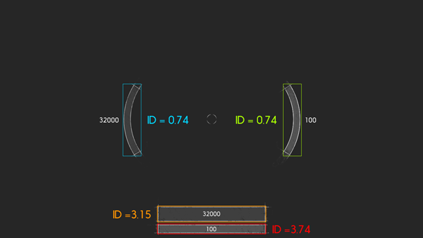
Fig. D3: Respective index of difficulty values for our old and new health and energy
components. Lower values are favorable.
The third component was our weapons display. We took a similar approach in fixing what was not performing as we wanted; in the end this gave us a HUD that was both balanced a lot better visually, but also transported the information the player needed a lot more efficient.
The initial placement had been in the lower right corner, like so many games do as well. A lot of our alpha players, testers and developers gave us feedback that they were unsure though, why a weapon would reload at a particular point of time; similarly it took them way too long to determine if a weapon still had enough ammo left. This tremendously reduced their ability be successful in their current battle.
To alleviate the performance of our component we chose to split the primary and secondary weapon UI into their own respective visual areas; we docked them right next to the health and energy indicators I talked about before.
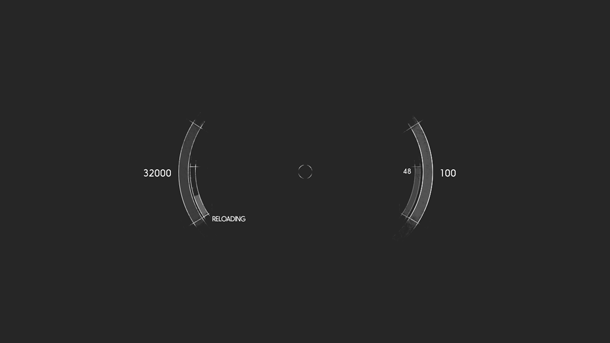
Fig. E1: Our new weapons display positioning.
Additionally we did not show the weapons name permanently anymore, yet only when a weapon switch or spawn into the game occurs. This led to about 60% of the original components space being able to be freed up, but also a way to more consistently inform the player of the current state of both of his weapons; It is now a lot more easy to tell which one is active and we achieved a greater signal amplitude when the reload notifications of any of the weapons is shown.
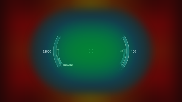
Fig. E2: All core components clearly within our established optimal vision cone.
Ultimately we made sure that players can react even faster to feedback when they choose their zoomed in weapons state. Since it reduces their in-game field of view we wanted to make sure they gain a little more awareness of their own ship’s current state. To achieve this we move all elements located around the locus of attention even further into the centre. Now even players of our sniper classes can react to possible threats in their vicinity faster than before.
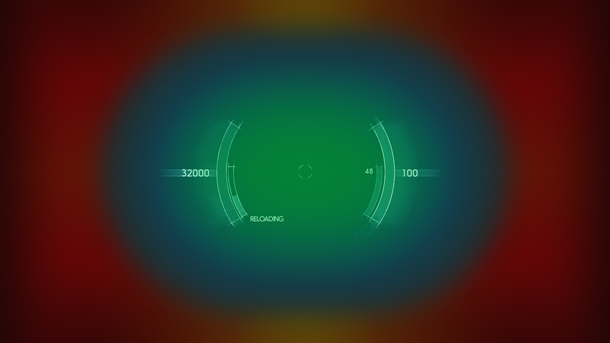
Fig. F1: Our “zoomed-in” state that increases readability in high focus situations.
I have to be honest, I did not have this equation ready at my disposal when we chose to execute this recent iteration of our HUD; though I do not want to discredit the validity of our assumptions at the time, since we could clearly see improvements in the ability of players through those changes.
Nevertheless, it has always bothered me that our understanding of why this is the case was very limited, to say the least. Thus, I started to look into possible scientific explanations. I feel that having gained this knowledge makes planning and design periods for upcoming projects a lot less tedious and more likely to produce the predicted outcome.
One last point I wanted to mention is that finding a good balance of your layout and sizing is crucial. Of course greater amplitude and size of your components will result in better usability of those components, but they in turn might decrease the usability of others; it’s a fragile balance, yet the tools I mention here can alleviate a lot of the headaches to get to a good point up front.
Habituation, you know where the door is! But please come back later!
Please mind that this next section is based on my own experience and there are a plethora of differing views on the topic; which all do have their own pros and cons. I do not claim to present the solution to all information-only UI questions to you.
Often times placement of rather important UI elements is based on previous habituation patterns. This is not necessarily bad as such, but habituation can severely hinder better UI/UX patterns to permute and become accepted by wider margins of the games developer circles. With it we can easily manage to parallelize tasks we would otherwise need a lot more time for. This is a double edged sword though; users might vastly benefit from better user experience patterns, yet if developers decide to stick to non efficient yet commonly used UX conventions we can see gamers that are new to the genre struggle a lot more than they should.
In the end I firmly believe in this rule of thumb: if an experienced and seasoned games developer can adjust and make use of the new pattern rather quickly, experienced players will have little to no problems doing so as well. The worst mistake you can make is to think your own users won’t get it. Never treat them as simple minded or even stupid. Just seeing how many multiplayer games have had “wow” moments where players found ways to play games in ways they were not meant to be is the best example illustrating that gamers come prepared to those kind of tasks. In the end it is all about making the game more accessible to all types of players and UX improvements usually benefit newer users the most.
To give you a practical example about this, I will use the most prominent occurrence I can think of and which is in my personal opinion one of the greatest faults of one of the oldest genres of video game history; The health bar in first person shooters.
A lot if not the majority of past and present FPS games place their health display into either the lower left or right corner of the screen; as we determined in the first part of this article this in turn makes it harder to shift your locus of attention towards the widget while still being engaged in heavy action gameplay.
As you can see ( Fig. G1 ) they are clearly outside the “focus cone” we have established sub-optimal for our game ( see Fig. C2 ). By no means I want to say this is a generally bad position, but always be mindful about what the gameplay ramifications of such a position are; and similarly check if this position lives up to the intentions you have established in collaboration with your game designers.
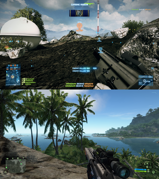
Fig. G1: Health UI widget in popular FPS games.Note that what we very often see as means to alleviate this problem is a meta solution; Think screen edge post effects - e.g blood splatters on your “camera lens” when your health gets to a critical level; you can see a few examples in Fig. G2. Depending on their strength, this might introduce other problems though; it might have a negative effect on how people with disabilities, like color blindness, perceive the game. Meta solutions like the one mentioned work pretty well in general but also poses the question: does it do a better job than the actual health bar; and if so, why is the health display even present? Popular games like Call of Duty seem to answer the question with a solid no. If you do need it though, you might want to think about your own health bar’s positioning and sizing.
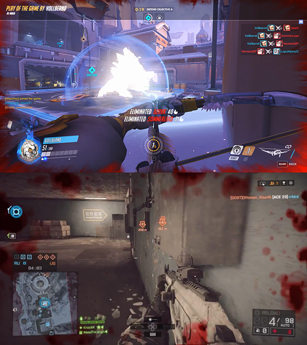
Fig. G2: Meta solutions for low health display in modern FPS gamesMy suggestion towards game designers, UX experts and UI artists is to gather all elements that have popular implementations or habituation patterns in other games; the reason for is that they might or will intersect with the type of game your are developing; analyse those elements, and be honest and open when it comes to finding flaws in those use cases.
If you have doubts about the component not being able to perform according to your requirements , flag them for a design iteration. Be both patient and bold about it; use your knowledge of Fitts’s Law and other UX patterns to find ways to create a component with a lesser index of difficulty. As soon as it is in a testable prototype state, get your team to try it out. Very often with elements that have popular implementations though, there will be resistance to new designs at first. That feeling might even affect you yourself, since it is very easy to fall into the trap of “it has always been done like that!”. Try to resist that urge to return to the old component straight away and engage in a little experiment first.
I observed this effect in the last year during the time we did our weapons display iteration. I think it holds one of the major keys to both finding the better UX pattern as well as to get users to adapt to UX patterns more quickly.
The major part of it is tricking our brain to give up some of its habituation. Through testing two variations of a UI element in parallel, we can bring down entry barriers I mention before. Make sure the testing cycle randomizes the use of either variant. This results in our brains not being to consistently make use of what we had internalized before, due to different requirements of the UI towards the player.
The key indicator now is to check how long it takes a player to get back into their habituation; usually the better UX pattern will be the one a player can return to more easily and will reach their comfort zone a lot quicker compared to the inferior design. This is a pretty easy and quick way to find a superior solution catered specifically towards your own game’s needs.
Prototypes are life-savers
This might sound like a no-brainer to many of us, still I think this is a hugely underused tool within game development, so I feel I should just give a few hints of why you might try to get this into your development cycles.
I cannot stress enough how important it is to have a working prototype of your HUD available as soon as possible if those elements have vast implications to your gameplay. It is a very good way to find out cut-off points for the player’s need for further data; more is not always better when it comes to the very fragile ecosystem of a screen space limited UI. Early prototypes can give you clear and easy indication what will help or rather confuse your user base.
Early prototypes are by far the best tool at your disposal when it comes to making good UI. Further get your team into the mindset that a prototype has to functionally work as intended, but not be as pretty the final product. Even though this seems to be evident, I had a lot of situations where co-workers were claiming they needed “final art” for prototypes; it’s a bit silly though, all relevant personnel that creates a certain feature should have more than enough abstraction abilities to judge if a feature is working without all icons and elements being 100% polished. Ironing out kinks in this stage should still be relatively easy compared to a UI closer to its final look. The ability to quickly make changes until your games feels great to play can make all the difference to your players in the end.
Conclusions
In closing I can say I am glad that we ended up with such a functional and clean HUD despite its need for a lot of data being displayed at some occasions. Even though I did not have the conclusive background knowledge to back it up due to it being a first time venture into this genre of games, I feel it’s great to now have these tools disposal for future projects.
I am also aware that not every genre can and will be able to apply similar optimizations to its ingame UI; yet I strongly believe that every game designer and UX expert can draw a few conclusions with these tools that can increase their users' perception of the UI and the game itself.
References
[1] Bits per second: model innovations driven by information theory
Read more about:
Featured BlogsAbout the Author(s)
You May Also Like


