Daily news, dev blogs, and stories from Game Developer straight to your inbox
Sponsored By
"Although there is a strong urge to use as many real-life interactions as possible, this gets physically tiresome quickly. Make sure you require the least amount of strain to play." - Paul van der Meer, VR game designer at Vertigo Games,
9 Min Read

The Gamasutra Deep Dives are an ongoing series that aim to shed light on how specific design, art, or technical features within a video game come to be, in order to show how seemingly simple, fundamental design decisions aren't really that simple at all.
Check out earlier installments, including creating drama through a multitude of simple tasks in Bomber Crew, or maintaining player tension levels in Nex Machina, and achieving seamless branching in Watch Dogs 2’s Invasion of Privacy missions.
Who: Paul van der Meer, VR game designer at Vertigo Games
I am a game designer at Vertigo Games and in cooperation with Wolfdog Interactive I have worked on the VR strategy game Skyworld. My previous game design experience is very diverse, working on a hack-and-slash console game, on applied games for several platforms, and even designed a physical card game.
Over ten years ago I wrote a student post-mortem for Gamasutra’s Game Career Guide for a FMV adventure game. So, hello again.
What: Creating comfortable and flexible VR UI for a strategy game
Skyworld was demanding from a user interface perspective for two reasons: it is a cross-platform VR game, and a VR strategy game.
We developed simultaneously for the Oculus, HTC and Microsoft Mixed Reality headsets. Whatever UI we came up with could not rely on too many buttons, because the amount of buttons between controllers varies. More importantly, what felt right with one controller, was less comfortable with the other, and intuitive controls are especially important in VR.
In a strategy game you need a lot of information to know what’s going on. This information flow was a constant challenge and influenced all of our design decisions; from the shape of the battlefield (a round table, in our case) to the panel-based interactions. Everything boiled down to three questions, even if we did not know it at the time.
‘Which info do we need when?’
‘What is the most direct way to present that info?’
And, ‘What is the most comfortable way to get that info?’
We ended up with a flexible and comfortable ‘world-based’ interface, without resorting to visual metaphors for all interactions.
Why?
Let us take a look at the implementation of two major features in the game: the round table and the panels.
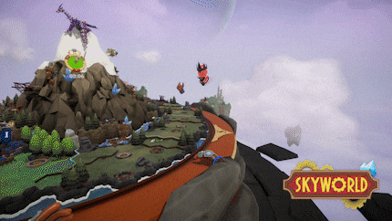
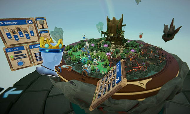
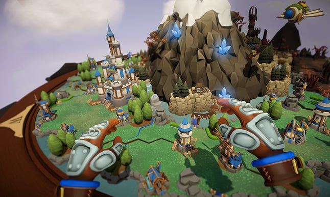
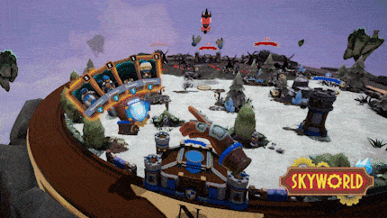
The Round Table
Skyworld has a very board game-like feel, a lot of this has to do with its layout. In a way it is immersion breaking to place the game on a table and not in a seemingly endless world. But this lesser immersion is not perceived as such. In fact a little distance is exactly what you want in a strategy game.
Which info do we need when?
Obviously you need room for your empire. But you also need a good way to navigate and oversee it. Finally you need ways to interact with it. But you do not always need to see your empire. For instance when you are doing something very specific, like setting your taxes. In those cases we flipped the table to create the workspace to focus on that task.
What is the most direct way to present that info?
When you see hands as input devices (we didn’t have any virtual tools) you use them like you would use your hands. A round table with a large border screams to be rotated. Less obviously, even the surface itself can be grabbed and moved away from and towards the player. If the input for the game matches logical hand behaviour in real life, use it.
In the end we needed the input schemes to be as basic as possible, which is always a good idea.
What is the most comfortable way to get that info?
By having the omnipotent view and the ability to rotate the board you can get across the entire playing field without getting out of your chair. Also the fact that only the table rotates and not your entire view minimizes possible nausea.
But some players wanted to grab objects in the world, for instance the General pawn, and go “full board game”. When standing up with a Vive, this is the most natural way of playing. But when you are sitting down this becomes an issue since you have to lean forward and accidentally punch out your monitors.
But we had to accommodate both. This is where ranged interaction came in (not called force-grab for copyright reasons, jk). We are still using objects that are placed in the world, but you can grab them from a distance. And when this object, a General pawn, is in your hand you can place it in the distance as well. We show this in the same way as you would show a teleport, with a beam and a reticule.
By allowing this ranged interaction we increased the comfort for the people who didn’t want to stand up or lean forward.
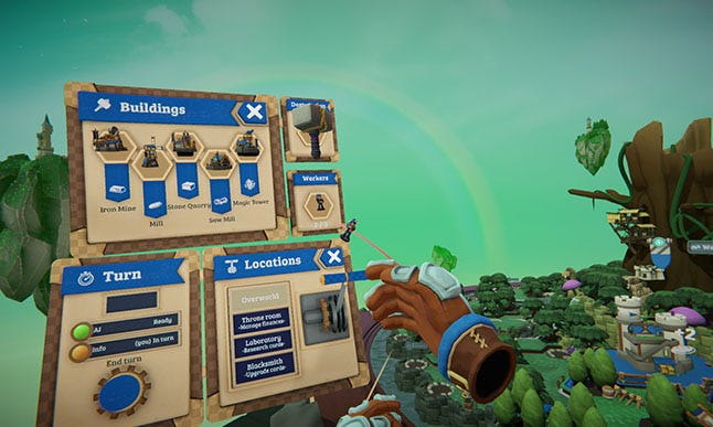
The Panels
The old fashioned way of opening up info in a strategy game is by pressing buttons that open panels. We ended up using panels too. But that was only the beginning.
Which info do we need when?
Much information was either abstract or high level so that adding it to a single object in the game world didn’t make sense. Things like: the happiness of your people or the total wood production of your lumberjack huts. And placing it above the world hurt the neck. In general showing all high level info constantly became very messy and unclear. No one wants to see a spreadsheet all the time. But you still want that info as fast as possible.
What is the most direct way to present that info?
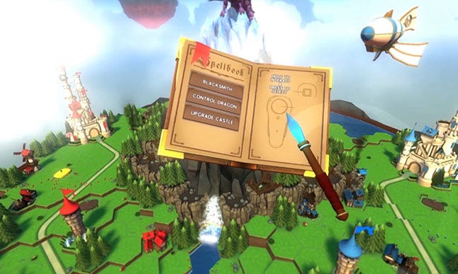
First we had a large spell book that was constantly open and attached to one of the controllers. But this felt cumbersome holding up, required flipping pages back and forth and reduced your available controllers to just one. Not very comfortable nor direct.
Then we tried out a plateau with a fixed place on the circumference of the table: go to the plateau and use the panels. But having to rotate the table to get to that plateau proved way too time-consuming. More comfortable, but even less direct.
It needed to be accessible all the time. Meaning the location of players was irrelevant. And players needed to be able to choose when to get it.
What is the most comfortable way to get that info?
This left a couple of options, either trigger the panels with a hand motion, or use a physical button on the controller. We chose a combination. By holding down a button (or touchpad) four small items float around your hand. Move your hand slightly towards one of them and you automatically select a panel that attaches itself to your hand until you let go. And when you do it is positioned in the world relative to the player so it is always nearby.
This meant that the player was in complete control of the presented information. The panel was pinned in the exact place of preference of the player and could be dragged or closed again. It sometimes got cluttered, but at least the player was always in control.
In testing we quickly realised that players had their own points of preference anyway. One player liked to stash the panels, another had them all open constantly, a third one opened a panel and closed it as soon as it was no longer needed. Which is why it turned out to be so important to offer a flexible way to get to the information and not force one down players’ throats.
Design for comfort
Although there is a strong urge to use as many real-life interactions in a VR game as possible, this gets physically tiresome pretty quickly. It just wears you down having to constantly grab things from behind your back, or hold down a button to hold a gun in a game. Although this is not gospel for all VR of course, the type of game greatly shapes its interaction. But for our more laid back and longer strategy experience we needed a system that was as comfortable as possible. This is why, for instance, you do not hold down any button to show your hand of cards during the battles, even though holding down a button would rationally make more sense.
We do have levers that you need to move physically, but since you do not use them constantly it does not become tiresome and remains a fun VR interaction. We tried to strike a balance between using your hands, this is VR after all, and a more traditional point-and-ranged click interaction.
But as a guideline make sure your game requires the least amount of physical strain to play. Do not make players cross their arms, crane their neck or hold their hands in the air for longer than necessary. This not only vastly improves the time your game can be played comfortably, but it also makes the game more accessible to differently physically abled gamers. Although that topic deserves an article and attention in its own right.
Design for flexibility
One of the key recurring conclusions was that players play in different ways. And just like the real life design of doors, cars, traffic lights etc. we have to take into account all sorts of body shapes and sizes and left-hand vs right-hand preferences.
We are not sure on which device they will be playing the game and if they will be standing up or sitting down when they do. In short, if they want to sit down and lean back, let them. If they want to get up and lean in, allow it. Are they left handed? Make sure your interface is equally suited for left-handed people. Apart from the battle arena, our entire game has completely symmetrical control schemes for both hands. And even for the battle arena the preferred hand can be switched.
Obviously it is more work to include multiple ways of interacting. But the more flexible your interaction is, the more a player can adapt it to their own preference.
Result
VR is a very new medium, but borrows from a lot of existing disciplines, both in real life and digital interaction design. Build the game for all kinds of users in mind and make sure they’re as comfortable as possible.
Unless you make a fitness VR game, in which case: make them sweat.
About the Author(s)
You May Also Like