Daily news, dev blogs, and stories from Game Developer straight to your inbox
Sponsored By
Featured Blog | This community-written post highlights the best of what the game industry has to offer. Read more like it on the Game Developer Blogs.
A great way to enhance a gameworld's believability and atmosphere is to make a custom alphabet for it. I've recently designed a complete alphabet for Spryke, and I'll take you through my whole process.
13 Min Read

 A screenshot from Spryke, showing various uses of its custom alphabet.
A great way to enhance a gameworld's believability and atmosphere is to make a custom alphabet for it. The written word is all around us, and plays a major role in making our world look and feel the way it does. A unique alphabet helps make a unique gameworld.
Anyone who's ever tried designing a font knows how difficult it is. Our brain is very sensitive to disturbances in the flow of readability, and each tiny alteration to curvature or line thickness can mean the difference between elegance and awkwardness.
The good news is that the rules are much looser when designing a fictional alphabet, and it can be very fun. But there's more to it than just throwing down some random squiggles! I've recently designed a complete alphabet for Spryke, and I'll take you through my whole process.
The benefits of adding a custom alphabet to your game
First off, let's take a look at some reasons you might want to design a custom alphabet for your game.
Written language is everywhere, and is a key component of culture (even its absence in oral cultures is a key component of those). If you want your world to feel like it has its own living, breathing culture, then you need to think about its written language.
If your game is set in a fantasy or sci-fi world, your characters probably don't speak/write English. Which begs the question: what do they speak/write?
If your game is in a fictional present-day country, a bespoke alphabet shows that you've put some effort into making your country feel unique, rather than just lazily assembled a bunch of general racial stereotypes, à la the Just Cause and Far Cry series.
Your alphabet could be used as a sort of code that your players need to try and decipher. You could even base puzzles around it.
A fictional alphabet means you can populate your world with billboards, signs, and slogans, without having to actually write catchy and convincing content for those billboards, signs and slogans.
If you have a number of different cultures/races/species in your game, using multiple alphabets would be a good way to differentiate between them, even when the characters themselves aren't present. For instance, inscriptions in an ancient ruin could indicate the presence of a long-gone foreign race, while text on an empty space ship could emphasise that it belongs to an enemy.
Designing a bespoke alphabet is fun!
 Text says a lot even if you don't understand it. It conveys cultural and aesthetic cues, and can evoke familiarity, strangeness, simplicity, complexity, grace, order, and more.
Step 1: Consider your gameworld's culture
An alphabet's aesthetic and functional aspects reveal a lot about its creators. Its forms naturally spring from the traits of the home culture.
Take this ancient alphabet, for example:

Comprised mainly of sturdy, masculine shapes, these glyphs have a uniformity of size and economy of form that makes them seem almost engineered, rather than merely written. They are solid, upright, efficient.
Judging by this alphabet, one could imagine that it was created by a pragmatic, rigid culture that prized order, strength, and structure. And actually, that's not a half-bad description of the ancient Romans.
Now look at these characters from another ancient alphabet:

These lack the frugality and symmetry of the Latin characters, and are much more complex, intricate, and floaty. One could suppose that the culture that created them was one that cherished sophistication, artisanship, and nuance.
Now examine a third ancient alphabet:

These jagged, spiky shapes have neither the balance and structure of the Latin letters, nor the grace and complexity of the Chinese ones. Instead, they evoke an aggressive, almost savage vibe. And so they should; they are the Dovahzul alphabet: the ancient language of Skyrim's dragons.
Your game's alphabet can (and will) inform your audience about your gameworld. If your alphabet looks interesting, boring, complex, or frivolous, your game's inhabitants will seem interesting, boring, complex, or frivolous. Use this to your advantage, and make sure that it's communicating the message you want it to convey.
Step 2: Consider your gameworld's technology
Apart from looking cool and a little bit hostile, there's another reason the dragon alphabet above is comprised mainly of long heavy slashes: It was carved by dragons. Dragons didn't have pens, brushes or chisels, but claws, and the clever designers at Bethesda took this into account.
You may not have consciously thought about these logistics when looting Skyrim's tombs, but you probably noticed it unconsciously on some level. By considering not just the alphabet's personality, but also its logistics, the Bethesda crew designed an alphabet that feels right.
There are various technological factors that can influence a successful alphabet. These Anglo-Saxon runes were usually carved into wood, so they avoid curves and horizontal lines (straight lines were easier to carve, and horizontal lines could have caught in the wood grain and split the wood):

Conversely, this gorgeous Sinhala alphabet from Sri Lanka avoids straight lines and corners (Sinhala was written on fragile palm leaf paper, and sharp corners would have caused tearing):

As you can see, technological considerations can have a profound impact on the look of your glyphs. Paying attention to technological logistics won't just make your alphabet more believable, but may take it in an exciting aesthetic direction.
Some things to think about:
What tools would the people/creatures in your game use to write with?
What surfaces would they use?
Do they have an abundant culture that would foster artisanship?
Do they live in a dangerous world and use a minimalist alphabet that is easy to write in a hurry?
Spryke is set in a distant planet sci-fi setting, so my alphabet needed to look somewhat modern (as it would most often be rendered by precise machines, just like in our present-day world). It would also need to be alien and unfamiliar, while maintaining an element of fun to suit the cartoony vibe of the game.
Step 3: Research
There are loads of writing systems on Earth - possibly more than you think. Look through a few of them to get ideas about what your own will look like.

One of my favourite alphabets is this Mkhedruli alphabet (from Georgia)
 Another favourite is the Ge'ez (Amharic) alphabet, which I first saw on a hand-written letter from my Ethipian sponsor child. I had never seen it before, and I loved how beautiful and unusual it was.
So, do some research and get ideas. Don't forget to check out different fonts where possible, as they may employ different design solutions. After all, a traditional Japanese scroll will have a dramatically different aesthetic to downtown Tokyo neons.
But if you're like me, inspiration is just a few centimetres away!

Both of my arms are tattooed with a prayer written in Glagolitic, an ancient Slavic alphabet. Convenient! Clearly, I have an affinity for this alphabet, and so this is the one I chose as my starting point.
Step 4: Choose your elements
Most writing systems are constructed using just a few building blocks, in various combinations. It's a good idea to pick your building blocks before you start designing any characters. This will help you create a cohesive design while guarding you from relying too heavily on the shapes of your native alphabet.
Pick a few appropriate shapes that will form the backbone of your alphabet's aesthetic. Remember to peruse existing alphabets for inspiration if need be.
Spryke's alphabet needs to look a bit cartoony, and like it belongs to an alien race. My starting point of Glagolitic is actually a pretty good choice, because it's unique looking and looks quite alien to modern eyes, having gone out of usage long ago. In addition, its hollow circle and equilateral triangle motifs lend it a certain geometric look that fits well with my desired cartoony vibe. To make my alphabet a bit more hi-tech looking, I focused on straight lines and precise angles.
 I decided my core elements would be equilateral triangles (3 sizes), circles (2 sizes), and angles of 45,60,90, and 120 degrees
Step 5: Sketches on Paper
Next, I used those elements to doodle several pages' worth of characters, referring to my Glagolitic alphabet (ie. looking down at my arms) as I went. Some characters looked good, others sucked, and most took several iterations to find their sweet spot.

Step 6: Vectorise and finalise
Once I had loads of characters on paper, I went back through them and circled the 40 or so that had the most promise. I ported these into Photoshop using the vector shape tools (You could of course use Illustrator or some other software). After plenty of fine tuning and iteration, my alphabet finally took shape. I'd created 52 finished characters in all:

Some things to consider while working on your characters:
Keep line thickness as consistent as you can
If a particular character calls for it, feel free to deviate from your core shapes, angles, and line thicknesses. Just don't deviate from them thoughtlessly or by accident.
As with all design, the secret is in iteration, iteration, iteration.
Try all of your designs flipped or rotated - they might look better that way
Decide how the weight of your alphabet will feel. Will your characters be grounded downwards like Latin, pull toward the heavens like Hebrew, or float weightlessly like Chinese? I chose to centre mine weightlessly, as I felt that this made them feel more digital, spacey, and self-contained.
Only do uppercase/lowercase if you have a really good reason for it, as it'll double your workload. Many real-world alphabets only have one case.
Step 7: Punctuation
Forgot about punctuation, didn't ya? For our purposes, there are two types of punctuation, which I'll call structural and emphatic.
Structural punctuation - such as commas, dashes, and semicolons - is punctuation that helps readability by organising sentences correctly; we don't really need it here, since our fictional text won't be readable anyway. Though feel free to include it in your alphabet, as it may add: visual interest, authenticity, diversity.
Emphatic punctuation emphasises the context of a phrase by indicating that the words "came from somewhere else" or that they are very important!! Could emphatic punctuation even be used to emphasise uncertainty? Or perhaps even................................silence?
Whether or not you need punctuation at all is up to you and the specifics of your game. I decided that Spryke won't need structural punctuation, but could benefit from some emphatic punctuation.
If you choose to use emphatic punctuation, you must make it somehow decipherable by your audience, even though the rest of your alphabet isn't. There's no point inventing a question mark symbol to replace "?" if people will think it's just another letter.
There are several ways to tackle this:
If your game's inhabitants are modern day humans, it may be appropriate to just use English punctuation marks, since some modern-day non-Latin languages also use them.
You could use creative variations of English punctuation marks that look somewhat original, yet still understandable.
You could ditch punctuation marks altogether and rely on other methods to emphasise certain words, like colour, spacing, italics, bold, underlining, and size.
You could make your punctuation marks look so different from your letters that there's no mistaking the two.
I went with the last option, and made three different punctuation marks. My players won't know what exactly they mean, but the marks should stand out enough to make it clear that they imply emphasis of some sort. Their unique design, raised position, and parenthesis-like clumping of other characters should all help with that.

Step 8: Numerals
As with emphatic punctuation, numerals need to be visually different from your letters. For Spryke, I achieved this in two ways. First, I made them smaller and more uniform in size. Second, I constructed them from different shapes.
I exclusively used arcs (incomplete portions of circles), to give them a different appearance from the letters, which were made from complete circles, triangles, and straight lines.

Step 9: Fonts
I'm writing this in a small home office, yet I can see more than 20 different fonts without even getting off my chair: several across my computer screens, a different one on the logo of almost every appliance and piece of computer hardware in the room, and a few on an old bill on my desk. No matter where you are, I bet you'd find plenty of fonts around you too.
Our world is loaded with different fonts, and things would look weird if everything was suddenly written in only one. So your gameworld should probably have a few fonts too. Making new fonts won't be quite as time-consuming as inventing your glyphs was, but it will still take a lot of work. I suggest making a few fonts, with specific use-cases in mind.
I made four:
My original font, which works well at small sizes due to its thin, uniform line weight.
A bolder one suitable for larger uses like building signs or machinery. I added slight curvature to various triangles and lines to give a softer, bolder look.
A rough, scrawled version for graffiti, cave paintings, etc. This was the only version in raster format.
A playful, stylised variant, for use on advertisements, neon signs, and the like. To give it a friendlier look, I eliminated most sharp corners, and tweaked the configurations of various characters, ensuring that white space between the various elements was kept loose.

Putting it all together
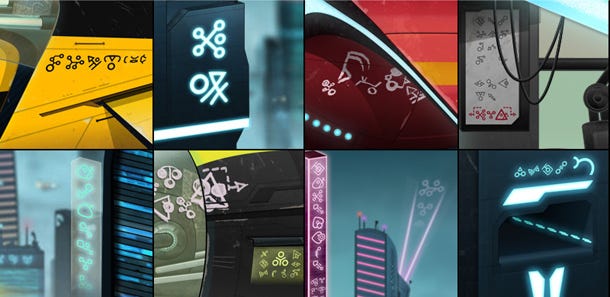 Various in-game elements throughout the world of Spryke, containing text, with various combinations of letters, numbers, punctuation and fonts.
Done! I now have a unique, cohesive, and interesting alien alphabet comprised of 52 letters, 10 numerals, 3 punctuation marks, and 4 fonts (that's 260 characters in total). I can now pepper it throughout Spryke's gameworld as I continue to develop it, confident that I have glyphs to suit any context.
I hope this helps someone, and if you've designed your own alphabet, I'd love to see it!
This article was originally posted at the Volnaiskra devblog. You can continue to see Spryke evolve by liking my facebook page.
Read more about:
Featured BlogsAbout the Author(s)
You May Also Like